
Option-Click AirPort Menu for Network Details
If you hold down the Option key while clicking the AirPort menu in Mac OS X 10.5 Leopard, you'll see not just the names of nearby Wi-Fi networks, but additional details about the selected network. Details include the MAC address of the network, the channel used by the base station, the signal strength (a negative number; the closer to zero it is, the stronger the signal), and the transmit rate in megabits per second showing actual network throughput. If you hover the cursor over the name of a network to which you're not connected, a little yellow pop-up shows the signal strength and type of encryption.
Written by
Adam C. Engst
Recent TidBITS Talk Discussions
- Alternatives to MobileMe for syncing calendars between iPad/Mac (1 message)
- Free anti-virus for the Mac (20 messages)
- iTunes 10 syncing iPod Touch 4.1 (2 messages)
- Thoughts about Ping (16 messages)
Published in TidBITS 1005.
Subscribe to our weekly email edition.
- Snow Leopard's Creator-Code Snubbing Now Official
- New Ebook Explains Syncing and Solves Syncing Problems
- Vote in the 2009 TidBITS Gift Guide Survey
- iPhoto 8.1.1 Fixes Face Recognition Bug
- Twitter Stops Asking What You're Doing
- TomTom Car Kit Now Supports Original iPhone and iPod touch
- How to Fix Snow Leopard's Finder-Copying Bug
- 7 Essential iPhone/iPod touch Tips
- TidBITS Watchlist: Notable Software Updates for 30 November 2009
- ExtraBITS for 30 November 2009
- Hot Topics in TidBITS Talk for 30 November 2009
See TidBITS Article Summaries as Pop-up Balloons
Web design is nothing if not an iterative process, and with the number of articles and ExtraBITS links we're publishing these days, I became unhappy with how quickly articles on our home page were pushed "below the fold" - visible only after scrolling. Depending on the length of article summaries, a MacBook screen might display only the two or three most recent articles, and while users can of course scroll to see more headlines, research shows that many people don't.
So Glenn and Jeff and I put our heads together and came up with an optional refinement to the design of our headline pages that shows more headlines in the same space (headline pages include the Latest Stories home page, plus each of our individual sections and staff pages accessible from the left-side navigation bar). Instead of presenting the full article summary between the headline and its associated metadata, the redesign hides the summary entirely, displaying it in a pop-up balloon when you mouse over it.
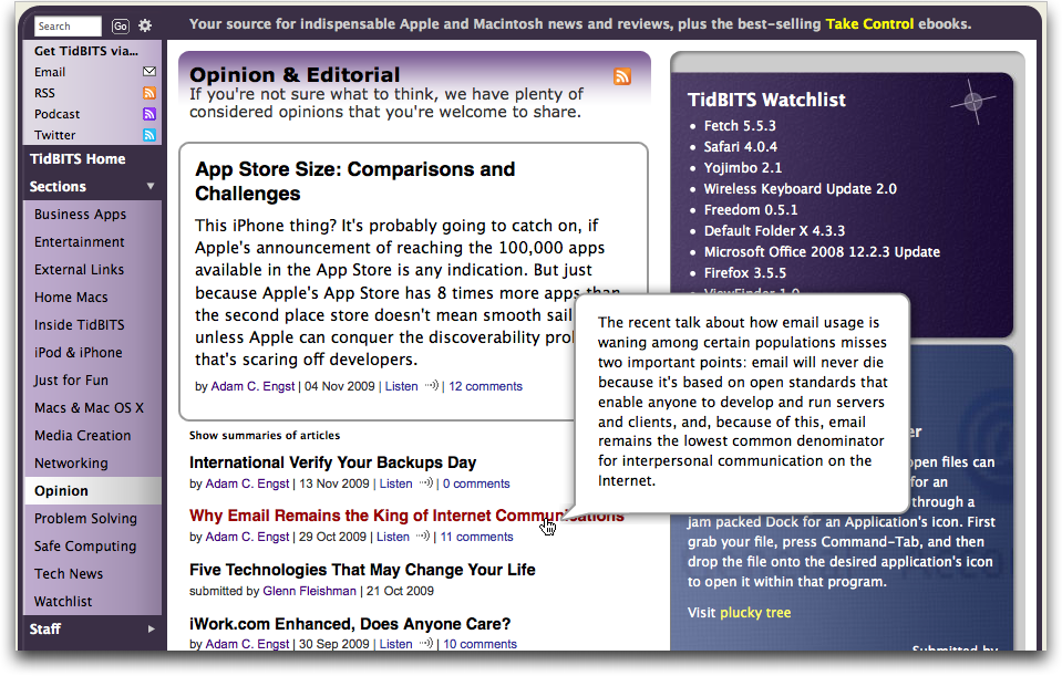
We didn't want to confuse regular readers, so the feature is turned off by default. To switch to balloon mode, click the Hide Summaries of Articles link under the featured article on any section's headline page. It becomes a Show Summaries of Articles link, and clicking that restores the previous design so you can easily choose whichever approach you prefer. A cookie records your Hide/Show selection so it can be honored on your subsequent visits. Give it a try and see what you think.
You'll also notice that we've updated the search results interface to use a similar approach.
Let us know in the comments if you have suggestions for improvements to this feature or other aspects of our Web site.
 READERS LIKE YOU! Support TidBITS with a contribution today!
<http://www.tidbits.com/about/support/contributors.html>
Special thanks this week to John & Nichola Collins, Chris Williams,
John K. Lilley, and Honeymoons By Sunset for their generous support!
As always, the rule is to ask yourself: WWTD? (What would Tognazzini do?)
We preserved the old mode as the default, for people who don't want this method. The triangle expand/collapse we tried extensively and found it too fussy, and thus not something T might D.
The problem is twofold. First, we assume that people will want to view more than one or two summaries, unlike Finder folders, where you generally know what you want to see. So it has to be easy to use for multiple headlines. However, and this is the second problem, collapsible triangles require constant clicking - you'd have to run down the left edge of the page, click click clicking. And worse, the target zone for an expansion triangle is very small. And, to go one step further, it becomes easy to click on the wrong thing, making it even more troublesome.
Hovering over a headline provides a larger target and requires only that you move the mouse pointer, not that you click each time you want to see an article summary.
I think this new innovation falls into the same category -- an answer looking for a problem that nobody has any problem with.
So your readers aren't intelligent enough to know how to scroll? Seems like you have a pretty low opinion of your demographic, I think. Or maybe you'd be better off without these folks in the long haul?
Personally, I've seen these buttons on other sites and they freak me out. More mouse movements, more effort spent clicking and clicking...I can scroll by hitting the space bar and skim things a lot faster without these so-called "improvements" -- and others, like pages that are so loaded with linked javascript files that take several minutes to fully download before you can work with a page that, based on its visual content and consensus standards, should actually appear in under 8 seconds optimally.
Okay, I realize this is opt-in (at least here at TIDBITS). But I vote we stop this wholesale "improving the internet" and stick with basic experience as envisioned by Berners-Lee, which is easily accessible (and I emphasis the "easily") content and information. Enough already with letting "designers" and wannabe engineers and proprietary commercial interests tinker with the structure.
EAR
As much as many would agree with you on the (to quote a snarky comment in Eudora by Steve Dorner) "trendy 3D junk," the unpleasant fact is that it's the world in which we have to compete.
Hopefully we're adding just features that make the site easier to use or more flexible, rather than just changing it to take advantage of the latest snazzy technology.
In this case, because it's opt-in, we provided a solution for readers (and ourselves) who wanted to omit seeing blurbs, and just read headlines. We don't know the size of that audience (although I can check cookies in the log to find out!), but it seemed like a reasonable improvement for those that wanted to engage in it.
For all other TidBITS readers, the site continues to function just as it has for a couple years.
As Adam noted, we now have readers who see (or hear) TidBITS in many different forms, so we try to tailor any improvements for the specific medium, like the Web.

Special thanks to digital.forest, our Web and mailing list host.
Unless otherwise noted, this article is copyright © 2009 Adam C. Engst
TidBITS is copyright © 2010 TidBITS Publishing Inc.
Reuse governed by Creative Commons License.
About TidBITS | Account Help | Advertise with TidBITS! | Contact Info | Copyright Terms