
Better Text Formatting in iPhoto
If you're creating a card or book in iPhoto, and you're not happy with the formatting options for the text (such as line spacing or justification), copy the text out to TextEdit, make the changes you want there, and paste it back into iPhoto, which will retain your changes.
Written by
Adam C. Engst
Recent TidBITS Talk Discussions
- Alternatives to MobileMe for syncing calendars between iPad/Mac (1 message)
- Free anti-virus for the Mac (20 messages)
- iTunes 10 syncing iPod Touch 4.1 (2 messages)
- Thoughts about Ping (16 messages)
Published in TidBITS 997.
Subscribe to our weekly email edition.
- Apple to Investigate SuperDrive Issues
- iTunes 9.0.1 Fixes Important Bugs
- NetNewsWire for Mac and iPhone, Finally Updated
- Enable MMS on the iPhone in the United States
- Google Offers Push Gmail and Google Sync to iPhone
- New "Take Control of Mac OS X Backups" Explains Smart Backups
- Hack Microsoft Word's Page Up/Page Down Keys
- Even More Hidden Refinements in Snow Leopard
- TidBITS Watchlist: Notable Software Updates for 28-Sep-09
- ExtraBITS for 28-Sep-09
- Hot Topics in TidBITS Talk for 28-Sep-09
Pantone iPhone App Offers Enjoyable Color Exploration
They had me at Pantone, but that's because I'm an old offset printing guy, who still has a high blood-ink concentration in his veins.
For those of you over 40 and involved in graphic design or print production, your first experience with Pantone was probably in those giant swatch books ("fandecks") of color. Those under 40 more likely know Pantone as spot-color palettes inside QuarkXPress and Adobe InDesign - and, soon, as an iPhone app.
Pantone's founding idea and continuing purpose is to provide a consistent color experience across various kinds of print output, especially commercial printing. You pick a color by looking at a swatch book produced by the firm under tightly controlled circumstances, type that number in your design program or image editor, and expect to see the results match at the end of the day. (Pantone is best known for spot colors, or mixed-ink colors, as opposed to four-color process in which cyan, yellow, magenta, and black are mixed to create faux full-color images.)
The $9.99 myPantone app for iPhone and iPod touch can't provide color fidelity - Apple hasn't provided color calibration as part of the iPhone OS yet - but it does offer a great exploration of Pantone's color spaces.
Andy Hatkoff, Pantone's technology vice president, said that the app is intended to match "the way in which designers aren't tethered to their desks, to their computers." The program lets a user quickly bring up colors from several standard swatchbooks, including textile-based and home-paint swatches, as well as capture colors in stored photos or photos taken on the spot.
"This is used for inspiration for direction; we would always refer someone back to the fandecks," he said. "What you see on the screen isn't necessarily what you're going to get." But color is notoriously difficult to remember, even for people who spend their lives working with it, so being able to compare colors on the spot is a boon.
Because it's impossible to describe what a program about color does - I might as well dance about architecture - and because Apple doesn't have demo versions of iPhone apps, I created a 4-minute tour as a movie that should give you a good sense of how the program works.
The interface takes total advantage of the strengths in the iPhone OS, using sliding and tapping to handle nearly all functions. For instance, in accessing color via the Fandeck view, you can either slide your finger along a color chart at the top, flip through swatches splayed out in a not-slavish imitation of physical reality, or double-tap a swatch page and then scroll up and down through successive and preceding pages in the book. You can switch between a physical swatchbook's organization and a spectrum-sorted view.

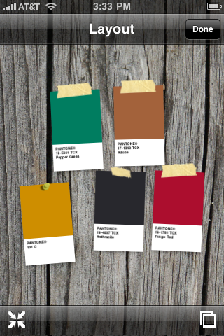
The bottom of the app holds a color well that can contain five samples at a time, and can be flipped through to reveal up to 10 unique palettes. You can drag any color shown in the upper half of the program into the well. Deleting colors is as easy as dragging them onto a trash can icon, or dragging them up out of the well. A palette in the well can be deleted by tapping the trash can icon.
The app can also analyze photos stored in your camera roll or new ones that you snap. The program automatically extracts five colors, but you can drag a magnifying glass to pick out others. "You have a way of extracting that color and using Pantone as the way to communicate that color," Hatkoff said, regarding the image analysis.
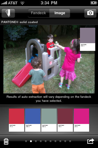
I see this as one key use: take a picture, and use the program to find better matches if the automatic extraction isn't close enough. Tapping any swatch brings up a full screen of the color making it easy to hold next to an object, even if the fidelity isn't perfect.
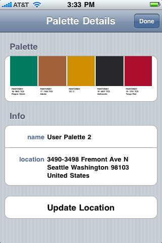
In the palette options menu, the Palette Details view lets you name the palette, as well as set a location using Core Location services. If you spot a particular restaurant sign that's the perfect paint color for your bedroom, you can take the photo, extract the colors, tune it up, and then put a pin on a map for finding it later.
Throughout the program, whenever a color is shown in the main part of the app, whether in a swatchbook or next to a photo, you simply tap and hold for a moment on the color and drag it into the well.
Once colors are in a palette in the well, you can email them (along with attachments that import the colors into applications from Adobe, Corel, and Quark), share them over peer-to-peer networking with nearby colleagues, or examine them against faux backgrounds. You can also post the palette to myPantone.com, a complementary service, to share with colleagues or others.
In using the app so far, I find it delightful. The program rewards exploration of color, letting you zoom through the spectrum, through the company's fandecks and through other methods. myPantone is a playful program that could be of use to anyone who wants to research, examine, and remember colors together.
 The Data Rescue Center is dedicated to bringing you the very best
hard drive recovery, data migration, and photo archiving options,
all at affordable and fair prices for individuals and businesses.
Get a FREE estimate today at <http://www.thedatarescuecenter.com/>
Are you able to comment if the app shows the PMS colour's cmyk data? I deal in print and this would help me a lot.
http://www.code-line.com/software/colorexpert
As an over-40 offset printer (who has ink in my blood) I see that the app doesn't include the mixing formulas for the colors. Too much to expect for a $9.99 application, eh? :-)
It's possible Pantone might get excited enough about the response to this app to create an in-app upgrade (fanbook by fanbook), or to release a ink-mixing version. However, they'd have to charge hundreds of dollars for that.

Special thanks to digital.forest, our Web and mailing list host.
Unless otherwise noted, this article is copyright © 2009 Glenn Fleishman
TidBITS is copyright © 2010 TidBITS Publishing Inc.
Reuse governed by Creative Commons License.
About TidBITS | Account Help | Advertise with TidBITS! | Contact Info | Copyright Terms