iPad UI Element Guidelines
Follow these guidelines as you use the new UI elements, and the new behaviors for existing UI elements, introduced in iOS 3.2. If you need to learn how to use an existing element that is not covered in this chapter, see the relevant section in iPhone Human Interface Guidelines.
Bars
The status bar, navigation bar, tab bar, and toolbar are views that have specifically defined appearances and behaviors in an application. Although bars in iPad applications look and behave much as they do in iPhone applications, there are a few differences.
The Status Bar
The status bar appears at the upper edge of the device screen (in all orientations) and contains information people need, such as the network connection, the time of day, and the battery charge.
Think twice before hiding the status bar if your application is not a game or full-screen media-viewing application. Most iPad applications do not need to hide the status bar to gain extra space, because the status bar occupies such a small fraction of the screen. On iPad, the subtle appearance of the status bar does not compete with your application for the user’s attention. As you can see in Figure 4-1, the small size of the status bar and the slightly rounded corners of the application’s upper bar combine to make the status bar seem like part of the device background.
Consider hiding the status bar (and all other application UI) while people are viewing full-screen media. If you do this, be sure to allow people to retrieve the status bar (and appropriate application UI) with a single tap.
Although a game might permanently hide the status bar, you should be aware of the ramifications of this design decision. Permanently hiding the status bar means that users must quit your application to find out, for example, whether they need to recharge their device.
Navigation Bar
A navigation bar appears at the upper edge of an application screen or view. A navigation bar usually displays the title of the current view, and it can contain controls that manage the view’s contents, in addition to navigational controls when appropriate. Figure 4-2 shows a navigation bar in Mail.
Note: Navigation bars are used in some iPad applications, but they are not as prevalent as they are in iPhone applications. Be sure to read “Flatten Your Information Hierarchy” as you consider using a navigation bar in your iPad application.
In your iPad application, you can use a navigation bar in:
Either pane of a split view
A popover
A modal view
A full-screen application view (although this usage is unusual in an iPad application)
Use a navigation bar if you need to allow people to drill down into an information hierarchy. You can do this at the top level of your application or within a discrete view, such as a tab, a split view pane, or a popover. For example:
Settings uses a navigation bar in the right pane of a split view to help people drill down through the settings associated with the application or feature they selected in the left pane.
Calendar uses a navigation bar in the Add Event popover to organize the set of detail screens within the popover. To input some of the values, people navigate to a new popover screen, but they remain within the popover.
iTunes uses navigation bars to allow people to drill down through the content in several of its tabs.
Use the title of the current view as the title of the navigation bar. When the user navigates to a new level, two things should happen:
The bar title should change to the new level’s title.
A back button should appear to the left of the title, and it should be labeled with the previous level’s title.
Use a toolbar instead of a navigation bar if you need to offer a larger set of controls, or you do not need to enable navigation.
Consider putting a segmented control in a navigation bar at the top level of an application. This is especially useful if doing so helps to flatten your information hierarchy and make it easier for people to find what they’re looking for. If you use a segmented control in a navigation bar, be sure to choose accurate back-button titles for subsequent information levels. (For usage guidelines, see “Segmented Control.”)
Avoid crowding a navigation bar with additional controls, even though there might be enough space. In addition to a view’s current title, the navigation bar should contain no more than the back button and one control that manages the view’s contents. If, instead, you use a segmented control in the navigation bar, the bar should not display a title and it should not contain any other controls.
Use only bordered-style controls in a navigation bar. If you place a plain (borderless) control in a navigation bar, it automatically converts to the bordered style.
Use system-provided buttons according to their documented meaning. For more information, see “Standard Buttons for Use in Toolbars and Navigation Bars” in iPhone Human Interface Guidelines. If you decide to create your own navigation bar controls, see “Icons for Navigation Bars, Toolbars, and Tab Bars” in iPhone Human Interface Guidelines for advice on how to design them.
Be aware that a navigation bar does not change its height or translucency with rotation. This behavior differs from the behavior of a navigation bar in an iPhone application.
Specify the color or translucency of a navigation bar, when appropriate. If you want the navigation bar to coordinate with the overall look of your application, you can specify a custom color. You can make a navigation bar translucent if you want to encourage people to pay more attention to the content underneath the bar. If you customize a navigation bar in these ways, try to make sure it’s consistent with the look of the rest of your application.
Tab Bar
A tab bar typically appears at the bottom edge of an application screen and gives people the ability to switch between different subtasks, views, or modes. Figure 4-3 shows a tab bar in iTunes.
In general, use a tab bar to organize information at the application level. A tab bar is well suited for use in the main application view because it’s a good way to flatten your information hierarchy and provide access to several peer information categories or modes at one time.
In limited circumstances, it might make sense to use a tab bar in a split view pane or a popover if the tabs switch or filter the content within that view. However, it often works better to use a segmented control at the bottom edge of a popover or split view pane, because the appearance of a segmented control coordinates better with the popover or split view appearance. (For more information on using a segmented control, see “Segmented Control.”)
Avoid crowding the tab bar with too many tabs. Putting too many tabs in a tab bar can make it physically difficult for people to tap the one they want. Also, with each additional tab you display, you increase the complexity of your application. In general, try to limit the number of tabs in the main view or in the right pane of a split view to about seven. In a popover or in the left pane of a split view, up to about five tabs fit well.
Avoid creating a More tab. On iPad, a screen devoted solely to a list of additional tabs is a poor use of space.
Display the same tabs in each orientation. In portrait, the recommended seven tabs fit well across the width of the screen. In landscape orientation, you should center the same tabs along the width of the screen. This guidance also applies to the usage of a tab bar within a split view pane or a popover. For example, if you use a tab bar in a popover in portrait, it works well to display the same tabs in the left pane of a split view in landscape.
When you avoid changing the tabs or their spacing, you increase the visual stability of your application. As you can see in Figure 4-4, iTunes displays precisely the same tabs in landscape as it does in portrait (shown in Figure 4-3).
Use system-provided tab icons according to their documented meaning. See “Standard Icons for Use in Tab Bars” in iPhone Human Interface Guidelines for more information. If you decide to create your own tab icons, see “Icons for Navigation Bars, Toolbars, and Tab Bars” in iPhone Human Interface Guidelines for advice on how to design them.
Be aware that a tab bar does not change its color, opacity, or height, regardless of orientation. This behavior is the same behavior as in an iPhone application.
Toolbar
A toolbar usually appears at the top edge of a screen or view, but it can also appear at the bottom edge. It contains controls that perform actions related to objects in the screen or view. Figure 4-5 shows a toolbar in Maps.
Use a toolbar to give people a selection of frequently used commands that make sense in the current context. You can also put a segmented control in a toolbar to give people access to different perspectives on your application’s data or to different application modes. (For usage guidelines, see “Segmented Control.”)
Maintain a hit target area of at least 44 x 44 pixels for each toolbar item. If you crowd toolbar items too closely together, people have difficulty tapping the one they want.
Use system-provided toolbar items according to their documented meaning. See “Standard Buttons for Use in Toolbars and Navigation Bars” in iPhone Human Interface Guidelines for more information. If you decide to create your own toolbar items, see “Icons for Navigation Bars, Toolbars, and Tab Bars” in iPhone Human Interface Guidelines for advice on how to design them.
Try to avoid mixing plain style (borderless) and bordered toolbar items in the same toolbar. You can use either style in a toolbar, but mixing them does not usually look good.
Content Views
In addition to the existing image, map, table, text, and web views, iOS 3.2 introduces two new views to manage content: the popover and the split view. With the exception of new capabilities for text views, the behaviors of the other existing content views remain the same as in previous versions of iOS.
Popover
A popover is a transient view that can be revealed when people tap a control or an onscreen area. Figure 4-6 shows a popover in Calendar.
A popover can contain a wide variety of objects and views. For example, a popover can contain:
Table, image, map, text, web, or custom views.
Navigation bars, toolbars, or tab bars.
Controls or objects that act upon objects in the current application view.
You can use a popover to:
Display additional information or a list of items related to the focused (or selected) object.
Display the contents of the left pane when a split view–based application is in portrait. If you do this, be sure to provide an appropriately titled button that displays the popover, preferably in a navigation bar or toolbar at the top of the screen.
Display an action sheet that contains a short list of options that are closely related to something on the screen.
Note: A popover always displays an arrow, and you cannot change the appearance of a popover’s border.
Avoid providing a “dismiss popover” button. A popover should close automatically when its presence is no longer necessary. For example:
When a popover’s only function is to provide a set of options or items that have an effect on the main view, it should close as soon as people make a choice. This behavior is very similar to that of a menu in a computer application. Note that this behavior also applies to a popover that contains only an action sheet: As soon as people tap a button in the action sheet, the popover should close.
Occasionally, it can make sense to provide a popover that contains items that affect the main view, but that does not close when people make a choice. You might want to do this if you implement an inspector in a popover, because people might want to make an additional choice or change the attributes of the current choice.
A popover that provides menu or inspector functionality should close when people tap anywhere outside its bounds, including the control that reveals the popover. In a popover that provides a menu of choices, this gesture means that the user has decided not to make a choice (so the main view remains unaffected). In a popover that contains an action sheet, this gesture takes the place of tapping a Cancel button.
If a popover enables a task, it can be appropriate to display buttons that complete or cancel the task, and simultaneously dismiss the popover. In general, popovers that enable an editing task display a Done button and a Cancel button. These buttons help remind people that they’re in an editing environment and allow them to explicitly keep or discard their input. When people tap either button, the popover should close.
If it makes sense in your application, you can prevent people from closing such a popover when they tap outside its borders. This might be a good idea if it’s important that people finish (or explicitly abandon) a task. Otherwise, you should save their input when they tap outside a popover’s borders, just as you would if they tapped Done.
In general, save users’ work when they tap outside a popover’s borders. Because a popover does not require an explicit dismissal, people might dismiss it mistakenly. You should discard their work only if they tap a Cancel button.
Ensure that the popover arrow points as directly as possible to the element that revealed it. Doing this helps people remember where the popover came from and what task or object it’s associated with.
Make sure people can use a popover without seeing the application content behind it. A popover obscures the content behind it, and people cannot drag a popover to another location.
Ensure that only one popover is visible onscreen at a time. A popover is closely associated with a user action, so it would be confusing for people to see more than one popover onscreen.
When possible, allow people to close one popover and open a new one with one tap. This behavior is especially desirable when several different bar buttons each open a popover, because it prevents people from having to make extra taps.
Avoid making a popover too big. A popover should not appear to take over the entire screen. Instead, it should be just big enough to display its contents and still point to the place it came from.
Ideally, the width of a popover should be at least 320 points, but no greater than 600 points. The height of a popover is not constrained, so you can use it to display a long list of items. In general, though, you should try to avoid scrolling in a popover that enables a task or that presents an action sheet. Note that the system might adjust both the height and the width of a popover to ensure that it fits well on the screen.
Prefer standard UI controls and views within a popover. In general, popovers look best, and are easier for users to understand, when they contain standard controls and views.
Take care if you combine a customized background color or texture with standard controls and views. Be sure the standard UI elements look good and are easy to read when they’re seen on top of your custom background appearance.
If appropriate, change a popover’s size while it remains visible. You might want to change a popover’s size if you use it to display both a minimal and an expanded view of the same information. If you adjust the size of a popover while it’s visible, you can choose to animate the change. Animating the change is usually a good idea because it avoids making people think that a new popover has replaced the old one.
Split View
A split view is a full-screen view that consists of two side-by-side panes. Even though the left pane is often called the master pane and the right pane is often called the detail pane, you are not limited to using a split view to implement a master-detail design. Figure 4-7 shows a split view in Mail.
Typically, you use a split view to display persistent information in the left pane and related details or subordinate information in the right pane. When people select an item in the left pane, the right pane displays the information related to that item. (You’re responsible for making this happen in code.) Two examples that use split views are Mail and Settings.
In landscape, Mail displays the user’s account and mailbox hierarchy in the left pane and the selected message in the right pane. People drill down through the content in the left pane and view the most detailed information in the right pane.
In all orientations, Settings displays top level device and application categories in the left pane and specific settings in the right pane. People select a category in the left pane and drill down through related settings in the right pane, if necessary.
Both panes can contain a wide variety of objects and views, such as:
Table, image, map, text, web, or custom views.
Navigation bars, toolbars, or tab bars. (Note, however, that it does not make sense to put a navigation bar in both panes of a split view at the same time.)
In general, when an application uses a split view in landscape, it displays the contents of the left pane in a popover when it rotates to portrait. However, this does not mean that you must follow this pattern. If it makes sense in your application, you can design your UI to display side-by-side views in all orientations.
Avoid creating a right pane that is narrower than the left pane. The width of the left pane is fixed at 320 points in all orientations. Although the width of the right pane is up to you, it does not look good to use a width of less than 320 points.
In general, indicate the current selection in the left pane in a persistent way. This behavior helps people understand the relationship between the item in the left pane and the contents of the right pane. This is important because the contents of the right pane can change, but they should always remain related to the item selected in the left pane.
Text View
Be sure to avoid using Core Text to compute layout of text and a UITextView object to draw the result, because this use is not supported. Core Text capabilities are primarily intended to help implement very full-featured word processing applications. Core Text is not necessary or suitable for the vast majority of applications that need simpler text-handling capabilities.
You can use your own fonts in your iPad application. Include the fonts in your application bundle, and specify them using the UIAppFonts key in your Info.plist file. To learn about this file, see “The Application Bundle” in iOS Application Programming Guide; for guidelines specific to iPad, see “Updating Your Info.plist Settings” in iPad Programming Guide.
Note that fonts of type .ttf or .otf work on iPad; traditional Mac OS fonts (that is, Classic font suitcases) do not work on iPad.
Controls
All UIKit controls introduced in previous versions of iOS are available to iPad applications. With a couple of slight differences, the controls look and behave as you and your users expect.
Date and Time Picker, Picker
A date and time picker allows people to select a value that can consist of multiple parts, such as a date. A picker is a generic version of a date and time picker, which allows people to select from a set of single-part values. Figure 4-8 shows a date and time picker in Calendar.
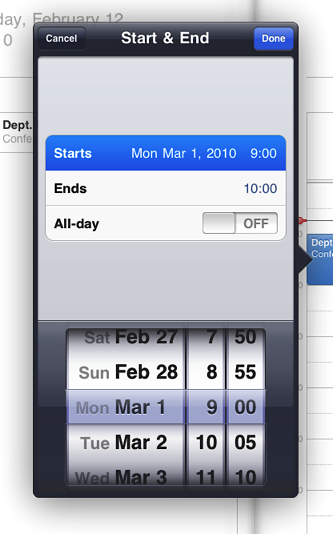
Present a picker or date and time picker only within a popover. This placement differs from the placement recommendation for an iPhone application. For more information about what these controls do and how you can customize them, see “Date and Time Pickers” in iPhone Human Interface Guidelines and “Pickers” in iPhone Human Interface Guidelines.
Info Button
Avoid using an Info button to flip the entire screen. Instead, you might use an Info button to show people that they can access an expanded view that contains related information or additional details. This usage differs from the most common usage of an Info button on iPhone, which is to flip the screen of a utility application to reveal configuration options.
Page Indicator
The large iPad screen lessens the need for the page indicator control. If you used a page indicator in your iPhone application, investigate ways to display your content on a single screen, instead of on multiple, parallel screens.
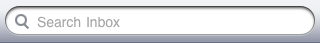
Search Bar
A search bar is a field that accepts text from people, which your application can use as input for a search. When the user taps a search bar, a keyboard appears; when the user is finished typing search terms, the input is handled in an application-specific way. Figure 4-9 shows a search bar in a Mail popover.
Use a search bar in a navigation bar or a toolbar to give people quick access to search. If search is a primary function in your application, you might want to provide a search tab, as iTunes does.
Display the search results button to let people retrieve or change the results of a previous search. People tap this button to see a list of search results in a popover. If it makes sense in your application, you can filter the list (or supply autocompletions or suggestions) while people type. See UISearchBar Class Reference to learn how to display the search results button in a search bar.
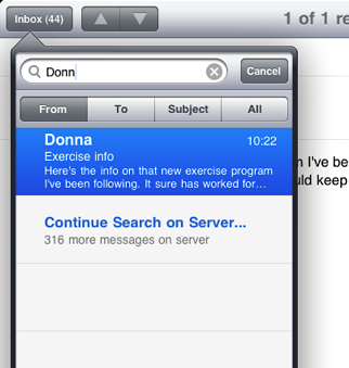
Consider using a scope bar to allow people to change the scope of the search. In iPad applications, you can put a scope bar below the search bar inside a subview, for example, in the left pane of a split view or in a popover, as shown in Figure 4-10.
Segmented Control
A segmented control is a linear set of segments, each of which functions as a button that can display a different view. Figure 4-11 shows a segmented control in the iTunes toolbar.
Use a segmented control in a top-edge toolbar to provide different perspectives or modes in the application. When you put a segmented control at the top of the screen, people tend to see it as a way to manage data categories or modes at the application level. For example, Maps uses a segmented control in a top-edge toolbar to let people switch between search mode and directions mode.
Use a segmented control in a bottom-edge toolbar to provide different perspectives or modes in a view. When you put a segmented control at the bottom of a view, people tend to see it as a way to manage data categories or modes on a view level. For example, the iPod application uses a segmented control in a bottom-edge toolbar to let people group their libraries in different ways.
Another example of a view-specific segmented control is in the Maps bookmarks popover, shown in Figure 4-12. Because the segmented control is contained in the popover, people understand that it acts upon the popover contents, and does not filter information or change modes in the rest of the application. If you need to provide mode-switching or filtering within a popover or split view pane, consider using a segmented control instead of a tab bar.
Action Sheets, Alerts, and Modal Views
Action sheets, alerts, and modal views are temporary views that appear when something requires the user’s attention or when additional choices or functionality need to be offered. People cannot interact with an application while one of these views is on the screen.
Action Sheet
An action sheet displays a set of choices related to a task the user initiates.
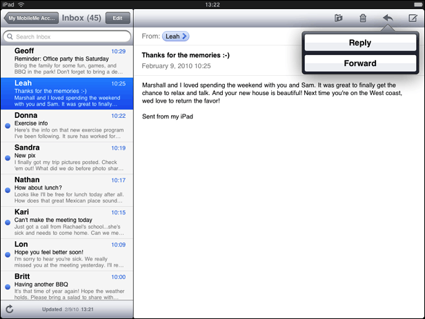
In an iPad application, an action sheet is displayed within a popover; it never has full-screen width. Figure 4-13 shows the action sheet that appears when the user taps the Reply button in Mail.
An action sheet can be displayed with or without animation.
Without animation, an action sheet and its popover appear simultaneously. Display an action sheet without animation to provide alternatives related to a task that the user initiates from outside a popover. When you display an action sheet this way, the popover’s arrow points to the control or area the user tapped to initiate the task.
Do not include a Cancel button, because people can tap outside the popover to dismiss the action sheet without selecting one of the other alternatives. (Note that there is no Cancel button in the action sheet in Figure 4-13.)
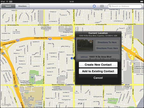
With animation, an action sheet slides up over an open popover’s content. Use animation to display alternatives related to a task that the user initiates from within an open popover.
An animated action sheet should include a Cancel button, because people need to be able to dismiss the action sheet without closing the popover. Figure 4-14 shows an action sheet that appears in the location popover in Maps.
Alert
Alerts behave the same on iPad as they do on iPhone. (See “Using Alerts” in iPhone Human Interface Guidelines for guidance on when to use an alert and how to design a good alert experience.)
Briefly, an alert should be used to give people important information that affects their use of the application or the device. Alerts are seldom necessary and are best used to:
Describe a problem and give people a choice of ways to handle it
Give people a chance to accept or reject an outcome that is potentially dangerous
If you merely want to increase the visibility of some information, especially information related to the standard functioning of your application, you should avoid using an alert. Instead, you should design an eye-catching way to display the information that harmonizes with your application’s style.
Modal View
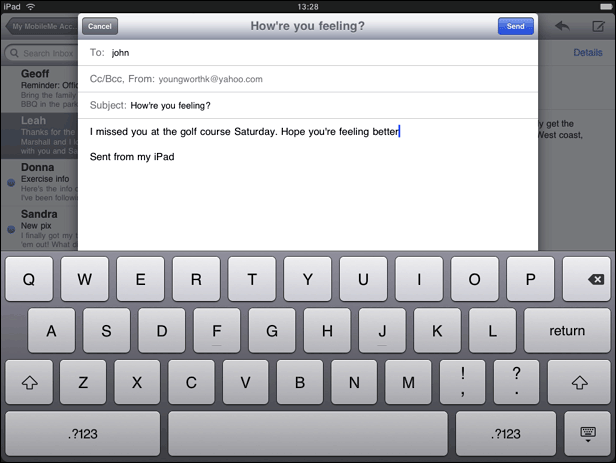
A modal view (that is, a view presented modally) provides self-contained functionality in the context of the current task or workflow. Figure 4-15 shows a modal view in Mail.
A modal view can be presented in a style that suits the current task and the visual style of your iPad application.
Full screen. Covers the entire screen. This style is good for presenting a potentially complex task that people can complete within the context of the modal view. For example, the iPod application uses this style for its Genius playlist creation task.
Page sheet. Has a fixed width of 768 points; the sheet height is the current height of the screen. In portrait, the modal view covers the entire screen; in landscape, the screen that is visible on both sides of the modal view is dimmed to prevent user interaction. For example, Mail uses this style for its message composition task (as shown in Figure 4-15).
Form sheet. Has fixed dimensions of 540 x 620 points and is centered in the screen. The area of the screen that is visible outside the modal view is dimmed to prevent user interaction. When the keyboard is visible in landscape, a form sheet view moves up to just below the status bar. This style is good for gathering structured information from the user.
Current context. Uses the same size as its parent view. This style is good for displaying a modal view within a split view pane, popover, or other non-full-screen view.
In addition to the existing transition styles (vertical and flip), iOS introduces the partial-curl transition. Using this transition, one corner of the current view curls up to reveal the modal view underneath. When the user leaves the modal view, the current view uncurls to its original position. Note that a modal view revealed by a partial-curl transition cannot itself reveal another modal view.
The partial-curl transition style is similar to the page-curl behavior of Maps on iPhone. You might want to use this style when the modal view you reveal is not large and does not require much user interaction, such as a view that holds configuration options.
If you’re considering displaying a modal view that can contain other modal views, be sure to avoid convoluted interactions. See “Restrict Complexity in Modal Tasks” for some guidance.
Edit Menu Additions
In general, the items you add to the edit menu should edit, alter, or otherwise act directly upon the user’s selection. People expect the standard edit menu items to act upon text or objects within the current context, and it’s best when your custom menu items behave similarly.
Note: If you need to enable actions that use the selected text or object in a way that’s external to the current context, it’s better to use an action sheet. For example, if you want to allow people to share their selection with others, you might display an action sheet that lists social networking sites to which they can send their selection. See “Action Sheet” to learn about the usage guidelines for action sheets.
If you add custom items to the edit menu, be sure to list them together after the system-provided items. Don’t intersperse your custom items with the system-provided ones.
Keep the number of custom menu items reasonable. You don’t want to overwhelm your users with too many choices.
Create succinct names for your custom menu items and make sure the names precisely describe what the commands do. In general, item names should be verbs that describe the action to be performed. Although you should prefer a single capitalized word for an item name, use title-style capitalization if you must use a short phrase. (Briefly, title-style capitalization means to capitalize every word except articles, coordinating conjunctions, and prepositions of four or fewer letters.)
Keyboard Customization
iOS 3.2 allows you to design a custom input view that replaces the system-provided onscreen keyboard. If you provide a custom input view, be sure its function is obvious to people. Also, be sure to make the controls in your input view look tappable.
Last updated: 2010-08-03