iPad User Experience Guidelines
Content and interactivity are paramount in the iPad user experience. The best iPad applications elevate content and interactivity by doing three things really well:
They downplay application UI so that the focus is on the content that people want.
They present the content in beautiful, often realistic ways.
They take full advantage of device capabilities to enable enhanced interaction with the content.
The primacy of content and interactivity inform the guidelines in this chapter. Keep this in mind as you design your iPad application.
Aim to Support All Orientations
Being able to run in all orientations is an important factor in the success of your iPad application. The large screen mitigates people’s desire to rotate the device to landscape to “see more.” And, because people don’t pay much attention to the minimal device frame or the location of the Home button, they don’t view the device as having a default orientation. This leads people to expect applications to run well in the device orientation they’re currently using. As much as possible, your application should encourage people to interact with iPad from any side by providing a great experience in all orientations.
The difference between landscape and portrait dimensions can significantly affect how your UI fits onscreen. Precisely how you respond to rotation might vary, but you should make every effort to abide by the following guidelines.
Maintain focus on the primary content. This is your highest priority. People use your application to view and interact with the content they care about. Altering the focus on that content in different orientations can make people feel that they’ve lost control over the application.
Consider changing how you display auxiliary information or functionality. Although you should make sure that the most important content is always in focus, you can respond to rotation by changing how you provide secondary content.
In Mail, for example, the lists of accounts and mailboxes comprise secondary content (the main content is the selected message). In landscape, secondary content is displayed in the left pane of a split view; in portrait, it’s displayed in a popover. Or, consider a game that displays a rectangular game board in landscape. In portrait, the game needs to redraw the board to fit well on the screen, which might result in additional space above or below the board. Instead of vertically stretching the game board to fit the space or leaving the space empty, the game could display supplemental information or objects in the additional space. Both of these examples maintain the user’s focus on the primary content and take best advantage of the current screen dimensions without altering the primary functionality of the application.
Avoid radical or gratuitous changes in layout. The large iPad screen allows you to provide a similar UI layout in all orientations. For example, if you display images in a grid while in landscape, you don’t need to display the same information in a list while in portrait (although you might adjust the dimensions of the grid). Focus on providing a consistent experience in all orientations, even if the layout of secondary information might change. A comparable experience in all orientations allows people to maintain their usage patterns when they rotate the device.
When possible, avoid reformatting information and rewrapping text on rotation. Strive to maintain a similar format in all orientations. Especially if people are reading text, it’s important to avoid causing them to lose their place when they rotate the device.
If some reformatting is unavoidable, use animation to help people track the changes. For example, if you must add or remove a column of text in different orientations, you might choose to hide the movement of columns and simply fade in the new arrangement. To help you design appropriate rotation behavior, think about how you’d expect your content to behave if you were physically interacting with it in the real world.
Avoid providing a UI element or defining a rotation gesture that rotates your content. Instead, people should be able to rotate your content by rotating the device.
Provide a unique launch image for each orientation. When each orientation has a unique launch image, people experience a smooth application start regardless of the current device orientation. In contrast with the Home screen on iPhone, the iPad Home screen supports all orientations, so people are likely to start your application in the same orientation in which they quit the previous application. See “Create a Launch Image for Each Orientation” for more information on iPad launch images.
Think twice before preventing your application from running in all orientations. People expect to use your application in whichever orientation they’re currently holding their iPad, and it’s best when you can fulfill that expectation. In certain cases, however, an application needs to run in portrait only or in landscape only. If it’s essential that your application run in only one orientation, you should:
Launch in your supported orientation, regardless of the current device orientation. For example, if your game or media-viewing application runs in landscape only, it’s appropriate to launch in landscape, even if the device is currently in portrait. This way, if people start your application in portrait, they know to rotate the device to landscape to view the content.
Avoid displaying a UI element that tells people to rotate the device. Launching in your supported orientation clearly tells people to rotate the device, if required, without adding unnecessary clutter to your UI.
Support both variants of an orientation. For example, if your application runs only in landscape, people should be able to use it whether they’re holding the device with the Home button on the right or on the left. And, if people rotate the device 180 degrees while using your application, it’s best if you can respond by rotating your content 180 degrees.
If your application interprets changes in device orientation as user input, you can handle rotation in application-specific ways. For example, if your application is a game that allows people to move game pieces by rotating the device, you can’t respond to device rotation by rotating the screen. In a case like this, you should launch in either variant of your required orientation and allow people to switch between the variants until they start the main task of the application. Then, as soon as people begin the main task, you can begin responding to device movement in application-specific ways.
Enhance Interactivity (Don’t Just Add Features)
The best iPad applications give people innovative ways to interact with content while they perform a clearly defined, finite task. Resist the temptation to fill the large screen with features that are not directly related to the main task. In particular, you should not view the large iPad screen as an invitation to bring back all the functionality you pruned from your iPhone application.
To make your iPad application stand out, concentrate on ways to amplify the user experience, without diluting the main task with extraneous features. For example:
A book-reader application that allows people to read books and keep track of reading lists can provide a much more enjoyable reading experience on the large screen. Instead of making people transition to another screen to manage their reading lists, the application can put the list in a popover and allow people to copy favorite passages into it. The application can also let people add bookmarks and annotations to the text, and help them trade their lists with others or compare their progress against a central repository of lists.
A fighter pilot game might enable a translucent heads-up display over the main view. Players can tap realistic cockpit controls to engage the enemy or locate themselves on a map overlay.
A soccer playing game can display a larger, more realistic playing field and more detailed characters, and allow people to manage their teams and customize the characters. It can also allow people to see information about characters without leaving the field view. Finally, it can enable a multiplayer mode in which two people can pit their teams against each other.
A screen writing application might provide ways to switch between a plot view and a character view without leaving the main context. Writers can switch between these views to check details as they write in the main view.
Flatten Your Information Hierarchy
Use the large iPad screen and new UI elements to give people access to more information in one place. Although you don’t want to pack too much information into one screen, you also want to prevent people from feeling that they must visit many different screens to find what they want.
In general, focus the main screen on the primary content and provide additional information or tools in an auxiliary view, such as a popover. This gives people easy access to the functionality they need, without requiring them to leave the context of the main task.
With the large iPad screen, and UI elements such as split view and popover, you have alternatives to the one-level-per-screen structure of many iPhone applications. For example, you can:
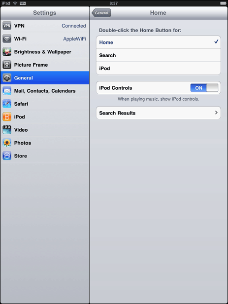
Use a navigation bar in the right pane of a split view to allow people to drill down into a top-level category that is persistently displayed in the left pane. This flattens your information hierarchy by at least one level, because two levels are always onscreen at the same time. Settings displays device and application settings in this way, as shown in Figure 3-1. (See “Split View” for usage guidelines.)
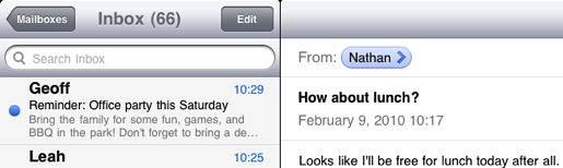
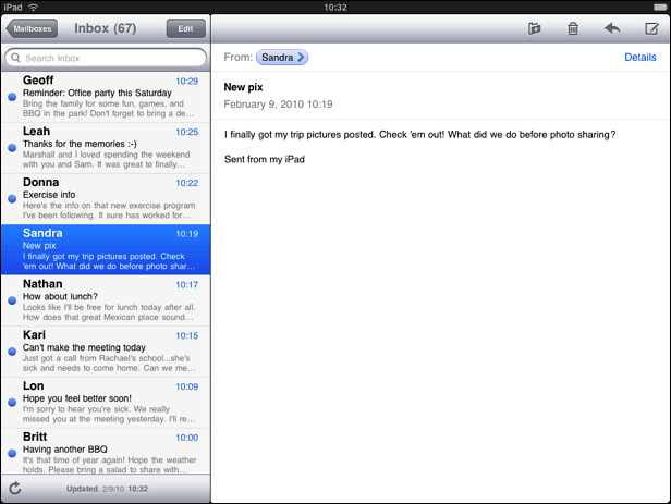
Use a navigation bar in the left pane of a split view to allow people to drill down through a fairly shallow hierarchy. Then, display the most specific information (that is, the leaf nodes in the hierarchy) in the right pane. This, too, flattens your hierarchy by displaying two levels onscreen at one time. Mail in landscape uses this design to display the user’s mailbox hierarchy in the left pane, as shown in Figure 3-2; individual messages are displayed in the right pane, as shown in Figure 2-2. (See “Navigation Bar” for usage guidelines.)
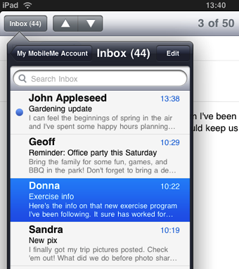
Use a popover to enable actions or provide tools that affect onscreen objects. A popover can display these actions and tools temporarily on top of the current screen, which means people don’t have to transition to another screen to get them. Mail in portrait uses a popover to display the user’s account and mailbox hierarchy, as shown in Figure 3-3. (See “Popover” for usage guidelines.)
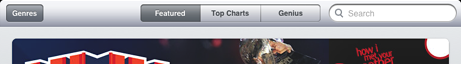
Use a segmented control in a toolbar to display different perspectives on the content or different information categories. In this way, you can provide access to these perspectives or categories from a single bar at the top (or the bottom) of the screen. iTunes uses a segmented control in a top-edge toolbar to provide different perspectives on the content in a category, as shown in Figure 3-4. (See “Toolbar” and “Segmented Control” for usage guidelines.)
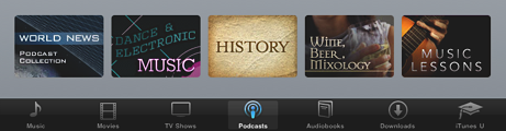
Use a tab bar to display different information categories or, less often, different application modes. In iPad applications, a tab bar is more likely to be used as a filter or category switcher than as a mode switcher. As shown in Figure 3-5, iTunes uses a tab bar to give people access to different categories of media. It’s worth changing your information architecture to avoid multiple, parallel modes, if this allows you to avoid using a tab bar to swap in different screens. (See “Tab Bar” for usage guidelines.)
Reduce Full-Screen Transitions
Closely associate visual transitions with the content that’s changing. Instead of swapping in a whole new screen when some embedded information changes, try to update only the areas of the user interface that need it. As a general rule, prefer transitioning individual views and objects, not the screen. In most cases, flipping the entire screen is not recommended.
When you perform fewer full-screen transitions, your application has greater visual stability, which helps people keep track of where they are in their task. You can use UI elements such as split view and popover to lessen the need for full-screen transitions.
Enable Collaboration and Connectedness
People view iPad as a personal device, but its convenient size also encourages physical collaboration and sharing with others.
Think of ways people might want to use your application with others. Expand your thinking to include both the physical sharing of a single device and the virtual sharing of data. For example, two people might be able to play a game on opposing sides of an onscreen board. Or a band application might allow different people to play different instruments together on a single device.
People expect to be able to share information that’s important to them. When it makes sense in your application, make it easy for people to interact with others and share things like their location, opinions, and high scores.
Most applications can add value by allowing people to go beyond the application and share data with other tools they use. For example, an iPad application can act as a mobile complement to a computer application. Or, an iPad application might allow its users to communicate with the users of the iPhone version of the application.
Add Physicality and Heightened Realism
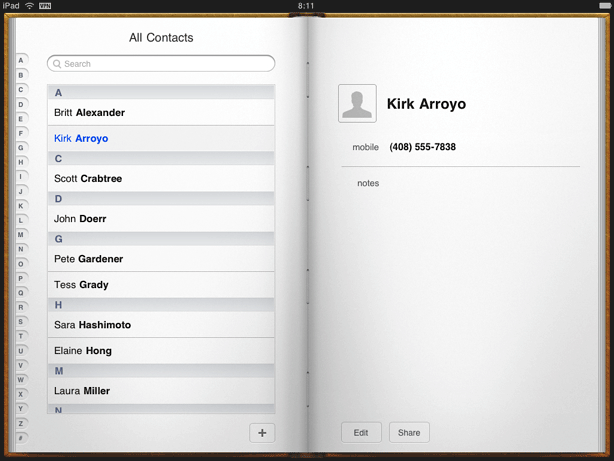
Whenever possible, add a realistic, physical dimension to your application. The more true to life your application looks and behaves, the easier it is for people to understand how it works and the more they enjoy using it. For example, people instantly know how to use the realistic address book that Contacts portrays (shown in Figure 3-6).
As you work on adding realistic touches to your application, don’t feel that you must strive for scrupulous accuracy. Often, an amplified or enhanced portrayal of something can seem more real, and convey more meaning, than a faithful likeness. As you design objects and scenes, think of them as opportunities to communicate with your users and to express the essence of your application.
Use animation to further enhance realism in your application. In general, it’s more important to strive for accuracy in movement than in appearance. This is because people accept artistic license in appearance, but they can feel disoriented when they see movement that appears to defy physical laws. As much as possible, make sure your virtual views and controls mimic the behavior of the physical objects and controls they resemble. Convincing animation heightens people’s impression of your application as a tangible, physical realm in which they want to spend time.
Delight People with Stunning Graphics
The high-resolution iPad screen supports rich, beautiful, engaging graphics that draw people into an application and make the simplest task rewarding. iPad showcases your application’s artwork, so you should consider hiring a professional artist to create first-rate graphics that people will admire.
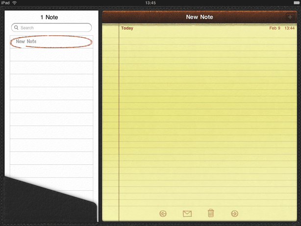
One way to increase the perceived value of your application is to replicate the look of high-quality or precious materials. For example, if the effect of wood, leather, or metal is appropriate in your application, take the time to make sure the material looks realistic and valuable. As shown in Figure 3-7, Notes reproduces the look of fine leather and meticulous stitching.
If your artwork is not already high resolution, you may need to recreate it. In most cases, scaling up your artwork is not recommended as a long-term solution. Instead, try creating your artwork in a dimension that is larger than you need, so you can add depth and details before scaling it down. This works especially well when the dimension of the original art file is a multiple of the dimension you need. Then, if you also use an appropriate grid size in your image-editing application, you’ll be able to keep the scaled-down art file crisp and reduce the amount of retouching and sharpening you need to do.
In addition to updating all your textures, effects, and images, make sure you remove from your code any hard-coded values that identify screen dimensions.
Update your existing launch images and create additional ones, if necessary (see “Create a Launch Image for Each Orientation”).
Create a large application icon (see “Create a Beautiful Application Icon”).
De-emphasize User Interface Controls
Help people focus on the content by designing your application UI as a subtle frame for the information they’re interested in. Downplay application controls by minimizing their number and prominence. Photos does this by placing a few unobtrusive controls on translucent bars.
Consider creating custom controls that subtly integrate with your application’s graphical style. In this way, controls are discoverable, without being conspicuous.
Also, consider fading controls after people have stopped interacting with them for a little while, and redisplaying them when people tap the screen. Sometimes you may want to fade the rest of your application UI, too. This gives even more of the screen space to the content people want to see. For example, Photos fades the controls and bars after a few moments of noninteraction, which encourages people to immerse themselves in the content.
Minimize Modality
When possible, minimize the number of times people must be in a modal environment to perform a task or supply a response. iPad applications should allow people to interact with them in nonlinear ways. Modality prevents this freedom by interrupting people’s workflow and forcing them to choose a particular path.
Modality is most appropriate when:
It’s critical to get the user’s attention.
A task must be completed (or explicitly abandoned) to avoid leaving the user’s data in an ambiguous state.
Rethink Your Lists
Lists (that is, table views) are a common way to efficiently display large amounts of information in iPhone applications. Lists are very useful in iPad applications, too, but you should take this opportunity to investigate whether you can present the same information in a richer way. For example:
Consider a more real-world vision of your application. For example, on iPhone, Contacts is a streamlined list, but on iPad, Contacts is an address book with a beautifully tangible look and feel (this is shown in Figure 3-6).
Consider presenting some of the information as objects instead of list items. For example, the iPod application displays albums in a grid of album cover thumbnails. And in Mail, messages that people mark for deletion are displayed as a stack of realistic sheets of paper (this is shown in Figure 2-4).
Constrain the width of a list by embedding it in another view. For example, it might be appropriate to display a list inside a popover or on the flip side of a view instead of in the full width of the screen.
When possible, avoid displaying list information in precisely the same format as you do in your iPhone application. On iPad, lists are much wider, so content that fills a list row on iPhone can look sparse on iPad. Take advantage of the extra room to provide additional information or details on each row.
Consider Multifinger Gestures
The large iPad screen provides great scope for custom multifinger gestures, including gestures made by more than one person. Although complex gestures are not appropriate for every application, they can enrich the experience in applications that people spend a lot of time in, such as games or content-creation environments. Always bear in mind that nonstandard gestures aren’t discoverable and should rarely, if ever, be the only way to perform an action.
Be sure the gestures you use make sense in the context of your application’s functionality and the expectations of your users. If, for example, your application enables an important task that users perform frequently and want to complete quickly, you should probably use only standard gestures. But if your application contains realistic controls that dictate a specific usage, or provides an environment that users expect to explore, custom or multifinger gestures can be appropriate. (For more information about the standard gestures, see “Support Gestures Appropriately” in iPhone Human Interface Guidelines.)
Consider Popovers for Some Modal Tasks
Popovers and modal views are similar, in the sense that people typically can’t interact with the main view while a popover or modal view is open. But a modal view is always modal, whereas a popover can be used in two different ways:
Modal, in which case the popover dims the screen area around it and requires an explicit dismissal. This behavior is very similar to that of a modal view, but a popover’s appearance tends to give the experience a lighter weight.
Nonmodal, in which case the popover does not dim the screen area around it and people can tap anywhere outside its bounds (including the control that reveals the popover) to dismiss it. This behavior makes a nonmodal popover seem like another view in the application, not a separate state.
In addition, a popover always has an arrow that points to the control or area the user tapped to reveal it. This visual tie-in helps people remember their previous context. It also makes a modal popover seem like a more transient state than a modal view, which takes over the screen without indicating where it came from.
If you use modal views to enable self-contained tasks in your iPhone application, you might be able to use popovers instead. To help you decide when this might be appropriate, consider these questions:
Does the task require different types of input? If so, use a popover.
Although a keyboard can accompany either a popover or a modal view, a popover is better for displaying a picker or a list of options.
Does the task require people to drill down through a hierarchy of views? If so, use a popover.
The frame of a popover is better suited to displaying multiple pages, because there is less chance people will confuse it with the main view.
Might people want to do something in the main view before they finish the task? If so, use a nonmodal popover.
Because people can see the main view around a nonmodal popover and they can dismiss it by tapping in the main view, you should allow them to suspend the popover’s task and come right back to it.
Is the task fairly in-depth and does it represent one of the application’s main functions? If so, you might want to use a modal view.
The greater context shift of a modal view helps people stay focused on the task until they finish it. The greater screen space of most modal view styles makes it easier for people to provide a lot of input.
If, on the other hand, the task represents an important part of application functionality, but it is not in-depth, a modal popover can be a better choice. This is because the lighter visual weight of a popover can be more pleasant for frequently performed tasks.
Is the task performed only once or very infrequently, as with a setup task? If so, consider using a modal view.
People aren’t as concerned about staying in the current context when they perform a task only once or very infrequently.
There are a number of other uses for popovers, such as to provide auxiliary tools (for complete usage guidelines, see “Popover”). Also, be aware that iPad applications display action sheets inside popovers (for more information, see “Action Sheet”).
If you decide to use a modal view, be sure to read about the different presentation styles you can use (they’re described in “Modal View”). In your iPad application, you can choose the presentation style that’s best suited to the modal task you need to enable.
Restrict Complexity in Modal Tasks
People appreciate being able to accomplish a self-contained subtask in a modal view, because the context shift is clear and temporary. But if the subtask is too complex, people can lose sight of the main task they suspended when they entered the modal view. This risk increases when the modal view is full screen and when it includes multiple subordinate views or states.
Try to keep modal tasks fairly short and narrowly focused. You don’t want your users to experience a modal view as a mini application within your application. Be especially wary of creating a modal task that involves a hierarchy of modal views, because people can get lost and forget how to retrace their steps. If a modal task must contain subviews, be sure to give users a single, clear path through the hierarchy, and avoid circularities.
Always provide an obvious and safe way to exit a modal task. People should always be able to predict the fate of their work when they dismiss a modal view or popover.
If the task needs multiple modal views, make sure your users understand what happens if they tap a Done button on a view that’s below the top level. Examine the task to decide whether a Done button in a subview should finish only that subview’s part of the task or the entire task. When possible, avoid adding Done buttons to subviews, because of this potential for confusion.
Downplay File-Handling Operations
Although iPad applications can allow people to create and manipulate files, this does not mean that people should have a sense of the file system on iPad.
On iPad, there is no application analogous to the Mac OS X Finder, and people should not be asked to interact with files as they do on a computer. In particular, people should not be faced with anything that encourages them to think about file types or locations, such as:
An open or save dialog that exposes a file hierarchy
Information about the permissions status of files
Instead, a document-handling iPad application should encourage people to view their content as objects in the application.
If your iPad application allows people to create and edit documents, it’s appropriate to provide some sort of document picker that allows them to open an existing document or create a new one. Ideally, such a document picker:
Is highly graphical. People should be able to easily identify the document they want by looking at visual representations of the documents onscreen.
Allows people to make the fewest possible gestures to do what they want. For example, people might scroll horizontally through a carousel of existing documents and open the desired one with a tap.
Includes a new document function. Instead of making people go somewhere else to create a new document, a document picker can allow them to tap a placeholder image to create a new document.
Ask People to Save Only When Necessary
People should have confidence that their work is always preserved unless they explicitly cancel or delete it. If your application helps people create and edit documents, make sure they do not have to take an explicit save action. iPad applications should take responsibility for saving people’s input, both periodically and when they open a different document or quit the application.
If the main function of your application is not content creation, but you allow people to switch between viewing information and editing it, it can make sense to ask them to save their changes. In this scenario, it often works well to provide an Edit button in the view that displays the information. When people tap the Edit button, you can change it to a Save button and add a Cancel button. The transformation of the Edit button helps remind people that they’re in an editing mode, and the Cancel button gives them the opportunity to exit without saving their changes.
In general, save information that people enter in a popover (unless they cancel their work), because they might dismiss the popover without meaning to. For more guidelines specific to using popovers, see “Popover.”
Migrate Toolbar Content to the Top
If your iPhone application has a toolbar, consider moving it to the top of the screen instead of leaving it at the bottom. With the additional width of the iPad screen, you should be able to provide all of your toolbar functionality in a single toolbar at the top. This gives you more vertical space for your focused content.
For example, Mail on iPhone uses a toolbar to give people access to the refresh, organize, trash, reply, and compose actions while they view messages, as shown in Figure 3-8.

Mail on iPad provides access to all but one of these actions in the toolbar above the message, as shown in Figure 3-9. The Refresh control is in the mailbox list, which is in a popover in portrait and in the left pane of the split view in landscape.
Start Instantly
iPad applications should start as quickly as possible so that people can begin using them without delay. When starting, iPad applications should:
Display a launch image that closely resembles the first application screen in the current orientation. This decreases the perceived launch time of your application and helps to reassure people that the device is active. (For more information, see “Create a Launch Image for Each Orientation.”)
Avoid displaying an About window or a splash screen that slows application startup. You’re not prohibited from displaying information about your brand, but you need to remember that your users will see this content every time they start your application. If you feel you must display a splash screen, make sure that it doesn’t remain visible for too long and that it disappears without requiring any user interaction. Your main concern should be to make your application launch quick and pleasant.
Restore state from the last time the application ran. People should not have to remember the steps they took to reach their previous location in your application.
Avoid asking people to supply setup information. Instead, you should:
Focus your solution on the needs of 80 percent of your users. When you do this, most people do not need to supply settings because your application is already set up to behave the way they expect. If there is functionality that only a few people might want, or that most people might want only once, leave it out.
Get as much information as possible from the system. If you can use any of the information people supply in built-in application or device settings, query the system for these values; don’t ask people to enter them again.
Let people benefit from your application before prompting them for input. If you must get information from people before they can use all the features of your application, first help them accomplish something that doesn’t require their input. Later, ask for information when it’s necessary, and store it as soon as possible so that you don’t have to ask for it again.
Always Be Prepared to Stop
Like iPhone applications, iPad applications stop when people press the Home button to open another application. Therefore, to provide a good stopping experience, an iPad application should:
Save user data as soon as possible and as often as reasonable, because an exit or terminate notification can arrive at any time. When you save frequently, your application quits more quickly and people don't have to tap a Save button (see “Ask People to Save Only When Necessary”).
Save the current state when stopping, at the finest level of detail possible. People expect to return to their earlier context when they restart your application. For example, if you use a split view, remember the current selection in the master pane and display it when the user starts your application again.
Create Custom Icons
Every application needs to supply a custom application icon, even if it doesn’t include any other custom artwork. You should also supply a small icon for display in Spotlight search results. Depending on your application, you might need to supply custom bar icons, a Settings icon, or an icon that represents a custom document type. Unlike other application artwork, all these custom icons need to meet specific criteria so that iOS can display them properly.
Note: When possible, you should use the system-provided buttons and icons in navigation bars, toolbars, and tab bars. If you need to design custom icons for use in these places, see “Icons for Navigation Bars, Toolbars, and Tab Bars” in iPhone Human Interface Guidelines.
Create a Beautiful Application Icon
In the App Store, your application icon introduces your application to potential customers. On their Home screens, your application icon is the first and last thing people see every time they use your application. It’s worthwhile to spend the time it takes to create an appealing icon that attracts people and makes a statement about your application.
Create a 72 x 72 pixel application icon. These dimensions give you a sizable area in which to tell a story about your application. One way to think about this is to imagine that you’re designing a poster for your application. Design a scene that introduces your characters or objects, gives a hint about interaction or storyline, and sets the tone for your application. Use these ideas to create a richly detailed icon that people will enjoy seeing on their Home screens.
As with iPhone application icons, iOS 3.2 automatically adds the following visual effects to your iPad application icon:
Rounded corners
Drop shadow
Reflective shine
To ensure that your icon can take advantage of these visual enhancements, produce a 72 x 72 pixel image in PNG format that:
Has 90-degree corners
Has no shine or gloss
Does not use alpha transparency
For example, Figure 3-10 shows a very simple application icon as it might be provided by an application:
Figure 3-11 shows the same icon as iOS would display it on a Home screen:
Important: Be sure to create an image that completely fills the 72 x 72 pixel area. If your image boundaries are smaller, or you use transparency to create “see-through” areas within it, your icon will appear to float on a black background with rounded corners. Icons like this are strongly discouraged on iPhone, but they are especially undesirable on iPad because people can display custom pictures on their Home screens. An icon with a visible black background looks very unattractive on an iPad Home screen.
Create a 512 x 512 pixel version of your application icon for display in the App Store. Although it’s important that this version be instantly recognizable as your application icon, it should be subtly richer and more detailed. In other words, you should not simply scale up your application icon to create an icon for the App Store.
Create an Icon for Spotlight Search Results
Every application should supply an icon that iOS can display when the application name matches a term in a Spotlight search.
This icon should clearly identify your application so that people can easily recognize it in a list of search results. To do this, create a streamlined, attractive icon that:
Uses PNG format
Measures 50 x 50 pixels
Note: The final visual size of this icon is 48 x 48 pixels. iOS trims 1 pixel from each side of your artwork and adds a drop shadow. Be sure to take this into account as you design your icon.
Create a Settings Icon (if You Supply Settings)
If you supply settings, you should create a small icon that clearly identifies your application in the Settings application. To do this, create a streamlined, attractive icon that:
Uses PNG format
Measures 29 x 29 pixels
Provide a Custom Document Icon
If your iPad application creates documents of a custom type, you might want to create a custom icon that identifies this type to users. If you don’t provide a custom document icon, iOS creates one for you by default, using your enhanced application icon. Figure 3-12 shows how this might look, using the application icon shown in Figure 3-11.
Optionally, you can provide custom artwork for iOS to use instead of your application icon.
Important: If you decide to create a custom document icon, be sure to follow the guidelines in this section. If your icon is too large, too small, or improperly padded, the resulting document icon will not look good.
Because people will see your document icon in different places, it’s best to design an image that's memorable and clearly associated with your application. Your custom artwork should be attractive, expressive, and detailed.
iOS uses two sizes of document icons: 64 x 64 pixels and 320 x 320 pixels. It’s a good idea to create both sizes so that your document icons look good in different contexts.
For both sizes, the overall dimensions include specific amounts of padding, leaving a smaller “safe zone” for your artwork. It’s essential to make sure your artwork fits well in these safe zones, or it may get cropped or scaled up.
Although your artwork can fill an entire safe zone, the upper right corner will always be partially obscured by the page curl effect that iOS adds. In addition, iOS adds a gradient that transitions from black (near the top, just below the page curl) to transparent (at the bottom edge).
To create a 64 x 64 pixel document icon:
Create a 64 x 64 pixel image in PNG format.
Add the following margins to create the safe zone:
1 pixel on top
4 pixels on bottom
10 pixels on each side
Your safe zone should look similar to the colored area shown below:
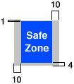
Place your custom artwork within the 44 x 59 pixel safe zone. The artwork can be centered, offset, or it can fill the entire safe zone. (Remember that iOS adds the page curl to the upper right corner and a gradient that runs from the page curl to the bottom edge.)
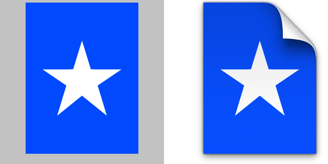
For example, if you supply an icon that looks like the image on the left in Figure 3-13, iOS creates a document icon that looks like the image on the right.

To create a 320 x 320 pixel document icon:
Create a 320 x 320 pixel image in PNG format.
Add the following margins to create the safe zone:
5 pixels on top
20 pixels on bottom
50 pixels on each side
Your safe zone should look similar to the colored area shown below:
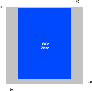
Place your custom artwork within the 220 x 295 pixel safe zone. The artwork can be centered, offset, or it can fill the entire safe zone. (Remember that the page curl will obscure some of the artwork in the upper right corner of the safe zone.)
For example, if you supply an icon that looks like the image on the left in Figure 3-14, iOS creates a document icon that looks like the image on the right.
Create a Launch Image for Each Orientation
Because most iPad applications should be able to launch in any of the four orientations, you need to provide four unique launch images. As with iPhone applications, a launch image is a simple, stripped-down snapshot of your application’s initial UI. It should include only the constant, unvarying elements of the initial UI and avoid all text (because the launch image is not localized).
Each launch image should be in the PNG format and should match the size of the device screen in that orientation, minus the status bar: either 1004 x 768 pixels (for portrait) or 748 x 1024 pixels (for landscape). See “Providing Launch Images for Different Orientations” in iPad Programming Guide for more information about naming the launch image files and adding them to your application bundle. For some examples of how plain a launch image should be, see “Launch Images” in iPhone Human Interface Guidelines, which shows some iPhone application launch images.
Follow Established Principles
As you develop your iPad application, don’t lose sight of the guidelines in iPhone Human Interface Guidelines. Most of the information in that document also applies to iPad application design, so you should look there for principles and guidelines on tasks, interactions, and UI elements that are not described in this document.
Last updated: 2010-08-03