Alerts, Action Sheets, and Modal Views
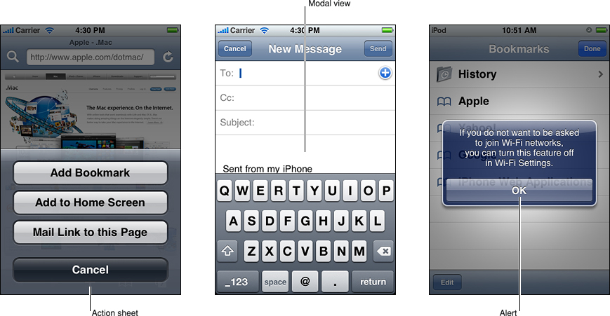
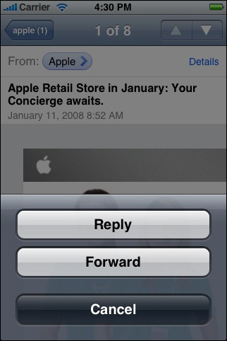
Alerts, action sheets, and modal views are types of views that appear when something requires the user’s attention or when additional choices or functionality need to be offered. Figure 7-1 shows examples of these types of views.
To learn about implementing these types of views programmatically, see “Modal View Controllers”.
Although local and push notification alerts look very similar to standard alerts, they are not programmatically the same. To learn how to use and design notification alerts, see “Enabling Local and Push Notifications.”
Usage and Behavior
Alerts, action sheets, and modal views are all modal, which means that users must explicitly dismiss them, by tapping a button, before they can continue to use the application. Although there are times when you need to warn users of potentially dangerous actions or provide extra choices, it’s important to avoid overusing these views. This is because:
All types of modal views interrupt the user’s workflow.
The too-frequent appearance of a view requesting confirmation or acknowledgment is likely to be more annoying than helpful.
Alerts, in particular, should be used only rarely. When alerts appear too frequently, people are likely to dismiss them without reading them, just to get them out of the way.
Alerts, action sheets, and modal views are designed to communicate different things:
Alerts give people important information that affects their use of the application (or the device). The arrival of an alert is usually unexpected, because it generally tells people about a problem or a change in the current situation that might require them to take action.
Action sheets give people additional choices related to the action they are currently taking. People learn to expect the appearance of an action sheet when they tap a toolbar button that begins either a potentially destructive action (such as deleting all recent calls) or an action that can be completed in different ways (such as a send action for which users can specify one of several destinations).
Modal views provide more extensive functionality in the context of the current task. Modal views can also provide a way to perform a subtask directly related to the user’s workflow.
These types of views also differ in appearance and behavior, which underscores the difference in the messages they send. Because users are accustomed to the appearance and behavior of these views, it’s important to use them consistently and correctly in your application.
Using Alerts
An alert pops up in the middle of the application screen and floats above its views to give users critical information in a highly visible way. The unattached appearance of an alert emphasizes the fact that its arrival is due to some change in the application or the device, not necessarily as the result of the user’s most recent action. An alert should display text that describes the situation and, ideally, give users a way to choose an appropriate course of action.
Users are accustomed to seeing alerts from the device or from built-in applications that run in the background, such as Messages, but you should seldom need to use them in your application. For example, you might use an alert to tell users that the task they initiated is blocked. It makes sense to display an alert with this message, because it’s important to tell users what the problem is and give them a choice of ways to handle it.
You can also use an alert to give users a chance to accept or reject an outcome that is potentially dangerous. When this is the case, the alert should display two buttons: one that dismisses the alert and performs the action and one that dismisses the alert without performing the action. Often, it makes sense to use the label "Cancel" for the button that dismisses the alert without performing the action. Note that if users press the Home button while such an alert is visible, the result, in addition to quitting the application, should be identical to tapping the Cancel button: That is, the alert is dismissed and the action is not performed.
The infrequency with which alerts appear helps users take them seriously. Be sure to minimize the number of alerts your application displays and ensure that each one offers critical information and useful choices. In general, try to avoid creating alerts that:
Update users on tasks that are progressing normally.
Instead, consider using a progress view or an activity indicator to provide progress-related feedback to users (these controls are described in “Progress Views” and “Activity Indicators”).
Ask for confirmation of user-initiated actions.
To get confirmation for an action the user initiated, even a potentially risky action such as deleting a contact, you should use an action sheet (described next in “Using Action Sheets”).
Inform users of errors or problems about which they can do nothing.
Although it might be necessary to use an alert to tell users about a critical problem they can’t fix, it’s better to integrate such information into the user interface, if possible. For example, instead of telling users every time a server connection fails, display the time of the last successful connection.
Using Action Sheets
An action sheet displays a collection of alternatives that are associated with a task users initiate by tapping a button in an application’s toolbar. An action sheet is an appropriate way to:
Provide a selection of ways the task can be completed. In Photos, for example, users can tap the Send button when viewing an individual photo. An action sheet appears, giving users a choice of three destinations for the photo (in addition to a Cancel button, which cancels the send).
It’s useful to display an action sheet in a situation like this, because it allows you to provide a range of choices that make sense in the context of the current task, without giving these choices a permanent place in the user interface.
Get confirmation before completing a potentially dangerous task. For example, depending on Mail settings, an action sheet appears when users tap the Trash button in the Mail toolbar, allowing them to proceed with the deletion or cancel it.
When you display an action sheet in a situation like this you ensure that users understand the dangerous effects of the step they’re about to take and you can provide some alternatives. This type of communication is particularly important on iOS-based devices because sometimes users tap controls without meaning to.
An action sheet always emerges from the bottom of the application screen and hovers over its views (as shown in the far left of Figure 7-1). Unlike an alert, however, the side edges of an action sheet are anchored to the sides of the screen, reinforcing its connection to the application and the user’s most recent action.
An action sheet contains a few buttons that allow users to choose how to complete their task. You should not have to add a message to an action sheet because the button labels, in conjunction with the task being performed, should provide enough context for the user to understand their choices. When users tap a button, the action sheet disappears. Because an action sheet should provide users with a choice of actions, an action sheet always provides more than one button.
Using Modal Views
By default, a modal view slides up from the bottom edge of the screen and always covers the entire application screen (as shown in the middle of Figure 7-1). Because a modal view hides the current application screen, it strengthens the user’s perception of entering a different, transient mode in which they can accomplish something.
A modal view can display text if appropriate, and contains the controls necessary to perform the task. In addition, a modal view generally displays a button that completes the task and dismisses the view, and a Cancel button users can tap to abandon the task.
A modal view supports more extensive user interaction than an action sheet. Unlike an action sheet, which accepts a single choice, a modal view supports multistep user interaction, such as the selection of more than one option or the inputting of information.
Use a modal view when you need to offer the ability to accomplish a self-contained task related to your application’s primary function. A modal view is especially appropriate for a multistep subtask that requires user interface elements that don’t belong in the main application user interface all the time. A good example of a modal view is the compose view in Mail. When users tap the Compose button, a modal view appears that contains text areas for the addresses and message, a keyboard for input, a Cancel, and a Send button.
Designing an Alert
You can specify the text, the number of buttons, and the button contents in an alert. You can’t customize the width or the background appearance of the alert view itself, or the alignment of the text (it’s center-aligned).
To learn how to design the content of a local or push notification alert, see “Enabling Local and Push Notifications.”
Note: As you read these guidelines, be aware of the following definitions:
Title-style capitalization means that every word is capitalized, except articles, coordinating conjunctions, and prepositions of four or fewer letters.
Sentence-style capitalization means that the first word is capitalized, and the rest of the words are lowercase, unless they are proper nouns or proper adjectives.
The alert title (and optional message) should succinctly describe the situation and explain what people can do about it. Ideally, the text you write gives people enough context to understand why the alert has appeared and to decide which button to tap.
As you compose the required alert title:
Keep the title short enough to display on a single line, if possible. A long alert title is difficult for people to read quickly, and it might get truncated or force the alert message to scroll.
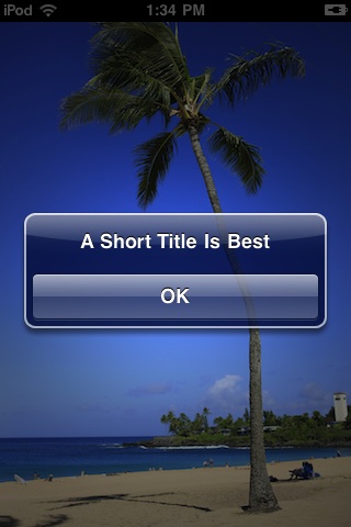
Avoid single-word titles that don’t provide any useful information, such as “Error” or “Warning.”
When possible, use a sentence fragment. A short, informative statement is often easier to understand than a complete sentence.
Don’t hesitate to be negative. People understand that most alerts tell them about problems or warn them about dangerous situations. It’s better to be negative and direct than it is to be positive but oblique.
Avoid using “you,” “your,” “me,” and “my” as much as possible. Sometimes, text that identifies people directly can be ambiguous and can even be interpreted as an insult.
Use title-style capitalization and no ending punctuation when:
The title is a sentence fragment
The title consists of a single sentence that is not a question
Use sentence-style capitalization and an ending question mark if the title consists of a single sentence that is a question. In general, consider using a question for an alert title if it allows you to avoid adding a message.
Use sentence-style capitalization and appropriate ending punctuation for each sentence if the title consists of two or more sentences. A two-sentence alert title should seldom be necessary, although you might consider it if it allows you to avoid adding a message.
If you provide an optional alert message:
Create a short, complete sentence that uses sentence-style capitalization and appropriate ending punctuation.
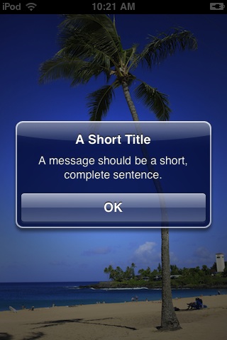
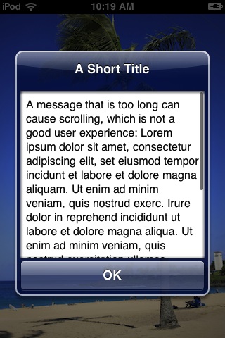
Avoid creating a message that is too long. If possible, keep the message short enough to display on one or two lines. If the message is too long it will scroll, which is not a good user experience.
Avoid lengthening your alert text with descriptions of which button to tap, such as “Tap View to see the information.” Ideally, the combination of unambiguous alert text and logical button labels gives people enough information to understand the situation and their choices. However, if you must provide detailed guidance, follow these guidelines:
Be sure to use the word “tap” (not “touch” or “click” or “choose”) to describe the selection action.
Don’t enclose a button title in quotes, but do preserve its capitalization.
Be sure to test the appearance of your alert in both orientations. Because the height of an alert is constrained in landscape, it might look different than it does in portrait. It’s recommended that you optimize the length of the alert text so that it looks good (and avoids scrolling) in both orientations.
Prefer a two-button alert. A two-button alert is often the most useful, because it is easiest for people to choose between two alternatives. It is rarely a good idea to display an alert with a single button because such an alert is merely informative; it does not give people any control over the situation. An alert that contains three or more buttons is significantly more complex than a two-button alert, and should be avoided if possible. In fact, if you find that you need to offer people more than two choices, you should consider using an action sheet instead (see “Using Action Sheets” and “Designing an Action Sheet” for more information on this type of view).
Use alert button colors appropriately. Alert buttons are colored either dark or light. In an alert with two buttons, the button on the left is always dark-colored and the button on the right is always light-colored. In a one-button alert, the button is always light-colored.
In a two-button alert that proposes a potentially risky action, the button that cancels the action should be on the right (and light-colored).
In a two-button alert that proposes a benign action that people are likely to want, the button that cancels the action should be on the left (and dark-colored).
Note: A Cancel button may be either light-colored or dark-colored and it may be on the right or the left, depending on whether the alternate choice is destructive. Be sure to properly identify which button is the Cancel button in your code (for more information, see UIAlertView Class Reference).
Give alert buttons short, logical titles. The best titles consist of one or two words that make sense in the context of the alert text. Follow these guidelines as you create titles for alert buttons:
As with all button titles, use title-style capitalization and no ending punctuation.
Prefer verbs and verb phrases, such as “Cancel,” “Allow,” “Reply,” or “Ignore” that relate directly to the alert text.
Prefer “OK” for a simple acceptance option if there is no better alternative. Avoid using “Yes” or “No.”
Avoid “you,” “your,” “me,” and “my” as much as possible. Button titles that use these words are often both ambiguous and patronizing.
Designing an Action Sheet
You choose the background of an action sheet to coordinate with the look of your application, and you can specify the number of buttons and their contents.
Unlike an alert, an action sheet should not need to display a textual message. This is because an action sheet appears as the result of a user action, such as tapping a Delete or Send button, so there should be no need to explain its arrival.
Action sheets can have two different background appearances. You need to ensure that the background of the action sheets in your application coordinates with the appearance of your application’s toolbars or navigation bars. If your application uses black navigation bars and toolbars, for example, the action sheet background should be translucent black. By default, iOS displays action sheets with a standard blue background, which coordinates with the standard blue toolbars and navigation bars. All action sheets in your application should have the same background color, and that color should coordinate with the color of the navigation bars and toolbars.
Be sure to display the Cancel button at the bottom of an action sheet. This encourages the user to read through all the alternatives before reaching the Cancel option.
Figure 7-2 shows an action sheet with the default background appearance and a Cancel button in the recommended location.
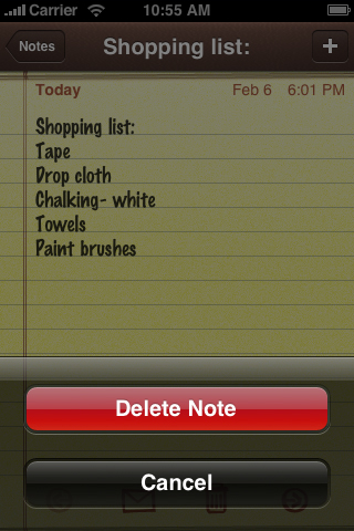
If you need to provide a button that performs a potentially destructive action, such as deleting all the items in a user’s shopping list, you should use the red button color. It’s important to display such destructive buttons at the top of the action sheet for two reasons:
The closer to the top of the action sheet a button is, the more visible it is.
Sometimes users mistakenly tap the bottom of the device screen when they’re aiming for the Home button. By placing a destructive button away from the bottom of an action sheet, users are less likely to cause undesirable results if they mistakenly tap the screen instead of the Home button.
Figure 7-3 shows an action sheet with the translucent black background appearance and both a Cancel and a destructive button in their recommended positions.
Figure 7-3 A button that performs a destructive action should be red and located at the top of the action sheet
You can display several buttons in an action sheet, as long as you make sure each button is easily distinguished from the others. Figure 7-4 shows an action sheet with a background that matches the standard blue toolbar and that provides three alternatives in addition to Cancel.
Designing a Modal View
The overall look of a modal view should coordinate with the application that displays it. For example, a modal view often includes a navigation bar that contains a title and buttons that cancel or complete the modal view’s task. The navigation bar should have the same background appearance as the navigation bar in the application.
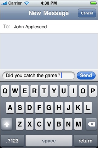
A modal view should usually display a title that identifies the task in some way. If appropriate, you can also display text in other areas of the view that more fully describes the task or provides some guidance. For example, the Messages application provides a modal view when users want to compose a text message. This modal view, shown in Figure 7-5, displays a navigation bar with the same background as the application navigation bar and with the title New Message.
In a modal view, you can use whichever controls are required to accomplish the task. For example, you can include text fields, buttons, and table views.
You can choose to reveal a modal view in a way that coordinates with your application and enhances the user’s awareness of the temporary context shift the view represents. To do this, you can specify one of the following transition styles:
Vertical. The modal view slides up from the bottom edge of the screen and slides back down when dismissed. (This is the default transition style.)
Flip. The current view flips horizontally from right to left to reveal the modal view. Visually, the modal view looks as if it is the back of the current view. When the modal view is dismissed, it flips horizontally from left to right, revealing the previous view.
If you decide to vary the transition styles of the modal views in your application, avoid doing so merely for the sake of variety. Be aware that users notice such differences and will assume that they mean something. For this reason, it’s best to establish a logical, consistent pattern that users can easily detect and remember, and avoid changing transition styles gratuitously.
Last updated: 2010-08-03