Application Controls
iOS provides several controls you can use in your application, most of which are already familiar to users of iOS-based devices. Many of these controls are intended for use in specific places, such as in a table view, but some are available for more general usage. This chapter describes the controls that you can use in arbitrary views in your application.
As you design the user interface of your application, always remember that users expect familiar controls to behave as they do in the built-in applications. This is to your advantage, as long as you use these controls appropriately in your application.
Activity Indicators
An activity indicator shows the progress of a task or process that is of unknown duration. If you need to display progress for a task of known duration, use a progress view instead (see “Progress Views” for more information about this control). The “spinning gear” appearance of the activity indicator shows users that processing is occurring, but does not suggest when it will finish.
Figure 9-1 shows two types of activity indicators. The activity indicator in the status bar is the network activity indicator; it should be displayed when your application accesses the network for more than a couple of seconds. The larger activity indicator in the toolbar should be displayed if it will take more than a second or two for your application to perform the current task.
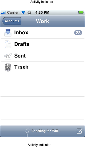
An activity indicator is a good feedback mechanism to use when it’s more important to reassure users that their task or process has not stalled than it is to suggest when processing will finish.
You can choose the size and color of an activity indicator to coordinate with the background of the view in which it appears. By default, an activity indicator is white.
An activity indicator disappears when the task or process has completed. This default behavior is recommended, because users expect to see an activity indicator when something is happening and they associate a stationary activity indicator with a stalled process.
To learn how to display the network activity indicator, see the networkActivityIndicatorVisible method in UIApplication Class Reference. To learn how to display the larger, non-network activity indicator in your code, see UIActivityIndicatorView Class Reference.
Date and Time Pickers
A date and time picker gives users an easy way to select a specific date or time. A date and time picker can have up to four independent spinning wheels, each of which displays values in a single category, such as month or hour. Users flick or drag to spin each wheel until it displays the desired value beneath the clear selection bar that stretches across the middle of the picker. The final value comprises the values displayed in each wheel. Figure 9-2 shows an example of a date and time picker.
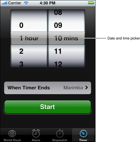
Use a date and time picker to allow users to avoid typing values that consist of multiple parts, such as the day, month, and year of a date. A date and time picker works well because the values in each part have a relatively small range and users already know what the values are.
Depending on the mode you specify, a date and time picker displays a different number of wheels, each with a set of different values. The date and time picker defines the following modes:
Time. The time mode displays wheels for the hour and minute values, with the optional addition of a wheel for the AM/PM designation.
Date. The date mode displays wheels for the month, day, and year values.
Date and time. The date and time mode displays wheels for the calendar date, hour, and minute values, with the optional addition of a wheel for the AM/PM designation. This is the default mode.
Countdown timer. The countdown timer mode displays wheels for the hour and minute. You can specify the total duration of a countdown, up to a maximum of 23 hours and 59 minutes.
By default, a minutes wheel displays 60 values (0 to 59). However, if you need to display a coarser granularity of choices, you can set a minutes wheel to display intervals of minutes, as long as the interval divides evenly into 60. For example, you might want to display the quarter-hour intervals 0, 15, 30, and 45.
Regardless of its configuration, the overall size of a date and time picker is fixed, and is the same size as the keyboard. You might choose to make a date and time picker a focal element in your view, or cause it to appear only when needed. For example, the timer mode of the built-in Clock application displays an always-visible date and time picker because the selection of a time is central to the function of the Timer. On the other hand, the Set Date & Time preference (available in Settings > General > Date & Time, when you turn off Set Automatically) displays transient date and time pickers, depending on whether users want to set the date or the time.
To learn more about using a date and time picker in your code, see UIDatePicker Class Reference.
Detail Disclosure Buttons
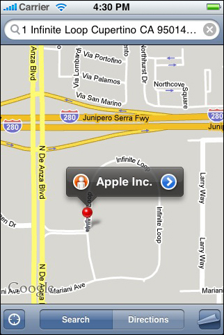
A detail disclosure button reveals additional or more detailed information about something. Usually, you use detail disclosure buttons in table views, where they give users a way to see detailed information about a list item (for more information about this usage, see “Table-View Elements”). However, you can use this element in other types of views to provide a way to reveal more information or functionality.
For example, the Maps application displays a detail disclosure button users can tap to access more functionality related to the dropped pin. Figure 9-3 shows an example of a detail disclosure button.
To learn more about using a detail disclosure button in your code, see UIButton Class Reference.
Info Buttons
An Info button provides a way to reveal configuration details about an application, often on the back of the screen. For this reason, Info buttons are especially well suited to utility applications. You can see an example of an Info button in the lower-right corner of the Weather application (shown in Figure 9-4).
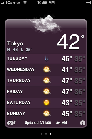
Info buttons are available with a light background and a dark background. The light background style (which is shown in Figure 9-4) looks good on a view with a dark background. Conversely, an Info button with a dark background shows up well on a view with a light background.
An Info button glows briefly when users tap it. When you use the Info button iOS provides, you get this pressed-state appearance automatically.
To learn more about using an Info button in your code, see UIButton Class Reference.
Labels
A label is a variably sized amount of static text. Figure 9-5 shows an example of a label.
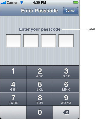
You can use a label to name parts of your user interface or to provide limited help to the user. A label is best suited to display a relatively small amount of text.
You can determine various properties of the label’s text, such as font, text color, and alignment, but above all, you should take care to make your labels legible. Don’t sacrifice clarity for fancy fonts or showy colors.
As you compose the text of your labels, be sure to use the user’s vocabulary. Examine the text in your application for developer-centric terms and replace them with user-centric terms.
To learn more about using labels in your code, see UILabel Class Reference.
Page Indicators
A page indicator displays a dot for each currently open view in an application. From left to right, the dots represent the order in which the views were opened (the leftmost dot represents the first view). The currently visible view is indicated by a glow on the dot that represents it. Users tap to the left or the right of the glowing dot to view the previous or next open view. Figure 9-6 shows an example of a page indicator.
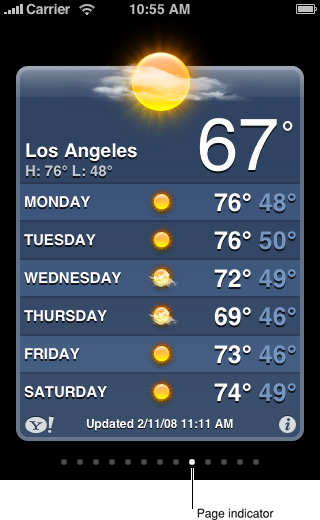
A page indicator gives users a quick way to see how many views are open and an indication of the order in which they were opened; it does not help users keep track of the steps they took through a hierarchy of views. Because the views in a utility application tend to be peers of each other, a page indicator is sufficient to help users navigate through them. A productivity application that displays hierarchical information, on the other hand, should offer navigation through the elements in the navigation bar (for more on this, see “Navigation Bars”).
Typically, page indicators work well near the bottom edge of the application screen, below the views it contains. This leaves the more important information (the view itself) in the upper part of the screen where users can see it easily. Be sure to vertically center a page indicator between the bottom edge of the view and the bottom edge of the screen.
Although there is no programmatic limit to the number of dots you can display in a page indicator, be aware that the dots do not shrink or squeeze together as more appear. For example, in portrait orientation, you can display at most 20 dots in a page indicator before clipping occurs. Therefore, you should provide logic in your application to avoid this situation.
Although you can hide a page indicator when there is only one open view, the default behavior is to display it.
To learn more about using a page indicator in your code, see UIPageControl Class Reference.
Pickers
A picker is a generic version of the date and time picker (see “Date and Time Pickers” for more information about this control). You can use a picker to display any set of values. As with a date and time picker, users spin the wheel (or wheels) of a picker until the desired value appears. Figure 9-7 shows a picker with a single wheel.
As you decide whether to use a picker in your application, consider that many, if not most, of the values in a wheel are hidden from the user when the wheel is stationary. This is not necessarily a problem, especially if users already know what those values are. For example, in a date and time picker, users understand that the hidden values in the month wheel can only be numbers between 1 and 12. If you need to provide choices that aren’t members of such a well-known set, however, a picker might not be the appropriate control.
If you need to display a very large number of values, you might want to list them in a table view instead of in a picker. This is because the greater height of a table view makes scrolling faster.
If you need to provide context for a value in a picker, such as a unit of measurement, display it in the translucent selection bar horizontally across the center of the control. Do not display such labels above the picker or on the wheels themselves. For an example of the correct way to display labels, see the Timer function of the built-in Clock application, which displays “hours” and “mins” (or “min”) next to the values users select.
As with a date and time picker, a generic picker can be visible all the time (as a focal point of your user interface) or it can appear only when needed. The overall size of a picker, including its background, is fixed, and is the same size as a keyboard.
To learn more about using a picker in your code, see UIPickerView Class Reference.
Progress Views
A progress view shows the progress of a task or process that has a known duration. If you need to display progress for a task of unknown duration, use an activity indicator instead (see “Activity Indicators” for more information about this control).
iOS provides two styles of progress view, which are the default style and the bar style. The appearance of each style is very similar, except for height:
The default style is intended for use in an application’s main content area.
The bar style is thinner than the default style, which makes it well-suited for use in a toolbar. For example, in Mail a bar-style progress view appears in the toolbar when users download new messages or send an email message.
The behavior of both styles of progress view is the same. As the task or process proceeds, the track of the progress view is filled from left to right. At any given time, the proportion of filled to unfilled area in the view gives the user an indication of how soon the task or process will finish. Figure 9-8 shows an example of a bar-style progress bar.
A progress view is a good way to provide feedback to users on tasks that have a well-defined duration, especially when it’s important to show users approximately how long the task will take. When you display a progress view, you tell the user that their task is being performed and you give them enough information to decide if they want to wait until the task is complete or cancel it.
To learn more about using a progress view in your code, see UIProgressView Class Reference.
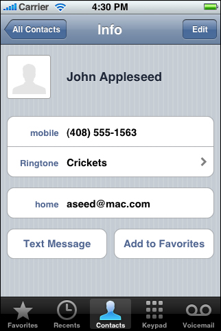
Rounded Rectangle Buttons
A rounded rectangle button is a versatile button you can use in a view to perform an action. You can see examples of this type of button at the bottom of an individual’s Contacts view: The Text Message and Add to Favorites buttons are rounded rectangle buttons, as shown in Figure 9-9.
When you supply a title for a rounded rectangle button, be sure to:
Use title-style capitalization (that is, capitalize every word except articles, coordinating conjunctions, and prepositions of four or fewer letters)
Avoid creating a title that is too long. Overly long text gets truncated, which can make it difficult for users to understand it.
To learn more about using a rounded rectangle button in your code, see UIButton Class Reference.
Search Bars
A search bar is a field that accepts text from users, which your application can use as input for a search. When the user taps a search bar, a keyboard appears; when the user is finished typing search terms, the input is handled in an application-specific way. (For guidelines on handling search in your application, see “Providing Search and Displaying Search Results.”)
By default, a search bar displays the search icon on the left side. In addition, a search bar can display a few optional elements:
Placeholder text. This text might state the function of the control (for example, “Search”) or remind users in what context they are searching (for example, “YouTube” or “Google”).
The Bookmarks button. This button can provide a shortcut to information users want to easily find again. For example, the Bookmarks button in the Maps search mode gives access to bookmarked locations, recent searches, and contacts.
The Clear button. Most search bars include a Clear button that allows users to erase the contents of the search bar with one tap.
A descriptive title, called a prompt, that appears above the search bar. For example, a prompt can be a short phrase that provides introductory or application-specific context for the search bar.
Figure 9-10 shows a search bar that includes customized placeholder text, a Bookmarks button, and the default search icon.
By default, the Bookmarks and Clear buttons interact in the following ways:
When the search bar contains any non-placeholder text, the Clear button is visible so users can erase the text. If there is no user-supplied or non-placeholder text in the search bar, the Clear button is hidden because there is no need to erase the contents of the search bar.
The Bookmarks button is visible only when there is no user-supplied or non-placeholder text in the search bar. This is because the Clear button is visible when there is text in the search bar that users might want to erase.
You can customize a search bar by specifying one of the standard-color background styles, such as:
Blue (the default gradient that coordinates with the default appearance of toolbars and navigation bars). The default background style is shown in Figure 9-10.
Black
In addition, you can display a scope bar below the search bar, which contains buttons that users tap to select a scope for the search. The scope bar adopts the same appearance you specify for the search bar, and you supply custom titles for the scope buttons.
The scope bar displays below the search bar, regardless of orientation, unless you use a search display controller in your code (see UISearchDisplayController Class Reference for more information). When you use a search display controller, the scope bar is displayed within the search bar to the right of the search field when the device is in landscape orientation (in portrait orientation, it’s below the search bar).
To learn more about using a search bar and scope bar in your code, see UISearchBar Class Reference.
Segmented Controls
A segmented control is a linear set of segments, each of which functions as a button that can display a different view. When users tap a segment in a segmented control, an instantaneous action or visible result should occur. For example, Settings displays different information when users use the segmented control to select an email protocol, as shown in Figure 9-11.
The length of a segmented control is determined by the number of segments you display and by the size of the largest segment. The height of a segmented control is fixed. Although you can specify the number of segments to display, be aware that users must be able to comfortably tap a segment without worrying about tapping a neighboring segment. Because hit regions should be 44 x 44 pixels, it’s recommended that a segmented control have five or fewer segments.
A segmented control can contain text or images; an individual segment can contain either text or an image, but not both. In general, it’s best to avoid mixing text and images in a single segmented control.
A segmented control ensures that the width of each segment is proportional, based on the total number of segments. This means that you need to ensure that the content you design for each segment is roughly equal in size.
To learn more about using a segmented control in your code, see UISegmentedControl Class Reference.
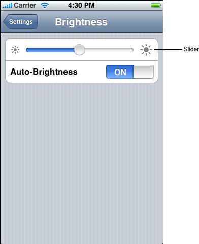
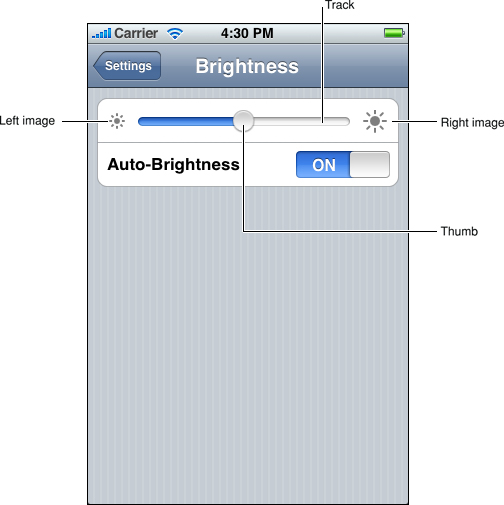
Sliders
A slider allows users to make adjustments to a value or process throughout a range of allowed values. When users drag a slider, the value or process is updated continuously. Figure 9-12 shows an example of a slider with minimum and maximum images.
Sliders are useful in two main situations:
When you want to allow users to have fine-grained control over the values they choose
When you want to allow users to have fine-grained control over the current process
A slider consists of a track, a thumb, and optional right and left value images. Figure 9-13 shows these parts of a slider.
You can set the width of a slider to fit in with the user interface of your application. In addition, you can display a slider either horizontally or vertically.
There are several ways to customize a slider:
You can define the appearance of the thumb, so users can see at a glance whether the slider is active.
You can supply images to appear at either end of the slider (typically, these correspond to minimum and maximum values), to help users understand what the slider does.
A slider that controls font size, for example, could display a very small character at the minimum end and a very large character at the maximum end.
You can define a different appearance for the track, depending on which side of the thumb it is on and which state the control is in.
To learn more about using a slider in your code, see UISlider Class Reference.
Text Fields
A text field is a rounded rectangular field that accepts user input. When the user taps a text field a keyboard appears; when the user taps Return in the keyboard, the text field handles the input in an application-specific way. A text field can contain a single line of input. Figure 9-14 shows two text fields in the Maps application.
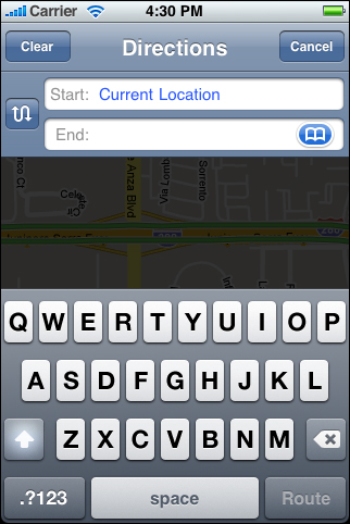
You can customize a text field to help users understand how they should use it in your application. For example, you can display custom images in the left or right sides of the text field, or a system-provided button, such as the Bookmarks button shown in Figure 9-14. In general, you should use the left end of a text field to indicate its purpose and the right end to indicate the presence of additional features, such as bookmarks.
You can also cause the Clear button to appear in the right end of a text field. When this element is present, tapping it clears the contents of the text field, regardless of any other image you might display over it.
Sometimes, it helps users understand the purpose of a text field if it displays a hint, such as “Name.” A text field supports the display of such placeholder text, which can appear when there is no other text in the field. To learn more about using a text field and customizing it to display images and buttons, see UITextField Class Reference.
You can specify different keyboard styles to accommodate different types of content you expect users to enter. (Note that you have no control over the keyboard’s input method and layout, which are determined by the user’s language settings.) For example, you might want to make it easy for users to enter a URL, a PIN, or a phone number. iOS provides several different keyboard types, each designed to facilitate a different type of input. To learn about the keyboard types that are available, see UIKeyboardType. To learn more about managing the keyboard in your application, read “Managing the Keyboard” in iOS Application Programming Guide.
Last updated: 2010-08-03