Creating Custom Icons and Images
Every application needs an application icon and a launch image. It’s recommended that applications also provide an icon for iOS to display in Spotlight search results (and, if necessary, in Settings). In addition, some applications need custom icons to represent custom document types or application-specific functions and modes in navigation bars, toolbars, and tab bars.
Unlike other custom artwork in your application, these icons and images must meet specific criteria so that iOS can display them properly. Table 11-1 contains a summary of information about these icons and images and provides links to specific guidelines for creating them. To learn what to name these files, and how to specify them in your code, see “Application Icons” in iOS Application Programming Guide and “Application Launch Images” in iOS Application Programming Guide.
Note: To support resolution independence on iPhone and iPod touch, you should provide high-resolution versions of your icons and images in addition to the resources you already supply. For guidelines on how to make the most of your high-resolution artwork, see “Tips for Creating Great High-Resolution Artwork.”
Description | Size for iPhone and iPod touch (in pixels) | Size for iPad (in pixels) | Guidelines |
|---|---|---|---|
Application icon (required) | 57 x 57 114 x 114 (high resolution) | 72 x 72 | |
App Store icon (required) | 512 x 512 | 512 x 512 | |
Small icon for Spotlight search results and Settings (recommended) | 29 x 29 58 x 58 (high resolution) | 50 x 50 for Spotlight search results 29 x 29 for Settings | |
Document icon (recommended for custom document types) | 22 x 29 44 x 58 (high resolution) | 64 x 64 320 x 320 | (For iPad, see “iPad User Experience Guidelines”) |
Web Clip icon (recommended for web applications and websites) | 57 x 57 114 x 114 (high resolution) | 72 x 72 | |
Toolbar and navigation bar icon (optional) | Approximately 20 x 20 Approximately 40 x 40 (high resolution) | Approximately 20 x 20 | |
Tab bar icon (optional) | No larger than 48 x 32 No larger than 96 x 64 (high resolution) | No larger than 48 x 32 | |
Launch image (required) | 320 x 480 640 x 960 (high resolution) | For portrait:
For landscape:
|
Note: For all images and icons, the PNG format is recommended.
The standard bit depth for icons and images is 24 bits (8 bits each for red, green, and blue), plus an 8-bit alpha channel.
You do not need to constrain your palette to web-safe colors. Although you can use alpha transparency in the icons you create for navigation bars, toolbars, and tab bars, do not use it in application icons.
Application Icons
An application icon is an icon users put on their Home screens and tap to start an application. This is a place where branding and strong visual design should come together into a compact, instantly recognizable, attractive package. Every application needs an application icon.
Try to balance eye appeal and clarity of meaning in your icon so that it’s rich and beautiful, and clearly conveys the essence of your application’s purpose. Also, it’s a good idea to investigate how your choice of image and color might be interpreted by people from different cultures.
Create different sizes of your application icon for different devices. If you’re creating a universal application, you need to supply application icons in all three sizes.
For iPhone and iPod touch both sizes are required:
57 x 57 pixels
114 x 114 pixels (high resolution)
For iPad:
72 x 72 pixels
When iOS displays your application icon on the Home screen of a device, it automatically adds the following visual effects:
Rounded corners
Drop shadow
Reflective shine (unless you prevent the shine effect)
For example, a simple 57 x 57 pixel iPhone application icon might look like this:
When it’s displayed on an iPhone Home screen, the same application icon would look like this:
Note: You can prevent iOS from adding the shine to your application icon. To do this, you need to add the UIPrerenderedIcon key to your application’s Info.plist file (to learn about this file, see “The Information Property List” in iOS Application Programming Guide).
The presence (or absence) of the added shine does not change the dimensions of your application icon.
Ensure your icon is eligible for the visual enhancements iOS provides. You should produce an image that:
Has 90° corners
Does not have any shine or gloss (unless you’ve chosen to prevent the addition of the reflective shine)
Does not use alpha transparency
Give your application icon a discernible background. Icons with visible backgrounds look best on the Home screen primarily because of the rounded corners iOS adds. This is because uniformly rounded corners ensure that all the icons on a user's Home screen have a consistent appearance that invites tapping. If you create an icon with a background that disappears when it's viewed on the Home screen, users don't see the rounded corners. Such icons often don't look tappable and tend to interfere with the orderly symmetry of the Home screen that users appreciate.
Be sure your image completely fills the required area. If your image boundaries are smaller than the recommended sizes, or you use transparency to create “see-through” areas within them, your icon can appear to float on a black background with rounded corners.
For example, an application might supply an icon on a transparent background, like the blue star on the far left. When iOS displays this icon on a Home screen, it looks like the image in the middle (if no shine is added) or it looks like the image on the right (if shine is added).
An icon that appears to float on a visible black background looks especially unattractive on a Home screen that displays a custom picture.
Create a 512 x 512 pixel version of your application icon for display in the App Store. Although it’s important that this version be instantly recognizable as your application icon, it can be subtly richer and more detailed. There are no visual effects added to this version of your application icon.
If you’re developing an application for ad-hoc distribution (that is, to be distributed in-house only, not through the App Store), you must also provide a 512 x 512 pixel version of your application icon. This icon identifies your application in iTunes.
iOS might also use this large image in other ways. In an iPad application, for example, iOS uses the 512 x 512 pixel image to generate the large document icon, if a custom document icon is not supplied.
Small Icons
Every application should supply a small icon that iOS can display when the application name matches a term in a Spotlight search. Applications that supply settings should also supply this icon to identify them in the built-in Settings application.
This icon should clearly identify your application so that people can recognize it in a list of search results or in Settings.
For iPhone and iPod touch, iOS uses the same icon for both Spotlight search results and Settings. If you do not provide this icon, iOS might shrink your application icon for display in search results and in Settings. Create icons that measure:
29 x 29 pixels
58 x 58 pixels (high resolution)
For iPad, you supply separate icons for Settings and Spotlight search results. Create icons that measure:
50 x 50 pixels (for Spotlight search results)
Note that the final visual size of this icon is 48 x 48 pixels. iOS trims 1 pixel from each side of your artwork and adds a drop shadow. Be sure to take this into account as you design your icon.
29 x 29 pixels (for Settings)
Document Icons
If your iPhone application creates documents of a custom type, you might want to create a custom icon that identifies this type to users. (For guidelines on how to create a custom document icon for an iPad application, see “Provide a Custom Document Icon” in iPad Human Interface Guidelines.)
If you don’t provide a custom document icon, iOS creates one for you by default, using your application icon (including the added visual effects). For example, using the 57 x 57 pixel white star application icon, a default document icon would look like this:
Using the 114 x 114 pixel white star application icon, a high-resolution default document icon would look like this:
Optionally, you can provide custom artwork for iOS to use instead of your application icon. To do this:
Design an attractive image that’s clearly associated with your application. People can see this icon in different places and contexts, so it’s best when they can instantly recognize it as being associated with your app.
Create your document icon in two sizes:
22 x 29 pixels
44 x 58 pixels (high resolution)
Place your custom artwork within each rectangular space as desired: The artwork can be centered, offset, or it can fill the entire space. Keep in mind that iOS applies a gradient that transitions from transparent (at the top edge) to black (at the bottom edge).
For example, if you supply a 22 x 29 pixel icon that looks like the image on the left, iOS creates a document icon that looks like the image on the right:
Similarly, if you supply a 44 x 58 pixel icon that looks like the image on the left, iOS creates a document icon that looks like the image on the right:
Web Clip Icons
If you have a web application or a website, you can provide a custom icon that users can display on their Home screens using the Web Clip feature. Users tap the icon to reach your web content in one easy step. You can create an icon that represents your website as a whole or an icon that represents a single webpage.
If your web content is distinguished by a familiar image or recognizable color scheme, it makes sense to incorporate it in your icon. However, to ensure that your icon looks great on the device, you should also follow the guidelines in this section. (To learn how to add code to your web content to provide a custom icon, see Safari Web Content Guide, available in the Safari Reference Library.)
For iPhone and iPod touch create icons that measure:
57 x 57 pixels
114 x 114 pixels (high resolution)
For iPad create an icon that measures:
72 x 72 pixels
As it does with application icons, iOS automatically adds some visual effects to your icon so that it coordinates with the built-in icons on the Home screen. Specifically, iOS adds:
Rounded corners
Drop shadow
Reflective shine
For example, a simple 57 x 57 pixel webpage icon might look like this:

When it’s displayed on an iPhone Home screen, the same icon would look like this:

Note: You can prevent the addition of all effects by naming your icon apple-touch-icon-precomposed.png (this is available in iOS 2.0 and later).
Ensure your icon is eligible for the visual enhancements iOS adds (if you want them). You should produce an image in PNG format that:
Has 90° corners
Does not have any shine or gloss
Icons for Navigation Bars, Toolbars, and Tab Bars
As much as possible, you should use the system-provided buttons and icons to represent standard tasks in your application. For a complete list of standard buttons and icons, and guidelines on how to use them, see “System-Provided Buttons and Icons.”
Of course, not every task your application performs is a standard one. If your application supports custom tasks users need to perform frequently, you need to create custom icons that represent these tasks in your toolbar or navigation bar. Similarly, if your application displays a tab bar that allows users to switch among custom application modes or custom subsets of data, you need to design tab bar icons that represent these modes or subsets.
Before you create the art for your icon, you need to spend some time thinking about what it should convey. As you consider designs, aim for an icon that is:
Simple and streamlined. Too many details can make an icon appear sloppy or indecipherable.
Not easily mistaken for one of the system-provided icons. Users should be able to distinguish your custom icon from the standard icons at a glance.
Readily understood and widely acceptable. Strive to create a symbol that most users will interpret correctly and that no users will find offensive.
Important: Be sure to avoid using images that replicate Apple products in your designs. These symbols are copyrighted and product designs can change frequently.
After you’ve decided on the appearance of your icon, follow these guidelines as you create it:
Use pure white with appropriate alpha.
Do not include a drop shadow.
Use anti-aliasing.
If you decide to add a bevel, be sure that it is 90° (to help you do this, imagine a light source positioned at the top of the icon).
For toolbar and navigation bar icons, create an icon in the following sizes:
For iPhone and iPod touch:
About 20 x 20 pixels
About 40 x 40 pixels (high resolution)
For iPad:
About 20 x 20 pixels
For tab bar icons, create an icon in the following sizes:
For iPhone and iPod touch:
No larger than 48 x 32 pixels
No larger than 96 x 64 pixels (high resolution)
For iPad:
No larger than 48 x 32 pixels
These sizes represent the maximum dimensions a tab bar icon can have. If you provide a larger icon, iOS will center it and clip the excess.
Note: The icon you provide for toolbars, navigation bars, and tab bars is used as a mask to create the icon you see in your application. It is not necessary to create a full-color icon.
Don’t include a pressed or selected appearance with your icons. iOS automatically provides these appearances for items in navigation bars, toolbars, and tab bars, so you do not need to provide them. Because these visual effects are automatic, you cannot change their appearance.
Give all icons in a bar a similar visual weight. Aim to balance the overall size, level of detail, and use of solid regions across all icons that can appear in a specific bar. In general, it does not look good to combine in the same bar icons that are large, blocky, and completely filled with icons that are small, detailed, and unfilled.
Launch Images
To enhance the user’s experience at application launch, you must provide at least one launch image. A launch image looks very similar to the first screen your application displays. iOS displays this image instantly when the user starts your application. As soon as it’s ready for use, your application displays its first screen, replacing the launch placeholder image.
Supply a launch image to improve user experience; avoid using it as an opportunity to provide:
An “application entry experience,” such as a splash screen
An About window
Branding elements, unless they are a static part of your application’s first screen
Because users are likely to switch among applications frequently, you should make every effort to cut launch time to a minimum, and you should design a launch image that downplays the experience rather than drawing attention to it.
Design a launch image that is identical to the first screen of the application, except for:
Text. The launch image is static, so any text you display in it will not be localized.
UI elements that might change. Avoid including elements that might look different when the application finishes launching, so that users don’t experience a flash between the launch image and the first application screen.
For iPhone and iPod touch create launch images that include the status bar region in the following sizes:
320 x 480 pixels
640 x 940 pixels (high resolution)
For iPad create launch images that do not include the status bar region in the following sizes:
768 x 1004 pixels (portrait)
1024 x 748 pixels (landscape)
Note that most iPad applications should supply a launch image for each orientation.
If you think that following these guidelines will result in a plain, boring launch image, you’re right. Remember, the launch image is not meant to provide an opportunity for artistic expression; it is solely intended to enhance the user’s perception of your application as quick to launch and immediately ready for use. The following examples show you how plain a launch image can be.
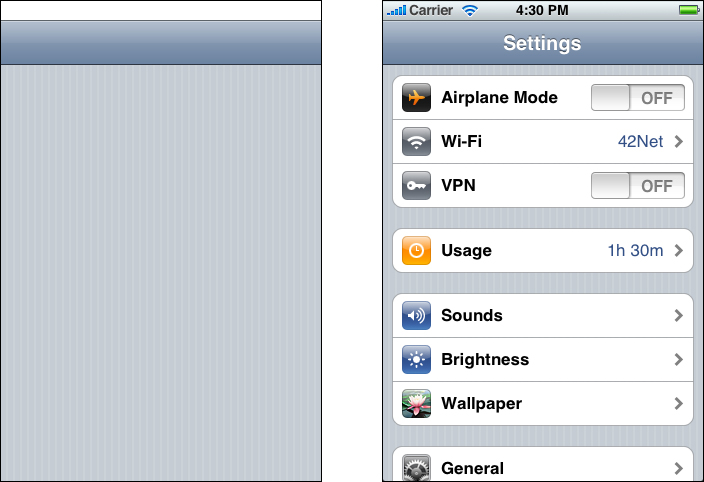
The Settings launch image displays only the background of the application, because no other content in the application is guaranteed to be static.
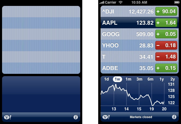
In the launch image for Stocks, only static images are included because these are always visible in the front view of the Stocks application.
Tips for Creating Great High-Resolution Artwork
Some device screens allow you to display high-resolution versions of your art and icons. If you merely scale up your existing artwork, you miss out on the opportunity to provide the beautiful, captivating images users expect. Instead, you should rework your existing resources to create large, higher quality versions that are:
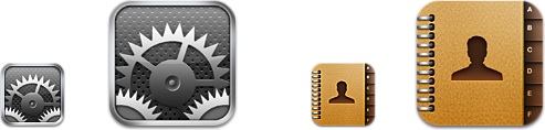
Richer in texture. For example, in the high-resolution versions of the Settings and Contacts icons, the metal and paper textures are clearly visible.
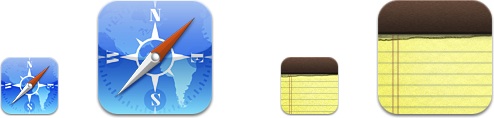
More detailed. For example, in the high-resolution versions of the Safari and Notes icons, you can see details such as the accurate contours of the continents behind the compass and the torn paper left by the previous note.
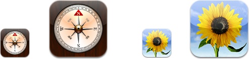
More realistic. For example, the high-resolution versions of the Compass and Photos icons combine rich texture and fine details to create realistic portrayals of a compass and a photograph.
Even though bar icons are simpler than application or document icons, you should consider adding details as you create high-resolution versions of them. For example, the artists tab bar icon in the iPod application is a streamlined silhouette of a singer. The high-resolution version of this icon is recognizably the same icon, but includes greater detail.
The following techniques can help you get great results as you create a high-resolution version of your artwork.
Scale up your original artwork to 200%, using the “nearest neighbor” scaling algorithm. This works well if the original artwork was not created with vector shapes and does not include layer effects. The result is a large, pixelated image on top of which you can draw matching high-resolution art. This is a good way to begin because it allows you to preserve the original layout of your design.
If the original artwork was created with vector shapes, or it includes layer effects, you can use the default scaling algorithm instead of the nearest neighbor algorithm.
Add detail and depth. Don’t hesitate to draw very small elements, because the high-resolution version of your artwork allows much more room for fine details. For example, a 1-pixel dot in your original image becomes a 4-pixel dot (that is, 2 x 2 pixels) in the larger version.
Consider softening scaled-up elements. If, for example, you have a sharp, 1-pixel dividing line in your original artwork, it might have the boldness you want when you leave it scaled up to a 2-pixel line. But for some lines and elements, you might want to soften the scaled results by feathering or even leaving the element at the smaller size.
Consider adding blur for better results in effects such as engravings and drop shadows. For example, text engraving is typically done by shifting a duplicate image of the text by 1 pixel. Scaled up, this shift would result in an engraving width of 2 pixels, which is likely to look very sharp and unrealistic at a higher resolution. To improve this, you can leave the shift as-is (that is, at 1 pixel), but add a 1-pixel blur to soften the engraving. This still results in a 2-pixel wide engraving effect, but the outer pixel now looks more like it is only half a pixel wide, which results in a better sense of dimensionality.
Last updated: 2010-08-03