Designing an iPhone Application: From Product Definition to Branding
As you develop an iPhone application you need to learn how iOS and various aspects of the mobile environment impact your design decisions. This chapter covers a range of guidelines for application design issues, from product definition to branding, and describes how to address them in an iPhone application.
Create a Product Definition Statement
Before you begin designing your application, it’s essential to define precisely what your application does. A good way to do this is to craft a product definition statement—a concise declaration of your application’s main purpose and its intended audience. Creating a product definition statement isn’t merely an exercise. On the contrary, it’s one of the best ways to turn a list of features into a coherent product.
To begin with, spend some time defining your user audience: Are they experienced or novice, serious or casual, looking for help with a specific task or looking for entertainment? Knowing these things about your users helps you customize the user experience and user interface to their particular needs and wants.
Because you’re designing an iPhone application, you already know a lot about your users. For example:
They're mobile.
They want to be able to open your application quickly and see useful content immediately.
They need to be able to accomplish things in your application with just a few taps.
Now ask yourself what traits might set your users apart from all other iOS users. Are they business people, teenagers, or retirees? Will they use your application at the end of every day, every time they check their email, or whenever they have a few extra moments? The more accurately you define your audience, the more accurate are your decisions about the look, feel, and functionality of your user interface.
For example, if your application helps business people keep track of their expenses, your user interface should focus on providing the right categories and making it easy to enter costs, without asking for a lot of details that aren’t central to the task. In addition, you might choose a subtle color palette that appears professional and is pleasant to look at several times a day.
Or, if your application is a game for a target audience of teenagers, you might instead want a user interface that is exciting, language that imparts a feeling of exclusivity, and a color palette that evokes current fashions.
Finally, examine the set of features you intend to deliver. With the image of your user audience in mind, try to distill the list of features into a single statement, a product definition statement, that describes the solution your product offers and who your users are. For example, the desktop iPhoto application allows users to, among other things, organize, edit, share, print, and view photos. But a good product definition statement doesn’t just focus on features, it also describes the intended audience. Therefore a sound product definition statement for iPhoto could be “An easy-to-use photo management application for amateur photographers.“ Notice how important it is to include a definition of your user audience in the product definition statement: Imagine how different an application iPhoto would be if it was designed to be “an easy-to-use photo management application for professional photographers.”
A good product definition statement is a tool you should use throughout the development process to determine the suitability of features, tools, and terminology. It’s especially important to eliminate those elements that don’t support the product definition statement, because iPhone applications have no room to spare for functionality that isn’t focused on the main task.
Imagine, for example, that you’re thinking of developing an iPhone application people can use when they shop for groceries. In the planning stage, you might consider including a wide range of activities users might like to perform, such as:
Getting nutritional information about specific foods
Finding coupons and special offers
Creating and using shopping lists
Locating stores
Looking up recipes
Comparing prices
Keeping a running total of prices
However, you believe that your users are most concerned with remembering everything they need to buy, that they would like to save money if possible, and that they’re probably in a hurry to get home with their purchases. Using this audience definition, you craft a product definition statement for your application, such as “A shopping list creation and coupon-finding tool for people in a hurry.“ Filtering your list of potential features through this product definition statement, you decide to focus primarily on making shopping lists easy to create, store, and use. You also offer users the ability to find coupons for the items on their list. Even though the other features are useful (and might become primary features of other applications), they don’t fit the product definition statement for this application.
When you’ve settled on a solid product definition statement and you’ve started to use it as a filter for your proposed features, you might also want to use it to make sure your initial decision on application type is still the right one. If you began your development process with a specific application type in mind, you might find that the process of defining a product definition statement has changed the landscape. (See “Three Application Styles” for more on different types of applications you can develop.)
Incorporate Characteristics of Great iPhone Applications
Great iPhone applications do precisely what users need while providing the experience users want. To help you achieve this balance in your application, this section examines some of the characteristics of great iPhone applications and provides advice on how to build them into your product.
Build in Simplicity and Ease of Use
Simplicity and ease of use are fundamental principles for all types of software, but in iPhone applications they are critical. iOS users are probably doing other things while they simultaneously use your application. If users can’t quickly figure out how to use your application, they’re likely to move on to a competitor’s application and not come back.
As you design the flow of your application and its user interface, follow these guidelines to build in simplicity and ease of use:
Make it obvious how to use your application.
Concentrate frequently used, high-level information near the top of the screen.
Minimize text input.
Express essential information succinctly.
Provide a fingertip-size target area for all tappable elements.
The following sections explain each guideline for simplicity and ease of use in more detail.
Make It Obvious
You can’t assume that users have the time (or can spare the attention) to figure out how your application works. Therefore, you should strive to make your application instantly understandable to users.
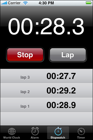
The main function of your application should be immediately apparent. You can make it so by minimizing the number of controls from which users have to choose and labeling them clearly so users understand exactly what they do. For example, in the built-in Stopwatch function (part of the Clock application), shown in Figure 3-1, users can see at a glance which button stops and starts the stopwatch and which button records lap times.
Think Top Down
People can tap the screen of an iOS-based device with their fingers or their thumbs. When they use a finger, people tend to hold the device in their nondominant hand (or lay it on a surface) and tap with a finger of the dominant hand. When they use thumbs, people either hold the device in one hand and tap with that thumb, or hold the device between their hands and tap with both thumbs. Whichever method people use, the top of the screen is most visible to them.
Because of these usage patterns, you should design your application’s user interface so that the most frequently used (usually higher level) information is near the top, where it is most visible and accessible. As the user scans the screen from top to bottom, the information displayed should progress from general to specific and from high level to low level.
Minimize Required Input
Inputting information takes users’ time and attention, whether they tap controls or use the keyboard. If your application requires a lot of user input before anything useful happens, it slows users down and can discourage them from persevering with it.
Of course, you often need some information from users, but you should balance this with what you offer them in return. In other words, strive to provide as much information or functionality as possible for each piece of information users provide. That way, users feel they are making progress and are not being delayed as they move through your application.
When you ask for input from users, consider using a type of table view (or a picker) instead of text fields. It’s usually easier for users to select an item from a list than to type words. For details on table views and pickers, see “Table Views” and “Pickers,” respectively.
Express Information Succinctly
When your user interface text is short and direct, users can absorb it quickly and easily. Therefore, identify the most important information, express it concisely, and display it prominently so users don’t have to read too many words to find what they’re looking for or to figure out what to do next.
To help you do this, think like a newspaper editor and strive to convey information in a condensed, headline style. Give controls short labels (or use well-understood symbols) so that users understand how to use them at a glance.
Provide Fingertip-Size Targets
If your layout places controls too close together, users must spend extra time and attention being careful where they tap, and they are more likely to tap the wrong element. A simple, easy-to-use user interface spaces controls and other user-interaction elements so that users can tap accurately with a minimum of effort.
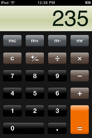
For example, the built-in Calculator application displays large, easy-to-tap controls that each have a target area of about 44 x 44 pixels. Figure 3-2 shows the Calculator application.
Focus on the Primary Task
An iPhone application that establishes and maintains focus on its primary functionality is satisfying and enjoyable to use. As you design your application, therefore, stay focused on your product definition statement and make sure every feature and user interface element supports it. See “Create a Product Definition Statement” for some advice on how to create a product definition statement.
A good way to achieve focus is to determine what’s most important in each context. As you decide what to display in each screen always ask yourself, Is this critical information or functionality users need right now? Or, to think of it in more concrete terms, Is this information or functionality the user needs while shopping in a store or while walking between meetings? If not, decide if the information or functionality is critical in a different context or if it’s not that important after all. For example, an application that helps users keep track of car mileage loses focus on this functionality if it also keeps track of car dealer locations.
When you follow the guidelines for making your application simple and easy to use, you help make your solution focused. In particular, you want to make the use of your application obvious and minimize user input. This makes it easier for users to arrive quickly at the most important parts of your application, which tightens the focus on your solution (for specifics on these guidelines, see “Build in Simplicity and Ease of Use”).
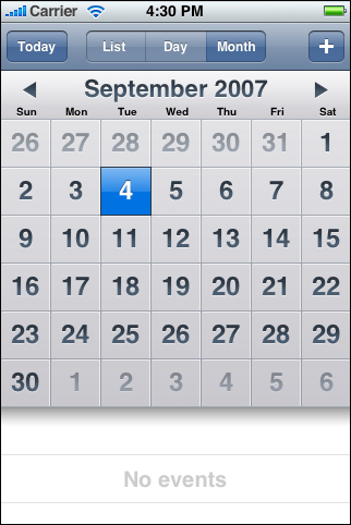
For example, the built-in Calendar application (shown in Figure 3-3) is focused on days and the events that occur on them. Users can use the clearly labeled buttons to highlight the current day, select a viewing option, and add events. The most important information, that is, the days and the events associated with them, is the most prominent. User input is simplified by allowing users to choose from lists of event times, repetition intervals, and alert options, instead of requiring keyboard entry for all input.
Communicate Effectively
Communication and feedback are as important in iPhone applications as they are in desktop computer applications. Users need to know whether their requests are being processed and when their actions might result in data loss or other problems. That said, it’s also important to avoid overdoing communication by, for example, alerting the user to conditions that aren’t really serious or asking for confirmation too often.
Animation is a great way to communicate effectively, as long as it doesn’t get in the way of users’ tasks or slow them down. Subtle and appropriate animation can communicate status, provide useful feedback, and help users visualize the results of their actions. Excessive or gratuitous animation can obstruct the flow of your application, decrease its performance, and annoy users.
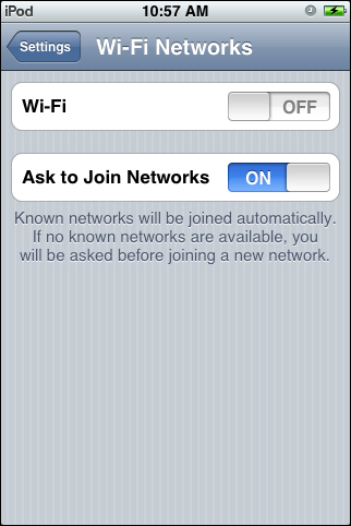
In all your text-based communication with users, be sure to use user-centric terminology; in particular, avoid technical jargon in the user interface. Use what you know about your users to determine whether the words and phrases you plan to use are appropriate. For example, the Wi-Fi Networks preferences screen uses clear, nontechnical language to describe how the device connects to networks, as shown in Figure 3-4.
Support Gestures Appropriately
People use their fingers to operate the unique Multi-Touch interface of iOS-based devices, tapping, flicking, and pinching to select, navigate, and read web content and use applications. There are real advantages to using fingers to operate a device: They are always available, they are capable of many different movements, and they give users a sense of immediacy and connection to the device that’s impossible to achieve with an external input device, such as a mouse.
However, fingers have one major disadvantage: They are much bigger than a mouse pointer, regardless of their size, their shape, or the dexterity of their owner. In the context of a display screen, fingers can never be as precise as a mouse pointer.
Fortunately, you can meet the challenges of a finger-based input system by having a good user interface design. For the most part, this means making sure your layout accommodates the average size of a fingertip. It also means responding to finger movements with the actions users expect.
Users perform specific movements, called gestures, to get particular results. For example, users tap a button to select it and flick or drag to scroll a long list. iPhone users understand these gestures because the built-in applications use them consistently. To benefit from users’ familiarity, therefore, and to avoid confusing them, you should use these gestures appropriately in your application.
The more complex gestures, such as swipe or pinch open, are also used consistently in the built-in applications, but they are less common. In general these gestures are used as shortcuts to expedite a task, not as the only way to perform a task. When viewing a list of messages in Mail, for example, users delete a message by revealing and then tapping the Delete button in the preview row for the message. Users can reveal the Delete button in two different ways:
Tap the Edit button in the navigation bar, which reveals a delete control in each preview row. Then, tap the delete control in a specific preview row to reveal the Delete button for that message.
Make the swipe gesture across a specific preview row to reveal the Delete button for that message.
The first method takes an extra step, but is easily discoverable because it requires only the tap and begins with the clearly labeled Edit button. The second method is faster, but it requires the user to learn and remember the more specialized swipe gesture.
To ensure that your application is discoverable and easy to use, therefore, try to limit the gestures you require to the most familiar, that is, tap and drag. You should also avoid making one of the less common gestures, such as swipe or pinch open, the only way to perform an action. There should always be a simple, straightforward way to perform an action, even if it means an extra tap or two.
In most applications, it’s equally important to avoid defining new gestures, especially if these gestures perform actions users already associate with the standard gestures. The primary exception to this recommendation is an immersive application, in which custom gestures can be appropriate. For example, a productivity application that requires users to make a circular gesture to reveal the Delete button in a table row would be confusing and difficult to use. On the other hand, a game might reasonably require users to make a circular gesture to spin a game piece.
Table 3-1 lists the standard gestures users can perform. Be sure to avoid redefining the meaning of these gestures; conversely, if you support these actions in your application, be sure to respond appropriately to the gestures that correspond to them. For more information on how to handle events created by gestures, see iOS Application Programming Guide.
Gesture | Action |
|---|---|
Tap | To press or select a control or item (analogous to a single mouse click). |
Drag | To scroll or pan. |
Flick | To scroll or pan quickly. |
Swipe | In a table-view row, to reveal the Delete button. |
Double tap | To zoom in and center a block of content or an image. To zoom out (if already zoomed in). |
Pinch open | To zoom in. |
Pinch close | To zoom out. |
Touch and hold | In editable text, to display a magnified view for cursor positioning. |
Incorporate Branding Elements Cautiously
Branding is most effective when it is subtle and understated. People use your iPhone application to get things done or to be entertained; they don’t want to feel as if they’re being forced to watch an advertisement. Therefore, you should strive to incorporate your brand’s colors or images in a refined, unobtrusive way. For example, you might use a custom color scheme in views and controls.
The exception to this is your application icon, which should be focused on your brand. (The application icon is the icon users can see on their Home screens after they install your application.) Because users see your application icon frequently, it’s important to spend some time balancing eye-appeal with brand recognition. For some guidelines on creating an application icon, see “Application Icons.”
Last updated: 2010-08-03