The iOS Platform: Rich with Possibilities
iOS supports numerous types of software, ranging from webpages that users view in Safari on iOS to iPhone applications that run natively on iOS-based devices. This chapter outlines the different types of software solutions you can create for iOS-based devices.
If you’re new to the platform, be sure to begin with the summary of differences between iOS-based devices and computers given in the first section, “Platform Differences to Keep in Mind.” Although the information in that section is not comprehensive, it touches on the issues you need to be aware of as you design an iPhone application.
Then, to help you plan an iPhone application, this chapter describes ways to think about different application styles and the characteristics that define them. This chapter also describes how some of the bundled Mac OS X applications were transformed into versions appropriate for iOS. If you have an existing computer application you’d like to refashion for iOS, understanding this process is key.
Device Characteristics to Keep in Mind
An iOS-based device is not a desktop or laptop computer, and an iPhone application is not the same as a desktop application. Although these seem merely common-sense statements, it is nonetheless paramount to keep them in mind as you embark on developing software for these devices.
Designing software for iOS-based devices requires a state of mind that may or may not be second nature to you. In particular, if the bulk of your experience lies in developing desktop applications, you should be aware of the significant differences between designing software for a mobile device and for a computer.
This section summarizes the concrete differences that have the highest potential impact on your design decisions. For detailed information on how to handle these and other issues in your iPhone application development process, see iOS Application Programming Guide.
Screen Size is Compact
The small, high-resolution screens of iOS-based devices make them powerful display devices that fit into users’ pockets. But that very advantage to users may be challenging to you, the developer, because it means that you must design a user interface that may be very different from those you’re accustomed to designing.
Use the compact screen size as a motivation to focus the user interface on the essentials. You don’t have the room to include design elements that aren’t absolutely necessary, and crowding user interface elements makes your application unattractive and difficult to use.
Memory is Limited
Memory is a critical resource in iOS, so managing memory in your application is crucial. Because the iOS virtual memory model does not include disk swap space, you must take care to avoid allocating more memory than is available on the device. When low-memory conditions occur, iOS warns the running application and may terminate the application if the problem persists. Be sure your application is responsive to memory usage warnings and cleans up memory in a timely manner.
As you design your application, strive to reduce the application’s memory footprint by, for example, eliminating memory leaks, making resource files as small as possible, and loading resources lazily. See iOS Application Programming Guide for extensive information about how to design iPhone applications that handle memory appropriately.
People See One Screen at a Time
One of the biggest differences between the iOS environment and the computer environment is the window paradigm. With the exceptions of some modal views, users see a single application screen at a time on an iOS-based device. iPhone applications can contain as many different screens as necessary, but users access and see them sequentially, not simultaneously.
If the desktop version of your application requires users to see several windows simultaneously, you need to decide if there’s a different way users can accomplish the same task in a single screen or a sequence of screens. If not, you should focus your iPhone application on a single subtask of your computer application, instead of trying to replicate a wider feature set.
People Interact with One Application at a Time
Only one application is visible in the foreground at a time. When people switch from one application to another, the previous application quits and its user interface goes away. Prior to iOS 4.0, this meant that the quitting application was immediately removed from memory. In iOS 4.0 and later, the quitting application transitions to the background, where it may or may not continue running. This feature, called multitasking, allows applications to remain in the background until they are launched again or until they are terminated.
Most applications enter a suspended state when they transition to the background. When people restart a suspended application, it can instantly resume running from the point where it quit, without having to reload its user interface.
Some applications might need to continue running in the background while users run another application in the foreground. For example, users might want an application that plays audio to continue playing even while they’re using a different application to check their calendar or handle email.
To learn about how multitasking can impact your application’s behavior, see “Accommodating Multitasking.”
Onscreen User Help is Minimal
Mobile users don’t have the time to read through a lot of help content before they can use your application. What’s more, you don’t want to give up valuable space to display or store it. A hallmark of the design of iOS-based devices is ease of use, so it’s crucial that you meet users’ expectations and make the use of your application immediately obvious. There are a few things you can do to achieve this:
Use standard controls correctly. Users are familiar with the standard controls they see in the built-in applications, so they already know how to use them in your application.
Be sure the path through the information you present is logical and easy for users to predict. In addition, be sure to provide markers, such as back buttons, that users can use to find out where they are and how to retrace their steps.
What Are Your Options?
Before you decide how to present your product to iOS users, you need to understand the range of options you have. Depending on the implementation details of your proposed product and its intended audience, some types of software may be better suited to your needs than others.
This section divides software for iOS-based devices into three broad categories, primarily based on implementation method. Roughly speaking, you can create:
An iPhone application, which is an application you develop using the iPhone SDK to run natively on iOS-based devices.
Web-only content, including web applications, which are websites that behave like built-in iPhone applications.
A hybrid application, which is an iPhone application that provides access to web content primarily through a web-content viewing area, but includes some iOS user interface elements.
iPhone Applications
iPhone applications resemble the built-in applications on iOS-based devices in that they reside on the device itself and take advantage of features of the iOS environment. Users install iPhone applications on their devices and use them just as they use built-in applications, such as Stocks, Maps, Calculator, and Mail.
An iPhone application is quick to launch and easy to use. Whether the application enables a task like sending email or provides entertainment to users, it is characterized by responsiveness, simplicity, and a beautiful, streamlined user interface.
Web-only Content
You have a few different options when it comes to providing web-only content to iOS users:
Web applications
Webpages that provide a focused solution to a task and conform to certain display guidelines are known as web applications, because they behave similarly to the built-in iOS applications. A web application, like all web-only content, runs in Safari on iOS; users do not install it on their devices, instead they go to the web application’s URL.
Optimized webpages
Webpages that are optimized for Safari on iOS display and operate as designed (with the exception of any elements that rely on unsupported technologies, such as plug-ins, Flash, and Java). In addition, an optimized webpage correctly scales content for the device screen and is often designed to detect when it is being viewed on iOS-based devices, so that it can adjust the content it provides accordingly.
Compatible webpages
Webpages that are compatible with Safari on iOS display and operate as designed (with the exception of any elements that rely on unsupported technologies, such as plug-ins, Flash, and Java). A compatible webpage does not tend to take extra steps to optimize the viewing experience on iOS-based devices, but the device usually displays the page successfully.
If you have an existing website or web application, first ensure that it works well on iOS-based devices. Also, you should consider creating a custom icon users can put on their Home screens using the Web Clip feature. In effect, this allows users to keep on their Home Screens a bookmark to your website that looks like a native application icon. To learn more about creating a custom icon and how to make web content look great on iOS-based devices, see iPhone Human Interface Guidelines for Web Applications.
Hybrid Applications
With iOS, you can create an application that combines features of native applications and webpages. A hybrid application is a native iPhone application that provides most of its structure and functionality through a web viewing area, but also tends to contain standard iOS user interface elements.
A hybrid application gives users access to web content with an element called a web view (described in “Web Views”). Precisely how you use a web view in your application is up to you, but it’s important to avoid giving users the impression that your application is merely a mini web browser. A hybrid application should behave and appear like a native iPhone application; it should not draw attention to the fact that it depends upon web sources.
Three Application Styles
This document identifies three application styles, based on visual and behavioral characteristics, data model, and user experience. Before you read further, it’s important to emphasize that these varieties are named and described to help you clarify some of your design decisions, not to imply that there is a rigid classification scheme that all iPhone software must follow. Instead, these styles are described to help you see how different approaches can be suitable for different types of information and functionality.
Note: Bear in mind that application style does not dictate implementation method. This document focuses on designing native iPhone applications, but the application styles explored here can be implemented in web or hybrid applications for iOS-based devices.
As you read about these three application styles, think about how the characteristics of each might enhance your proposed feature set and the overall user experience you plan to deliver in your iPhone application. To help you discover the combination of characteristics that best suit your application, keep the following questions in mind as you learn about different design styles for iPhone applications:
What do you expect to be the user’s motivation for using the application?
What do you intend to be the user’s experience while using the application?
What is the goal or focus of your application?
How does your application organize and display the information people care about? Is there a natural organization associated with the main task of the application?
Productivity Applications
A productivity application enables tasks that are based on the organization and manipulation of detailed information. People use productivity applications to accomplish important tasks. Mail is a good example of a productivity application.
Seriousness of purpose does not mean that productivity applications should attempt to appear serious by providing a dry, uninspiring user experience, but it does mean that users appreciate a streamlined approach that does not hinder them. To this end, successful productivity applications keep the user experience focused on the task, so people can quickly find what they need, easily perform the necessary actions, complete the task, and move on to something else.
Productivity applications often organize user data hierarchically. In this way, people can find information by making progressively more specific choices until they arrive at the desired level of detail. iOS provides table elements that make this process extremely efficient on iOS devices (see “Table Views” for more information about these user interface elements). Figure 1-1 shows an example of this type of data organization.

Typically, the user interaction model in a productivity application consists of:
Organizing the list
Adding to and subtracting from the list
Drilling down through successive levels of detail until the desired level is reached, then performing tasks with the information on that level
Productivity applications tend to use multiple views, usually displaying one level of the hierarchy per view. The user interface tends to be simple, uncluttered, and composed of standard views and controls. Productivity applications do not tend to customize the interface much, because the focus is on the information and the task, and not as much on the environment or the experience.
Among all types of iPhone applications, a productivity application is the most likely to supply preferences, or settings, the user can specify in the Settings application. This is because productivity applications work with lots of information and, potentially, many ways to access and manage it. It’s important to emphasize, however, that the user should seldom need to change these settings, so the settings should not target simple configuration changes that could be handled in the main user interface.
Utility Applications
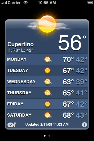
A utility application performs a simple task that requires a minimum of user input. People open a utility application to see a quick summary of information or to perform a simple task on a limited number of objects. The Weather application (shown in Figure 1-2) is a good example of a utility application because it displays a narrowly focused amount of information in an easy-to-scan summary.
Utility applications are visually attractive, but in a way that enhances the information they display without overshadowing it. People use utility applications to check the status of something or to look something up, so they want to be able to spot the information they’re interested in quickly and easily. To facilitate this, a utility application’s user interface is uncluttered and provides simple, often standard, views and controls.
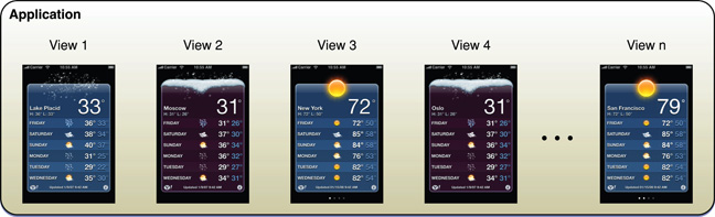
A utility application tends to organize information into a flattened list of items; users do not usually need to drill down through a hierarchy of information. Typically, each view in a utility application provides the same organization of data and depth of detail, but can be served by a different source. In this way, users can open a single utility application to see similar treatments of multiple subjects. Some utility applications indicate the number of open views; users can navigate through them sequentially, selecting one view after another. Figure 1-3 shows an example of this type of data organization.
The user interaction model for a utility application is very simple: Users open the application to scan a summary of information and, optionally, change the configuration or source of that information. Utility applications may need to support frequent changes to configuration or information source, so they often provide a small set of such options on the back of the main view. Users tap the familiar Info button in the lower-right corner of the main view to see the back. After making adjustments, users tap the Done button to return to the front of the main view. In a utility application, the options on the back of the main view are part of the functioning of the application, not a group of preference-style settings users access once and then rarely, if ever, again. For this reason, utility applications should not supply application-specific settings in the Settings application. Figure 1-4 shows how the Weather application provides configuration options on the back of the main view.

Immersive Applications
An immersive application offers a full-screen, visually rich environment that’s focused on the content and the user’s experience with that content. People often use immersive applications to have fun, whether playing a game, viewing media-rich content, or performing a simple task.
It’s easy to see how games fit this style of iPhone application, but you can also imagine how characteristics of immersive applications can enhance other types of tasks. Tasks that present a unique environment, don’t display large amounts of text-based information, and reward users for their attention are good candidates for the immersive approach. For example, an application that replicates the experience of using a bubble level works well in a graphics-rich, full-screen environment, even though it doesn’t fit the definition of a game. In such an application, as in a game, the user’s focus is on the visual content and the experience, not on the data behind the experience. Figure 1-5 shows an example of an immersive application that replicates an actual experience and enables a simple task.
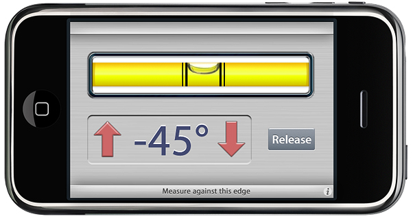
Note: Although applications that launch in landscape orientation should launch so that the Home button is on the right, the Bubble Level application shown above in Figure 1-5 launches in the opposite orientation. This ensures that the physical buttons on the edge of the device don’t interfere with the measurement. See “Starting” for more launch guidelines.
An immersive application tends to hide much of the device’s user interface, replacing it with a custom user interface that strengthens the user’s sense of entering the world of the application. Users expect seeking and discovery to be part of the experience of an immersive application, so the use of nonstandard controls is often appropriate.
Immersive applications may work with large amounts of data, but they do not usually organize and expose it so that users can view it sequentially or drill down through it. Instead, immersive applications present information in the context of the game-play, story, or experience. Also for this reason, immersive applications often present custom navigational methods that complement the environment, rather than the standard, data-driven methods used in utility or productivity applications.
The user interaction model for an immersive application is determined by the experience the application provides. Although it’s not likely that a game would need to offer application-specific settings in Settings, other types of immersive applications might. Immersive applications might also furnish configuration options on the back of the main view.
Choosing an Application Style
After reading about productivity, utility, and immersive application styles, think about the type of information your application displays and the task it enables. In theory, the type of application you should create is obvious to you and you’re ready to get started; in practice, it’s not always that simple. Here is a hypothetical scenario to consider as you make your decision.
If you have a subject you’d like to explore, think about the objects and tasks related to it. Imagine the different perceptions people have of that subject. For example, consider the subject of baseball. Baseball brings to mind, among other things, teams, games, statistics, history, and players. Baseball is probably too extensive a subject for a single application, so consider just the players. Now imagine how you might create an application that relates to players—for example, using their likenesses on baseball cards.
You could develop a productivity application that helps serious collectors manage their baseball card collections. Using list-based formats, you could display cards in a hierarchy of teams, then players, then seasons. In the most detailed view, you could give users the ability to note where they acquired the card, how much they paid for it, its current market value, and how many copies they have. Because the focus of this application is on the data that defines the collection, the user interface streamlines the tasks of seeking and adding information.
You could also develop a utility application that displays the current market value of particular baseball cards. Each view could look like a baseball card with its current value added to the picture, and the back of the view could allow users to select specific cards to track and display. The focus of this application is on individual cards, so the user interface emphasizes the look of the cards and provides a simple control or two that allows users to look for new cards.
Or, of course, you could develop a game. Perhaps the game would focus on the user’s knowledge of certain statistics on individual baseball cards or ability to recognize famous cards. Or perhaps it would simply use baseball cards as icons in another type of game, such as a sliding puzzle. In each of these cases, the focus of the application is on the images on the baseball cards and the game play. The user interface complements this by displaying a few baseball-themed controls and hiding the iOS user interface.
It’s important to reiterate that you’re not restricted to a single application style. You may find that your application idea is best served by a combination of characteristics from different application styles.
When in doubt, make it simple. Pare the feature list to the minimum and create an application that does one simple thing (see “Create a Product Definition Statement” for advice on how to focus your application). When you see how people use and respond to the application, you might choose to create another version of the application with a slightly shifted focus or altered presentation. Or, you might discover a need for a more (or less) detail-oriented version of the same concept.
When You Have an Existing Computer Application
If you have an existing computer application, don’t just port it to iOS. People use iOS-based devices very differently than they use desktop and laptop computers, and they have different expectations for the user experience.
Remember that people use iOS-based devices while on the go, and often in environments filled with distractions. This generally means that they want to open your application, use it briefly, and move on to something else. If your application relies on the user’s undivided attention for long stretches of time, you need to rethink its structure and goals if you want to bring it to iOS.
If your desktop application enables a complex task or set of tasks, examine how people use it in order to find a couple of subtasks they might appreciate being able to accomplish while they’re mobile. For example, a business-oriented application that supports project scheduling, billing, and expense reporting could spawn an iPhone utility application that shows progress summaries for a project, or an iPhone productivity application that allows mobile users to keep track of their business-related expenses.
As you think about how to bring ideas from your desktop application to an iPhone application, apply the 80-20 rule to the design of your application. Estimate that the largest percentage of users (at least 80 percent) will use a very limited number of features in an application, while only a small percentage (no more than 20 percent) will use all the features. Then, consider carefully whether you want to load your iPhone application with the power features that only a small percentage of users want. Be aware that a desktop computer application might be the better environment in which to offer those features, and that it’s usually a good idea to focus your iPhone application on the features that meet the needs of the greatest number of people.
Case Studies: Bringing a Desktop Application to iOS
To help you visualize ways you can create an iOS version of a desktop computer application, this section describes some of the design differences between familiar Mac OS X applications and their iOS counterparts. As you learn about which features and functions in each application were adapted for its iOS version, you will gain insight into the types of design decisions you need to make for your own iPhone application.
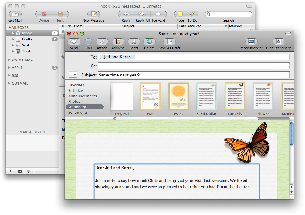
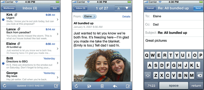
Mail is one of the most highly visible, well-used, and appreciated applications in Mac OS X. It is also a very powerful program, one that allows users to create, receive, prioritize, and store email, track action items and events, and create notes and invitations. Mail provides most of this functionality in a single multipane window. This is convenient for people using a desktop computer, because they can leave a Mail window on the display screen (or minimized to the Dock) all the time and switch to it whenever they choose. Figure 1-6 illustrates many of the features available in the Mail message-viewing and compose windows on the desktop.
But when people are mobile, their needs for an email application are simpler, and they want access to core functionality quickly. For this reason, Mail on iOS-based devices focuses on the most important things people do with their email: receive, create, send, and organize messages. To do this, it displays a pared-down user interface that makes the organization of the user’s accounts and mailboxes clear and centers the user’s attention on the messages.
Mail in iOS is a perfect example of a productivity style application: To ease navigation through the content, Mail in iOS takes advantage of the naturally hierarchical organization of people’s email and displays on successive pages accounts, mailboxes, message lists, and individual messages. Users drill down from the general (the list of accounts) to the specific (a message) by selecting an item in a list and viewing the things associated with that item. To learn more about the productivity style of iPhone applications, see “Productivity Applications.”
In addition, Mail in iOS enables actions, such as create and send, by displaying a handful of familiar controls that are easy to tap. Figure 1-7 shows how Mail makes it simple to view and send email in iOS. Note how elements at the top of each screen make it easy for users to know both their current and previous location in the application.
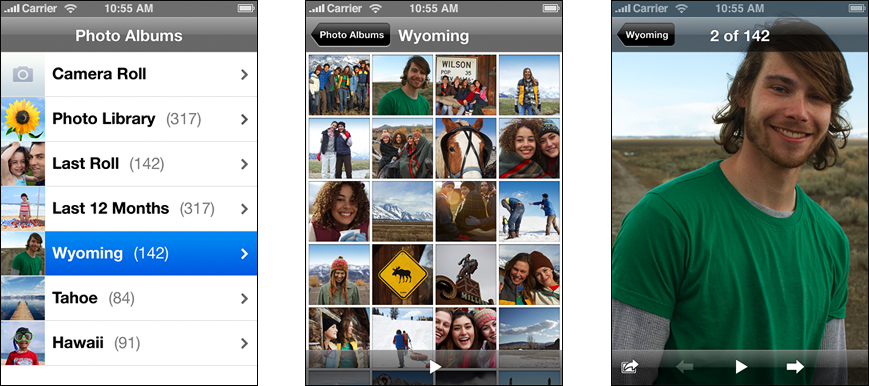
iPhoto
Another instructive example of a Mac OS X application that was reimagined for iOS is iPhoto. On the desktop, iPhoto supports comprehensive searching and organization, powerful editing capabilities, and creative printing options. When people use iPhoto on their desktop or laptop computers, they appreciate being able to see and organize their entire collection, make adjustments to photos, and manipulate them in various ways. Although the main focus of iPhoto is on the user’s content, the application also offers extensive functionality in its window. Figure 1-8 shows the iPhoto user interface on the desktop.

But when they’re mobile, people don’t have time to edit their photos (and they don’t expect to print them); instead, they want to be able to quickly see and share their photos.
To meet this need on iOS-based devices, Apple has provided the Photos application, which focuses on viewing photos and sharing them with others. The Photos user interface revolves around photos; so much so, in fact, that even parts of the device user interface can be hidden. When users choose to view a slideshow of their photos, the Photos application hides the navigation bar, toolbar, and even status bar, and displays translucent versions of these elements when users need to see them.
Photos makes it easy for users to organize and find their photos by using a hierarchical arrangement: Users select an album, which contains a collection of photos, and then they select a single photo from the collection. In this way, Photos is an example of an application that combines features of the productivity style and the immersive style (to learn more about these styles, see “Three Application Styles”). Figure 1-9 shows how users can view photos in the Photos application.
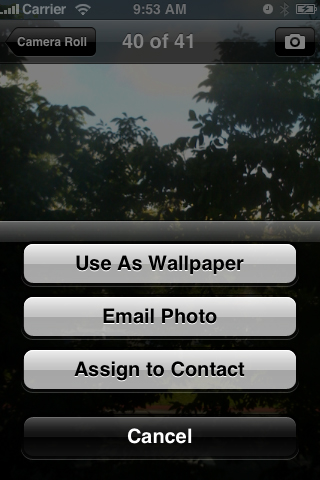
In addition, Photos uses a transient view, called an action sheet (described in “Alerts, Action Sheets, and Modal Views”), to give users additional functionality without taking them out of the photo-viewing experience. Figure 1-10 shows how Photos provides options for using an individual photo.
Last updated: 2010-08-03