Table Views, Text Views, and Web Views
Table views, text views, and web views are versatile elements that lend themselves to different uses in your iPhone application. For example, table views can be configured to display short lists of choices, grouped lists of detailed information, or long, indexed lists of items. Text views and web views are relatively unconstrained containers you can use to accept and display content.
Table Views
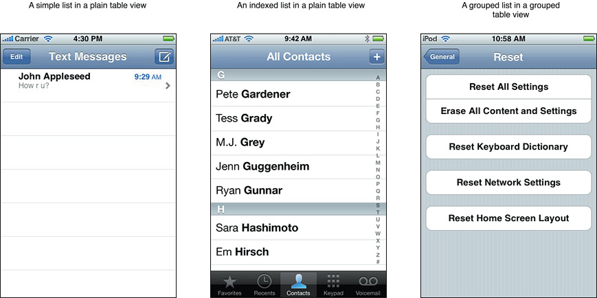
A table view presents data in a single-column list of multiple rows. Rows can be divided into sections or groups and each row can contain some combination of text, images, and controls. Users flick or drag to scroll through rows or groups of rows. Figure 8-1 shows how different styles of table views can display lists in different ways.
Usage and Behavior
Table views are extremely useful in iPhone applications because they provide attractive ways to organize both large and small amounts of information. Table views are most useful in productivity applications that tend to handle lots of user items, although utility applications can make use of smaller-scale table views, as well. An immersive application would probably not use a table view to display information, but it might use one to display a short list of options.
Table views provide built-in elements that allow users to navigate and manipulate information. In addition, table views support:
The display of header and footer information. You can display descriptive text above or below each section or group in a list, and above or below the list as a whole.
List editing. You can allow users to add, remove, and reorder list items in a consistent way. Table views also support the selection and manipulation of multiple list items, which you might use to give users a convenient way to delete more than one list item at a time.
A table should always provide feedback when users select a list item. When an item can be selected, the row containing the item highlights briefly when the user selects it, providing feedback that the selection has been received. Then, an immediate action occurs: Either a new view is revealed or the row displays a checkmark to indicate that the item has been selected or enabled.
In rare cases, a row might remain highlighted when secondary details or controls related to the row item are displayed in the same screen. However, this is not encouraged because it is difficult to display a list of choices, a selected item, and related details or controls without creating an uncomfortably crowded layout.
If a row selection results in navigation to a new screen, the selected row highlights briefly as the new screen slides into place. When the user navigates back to the previous screen, the originally selected row again highlights briefly to remind the user of their earlier selection.
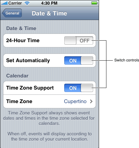
Note that you can also animate the changes users make to list items. Doing so is a good way to provide feedback and strengthen the user’s sense of direct manipulation. In Settings, for example, when you turn off the automatic date and time setting (by selecting Off in Date & Time > Set Automatically), the list group expands smoothly to display two new items, Time Zone and Set Date & Time.
A table should display content immediately. If the table's content is extensive or complex, avoid waiting until all the data is available before displaying anything. Instead, fill the onscreen rows with textual data immediately and display more complex data (such as images) as they become available. This technique gives users useful information right away and increases the perceived responsiveness of your application.
If your application displays data that changes infrequently, you might consider displaying “stale” data while waiting for new data to become available. This technique also allows users to see something useful right away, but it is not recommended for applications that handle data that changes frequently. Before you decide to do this, gauge how often the data changes and how much users depend on seeing fresh data quickly.
If it’s difficult to display anything useful right away, it's important to avoid displaying empty rows, because this can imply that the application has stalled. Instead, the table should display a spinning activity indicator along with an informative label, such as “Loading...”, centered in the screen. If you can display older data, you don’t have to worry about blank rows, but you should update onscreen rows as soon as possible. Both techniques provide feedback to users, letting them know that processing is continuing.
Table-View Styles
iOS defines two styles of table views, which are distinguished mainly by appearance:
Plain (UITableViewStylePlain). This table-view style displays rows that extend from side edge to side edge of the screen. The background of the rows is white. The rows can be separated into labeled sections and the table view can display an optional index that appears vertically along the right edge of the view.
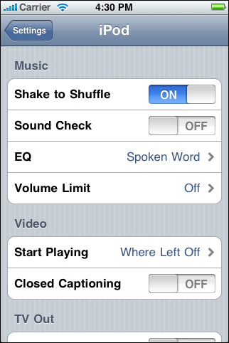
Figure 8-2 shows a list in a plain table (without headers, footers, or an index) in the iPod application.
Grouped (UITableViewStyleGrouped). This table-view style displays groups of rows that are inset from the side edges of the screen. The groups are displayed on a distinctive vertically striped background, while inside the groups the background is white. A grouped table can contain an arbitrary number of groups, and each group can contain an arbitrary number of rows. Each group can be preceded by header text and followed by footer text. This style of table view does not provide an index.
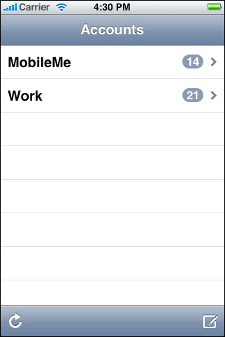
Figure 8-3 shows a list in a grouped table, in which each group contains one row. This list, in the Settings application, does not include header or footer text.
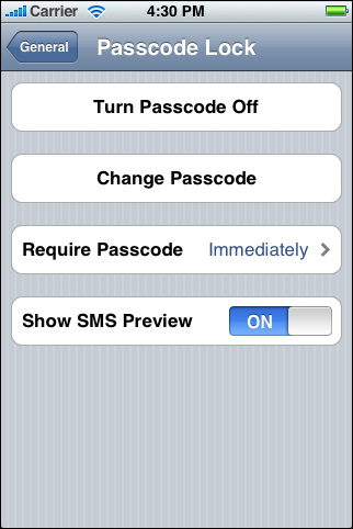
Table-Cell Styles
iOS 3.0 and later includes four predefined table-cell styles you can use to quickly and easily produce the most common layouts for table rows in both plain and grouped tables. Note that, programmatically, these styles are applied to a table view’s cell, which is an object that tells the table how to draw its rows.
When you use the standard table-cell styles, your application is consistent with the built-in applications, which benefits you in a couple of ways:
Users more quickly understand how your application works
Your application remains consistent without a lot of extra work on your part, if the standard table-cell styles are enhanced in the future
If you want to lay out your table rows in a nonstandard way, it’s better to create a custom table-cell style than to significantly alter a standard one. “Customizing Cells” in Table View Programming Guide for iOS helps you learn how to create your own cells.
Be aware that text truncation is automatic in all table-cell styles. Generally speaking, you should ensure that your text is as succinct as possible to avoid displaying truncated words or phrases that are difficult for users to understand. Specifically, text truncation can be more or less of a problem, depending on which cell style you use and on where truncation occurs.
iOS provides the following standard table-cell styles:
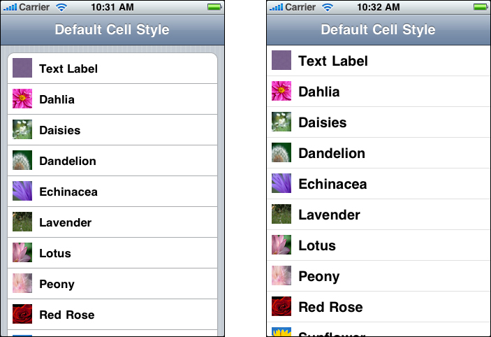
The default table-cell style (
UITableViewCellStyleDefault) includes an optional image on the left, followed by a left-aligned text label in black.The text label’s appearance implies that it represents an item name or title and its left-alignment makes the list easy to scan. This makes the default style good for displaying a list of items that do not need to be differentiated by supplementary information.
Short text labels are best, but if truncation is unavoidable, try to ensure that the most important information is contained in the first few words.
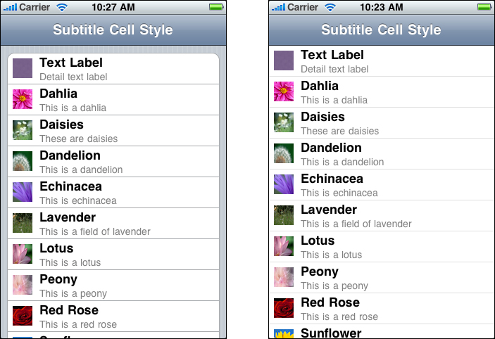
The subtitle table-cell style (
UITableViewCellStyleSubtitle) includes an optional image on the left, followed by a left-aligned text label on one line and a left-aligned detail text label on the line below. The text label is in black and the detail text label is in a smaller, gray font.The prominent appearance of the text label implies that it represents an item name or title, while the subtle appearance of the detail text label implies that it contains subsidiary information related to the item. The left-alignment of the text labels makes the list easy to scan. This table-cell style works well when list items might look similar, because users can use the additional information in the detail text labels to help distinguish items named in the text labels.
Text labels should be short to avoid truncation. If truncation is unavoidable, focus on putting the most important information in the first few words. If the detail text label is truncated, users are not likely to mind too much because they view it as information that enhances or supplements the item named by the text label.
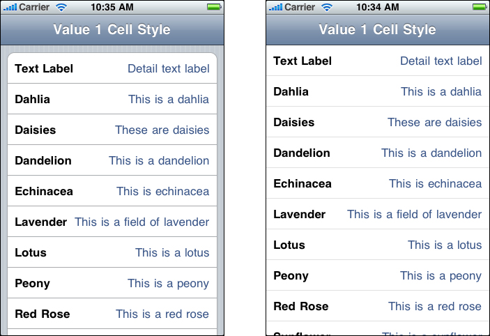
The value 1 table-cell style (
UITableViewCellStyleValue1) displays a left-aligned text label in black on the same line with a right-aligned detail text label in a smaller, blue font. Images do not fit well in this style.The appearance of the text label implies that it represents an item name or title, while the appearance of the detail text label implies that it provides important information that is closely associated with the item.
The left-alignment and font of the text label help users scan the list for the item they want, and the right-alignment of the detail text label draws their attention to the related information it provides. This table-cell style works well to display an item’s current value, possibly selected from a sublist.
Text truncation can be difficult to avoid in this layout (because both labels are on the same line), but it’s worth the effort. Otherwise, you lose the active space between the labels that helps users understand the relationship between the two pieces of information.
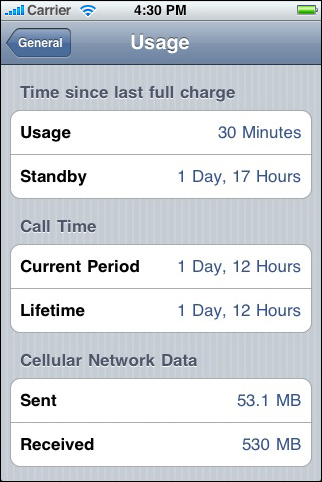
Although you can use the value 1 table-cell style in either a plain or a grouped table, its appearance is better suited to a grouped table. For example, the Usage screen in Settings uses the value 1 style in grouped tables:
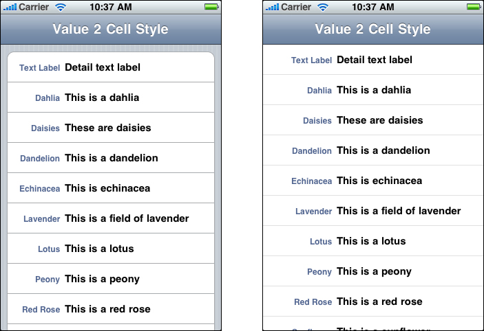
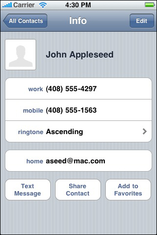
The value 2 table-cell style (
UITableViewCellStyleValue2) displays a right-aligned text label in a small blue font, followed on the same line by a left-aligned detail text label in a larger, black font. Images do not fit well in this style.The right-alignment, constrained width, and font of the text label imply that it functions as a heading or caption for the important information in the more prominent, left-aligned detail text label.
In this layout, the labels are aligned towards each other at the same location in every row. This creates a crisp, vertical margin between the text labels and the detail text labels in the list, which helps users focus on the first words of the detail text label. If you allow the text labels to be truncated, you lose the sharpness of this vertical strip, which can make it harder for users to scan the information in the detail text labels.
Although you can use the value 2 table-cell style in either a plain or a grouped table, it looks much better in a grouped table. For example, the Info screen in Contacts uses the value 2 table-cell style in grouped tables:
Note: All standard table-cell styles also allow the addition of a table-view element, such as the checkmark or the disclosure indicator. Be aware that adding these elements decreases the width of the cell available for the title and subtitle.
You might be able to avoid text truncation by increasing the height of a table row to accommodate text wrapping, but this can be problematic:
You have to programmatically check the text length and decide if wrapping might occur. You must make this determination for both portrait and landscape orientation, because the table width affects text wrapping.
You should avoid displaying wrapped text in one orientation, but not the other.
Variable row heights can negatively impact the overall table view performance in your application, regardless of table-view style.
Finally, although variable row heights are acceptable in grouped tables, they can make a plain table look cluttered and uneven.
Table-View Elements
iOS includes a handful of table-view elements that can extend the functionality of table views. Unless noted otherwise, these elements are suitable for use in table views only. Be sure to use these elements correctly in your application, because users are accustomed to their appearance and behavior in the built-in applications.
Note: Programmatically, table-view elements are implemented in different ways. Some are accessory views of the table cell (an object that tells the table how to draw its rows) and others can be displayed when the table view enters an editing mode. See Table View Programming Guide for iOS to learn about the different ways to manage these elements.
Disclosure indicator. When this element is present, users know they can tap anywhere in the row to see the next level in the hierarchy or the choices associated with the list item.
Use a disclosure indicator in a row when selecting the row results in the display of another list. Don’t use a disclosure indicator to reveal detailed information about the list item; instead, use a detail disclosure button for this purpose.
Detail disclosure button. Users tap this element to see detailed information about the list item. (Note that you can use this element in views other than table views, to reveal additional details about something; see “Detail Disclosure Buttons” for more information.)
In a table view, use a detail disclosure button in a row to display details about the list item. Note that the detail disclosure button, unlike the disclosure indicator, can perform an action that is separate from the selection of the row. For example, in Phone Favorites, tapping the row initiates a call to the contact; tapping the detail disclosure button in the row reveals more information about the contact.
Delete button. Users tap this element to delete the list item. This element appears to the right of a list item when users swipe in the row or when they tap the delete control button while in an editing context. (See Figure 8-10 for an example of this element.)
Delete control button. Users tap this element to reveal and hide the Delete button for each list item. To give additional feedback to users, the horizontal minus symbol inside this button becomes vertical when users tap it to reveal the Delete button. See Figure 8-10 for an example of this element.
In a grouped table that supports a transitory editing mode, the delete control appears outside the table view, on the left. You can see this, for example, when editing an individual’s information in Contacts. In a grouped table that is in a permanent editing mode (such as the grouped tables on the back of Stocks and Weather), the delete control appears inside the table, on the left.
In a plain table, the delete control always appears inside the table, on the left, as shown in Figure 8-10.
Row insert button. Users tap this element to add a row to the list.
Row reorder control. When this element is present, users can drag the row to another location in the list.
Checkmark. This element appears next to a list item to show that it is currently selected.
Switch Controls
A switch control presents to the user two mutually exclusive choices or states, such as yes/no or on/off. A switch control shows only one of the two possible choices at a time; users slide the control to reveal the hidden choice or state. Figure 8-11 shows examples of switch controls.
Use a switch control in a grouped table view when you need to offer the user two simple, diametrically opposed choices. Because one choice is always hidden, it’s best to use a switch control when the user already knows what both values are. In other words, don’t make the user slide the switch control just to find out what the other option is.
You can use a switch control to change the state of other user interface elements in the view. Depending on the choice users make, new list items might appear or disappear, or list items might become active or inactive.
Using Table Views to Enable Common User Actions
Table views are particularly versatile user interface elements, because they can be configured in different ways to support different user actions, such as:
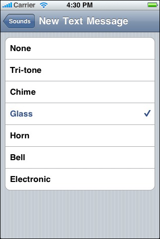
Selecting options.
iOS does not include multi-item selection controls analogous to menus or pop-up menus, but a table view works well to display a list of options from which the user can choose. This is because table views display items in a simple, uncluttered way. In addition, the table view provides a checkmark image that shows users the currently selected option (or options) in a list, as shown in Figure 8-12.
If you need to display a list of choices users see when they tap an item in a table row, you can use either style of table view. But if you need to display a list of choices users see when they tap a button or other user interface element that is not in a table row, use the plain style.
Navigating hierarchical information.
A table view works well to display a hierarchy of information in which each node (that is, list item) can contain its own subset of information, because each subset can be displayed in a separate list. This makes it easy for users to follow a path through the hierarchy by selecting one item in each successive list. The disclosure indicator element tells users that tapping anywhere in the row reveals the subset of information in a new list, as shown in Figure 8-13.
When a table is used for navigation, previously selected table rows do not remain highlighted when users retrace their steps through the hierarchy.
Viewing conceptually grouped information.
You can use either table-view style to cluster information into logical groups, such as work, home, or school. Both plain and grouped tables allow you to provide context for each section by supplying header and footer text, as shown in Figure 8-14.
Generally speaking, grouped tables provide a clearer visual indication of grouping because it’s easy for users to distinguish the rounded corners of the groups, even when scrolling quickly. Figure 8-15 shows several conceptual groups of values in iPod settings.
Looking up indexed information.
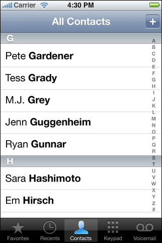
If you’re using a plain table, you can display an index that helps users quickly find what they need. The index consists of a column of entries (usually letters in an alphabet) that floats on the right edge of the screen, as shown in Figure 8-16. Users tap (or drag to) an index entry to reveal the corresponding area in the list. An index is most useful in a list that might span more than a few screenfuls.
If you include an index in a plain table, avoid using table-view elements that display on the right edge of the table (such as the disclosure indicator), because these elements interfere with the index.

Text Views
A text view is a region that displays multiple lines of text and supports scrolling when the content is too large to fit inside its bounds. Mail uses a text view to allow users to create a signature that appears at the end of each email message they compose, as shown in Figure 8-17.
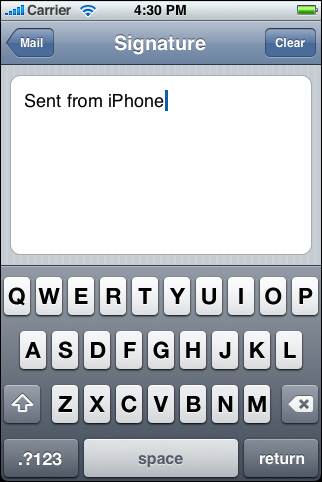
Although you might use a text view to display many lines of text, such as the content of a large text document, you can also use a text view to support user editing. If you make a text view editable, a keyboard appears when the user taps inside the text view. The keyboard’s input method and layout are determined by the user’s language settings. When users tap the button labeled “.?123” (shown in Figure 8-17), the keyboard changes to facilitate the entry of numbers and punctuation. You can also specify different keyboard styles, depending on the type of content you expect users to enter. See “Text Fields” for a description of the styles you can use.
You have control over the font, color, and alignment of the text in a text view, but only as they apply to the entirety of the text. In other words, you can’t change any of these properties for only part of the text. The defaults for the font and color properties are, as you would expect, the system font and black, because they tend to be the most readable. The default for the alignment property is left (you can change this to center or right).
If you must enable variable fonts, colors, or alignments within a view that displays text, you can use a web view instead of a text view, and style the text using HTML.
Web Views
A web view is a region that can display rich, HTML content in your application screen. For example, Mail uses a web view to display message content, because it can contain elements in addition to plain text (Figure 8-18 shows an example of this).

In addition to displaying web content, a web view provides elements that support navigation through open webpages. Although you can choose to provide webpage navigation functionality, it’s best to avoid creating an application that looks and behaves like a mini web browser.
If you have a webpage or web application, you might choose to use a web view to implement a simple iPhone application that provides a wrapper for it. If you plan to access web content that you control, be sure to read Safari Web Content Guide to learn how to create web content that is compatible with and optimized for display on iOS-based devices.
Last updated: 2010-08-03