From iPhone Application to iPad Application
If you already have an iPhone application, you need to know how to revise your application so that it can take full advantage of iPad. Your familiarity with iOS helps you change your code with relative ease, but evolving the user interface and user experience can be more challenging.
Important: Unmodified, your iPhone application runs in a compatibility mode on iPad. This allows your users to access your application on iPad, but it does not give them the device-specific experience they want.
This chapter describes some general strategies for revising the user interface of your iPhone application. For specific guidelines you should follow, see “iPad User Experience Guidelines.” For help with transitioning your iPhone application code to iPad, see iPad Programming Guide.
Design Strategies for Translating Your iPhone Application
It’s vital that you revise the user interface and user experience of your iPhone application to take advantage of the large iPad screen and to give people the enhanced interactivity they expect. Precisely how you do this depends on the specifics of your iPhone application.
Games and other immersive iPhone applications may not need much change in information architecture, because they’re experience-driven, rather than data-driven. But games generally require significant revision of artwork and interaction to deliver a compelling experience on iPad. As you plan the revision of your game, think about the following things:
It’s essential that you make your artwork as high-fidelity as possible. On iPad, people expect games to furnish a lavish visual environment they can explore in depth. Don’t just scale up your artwork. Instead, increase the resolution and take every opportunity to add details that encourage people to immerse themselves in your application.
You should make sure that your visual effects are also high-fidelity. Clear, finely detailed, lifelike portrayals of events and actions enhance people’s emotional response and strengthen their sense of entering a game’s unique environment.
You should investigate ways to let users interact more with your application, without changing the fundamental experience. For example:
Consider adding multiplayer capabilities.
Give people more things to see and control, by adding more camera angles; more knobs, switches, and dials; or more ways to customize game pieces and gameplay.
When it makes sense, support multifinger gestures, especially when you can integrate them with custom controls.
iPhone productivity applications tend to require some rearchitecting of the information hierarchy, in addition to an enriched UI and an enhanced user experience. As you plan the revision of your productivity application, keep the following things in mind:
You want to let users see more content and do more work in one screen. Try to avoid making them drill down through many screens to accomplish their goal. (See “Flatten Your Information Hierarchy” for some ways to do this.)
Your user interface should still be understated enough to avoid distracting users from the task, but don’t let that prevent you from making it beautiful. Even though people use productivity applications to accomplish an important task, they expect to enjoy the experience on iPad. Consider using subtly custom elements that harmonize with the task, or making the objects that users interact with look more realistic. Also consider displaying data in more appealing ways, such as graphically instead of textually.
Look into ways to provide more interactivity in your iPad application. You always want to maintain a clear focus on the main task, but it’s often a good idea to expose more of the data for people to see and control.
Utility applications need to be reenvisioned for iPad so that they take advantage of the larger screen. Because flipping the entire screen is not generally recommended, many utility applications need to change their interaction model. If you have a utility-style iPhone application:
Consider ways to combine the content from separate iPhone screens into one screen on iPad.
Think about giving users more in-depth information about the task. If your iPhone utility application provides a summary view of the content, you might allow people to get an expanded view on the same screen.
Give people more ways to interact with the content. For example, it might make sense to allow people to manipulate a graph in real time, see a simulation of data, or customize details of the content they see.
Regardless of the style of your iPhone application, be sure to follow the iPad-specific guidelines described in “iPad User Experience Guidelines.”
Case Study: From Mail on iPhone to Mail on iPad
Mail is one of the premier built-in applications on iPhone. People appreciate the clear, streamlined way it organizes large amounts of information, its ease of use, and its scalability.
Mail on iPad delivers the same core functionality with a modified user experience that includes:
More onscreen space for people’s messages
Meaningful touches of realism
Powerful organizing and editing tools that are always accessible, but not obtrusive
The visual stability of a single, uncluttered screen that provides what users need in one place, with minimal context changes
The differences between Mail on iPhone and Mail on iPad reflect the different user experiences of each device. Mail on iPhone is designed to help mobile users handle their email while they’re standing in line or walking to a meeting. Mail on iPad is efficient enough for people to use on the go, but it also encourages more in-depth usage.
It’s crucial to note that, although Mail on iPad tailors the user experience to the device, it does not alter the core functionality people are used to. Nor does it gratuitously change the location or effect of individual functions. iPhone Mail users easily recognize the toolbar items and mailbox structure in iPad Mail, and immediately know how to use them because they’re virtually identical.
To enhance the mobile email experience, Mail on iPad evolves the iPhone Mail UI in two main ways:
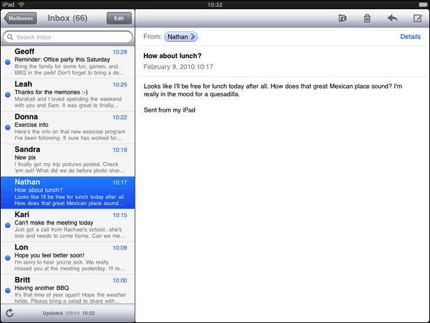
Expanded support for device orientations. People can use Mail on iPad in any of the four orientations. Although the landscape layout differs somewhat from the portrait layout, people can easily access all the functionality they care about in any orientation. Figure 2-2 shows Mail in landscape; Figure 2-3 shows Mail in portrait.
Increased focus on message content. Mail on iPad reserves most of the screen for the current message. This includes moving the toolbar to the top of the message view to increase the vertical space available for the message content. With the extra space, people can read longer messages with less scrolling. And when people want to view the message list, they can still see a large portion of the current message.
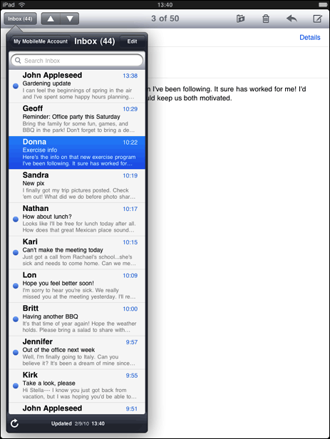
Flatter hierarchy. Mail on iPad effectively flattens the account > mailbox > message list > message hierarchy by confining all levels above the message itself to a separate UI element. In landscape, this element is the left pane of a split view (shown in Figure 2-2); in portrait, this element is a popover (shown in Figure 2-3).
Drastically reduced full-screen transitions. Because most of the hierarchy is available in a separate onscreen element, people can access most of what they need in a single screen. When people drill down through the hierarchy, it’s the view inside the split view pane or popover that transitions, not the entire screen.
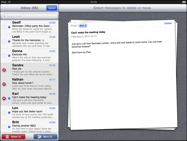
Realistic messages. When people mark a message for deletion, it slides onto the message view like a physical sheet of paper. As they choose additional messages to delete, the messages form a realistic stack of papers, complete with slightly untidy edges, as shown in Figure 2-4.
Last updated: 2010-08-03