Navigation Bars, Tab Bars, Toolbars, and the Status Bar
The status bar, navigation bar, tab bar, and toolbar are views that have specifically defined appearances and behaviors in an iPhone application. These bars are not required to be present in every application (immersive applications often don’t display any of them), but if they are present, it’s important to use them correctly. The reason is that these bars provide familiar anchors to users of iOS-based devices, who are accustomed to the information they display and the types of functions they perform.
The Status Bar
The status bar shows users important information about their device, including cell signal strength, the current network connection, and battery charge. Figure 6-1 shows an example of a status bar.

Although a full-screen, immersive application can hide the status bar, you should carefully consider the ramifications of this design decision. People expect to be able to see the current battery charge of their devices; hiding this information, and requiring users to quit your application to get it, is not an ideal user experience.
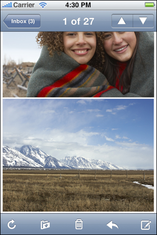
For example, Photos displays individual photos from a camera roll in a full-screen view that fades out the status bar, navigation bar, and toolbar after a few seconds. This is appropriate because in Photos, users focus on viewing the content, not interacting with it. However, users can bring back the status bar, navigation bar, and toolbar with a single tap on the screen.
If you sometimes hide the status bar in your application, you should take advantage of users’ experience of this behavior and allow them to redisplay it with a single tap. Unless you have a very compelling reason to do so, it’s best to avoid defining a custom gesture to redisplay the status bar because users are unlikely to discover such a gesture or remember it.
Although you have little control over the contents of the status bar, you can customize its appearance and, to some extent, its behavior. Specifically, you can:
Indicate whether the network activity indicator should be visible. You should display the network activity indicator if your application is performing a network operation that will take more than a couple of seconds. If the operation will finish sooner than that, you don’t have to show the network activity indicator, because it would be likely to disappear before users notice its presence. (In your code, you use the
UIApplicationmethodnetworkActivityIndicatorVisibleto control the indicator’s visibility.)Specify the color of the status bar. You can choose gray (the default color), opaque black, or translucent black (that is, black with an alpha value of 0.5). Figure 6-2 shows these styles. (Note that you set a value in your
Info.plistfile to specify the status bar style; see iOS Application Programming Guide for more information on how to do this.)Set whether the change from the current status bar color to the new color should be animated. (Note that the animation causes the old status bar to slide up until it disappears off the screen, while the new status bar slides into place.)

Be sure to choose a status bar appearance that coordinates with the rest of your application. For example, avoid using a translucent status bar if the navigation bar is opaque.
Navigation Bars
A navigation bar appears at the upper edge of an application screen, just below the status bar. A navigation bar usually displays the title of the current view and can contain controls that act on the view’s contents, in addition to navigational controls when appropriate. Navigation bars are especially useful in productivity applications (described in “Productivity Applications”), because these applications typically arrange information in a hierarchy.
Navigation bars have two purposes:
To enable navigation among different views in an application
To provide controls that manage the items in a view
Figure 6-3 shows examples of both these uses.

Navigation Bar Contents
A navigation bar can display just the title of the current view, centered along its width, as shown in Figure 6-4. The initial view in a productivity application should include a navigation bar that displays only the title of the first view because the user hasn’t yet navigated to another location.
As soon as the user navigates to another view, the navigation bar should change its title to the title of the new location, and should provide a back button labeled with the title of the previous location. For example, Figure 6-5 shows the navigation bar in Date & Time settings, which is in General settings.
The standard back button gives users a reliable way to return to the previous screen, so it’s important to avoid altering the button’s behavior. In particular, you should avoid creating a multi-segment back button, such as the one shown in Figure 6-6.
Using a multi-segment back button causes several problems:
The extended width of a multi-segment back button does not leave room for the title of the current screen.
There is no way to indicate the selected state of an individual segment.
The more segments there are, the smaller the hit region for each one, which makes it difficult for users to tap a specific one.
Choosing which levels to display as users navigate deeper in the hierarchy is problematic.
If you think users might get lost without a multi-segment back button that displays a type of breadcrumb path, it probably means that users must go too deeply into the information hierarchy to find what they need. To address this, you should flatten your information hierarchy.
In addition to a back button, a navigation bar can also contain a second button to the right of the title. If you do not need to display a back button (because your application does not support hierarchical navigation), you can opt instead to display a button that affects the contents of the view, such as an Edit button, to the left of the title. Figure 6-7 shows an example of this.
To learn how to implement a navigation bar in your application, see “Navigation Controllers”.
As you can see in the illustrations above, buttons in a navigation bar include a bezel around them. In iOS, this style is called the bordered style. All controls in a navigation bar should use the bordered style. In fact, if you place a plain (borderless) control in a navigation bar, it will automatically convert to the bordered style.
You can design your own icons for use in navigation-bar buttons, or you can take advantage of the predefined buttons iOS provides. See “Standard Buttons for Use in Toolbars and Navigation Bars” for more information on the buttons available to you.
Although you can specify a font for all text displayed in a navigation bar, it’s recommended that you use the system font for maximum readability. When you use the appropriate UIKit programming interfaces to create your navigation bar, the system font is used automatically to display the title.
Navigation Bar Size and Color
Changing the device orientation from portrait to landscape can change the height of the navigation bar automatically (you should not specify the height programmatically). In landscape orientation, the thinner navigation bar provides more space for your screen contents. Be sure to take the difference in heights into account when you design icons for navigation bar controls and when you design the layout of your screens.
You can specify the color and translucency of a navigation bar to coordinate with the overall look of your application and with the other bars in it (that is, toolbars, tab bars, and the status bar). You can use a custom color or choose one of the standard colors:
Blue (the default color)
Black
If it complements the look of your application, you can add translucency to the navigation bar. When you use a translucent navigation bar, the screen gives the impression of having a larger visible area, which is especially desirable in landscape orientation. Be sure to avoid mixing a translucent navigation bar with an opaque black status bar (although you can display a translucent navigation bar with an opaque gray status bar).
Strive for consistency in the appearance of navigation bars and other bars in your application. If you use a translucent navigation bar, for example, don’t combine it with an opaque toolbar. Also, avoid changing the color or translucency of the navigation bar in different screens in the same orientation.
Toolbars
If your application provides a number of actions users can take in the current context, it might be appropriate to provide a toolbar. A toolbar appears at the bottom edge of the screen and contains buttons that perform actions related to objects in the current view. A toolbar should not be used to switch among different modes in an application; if you need to do this, use a tab bar instead (see “Tab Bars” for more information).
For example, when users view a message in Mail, the application provides a toolbar that contains items for deleting, replying to, and moving the message, in addition to checking for new mail and composing a new message. In this way, users can stay within the message-viewing context and still have access to the commands they need to manage their email. Figure 6-8 shows what this looks like.
Toolbar Contents
The toolbar displays toolbar items equally spaced across the width of the toolbar. It’s a good idea to constrain the number of items you display in a toolbar, so users can easily tap the one they want. Remember that the hit-region of a user interface element is recommended to be 44 x 44 pixels, so providing five or fewer toolbar items is reasonable. Figure 6-9 shows an example of appropriate spacing of toolbar items in a toolbar.
The items in both Figure 6-8 and Figure 6-9 do not include a bezel. In iOS this style is called the plain style. (For an example of the bordered style, look at the buttons in Figure 6-7.) Although you can use either the bordered or plain style for buttons in a toolbar, you should not mix both styles in the same toolbar.
You can design your own icons for use in toolbar buttons, or you can take advantage of the predefined buttons iOS provides. (See “Standard Buttons for Use in Toolbars and Navigation Bars” for more information on the buttons available to you.) If you choose to create custom toolbar buttons, be sure to make them as similar in size as possible to achieve a balanced, attractive appearance.
Toolbar Size and Color
Changing the device orientation from portrait to landscape can change the height of the toolbar automatically (you should not specify the height programmatically). The thinner toolbar available in landscape orientation leaves more room for your screen contents. Be aware of the difference in heights when you design icons for toolbar buttons and when you design the layout of your screens.
You can specify the color and translucency of a toolbar to coordinate with the overall look of your application and with the other bars in it (that is, navigation bars, tab bars, and the status bar). You can use a custom color or choose one of the standard colors:
Blue (the default color)
Black
If it complements the look of your application, you can add translucency to the toolbar. When you use a translucent toolbar, the screen gives the impression of having a larger visible area, which is especially advantageous in landscape orientation.
Strive for consistency in the appearance of toolbars and other bars in your application. If you use a translucent toolbar, for example, don’t combine it with an opaque navigation bar. And, avoid changing the color or translucency of the toolbar in different screens in the same orientation.
Tab Bars
If your application provides different perspectives on the same set of data, or different subtasks related to the overall function of the application, you might want to use a tab bar. A tab bar appears at the bottom edge of the screen.
A tab bar gives users the ability to switch among different modes or views in an application, and users should be able to access these modes from everywhere in the application. However, a tab bar should never be used as a toolbar, which contains buttons that act on elements in the current mode (see “Toolbars” for more information on toolbars).
For example, on iPhone, iPod uses a tab bar to allow users to choose which part of their media collection to focus on, such as Podcasts, artists, videos, or playlists. The Clock application, on the other hand, uses a tab bar to give users access to the four functions of the application, namely, World Clock, Alarm, Stopwatch, and Timer. Figure 6-10 shows how selecting a tab in a tab bar changes the view in Clock. Notice how the tab bar remains visible in the different Clock modes shown in Figure 6-10. This makes it easy for users to see which mode they’re in, and allows them to access all Clock modes regardless of the current mode.

The tab bar displays icons and text in tabs, all of which are equal in width and display a black background. When a tab is selected, its background lightens and the image in the tab is highlighted. Figure 6-11 shows how this looks.
iOS provides a number of icons for tabs, such as the items labeled Featured and Bookmarks in Figure 6-11. If you choose to use these icons, be sure to use them in accordance with their documented meaning. For more information on the tab bar icons available to you, see “Standard Icons for Use in Tab Bars.”
Providing Additional Tabs
If your application's tab bar contains five or fewer tabs, iOS displays all of them, equally spaced within the tab bar, as shown in Figure 6-12.
If your application’s tab bar contains more than five tabs, iOS displays four of them in the tab bar and adds a More tab, as shown in Figure 6-11.
Users tap the More tab to see a list of additional tabs in a separate screen, as shown in Figure 6-13.

The More screen can also include an Edit button that users can tap to configure the tab bar so that it displays the tabs they use most often. For example, Figure 6-14 shows the Configure screen users see after they tap the Edit button in the iPod application’s More screen.
Figure 6-14 When an application has more than five tabs, users can select their favorite tabs to display in the tab bar

Notice how iPod uses the same tab icons in all three places (the tab bar, the More screen, and the Configure screen). This helps users be confident that each icon means the same thing, regardless of where it’s displayed.
Badging a Tab in a Tab Bar
You can display a badge on a tab to communicate with users in a nonintrusive, understated way. This type of feedback is suitable for communicating information that isn’t critical to the user’s task or context, but that is useful to know. The badge looks similar to the one Phone displays on the Voicemail tab to indicate the number of unheard messages: it is a red oval that appears near the upper right corner of the tab. The white text inside the oval provides the information.
Associating a badge with a specific tab allows you to connect the information in the badge with a particular mode in your application, even when that mode is not the current one. Figure 6-15 shows an example of a badge on a tab.

Note that a badge can also be displayed on your application icon in the Home screen if you register for Apple Push Notification Service and users agree to allow badging. See “Enabling Push Notifications” for more information on how this works.
Last updated: 2010-08-03