Metrics, Layout Guidelines, and Tips
This chapter provides specific layout guidelines and metrics you can use to design the user interface of your web content so it looks great and works well on iPhone OS–based devices. Some guidelines and metrics are more applicable to iPhone web applications than to webpages, but you should read them all and follow the ones that make the most sense for your needs.
If you’re new to web content design, be sure to familiarize yourself with accepted best practices; for an overview, see “Creating Compatible Web Content”. Then, read this chapter to find out how to adjust your content so it works well with the unique features of iPhone.
Note: This chapter describes metrics and other specifics you need when you create web content "by hand” for display on iPhone OS–based devices. As an alternative, you might choose to take advantage of the comprehensive and intuitive web application development environment introduced in Dashcode 2.0. To learn more about the facilities Dashcode provides, see Dashcode User Guide.
Create an Icon for Your Web Application or Webpage
You can provide a custom icon that users can display on their Home screens using the Web Clip feature. You can create an icon that represents your website as a whole or an icon that represents a single webpage. Users tap the icon to reach your web content in one easy step.
Users can display as many custom icons on their Home screens as they want, so you should design an icon that is:
Attractive, so users want to keep it on their Home screens
Distinctive, so users can easily find it among all other icons
If your web content is distinguished by a familiar image or memorable color scheme, it makes sense to incorporate it in your icon. However, to ensure that your icon looks great on iPhone you should also follow the guidelines in this section. (To learn how to add code to your web content to provide a custom icon, see “Specifying a Webpage Icon for Web Clip” in Safari Web Content Guide.)
When a user decides to display your icon on the Home screen, iPhone 1.1.3 and later automatically adds some visual effects so that it coordinates with the built-in icons. Specifically, iPhone 1.1.3 adds:
Rounded corners
Drop shadow
Reflective shine
For example, Figure 4-1 shows a simple icon as it might be provided by a webpage:

Figure 4-2 shows the same icon as it is displayed on a Home screen by iPhone 1.1.3 and later:

To ensure that your icon can take advantage of these visual enhancements, provide an image in PNG format that:
Measures 57 x 57 pixels, with 90 degree corners (if the image measures other than this size, iPhone 1.1.3 scales it)
Does not have any shine or gloss
Note: In iPhone OS 2.0 and later, you can prevent Safari on iPhone from adding any effects to your icon by naming it apple-touch-icon-precomposed.png.
As with other user interface elements on iPhone, icons that use bold shapes and lines and pleasing color combinations work best. It’s advisable to spend some time simplifying your icon design so it clearly conveys the essence of your web content. Also, it’s a good idea to investigate how your choice of image and color might be interpreted by people from different cultures.
Use Custom CSS
To ensure that your content is readable and well laid out when it displays on iPhone, you can provide a style sheet that adapts to iPhone. For example, you might want to do this if your text looks better in Safari on iPhone when it is displayed at 200%. Or, you might change the display of a set of items from a horizontal orientation to a vertical one, to accommodate the smaller screen.
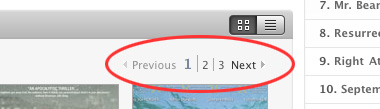
You can also use custom CSS to style controls or provide alternative controls. For example, the Apple website includes a page that displays movie trailers users can watch. When viewed in Safari on the desktop, users can click the numbers or the previous and next controls (shown in Figure 4-3) to see additional trailers.
Figure 4-3 The additional trailers controls on the Apple movie trailers webpage when viewed in Safari on the desktop
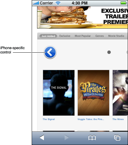
When viewed on iPhone, however, the next, previous, and number controls are replaced by prominent, easy-to-use buttons with symbols that echo the style of built-in controls. Figure 4-4 shows one of these custom controls.
Figure 4-4 The previous trailers control on the Apple movie trailers webpage when viewed in Safari on iPhone
To provide a style sheet specifically for iPhone, use the CSS 3 media query. For more information on how to do this, including code samples, see “Customizing Style Sheets”.
Lay Out Content for Safari on iPhone
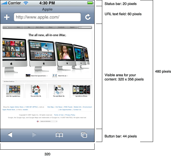
As you design the user interface of your webpage or iPhone web application, you need to know how much display space Safari on iPhone makes available to you. By default, Safari on iPhone displays a status bar, a URL text field, and a button bar, all of which extend across the full width of the screen, in both portrait and landscape orientation. The status bar can show battery charge, network status, and time. The URL text field displays a bookmark button and a refresh button, in addition to a text field in which users can type a URL. The button bar at the bottom of the screen displays buttons that act on the current iPhone feature or built-in application. The button bar is the toolbar of the Safari on iPhone application.
Safari on iPhone displays your content between the lower edge of the URL text field and the top edge of the button bar. Figure 4-5 shows the metrics of the Safari on iPhone controls and the visible area in which you can display your content when iPhone is in portrait orientation.
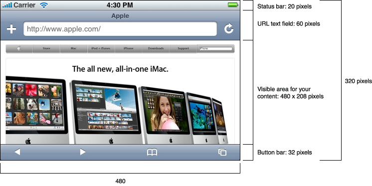
When iPhone is in landscape orientation the metrics change, although the relative arrangement of the status bar, URL text field, and button bar is the same. Figure 4-6 shows the dimensions of the visible area available for your content when iPhone is in landscape orientation.
Note: Although it is possible for your iPhone web application to scroll the URL text field off the top edge of the screen, it cannot change the position of the button bar or the status bar. You can, however, run your web application in a full-screen mode. See “Consider Hiding the Safari on iPhone User Interface” for information on how to do this.
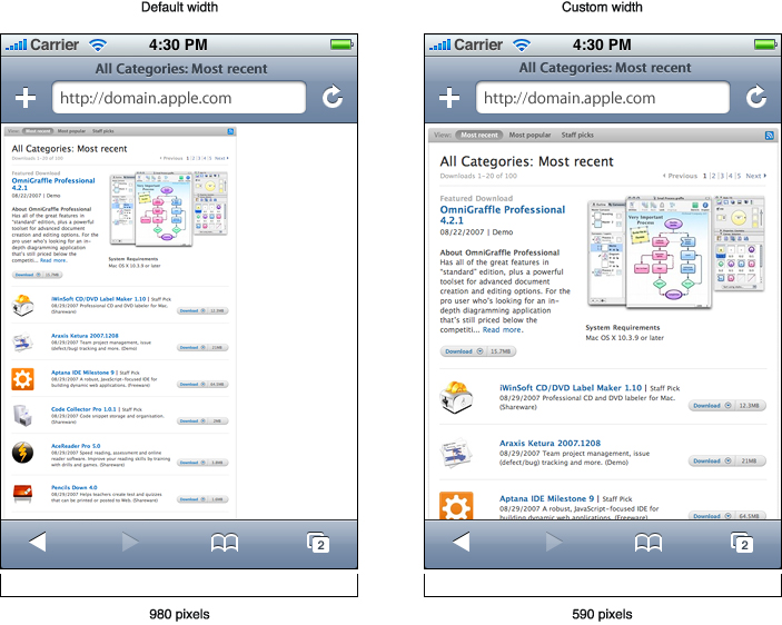
As mentioned in “The iPhone Viewport,” the iPhone viewport determines how your content is laid out on iPhone. When Safari on iPhone loads a webpage, it sets the viewport’s initial scale property so that the full width of the webpage fits the width of the iPhone screen. It also sets the viewport’s width property to 980 pixels, which is the width of most webpages.
You might need to change the default values of these properties if the width of your webpage is much different from 980 pixels, especially if it is narrower. This is because if the width of your webpage is less than 980 pixels, your content scales too small, making it very difficult for users to see without zooming. If the width of your webpage is greater than 980 pixels, users must pan to see all the content on the page. Figure 4-7 shows a narrow webpage before and after its width property is set appropriately.
It’s especially important for iPhone web applications to specify the correct values for viewport width and height, because it means that the user interface fits the screen precisely, without requiring users to zoom or pan. This strengthens the user’s perception of the content as a standalone application and reduces the user’s awareness of Safari on iPhone. For example, Figure 4-8 shows how an application looks when it incorrectly sets the width to 980 pixels (on the left) and how it looks when the width is corrected to equal the width of the iPhone screen (on the right).
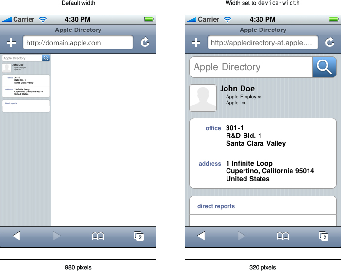
If you’re developing an iPhone web application using Safari on iPhone 1.1.1 and later, you should use the device-width and device-height constants to set the viewport width and height properties to the size of the iPhone screen. This ensures that Safari on iPhone renders the application with a scale of 1.0 and doesn’t change the layout of the user interface when users switch from portrait to landscape orientation.
It is also recommended that you turn off user scaling in your iPhone web application. This means that Safari on iPhone does not zoom in your content when users double-tap or pinch open.
To supply values for viewport properties, use the viewport meta tag. In addition to width and height, you can also use the meta tag to specify values that control scaling. For more information about using the meta tag to set viewport properties, including sample code, see “Configuring the Viewport”.
Consider Hiding the Safari on iPhone User Interface
In iPhone OS 2.1 and later, your iPhone web application can run in a full-screen mode, which makes it look more like a native application. When you specify full-screen mode, Safari on iPhone is not used to display the web content, so there is no URL text field at the top of the screen or button bar at the bottom of the screen. Only the status bar appears above your content at the top of the screen. See “Hiding Safari User Interface Components” in Safari Web Content Guide to learn which meta tag you must use to specify this mode.
If you want your iPhone web application to run in full-screen mode, it must launch from a Web Clip icon on the Home screen. You can let users use a snapshot of your content to create a Web Clip, or you can provide one (see “Create an Icon for Your Web Application or Webpage” for more information). In addition, you can:
Specify a custom launch image that displays while your web application is starting. A launch image decreases the perceived launch time of your web application because it is displayed instantly when the user taps your Web Clip icon.
To create a launch image, design a simple image that looks as much as possible like the first screen in your application. The image should be in portrait orientation and should measure 320 x 460 pixels. If you don’t provide a launch image, a screenshot of the previous launch is used.
Specify the status bar style that complements your web application. You can choose:
Default
Opaque black
Translucent black
If you choose translucent black, the top 20 pixels of your content is partially visible through the status bar. See “Changing the Status Bar Appearance” in Safari Web Content Guide to learn how to specify the status bar style in your code.
Consider the List Approach
As you lay out your webpage or iPhone web application, you often find that you need to display information in a list-like format. Lists are a natural way to present information organized by date, popularity, name, location, or any other sorting scheme. Lists are based on the principles of simplicity and ease of use (described in “Simplicity and Ease of Use”) and consistency (described in “Consistency”) and they are an especially effective way for iPhone web applications to display information. This is because lists encourage a simple, uncluttered layout and, because they are similar to menus, users already understand how they work. This section describes two ways to lay out lists and provides the metrics you need to organize your content so that it looks good on iPhone and is easy for users to read and use.
For code examples showing how to implement these guidelines, see iPhoneListPatterns.
One style of list layout, the edge-to-edge list layout, displays all items in equally sized rows. It is well suited to iPhone web applications that need to display a large number of items, such as locations, names, or objects, from which users can choose. When users choose an item from the list, an iPhone web application might respond by:
Displaying details about the item, such as contact information for the chosen person or theater information associated with the chosen concert.
Performing an action associated with the item. For example, if the list displays items for sale, the selection of an item might result in the display of an order form.
Displaying another, more focused list of items that helps users drill down to the desired content. In this way, you can present a large amount of hierarchically organized information in a simple, efficient way. For example, an iPhone web application that helps users decide which books to buy might first display a list of literary genres, followed by a list of authors in each genre, followed by a list of book titles for each author.
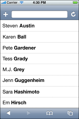
Figure 4-9 shows an example of an edge-to-edge layout used to display a list of names. Note that the last names are displayed in bold font to make it clear that the list is alphabetized by last name (see “Edge-to-Edge List Metrics” for details on the display of text in lists).
The other style of list layout, the rounded rectangle list layout, displays information in separate, rounded-corner boxes that are visually distinct from the background. This type of layout is useful for displaying small groups of information related to a single topic. To display a person’s contact information, for example, you might list home, work, mobile, and fax numbers in one box, email addresses in another box, and street addresses in a third box. The “After” illustration in Figure 4-8 shows one way this can look.
The rounded-rectangle design is well suited for use as the destination screen displayed at the end of some number of preceding edge-to-edge lists. For example, as described above, an iPhone web application that helps users find books can use edge-to-edge lists that allow users to make increasingly specific choices, drilling down through genres, authors, and book titles. To display details about a specific book, however, the application can use the rounded-rectangle layout to display groups of related information, such as the book’s publication information, links to reviews, and titles of similar books.
Edge-to-Edge List Metrics
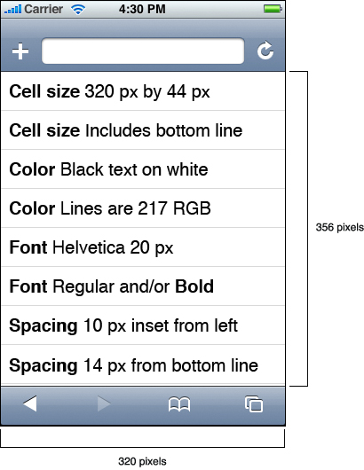
To display a flat list of items, use the edge-to-edge design, which yields the most space for your content. Each row, or cell, is 44 pixels high (including the line at the bottom of the cell) and 320 pixels wide.
Use Helvetica, 20-pixel size, in black for all text. By default, you should make your text bold for optimum readability, but you can use regular font for content that's less important. You can also use bold to emphasize a portion of the text that’s used for sorting. For example, if you display a list of full names alphabetized by last name, you can use bold font for the last name and regular font for the rest of the name. Text should be inset 10 pixels from the left edge and 14 pixels from the line at the bottom edge of the cell.
The background fill color of the list is white, and the lines between items are R = 217, G = 217, B = 217 (0xD9, in hexadecimal).
If you need to provide a control, design a rounded rectangular button that is 29 pixels high and has a corner radius of 5 pixels but that has a target area that is 44 pixels high. Use Helvetica, 12-pixel size, for the label on the button. Place the button 10 pixels from the right edge of a cell and center it vertically. Figure 4-10 shows this style of layout (without a button).
Rounded-Rectangle List Metrics
To display items in groups, use the rounded-rectangle design. Each rounded rectangle has a corner radius of 8 pixels, a width of 300 pixels, and white background fill. The edges of the rounded rectangles and the horizontal lines between the cells inside them are R = 217, G = 217, B = 217 (0xD9, in hexadecimal).
Because there is slightly less space for content in this design, use Helvetica, 17-pixel size, in black for all text. As with the edge-to-edge design, you should use bold font by default, but you can use regular font for secondary or de-emphasized text. Within a rounded rectangle, text should be inset 10 pixels from the left edge and 14 pixels from the bottom edge of a cell.
A rounded rectangle should be inset 10 pixels from both right and left edges of the iPhone screen and 17 pixels from the top of the button bar. Figure 4-11 shows the layout of this design.
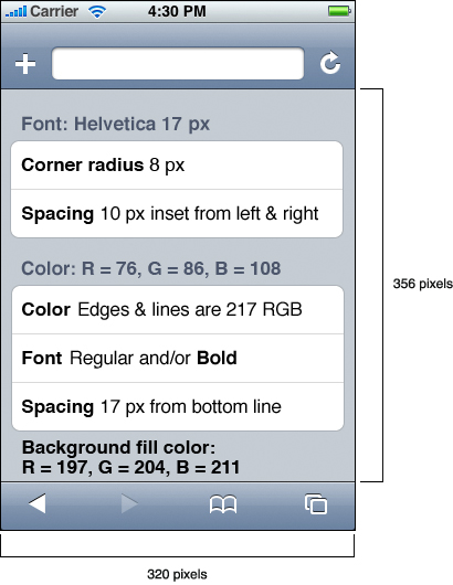
The design shown in Figure 4-11 allows you to display text between the rounded rectangles that you can use as labels for the groups of content. This text should be Helvetica, 17-pixel size, and should be bold. Instead of black, however, the color of this text is R = 76, G = 86, B = 108 (R = 0x4C, G = 0x56, B = 0x6C, in hexadecimal). The size of the area behind the rounded rectangles is 320 pixels wide and 356 pixels high and its background fill color is R = 197, G = 204, B = 211 (R = 0xC5, G = 0xCC, B = 0xD3, in hexadecimal).
Accommodate the Built-in Form Interface
Under certain circumstances, Safari on iPhone provides to users some built-in conveniences, such as a keyboard, a navigation bar, and a form assistant. The fact that these user interface components are built in means you don’t have to replicate them in your content, but it also means that you may need to take them into account when you design your layout. This is especially true for the layout of an iPhone web application’s user interface.
An HTML form is a section of an HTML document that contains special elements that users interact with, such as buttons, checkboxes, and text fields. Users typically enter text, select menu items, or check checkboxes and then submit the form to a web server for processing. The following sections describe how to work with the user interface objects that Safari on iPhone displays for some of the controls in HTML forms.
Keyboards
When users tap an input element in a webpage form, Safari on iPhone automatically displays the keyboard and the form assistant in place of the button bar. The form assistant contains iPhone controls users tap to move among form controls and to dismiss the keyboard.
There are two ways you can handle the display of forms in your content. One way is to allow Safari on iPhone to automatically zoom in and center each form control in turn as the user taps it. The other way is to specify a form layout that fits the available area of the screen when the keyboard and form assistant are displayed.
The first method is suitable for webpages that don’t look and behave like an iPhone web application. When you define a form in such a webpage, you can count on Safari on iPhone to automatically zoom in on and center an individual form control when the user taps it and simultaneously display a keyboard and the form assistant. When the user taps Next or Previous in the form assistant, Safari on iPhone automatically centers and displays the next or previous form control.
Note: If you choose to turn off user scaling, be aware that you also lose the automatic zoom on form controls. User scaling is one of the viewport properties you can set using the viewport meta tag, introduced in “Lay Out Content for Safari on iPhone.”
The second method of handling forms in your content is suitable for an iPhone web application. As described in“Lay Out Content for Safari on iPhone,” you’ve already set the viewport width and height properties to ensure your content fits the screen precisely. In addition, you’ve turned off user-scaling so your application looks right in both portrait and landscape orientation. Then, if your application needs to display a form, you need to determine the screen size that’s available when the keyboard and form assistant are visible, and lay out your content to fit.
When a keyboard and the form assistant are visible, Safari on iPhone displays your webpage in the area below the URL text field and above the keyboard and form assistant, as shown in Figure 4-12.
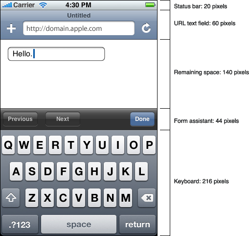
When a keyboard and the form assistant are not displayed, there is an additional 216 pixels of vertical space available (in portrait orientation) for the display of your webpage (as shown in Figure 4-5).
In landscape orientation, two of the values differ: The keyboard height is 162 pixels, and the form assistant height is 32 pixels.
Notice that the keyboard in Figure 4-12 displays a return button in the lower-right corner. The label of this button can change, depending on the type of the input control. For example, a search field causes the lower-right button to be labeled Search.
For information on available configuration options for forms and the keyboard, see “Designing Forms”.
The Pop-up Menu
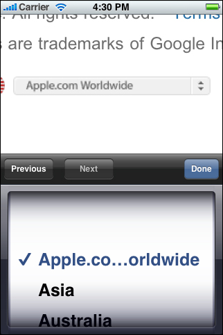
When users tap a pop-up menu style selection control in a webpage or iPhone web application, Safari on iPhone displays a custom user interface control that differs from the corresponding control Safari displays on the desktop. In Safari on the desktop, a pop-up menu that contains a large number of items displays as it does in a Mac OS X application; that is, the menu opens to display all items, extending past the window boundaries, if necessary. Users can scroll through the list itself to see each item.
On the small iPhone screen, however, it’s too difficult for users to scroll through an open menu without also scrolling the surrounding page. Therefore, Safari on iPhone automatically displays a unique style of list when users tap a pop-up menu control. Figure 4-13 shows the list Safari on iPhone displays when a user taps the Apple.com Worldwide pop-up menu on the Apple website.
Create Custom Form Controls
The WebKit engine that Safari on iPhone uses allows you to style your own form controls. Using CSS, you can create custom checkboxes, text fields, selection elements, and other form controls specifically for display on iPhone.
Although you can style form controls any way you want, you should focus on designing controls that are easy to use, attractive, and consistent both within your content and, as much as possible, with built-in iPhone controls. (For more information on the principles of ease of use and consistency, see “Principles and Guidelines for Creating Great iPhone Content.”) In particular, keep in mind the following:
Create controls that are at least 29 pixels high and provide a target area that’s 44 pixels high.
Users tap controls with their fingers, so controls that are too small are frustrating and difficult to use. Following this recommendation for control size ensures that users can successfully tap a control without mistakenly tapping a nearby control.
Design your controls to be consistent with each other.
Different instances of the same type of control should not be greatly dissimilar in size and style unless you need to use the differences to communicate something to users. Users assume there is a reason for user interface elements to look different, so it’s a good idea to work with this assumption and not against it. See “Consistency” for more information about the principle of consistency.
Style your controls to coordinate with the design of your user interface and enhance the message you present to users.
A pleasing user interface design encourages users to return to your webpage or application. Knowing as much as possible about your user audience helps you design the best controls for your webpage’s user interface. See “Design for Your Users” for more information about defining your user audience.
Be Aware of Default Control Styles
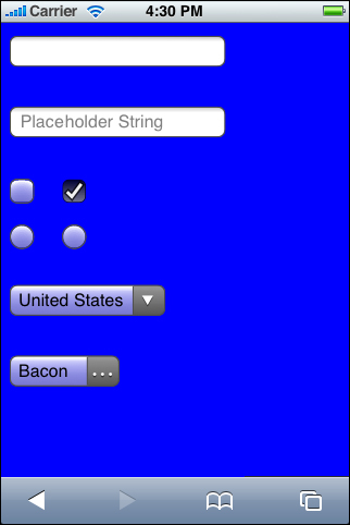
As with Safari on the desktop, Safari on iPhone provides default styles for form controls in your webpage or iPhone web application. Whereas Safari on the desktop supplies Aqua controls by default, Safari on iPhone supplies default control styles that are specific to iPhone. Before you design custom form control styles, look at the default control styles you get automatically, shown in Figure 4-14:
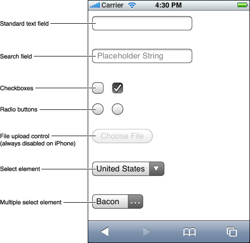
The first five form control types shown in Figure 4-14 are produced by specifying different values for the type attribute of the input HTML tag (to learn more about the input tag, see Safari HTML Reference). Table 4-1 shows the value used for each type.
Control description | Value of |
|---|---|
Standard text field |
Note that the standard text field is the default type of the |
Search field |
|
Checkbox |
|
Radio button |
|
File upload control Note that this control is always disabled on iPhone, because iPhone does not support file uploading. |
|
Note: Safari on iPhone does not display the text “Placeholder String” in the search field control by default; it is added by specifying this text in the placeholder attribute.
The two selection controls shown in Figure 4-14 are both created using the select HTML tag. To display a list of items from which users can choose only one at a time, use the select tag and supply a set of option elements that represent the items. By default, Safari on iPhone displays the closed state of this control in a style that resembles a closed pop-up menu on the desktop.
To display a list of items from which users can choose more than one at a time, use the select tag with the multiple attribute and supply a set of option elements that represent the items. By default, Safari on iPhone displays the closed state of this control in the same way it displays a closed single selection control, except that it displays an ellipsis character (…) in place of the downward triangle to indicate additional selections.
When users tap either the single or multiple selection control, Safari on iPhone reveals the list of items in a custom scrolling list, as shown in Figure 4-13. See “The Pop-up Menu” for more information on how users interact with this type of control.
Although the checkbox, radio button, and selection controls shown in Figure 4-14 appear to have a white background, by default the background of these controls is translucent. As a result, the controls blend better with the background of your webpage. Using CSS properties, however, you can change this default translucency or set a specific background color. Figure 4-15 shows the translucency of the checkbox, radio button, and selection controls by placing them on a blue background.
Figure 4-15 Checkboxes, radio buttons, and selection controls rendered by Safari on iPhone have a translucent background by default
Provide a Custom Navigation Solution
Navigation is a necessity in both webpages and iPhone web applications. The combination of the way users interact with iPhone and the size of the iPhone screen makes easy, accurate navigation essential.
In accordance with webpage design best practices and the principles of simplicity and focus (described in “Simplicity and Ease of Use” and “Focus”), you should avoid requiring users to move through too many pages to get to what they’re interested in. Tapping too many times on iPhone is as annoying as clicking too many times in a desktop browser. It is also irritating if your webpage requires users to pan to a different location on the page to reveal the control that takes them to the next page.
Safari on iPhone, like Safari on the desktop, provides a back button (it’s the left-pointing arrow on the left end of the button bar, as shown in Figure 4-5). When users tap this back button, Safari on iPhone opens the previously visited URL. Under certain circumstances, this behavior may present a problem. For example, if your webpage or iPhone web application preserves its own context and displays different pages with a single URL, users may assume that tapping the Safari on iPhone back button will return them to the previously viewed page, when in fact it returns them to the previously viewed website. This is an especially important problem for iPhone web applications to solve, because an iPhone web application strives to emphasize its similarities to built-in iPhone applications and to downplay the fact that it is a web application viewed in Safari on iPhone.
If you’re developing an iPhone web application or if your webpage maintains its own context, you can address this issue by designing a custom control that helps users navigate your content, as described next.
Important: This is not a recommendation to design another back button; providing redundant controls is a user interface design error.
To enable custom navigation, follow these steps:
On each page, including the first page, clearly and succinctly title each link to a subsequent page. If possible, use a one-word title.
Be sure the title of each subsequent page is identical to the title you used in the text that links to it.
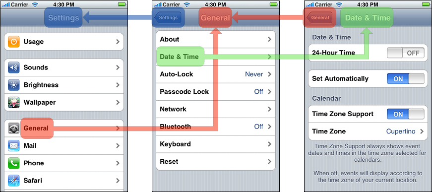
Add a custom navigational control to the upper-left corner of every page except the first page, and label it with the title of the page the user visited previously.
When users move from one page to another, they can easily return to the previous page because your custom navigational control always displays the title of the previous page. Figure 4-16 shows how this looks in a few pages of the built-in Settings application.
Providing a custom navigational control encourages users to ignore the built-in button bar while they are in your application, decreasing the possibility that they will mistakenly tap the Safari on iPhone back button and strengthening the feeling that they are using a standalone application. The built-in iPhone applications use this method to good effect, which means that users are already accustomed to it.
Pay Attention to Text
For most webpages, the automatic zooming that Safari on iPhone performs in response to user gestures is sufficient to allow users to read the content with ease. For in-depth information on how Safari on iPhone zooms and centers content, see “Creating Compatible Web Content”. In addition, following web-design best practices, such as avoiding fonts, font colors, and font sizes that are difficult to read, and displaying text in a column format, is probably all you need to do to display clear, easily readable text in your webpage.
Note: Even though Safari on iPhone supports a wide range of built-in fonts, it’s best to use the most readable fonts, such as Helvetica, for most of the text you display. For example, you may have a good design reason to display a word or two in Zapfino, but using it for all the text on your webpage can make your content difficult to read.
If you’re developing an iPhone web application, on the other hand, you might want to go a bit further to ensure your text is easy to read and helps focus the user’s attention on your content. The following list presents guidelines that help you save space and make text more readable in your application:
Use a 17-pixel to 22-pixel font.
Use bold for emphasis, to delineate list items, or to show hierarchy or sort order (see Figure 4-10 and Figure 4-11 for examples).
Make each label as succinct as possible, begin it with a capital letter, and do not follow it with a colon.
Left align text, especially in a list layout.
Consider avoiding the underlined style for displaying links, because it can make the text appear crowded.
Last updated: 2010-01-29