Designing Forms
There are many adjustments you can make to your forms so that they work better on iPhone OS. The forms should fit neatly on the iPhone OS screen, especially if you are designing a web application specifically for iPhone OS. Web applications can have a rich user interface and even look like native applications to the user. Consequently, the user may expect them to behave like native applications, too.
This chapter explains what you can do to make your forms work well on iPhone OS:
Take into account the available screen space when the keyboard is and isn’t displayed.
Use CSS extensions to create custom controls.
Control where automatic correction and capitalization are used.
See iPhone Human Interface Guidelines for Web Applications for more tips on laying out forms and designing web applications for iPhone OS. Read “Hiding Safari User Interface Components” for how to use the full-screen like a native application.
Laying Out Forms
The available area for your forms changes depending on whether or not the keyboard is displayed on iPhone OS. You should compute this area and design your forms accordingly.
Figure 5-1 shows the layout of Safari controls when the keyboard is displayed on iPhone. The status bar that appears at the top of the screen contains the time and Wi-Fi indicator. The URL text field is displayed below the status bar. The keyboard is used to enter text in forms and is displayed at the bottom of the screen. The form assistant appears above the keyboard when editing forms. It contains the Previous, Next, and Done buttons. The user taps the Next and Previous buttons to move between form elements. The user taps Done to dismiss the keyboard. The button bar contains the back, forward, bookmarks, and page buttons and appears at the bottom of the screen. The tool bar is not visible when the keyboard is visible. Your webpage is displayed in the area below the URL text field and above the tool bar or keyboard.
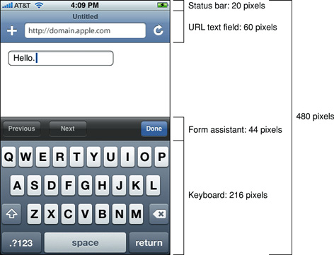
Table 5-1 contains the metrics for the objects that you need to be aware of, in both portrait and landscape orientation, when laying out forms to fit on iPhone and iPod touch.
Object | Metrics in pixels |
|---|---|
Status bar | Height = 20 |
URL text field | Height = 60 |
Form assistant | Height = 44 |
Keyboard | Portrait height = 216 Landscape height = 162 |
Button bar | Portrait height = 44 Landscape height = 32 |
Use this information to compute the available area for your web content when the keyboard is and isn't displayed. For example, when the keyboard is not displayed, the height available for your web content on iPhone is 480 - 20 - 60 - 44 = 356. Therefore, you should design your content to fit within 320 x 356 pixels in portrait orientation. If the keyboard is displayed, the available area is 320 x 140 pixels on iPhone.
iPhone OS Note: In iPhone OS 1.1.4 and earlier, the keyboard height in landscape orientation on iPhone and iPod touch was 180 pixels.
Customizing Form Controls
Form controls in Safari on iPhone OS are resolution independent and can be styled with CSS specifically for iPhone OS. You can create custom checkboxes, text fields, and select elements.
For example, you can create a custom checkbox designed for iPhone OS as shown in Figure 5-2 with the CSS code fragment in Listing 5-1. This example uses the -webkit-border-radius property—an Apple extension to WebKit. See Safari CSS Reference for details on more WebKit properties.
Listing 5-1 Creating a custom checkbox with CSS
{ |
width: 100px; |
height: 100px; |
-webkit-border-radius:50px; |
background-color:purple; |
} |
Figure 5-3 shows a custom text field with rounded corners corresponding to the CSS code in Listing 5-2.
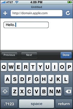
Listing 5-2 Creating a custom text field with CSS
{ |
-webkit-border-radius:10px; |
} |
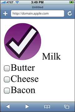
Figure 5-4 shows a custom select control corresponding to the CSS code in Listing 5-3.
Listing 5-3 Creating a custom select control with CSS
{ |
background:red; |
border: 1px dashed purple; |
-webkit-border-radius:10px; |
} |
Configuring Automatic Correction and Capitalization
You can also control whether or not automatic correction or capitalization are used in your forms on iPhone OS. Set the autocorrect attribute to on if you want automatic correction and the autocapitalize attribute to on if you want automatic capitalization. If you do not set these attributes, then the browser chooses whether or not to use automatic correction or capitalization. For example, Safari on iPhone OS turns the autocorrect and autocapitalize attributes off in login fields and on in normal text fields.
For example, the following lines turn the autocorrect attribute on:
<input autocorrect = "on"/> |
<input autocorrect> |
The following line turns the autocorrect attribute off:
<input autocorrect = "off"> |
Last updated: 2010-03-24