Principles and Guidelines for Creating Great iPhone Content
Great iPhone content embodies many of the characteristics of great computer applications and is informed by many of the same design principles. One such principle, understanding your users, is a cornerstone of user experience and user interface design, whether you are designing a webpage, an iPhone web application, or a computer application. (Read “Design for Your Users” for more information on how to define your user audience and create a product definition statement.) This chapter describes the essential principles of human interface design behind great iPhone content and provides guidelines that help you incorporate these characteristics in your webpage or iPhone web application.
At a high level, the advice and guidelines in this chapter are applicable to both webpages and iPhone web applications. After all, characteristics such as simplicity, focus, and clear communication are essential ingredients of a great user experience, whether that experience involves reading a webpage or using an application. The differences lie primarily in the interpretation and implementation of the guidelines.
For example, one of the ways to achieve simplicity is to avoid the clutter of too many visual elements that compete for the user’s attention. In a webpage, you might do this by reducing the number of ads, images, and links. In an iPhone web application, you might do this by reducing the number of controls, shortening the displayed text, avoiding purely decorative elements, and ensuring adequate spacing between controls.
Simplicity and Ease of Use
Simplicity and ease of use are fundamental principles for creating all types of software, but in iPhone content they are critical. As described in “iPhone and Its Place in the User’s World,” iPhone users are probably doing other things while they simultaneously view or use your content on iPhone. If users can’t quickly figure out how to use your content, they’re likely to move on to something else and not come back.
As you design the flow of your content and its user interface, follow these guidelines to build in simplicity and ease of use:
Make it obvious how to use your content.
Avoid clutter, unused blank space, and busy backgrounds.
Minimize required user input.
Express essential information succinctly.
Provide a fingertip-sized target area for all links and controls.
Avoid unnecessary interactivity.
The following sections explain each guideline for simplicity and ease of use in more detail.
Make It Obvious
You can’t assume that users have the time (or can spare the attention) to figure out how your content works. Therefore, you should strive to make your web content instantly understandable to users.
In a webpage, you should display the most important information and functionality prominently. Remember that users view your webpage in a small screen, probably with some of their attention elsewhere. As a result, panning, scrolling, or paging past irrelevant elements to find valuable information can be irritating.
For example, Apple’s main website, shown in Figure 3-1, prominently displays featured products; users can get more information about them with a tap.

In an iPhone web application, the main function should be immediately apparent. You can do this by minimizing the number of controls from which users have to choose and labeling them clearly so users understand exactly what they do. For example, in the built-in Stopwatch function (part of the Clock application), shown in Figure 3-2, users can see at a glance which button stops and starts the stopwatch and which button records lap times.

Avoid Clutter
A webpage that is cluttered with many different sizes and styles of elements, different sizes and colors of text, and gratuitous images presents an unpleasant user experience. Viewed in the small iPhone screen, the negative effects of clutter are magnified, making webpages that might be acceptable on the desktop difficult to use on iPhone.
In both webpages and iPhone web applications, it’s important to avoid overloading users with a profusion of images and elements. Space is at a premium in the iPhone screen, so you should display only those elements that provide essential information or functionality in the current context. For the most part, avoid displaying elements and images that are purely decorative.
It’s also important to avoid leaving too much blank space around your content. If blank space separates important content, users must pan or scroll past it to reach that content. If a lot of blank space is concentrated around the edges of your webpage, it makes your webpage look poorly laid out. Whether you’re designing a webpage or an iPhone web application, you should use only enough blank space to make controls easy to tap accurately and to make images and text look uncrowded.
Minimize Required Input
Inputting information takes time and attention, whether users tap your controls or use the iPhone keyboard. If your application requires a lot of user input, either all at once or before users can begin using your content, it slows users down and can discourage them from persevering with your site.
Of course, you often need some information from users to tailor the content or task to their needs, but you should balance this with what you offer users in return. In other words, strive to provide as much information or functionality as possible for each piece of information users provide. That way, users feel they are making progress and are not being delayed as they attempt to reach the important parts of your content.
For example, a website that helps users purchase concert tickets might first ask users for input—such as artist name, concert dates, and locations—before displaying a list of concerts that meet these criteria. Finally, the website would give users a way to purchase the tickets they’ve selected. In an iPhone web application that performs the same function, however, it’s better to avoid requiring users to supply a lot of information before they can get to the main purpose, which is to buy tickets. Therefore, this iPhone web application might first display a short list of the most popular concerts scheduled in the next few weeks. In this way, most users can make progress toward their goal before they have to supply the information required to make a purchase.
Consider using cookies to store previously input information to avoid asking for it again. You can also use cookies to remember where users were the last time they accessed your webpage or application. Cookies can help you tailor your content to users as soon as they arrive at your content.
When you ask for input from users, consider using lists (or pop-up menus) instead of text fields whenever possible. It’s usually easier for users to select an item from a list than to type words. By default, Safari on iPhone displays pop-menus in an easy-to-use, aesthetically pleasing way. See Figure 4-13 for an example.
Express Information Succinctly
When your user interface text is short and direct, users can quickly and easily absorb it. Therefore, identify the most important information, express it concisely, and display it prominently so users don’t have to read too many words to find what they’re looking for or to figure out what to do next.
To help you do this, think like a newspaper editor and strive to convey information in a condensed, headline style. Give controls short labels (or use well-understood symbols) so users understand how to use them at a glance.
Provide Fingertip-Sized Targets
If your layout places links and controls too close together, users must spend extra time and attention being careful where they tap and are more likely to tap the wrong element. A simple, easy-to-use user interface spaces controls and other user-interaction elements so that users can tap accurately with a minimum of effort. “Metrics, Layout Guidelines, and Tips” contains some specific metrics you can use in your layout.
For example, the built-in Calculator application displays large, easy-to-tap controls that each have a target area of about 44 x 44 pixels. Figure 3-3 shows the Calculator iPhone application.

Avoid Unnecessary Interactivity
Interactivity, not including required user input, is often used to engage users’ interest and imagination. For example, some webpages present elaborate entry pages users must pass through before getting to the main content. Although an entry page might be acceptable in a webpage viewed on the desktop, when viewed on iPhone it merely prevents users from reaching your content quickly. In your iPhone solution, make sure you use interactivity to get users closer to their goal and avoid interactivity that serves no functional purpose.
Another form of interactivity in a webpage is the use of elements and images that hide their functionality until users interact with them by, for example, mousing over them. This design doesn’t work well on iPhone for two reasons. The first is that you do not receive an event equivalent to a mouseover, so such elements and images do not reveal their functionality to iPhone users. The second is that this type of interactivity adds an unnecessary layer of indirection between users and the content they want to view. Therefore, you should avoid interactivity that can be replaced by simple, straightforward elements.
If you’re designing an iPhone web application, your content is, by definition, interactive. However, you should examine your design and eliminate those interactive elements that don’t provide essential functionality and consider replacing others with simple, clearly labeled controls.
Focus
A webpage or iPhone web application that establishes and maintains focus on its prime functionality is rewarding and enjoyable to use. Especially critical for iPhone web applications, focus strengthens the user’s perception of your content as a standalone solution. As you design your content, therefore, stay focused on your product definition statement and make sure every feature and user interface element supports it. See “Design for Your Users” for some advice on how to create a product definition statement.
In an iPhone web application, a good way to achieve focus is to determine what’s most important in each context. As you decide what to display on each page always ask yourself, is this critical information or functionality users need right now? If not, decide if the information or functionality is critical in a different context or if it’s not that important after all. For example, an iPhone web application that helps users keep track of car mileage loses focus on this functionality if it also displays the car’s maintenance history.
Following the guidelines for making your content simple and easy to use also helps make your content focused. In particular, avoiding clutter and unnecessary interactivity, and minimizing user input make it easier for users to arrive quickly at the most important parts of your content, which tightens the focus on your solution (for specifics on these guidelines, see “Simplicity and Ease of Use”).
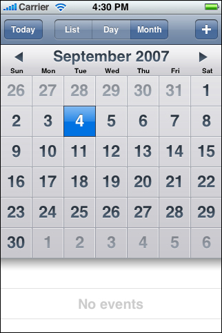
For example, the built-in Calendar application (shown in Figure 3-4) is focused on days and the events that occur on them. Users can use the clearly labeled buttons to highlight the current day, select a viewing option, and add events. The most important information, days and the events associated with them, is the most prominent. User input is simplified by allowing users to choose from lists of event times, repetition intervals, and alert options, instead of requiring keyboard entry for all input.
Communication
Communication and feedback are as important in webpages and web applications are they are in desktop applications. Users need to know that their requests are being processed and when their actions might result in data loss or other problems. On the other hand, it’s also important to avoid overdoing it by, for example, alerting the user to conditions that aren’t really serious or asking for confirmation too often.
Here are some guidelines to help you provide the right level of communication and feedback:
Use user-centric terminology.
Avoid technical jargon in the user interface. Use what you know about your users to determine whether the words and phrases you plan to use are appropriate. For example, if your content targets soccer fans, it might be appropriate to use terms and abbreviations that are commonly used in the sport. On the other hand, if your user audience includes fans of many different sports, it’s better to avoid relying on terms that are specific to only one sport.
In an iPhone web application, provide embedded navigational functionality, when appropriate.
In iPhone web applications that preserve their own context and contain multiple pages through which users can navigate, it’s a good idea to provide custom navigation controls. This minimizes the browser experience and helps users avoid inadvertently jumping to a different website. For information on how to do this, see “Provide a Custom Navigation Solution.”
Provide feedback when necessary.
If you need to tell the user something important, such as asking for confirmation of input data before the user taps a submit button, you can use the JavaScript
alertelement. (Safari on iPhone displays such a JavaScript alert as shown in Figure 3-5.)If your webpage or iPhone web application is communicating with the server or downloading its resources, it might be appropriate to let users know that progress is being made, so they don’t think that your content has stopped responding. You can create and display a progress indicator for this purpose. If possible, display the progress indicator next to the element that is associated with the processing. You should avoid displaying a progress indicator in a JavaScript alert, however, unless the entire website or iPhone web application is busy.

Consistency
Consistency across user interfaces allows users to apply knowledge they’ve gained from other webpages and applications to new content. For webpages, there are many examples of good website design with which to be consistent. But for web applications, iPhone presents a different platform and a different way of doing things. With what should you be consistent?
To the extent that you can, emulate the clean lines and layout of the built-in iPhone applications. Use a color palette that subtly unifies your content. And, where appropriate, design controls to look and behave like the controls in the built-in iPhone applications. See “Metrics, Layout Guidelines, and Tips” for some specific guidelines to help you do these things.
For example, the World Clock function of the built-in Clock application (shown in Figure 3-6) uses the same style of button and the same fonts and font attributes used in many other built-in applications. In addition, World Clock displays the user-selected locations in a scrollable list, which works like the lists in other built-in applications. Consistency of appearance and function helps users know what to expect when they tap a button or see a list.
Figure 3-6 The controls and list of the built-in World Clock function make it consistent with other built-in applications

Consistency within a user interface is at least as important as consistency with other user interfaces. Remember that iPhone users don’t want to spend time discovering and working around the idiosyncrasies of your user interface; they want to be able to use your content as soon as they view it on iPhone. Therefore, you should reward their attention by ensuring that controls and features work as users have learned to expect.
If, for example, you use the same control to perform different actions, you make it impossible for users to apply what they’ve learned from their earlier encounter with the control and predict the outcome of their gesture. Because iPhone users may have little patience with an application that doesn’t behave consistently, an inconsistent user interface can alienate your audience.
Responsiveness
Responsiveness means that an iPhone web application or webpage is perceived to respond quickly and accurately to users' requests and gestures. Responsiveness in an iPhone web application or webpage is even more important than it is in an application or webpage on the desktop, because users are constantly aware of the passage of time, both in terms of the flow of real-world events and in the usage of the battery.
As described in “Network Connectivity,” you can’t predict what network speed users experience at any given time, because iPhone automatically switches to the currently available network. As a general rule, therefore, you should design your solution so that it loads quickly and works well at the slowest connection speed. In addition, be sure to provide adequate feedback on potentially lengthy processes (as described in “Communication”) so that users know your content is still responding.
If your webpage or iPhone web application seems unresponsive, users may not give it a second chance. Here are some things you can do to increase perceived performance:
Optimize images.
Be mindful of the recommended limits on image sizes (for specifics on these limits, see “Creating Compatible Web Content”) and supply reduced-size images whenever possible.
Consider using JavaScript to draw elements, such as controls and backgrounds, instead of adding existing images to your resources.
Handle video and audio content correctly.
iPhone streams movies and audio using HTTP over cellular and Wi-Fi networks. See “Creating Video” for details on how to ensure a great audio and video experience on iPhone.
Make sure JavaScript execution does not exceed 5 seconds for each top-level entry point.
Execution longer than 5 seconds raises an exception and makes your webpage seem unresponsive.
Be mindful of resource limits.
Make sure your webpage or application does not contain unneeded JavaScript, which consumes memory resources without providing any benefit.
Interoperability
An iPhone webpage or application is interoperable when it works seamlessly with built-in iPhone applications and features. It’s natural to focus only on your own content, but it’s important to remember the other things users can do with their iPhones and the larger environment in which they’re operating. The better your content handles interruptions and, when appropriate, integrates with iPhone features, the more useful your webpage or application is.
The iPhone environment includes features such as phone, iPod, email, and web browser functionality. There are two main ways to take this environment into account as you design your webpage or iPhone web application:
Make sure your content can handle frequent interruptions.
Users are likely to quickly switch between webpages, applications (both built-in and external), and iPhone functions, so you should perform frequent server-side saves of user data and state. Because there is no concept of quitting an application on iPhone, you won’t get any notification when users decide to switch from your webpage to another webpage or to a built-in application.
Remember that there is no local storage on iPhone that is available to your application. Therefore, you need to make sure you save important information when you can. And, if users are in the midst of providing information to your webpage (by filling in a form, for example), you should alert them to the possibility of data loss if they navigate away from your webpage before they are finished. (See “Communication” for more information on communicating with users.)
Make it easy for users to use built-in iPhone features and applications.
Where appropriate, you can include links that allow users to make a phone call, open Mail, look at Google maps, or view YouTube videos. See Apple URL Scheme Reference for details on how to add these links to your content.
Adaptability
Users can view iPhone content in landscape or portrait orientation, and they can be connected through Wi-Fi or EDGE. Your webpage or application, however, probably won’t know when these things change. Fundamentally, this means two things:
Avoid making assumptions about the way users view your content or the speed of the connection. Design and optimize your webpage or application to work well at slower connection speeds and in both portrait and landscape orientations.
If possible, avoid absolute positioning in your layout. This is because text that appears in absolute-positioned elements can overflow the screen after users zoom in.
Last updated: 2010-01-29