A Closer Look at Table-View Cells
A table view uses cell objects to draw its visible rows and caches those objects as long as the rows are visible. These objects inherit from the UITableViewCell class. The table view’s data source provides the cell objects to the table view by implementing the tableView:cellForRowAtIndexPath: method, a required method of the UITableViewDataSource protocol. The following sections describe the characteristics of table-view cell objects, explain how to use the default capabilities of UITableViewCell for setting cell content, and show how to create custom UITableViewCell objects.
Characteristics of Cell Objects
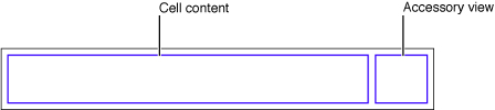
A cell object has various parts which can change depending on the mode of the table view. Normally, most of a cell object is reserved for its content: text, image, or any other kind of distinctive identifier. As shown in Figure 5-1, a smaller area on the right side of the cell is reserved for accessory views: disclosure indicators, detail disclosure controls, control objects such as sliders or switches, and custom views. Figure 5-1 shows the major parts of a cell.
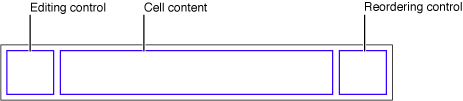
When the table view goes into editing mode, the editing control for each cell object (if it’s configured to have such a control) appears on its left side in the area shown in Figure 5-2; the editing control can be either a deletion control (a red minus sign inside a circle) or an insertion control (a green plus sign inside a circle). The cell’s content is pushed toward the right to make room for the editing control. If the cell object is configured for reordering (that is, relocation within the table view), the reordering control appears in the right side of the cell, next to any accessory view specified for editing mode. The reordering control is a stack of horizontal lines; to relocate a row within its table view, users press on the reordering control and drag the cell.
If a cell object is reusable—the typical case—the data source assigns the cell object a reuse identifier (an arbitrary string) when it creates the cell. The table view stores the cell object in an internal queue. When the table view subsequently requests another cell object, the data source can access the queued object by sending a dequeueReusableCellWithIdentifier: message to the table view, passing in a reuse identifier. The data source simply sets the content of the cell and any special properties before returning it. This reuse of cell objects is a performance enhancement because it eliminates the overhead of cell creation. Having multiple cell objects in a queue, each with its own identifier, makes it possible to have table views constructed from cell objects of different types. For example, some rows of a table view could have content based on the image and text properties of a UITableViewCell in a predefined style while other rows could be based on a customized UITableViewCell that defines a special format for its content.
When providing cells for the table view, there are three general approaches you can take. You can either use ready-made cell objects in a range of styles; you can add your own subviews to the cell object’s content view (which can be done in the Interface Builder application); or you can use cell objects created from a custom subclass of UITableViewCell. Note that the content view is only a container of other views and displays no content itself.
Using Cell Objects in Predefined Styles
Using the UITableViewCell class directly, you can create “off the shelf” cell objects in a range of predefined styles. “Standard Styles for Table-View Cells” describes these standard cells and provides examples of how they look in a table view. These cells are associated with the following enum constants, declared in UITableViewCell.h::
typedef enum { |
UITableViewCellStyleDefault, |
UITableViewCellStyleValue1, |
UITableViewCellStyleValue2, |
UITableViewCellStyleSubtitle |
} UITableViewCellStyle; |
Note: The predefined cell styles and their corresponding content properties were introduced in iOS 3.0.
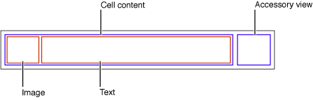
These cell objects have two kinds of content: one or more titles (text strings) and, in some cases, an image. Figure 5-3 shows the approximate areas for image and text. As an image expands to the right, it pushes the text in the same direction.
The UITableViewCell class defines properties for cell content in these predefined cell styles:
textLabel—The main label for text in the cell (aUILabelobject)detailTextLabel—The secondary label for text in the cell when there is additional detail (aUILabelobject)imageView—An image view to hold an image (aUIImageViewobject)
Because the first two of these properties are labels, you can set the font, alignment, line-break mode, and color of the associated text through the properties defined by the UILabel class (including the color of text when the row is highlighted). For the image-view property, you can also set an alternate image for when the cell is highlighted using the highlightedImage property of the UIImageView class.
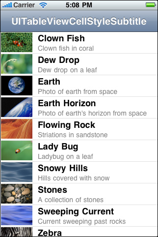
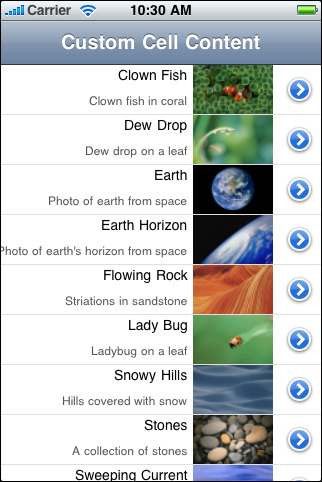
Figure 5-4 gives an example of a table view whose rows are drawn using a UITableViewCell object in the UITableViewCellStyleSubtitle style; it includes both an image and, for textual content, a title and a subtitle.
Listing 5-1 shows the table view data source implementation of tableView:cellForRowAtIndexPath: that creates the table view in Figure 5-4. Typically, the first thing the data source should do is send dequeueReusableCellWithIdentifier: to the table view, passing in a reuse-identifier string. If the table view does not return a reusable cell object, the data source creates one, assigning the object a reuse identifier in the final parameter of initWithStyle:reuseIdentifier:. At this point it also sets sets general properties of the cell object for the table view (in this case, its selection style). Then it sets the cell object’s content, both text and image.
Listing 5-1 Configuring a UITableViewCell object with both image and text
- (UITableViewCell *)tableView:(UITableView *)tableView cellForRowAtIndexPath:(NSIndexPath *)indexPath { |
UITableViewCell *cell = [tableView dequeueReusableCellWithIdentifier:@"MyIdentifier"]; |
if (cell == nil) { |
cell = [[UITableViewCell alloc] initWithStyle:UITableViewCellStyleSubtitle reuseIdentifier:@"MyIdentifier"]; |
cell.selectionStyle = UITableViewCellSelectionStyleNone; |
} |
NSDictionary *item = (NSDictionary *)[self.content objectAtIndex:indexPath.row]; |
cell.textLabel.text = [item objectForKey:@"mainTitleKey"]; |
cell.detailTextLabel.text = [item objectForKey:@"secondaryTitleKey"]; |
NSString *path = [[NSBundle mainBundle] pathForResource:[item objectForKey:@"imageKey"] ofType:@"png"]; |
UIImage *theImage = [UIImage imageWithContentsOfFile:path]; |
cell.imageView.image = theImage; |
return cell; |
} |
The table view’s data source implementation of tableView:cellForRowAtIndexPath: should always reset all content when reusing a cell.
When you configure a UITableViewCell object, you also can set various other properties including (but not limited to) the following:
selectionStyle—Controls the appearance of the cell when selected.accessoryTypeandaccessoryView—Allows you to set one of the standard accessory views (disclosure indicator or detail disclosure control) or a custom accessory view for a cell in normal (non-editing) mode. For a custom view, you may provide anyUIViewobject, such as a slider, a switch, or a custom view.editingAccessoryTypeandeditingAccessoryView—Allows you to set one of the standard accessory views (disclosure indicator or detail disclosure control) or a custom accessory view for a cell in editing mode. For a custom view, you may provide anyUIViewobject, such as a slider, a switch, or a custom view. (These properties were introduced in iOS 3.0.)showsReorderControl—Specifies whether it shows a reordering control when in editing mode. The related but read-onlyeditingStyleproperty specifies the type of editing control the cell has (if any). The delegate returns the value of theeditingStyleproperty in its implementation of thetableView:editingStyleForRowAtIndexPath:method.backgroundViewandselectedBackgroundView—Provides a background view (when a cell is unselected and selected) to display behind all other views of the cell.indentationLevelandindentationWidth—Specifies the indentation level for cell content and the width of each indentation level.
Because a table-view cell inherits from UIView, you can also affect its appearance and behavior by setting the properties defined by that superclass. For example, to affect the background color a cell, you could set its backgroundColor property. Listing 5-2 shows how you might alternate the background color of rows (via their backing cells) in a table view.
Listing 5-2 Alternating the background color of cells in tableView:willDisplayCell:forRowAtIndexPath:
- (void)tableView:(UITableView *)tableView willDisplayCell:(UITableViewCell *)cell forRowAtIndexPath:(NSIndexPath *)indexPath { |
if (indexPath.row == 0 || indexPath.row%2 == 0) { |
UIColor *altCellColor = [UIColor colorWithWhite:0.7 alpha:0.1]; |
cell.backgroundColor = altCellColor; |
} |
} |
Listing 5-2 also illustrates an important aspect of the table-view API. A table view sends a tableView:willDisplayCell:forRowAtIndexPath: message to its delegate just before it draws a row. If the delegate chooses to implement this method, it can make last-minute changes to the cell object before it is displayed. In this method the delegate should change state-based properties set earlier by the table view, such as selection and background color, and not content.
Customizing Cells
UITableViewCell objects in their various predefined styles suffice for most of the rows that table views display. With these ready-made cell objects, rows can include one or two styles of text, often an image, and an accessory view of some sort. The application can modify the text in its font, color, and other characteristics, and it can supply an image for the row in its selected state as well as its normal state.
However, as flexible and useful as this cell content is, it might not satisfy the requirements of all applications. For example, the labels permitted by a native UITableViewCell object are pinned to specific locations within a row, and the image must appear on the left side of the row. If you want the cell to have different content components and to have these laid out in different locations, or if you want different behavioral characteristics for the cell, you have two alternatives. You can add subviews to the contentView property of the cell object or you can create a custom subclass of UITableViewCell.
You should add subviews to a cell’s content view when your content layout can be specified entirely with the appropriate autoresizing settings and when you don’t need to modify the default behavior of the cell.
You should create a custom subclass when your content requires custom layout code or when you need to change the default behavior of the cell, such as in response to editing mode.
The following sections discuss both approaches.
Programmatically Adding Subviews to a Cell’s Content View
A cell that a table view uses for displaying a row is a view (UITableViewCell inherits from UIView). As a view, a cell has a content view—a superview for cell content—that it exposes as a property. To customize the appearance of rows in a table view, you can add subviews to the cell’s content view, which is accessible through its contentView property, and lay them out in the desired locations in their superview’s coordinates. You may configure and lay them out programmatically or in Interface Builder. (The approach using Interface Builder is discussed in “Loading Custom Table-View Cells From Nib Files.”)
One advantage of this approach is its relative simplicity; it doesn’t require you to create a custom subclass of UITableViewCell and handle all of the implementation details required for custom views. However, if you do take this approach, avoid making the views transparent, if you can. Transparent subviews affect scrolling performance because of the increased compositing cost. Subviews should be opaque, and typically should have the same background color as the cell. And if the cell is selectable, make sure that the cell content is highlighted appropriately when selected; this happens automatically if the subview implements (if appropriate) the accessor methods for the highlighted property.
Let’s say you wanted a cell with text and image content in entirely different locations than those provided by the standard cell styles. For example, you want the image on the right side of the cell and the title and subtitle of the cell right-aligned against the left side of the image. Figure 5-5 show how a table view with rows drawn with such a cell might look. (This example is for illustration only, and is not intended as a human-interface model.)
The code example in Listing 5-3 illustrates how the data source programmatically composes the cell with which this table view draws its rows. In tableView:cellForRowAtIndexPath:, it first checks to see the table view already has a cell object with the given reuse identifier. If there is no such object, the data source creates creates two label objects and one image view with specific frames within the coordinate system of their superview (the content view). It also sets attributes of these objects. Next—or if the cell already exists in the table view’s queue—the data source sets the cell’s content before returning the cell.
Listing 5-3 Adding subviews to a cell’s content view
#define MAINLABEL_TAG 1 |
#define SECONDLABEL_TAG 2 |
#define PHOTO_TAG 3 |
- (UITableViewCell *)tableView:(UITableView *)tableView cellForRowAtIndexPath:(NSIndexPath *)indexPath { |
static NSString *CellIdentifier = @"ImageOnRightCell"; |
UILabel *mainLabel, *secondLabel; |
UIImageView *photo; |
UITableViewCell *cell = [tableView dequeueReusableCellWithIdentifier:CellIdentifier]; |
if (cell == nil) { |
cell = [[[UITableViewCell alloc] initWithStyle:UITableViewCellStyleDefault reuseIdentifier:CellIdentifier] autorelease]; |
cell.accessoryType = UITableViewCellAccessoryDetailDisclosureButton; |
mainLabel = [[[UILabel alloc] initWithFrame:CGRectMake(0.0, 0.0, 220.0, 15.0)] autorelease]; |
mainLabel.tag = MAINLABEL_TAG; |
mainLabel.font = [UIFont systemFontOfSize:14.0]; |
mainLabel.textAlignment = UITextAlignmentRight; |
mainLabel.textColor = [UIColor blackColor]; |
mainLabel.autoresizingMask = UIViewAutoresizingFlexibleLeftMargin | UIViewAutoresizingFlexibleHeight; |
[cell.contentView addSubview:mainLabel]; |
secondLabel = [[[UILabel alloc] initWithFrame:CGRectMake(0.0, 20.0, 220.0, 25.0)] autorelease]; |
secondLabel.tag = SECONDLABEL_TAG; |
secondLabel.font = [UIFont systemFontOfSize:12.0]; |
secondLabel.textAlignment = UITextAlignmentRight; |
secondLabel.textColor = [UIColor darkGrayColor]; |
secondLabel.autoresizingMask = UIViewAutoresizingFlexibleLeftMargin | UIViewAutoresizingFlexibleHeight; |
[cell.contentView addSubview:secondLabel]; |
photo = [[[UIImageView alloc] initWithFrame:CGRectMake(225.0, 0.0, 80.0, 45.0)] autorelease]; |
photo.tag = PHOTO_TAG; |
photo.autoresizingMask = UIViewAutoresizingFlexibleLeftMargin | UIViewAutoresizingFlexibleHeight; |
[cell.contentView addSubview:photo]; |
} else { |
mainLabel = (UILabel *)[cell.contentView viewWithTag:MAINLABEL_TAG]; |
secondLabel = (UILabel *)[cell.contentView viewWithTag:SECONDLABEL_TAG]; |
photo = (UIImageView *)[cell.contentView viewWithTag:PHOTO_TAG]; |
} |
NSDictionary *aDict = [self.list objectAtIndex:indexPath.row]; |
mainLabel.text = [aDict objectForKey:@"mainTitleKey"]; |
secondLabel.text = [aDict objectForKey:@"secondaryTitleKey"]; |
NSString *imagePath = [[NSBundle mainBundle] pathForResource:[aDict objectForKey:@"imageKey"] ofType:@"png"]; |
UIImage *theImage = [UIImage imageWithContentsOfFile:imagePath]; |
photo.image = theImage; |
return cell; |
} |
Note that when the data source creates the cells, it assigns each subview a tag. A tag is an identifier of a view; it allows you to locate a view in its view hierarchy by calling the viewWithTag: method. If later the delegate gets the designated cell from the table view’s queue, it uses the tags to obtain references to the three subviews prior to assigning them content.
Also note that this code creates a UITableViewCell object in the predefined default style (UITableViewCellStyleDefault). However, because the content properties of the standard cells—textLabel, detailTextLabel, and imageView—are nil until assigned content, you may use any predefined cell as the template for customization.
Note: An alternative, and perhaps easier, approach for programmatically composing the same cells shown in Figure 5-5 is to subclass UITableViewCell and create instances in the UITableViewCellStyleSubtitle style. Then override the layoutSubviews method to reposition the textLabel, detailTextLabel, and imageView subviews (after calling super).
A common technique for achieving “attributed string” effects with textual content is to lay out UILabel subviews of the UITableViewCell content view. The text of each label can have its own font, color, size, alignment, and other characteristics. There can be no variation of textual attributes within a label object, so you must create multiple labels and lay them out relative to each other if you want that kind of variation within a cell.
Loading Custom Table-View Cells From Nib Files
You can easily do the same subview customizations of table-view cells in Interface Builder that you can do programmatically. Cells in nib files require you to take one of two approaches based on whether the cells are for static or dynamic row content. With dynamic content, the table view is a list with a large (and potentially unbounded) number of rows. With static content, the number of rows is a finite, known quantity; a table view that presents a detail view of an item typically has static content. These two content types have different implications for nib files. With dynamic content, each UITableViewCell object should be in its own nib file. With static content, the UITableViewCell objects used in the table view can be in the same nib file as the table view.
The following sections demonstrate different ways to load nib files containing custom-configured table-view cells. They also show different techniques for access the subviews of the cells; one technique uses tags (the tag property defined by UIView) and the other uses outlet properties declared by the custom table-view controller class. With the former technique there is a small cost associated with searching for the tagged view; with the latter technique you can access the subview directly through the outlet connection.
The Technique for Dynamic Row Content
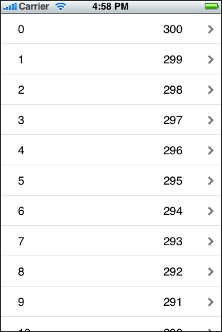
In this section you compose a simple table-view cell in Interface Builder and save it to a nib file. At runtime, the data source loads the nib file, prepares the cell, and gives it to its table view for drawing the rows depicted in Figure 5-6.
In the view controller that manages the table view (typically a UITableViewController object), define an outlet property for the customized table-view cell you are going to load from the nib file, as shown in Listing 5-4. Make sure you synthesize accessor methods for the property in the implementation file.
Listing 5-4 Defining an outlet for the cell
@interface TVController : UITableViewController { |
UITableViewCell *tvCell; |
} |
@property (nonatomic, assign) IBOutlet UITableViewCell *tvCell; |
@end |
In Interface Builder complete the following steps:
Create a nib file.
To this, choose New from the File menu, select the Empty template, and click Choose.
Save the nib file under an appropriate name and, when prompted, add it to the project.
This name is what you specify as the first argument of the
loadNibNamed:owner:options:method call that loads the nib file from the application’s main bundle. See Listing 5-5 for a code example.Drag a Table View Cell object from the Library into the nib document window.
The cell object indicates where its content view is:
Drag objects from the Library onto the content view.
For this example, drag two label objects and position them near the ends of each cell (leaving room for the accessory view).
Select the objects on the content view and set their attributes, sizes, and autoresizing characteristics.
An important attribute to set for the programmatic portion of this procedure is each object’s
tagproperty. Find this property in the View section of the Attributes pane and assign each object a unique integer.Select the cell itself and set any general attributes you want it to have, such as alignment, font size, color, line-break mode, and so on.
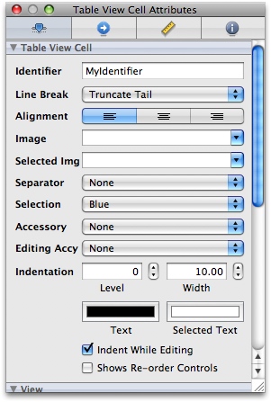
Always set a string as an identifier of the cell; the table view requires the identifier to fetch a cell from its cache, if it’s present. Setting the identifier is especially important if you have more than one kind of cell for a table view. You may also set the height and autoresizing characteristics of the cell at this time.
Select File’s Owner in the nib document window, open the Identity pane of the inspector, and set the class of File’s Owner to your custom view controller class.
Connect the cell outlet of File’s Owner (now the placeholder instance of your custom subclass) to the table-view cell object in the nib-file document.
Now save the nib file and return to the Xcode project. Write all the code you normally to obtain the table-view’s data and set up the table view. Implement the data source methods as you normally would, except for tableView:cellForRowAtIndexPath:. Implement that in a manner similar to the example in Listing 5-5.
Listing 5-5 Loading a cell from a nib file and assigning it content
- (UITableViewCell *)tableView:(UITableView *)tableView cellForRowAtIndexPath:(NSIndexPath *)indexPath { |
static NSString *MyIdentifier = @"MyIdentifier"; |
UITableViewCell *cell = [tableView dequeueReusableCellWithIdentifier:MyIdentifier]; |
if (cell == nil) { |
[[NSBundle mainBundle] loadNibNamed:@"TVCell" owner:self options:nil]; |
cell = tvCell; |
self.tvCell = nil; |
} |
UILabel *label; |
label = (UILabel *)[cell viewWithTag:1]; |
label.text = [NSString stringWithFormat:@"%d", indexPath.row]; |
label = (UILabel *)[cell viewWithTag:2]; |
label.text = [NSString stringWithFormat:@"%d", NUMBER_OF_ROWS - indexPath.row]; |
return cell; |
} |
There are a few useful aspects of this code to note:
The string identifier you assigned to the cell in Interface Builder is the same string passed to the table view in
dequeueReusableCellWithIdentifier:. The cell is loaded from the nib file as required to fill the table view. If rows are scrolled out of view, the associated cells become available in the table view’s cache.Keep in mind that the table view may request additional cells—that is, more than are present in the reuse queue—at any time for a variety of reasons. For example, if you insert a hundred new rows, the table view might ask for a hundred new cells at once, none of which will be kept in the reuse queue until after the insertion operation completes.
The nib file is loaded using the
NSBundlemethodloadNibNamed:owner:options:, which passesselfas the owner (remember, File’s Owner refers to your table-view controller).Because of the outlet connection you made, the
tvCelloutlet now has a reference to the cell loaded from the nib file. Immediately assign the cell to the passed-incellvariable and set the outlet tonil.The code gets the labels in the cell by calling
viewWithTag:, passing in their tag integers. It can then set the textual content of the labels.
The Technique for Static Row Content
In this section you compose several table-view cells in Interface Builder and save them to the same nib file that contains the table view. At runtime, when the table view is loaded from its nib file, the data source has immediate access to these cells and composes the sections and rows of the table view with them, as depicted in Figure 5-6.
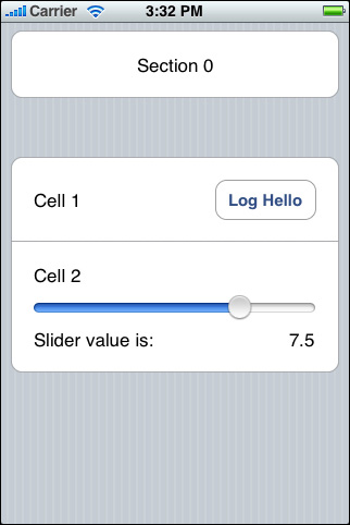
As with the procedure for dynamic content, start by adding a subclass of UITableViewController to your project. (See “Adding Table Views to the Application” for details.) Define outlet properties for each of the three cells in the nib file plus an outlet property for the slider-value label in the last cell, as shown in Listing 5-6.
Listing 5-6 Defining outlet properties for the cells in the nib file
@interface MyTableViewController : UITableViewController { |
UITableViewCell *cell0; |
UITableViewCell *cell1; |
UITableViewCell *cell2; |
UILabel *cell2Label; |
} |
@property (nonatomic, retain) IBOutlet UITableViewCell *cell0; |
@property (nonatomic, retain) IBOutlet UITableViewCell *cell1; |
@property (nonatomic, retain) IBOutlet UITableViewCell *cell2; |
@property (nonatomic, retain) IBOutlet UILabel *cell2Label; |
- (IBAction)logHello; |
- (IBAction)sliderValueChanged:(UISlider *)slider; |
@end |
Start by creating a nib file that contains a table view and make your custom table-view controller File’s Owner of the nib file. Connect the view outlet of the controller to the table view and change the style of the table view to Grouped in the Attributes pane of the inspector. (“Creating a Table View Application the Easy Way” describes how to do these things.) Then for the cells, complete the following steps:
Drag three Table View Cell objects from the Interface Builder Library into the nib document window.
Drag objects from the Library to compose the subviews of each cell as depicted here:
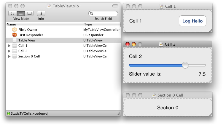
It is not necessary to assign identifiers as attributes of these cells because they are single-use cells.
Set any desired attributes of these objects.
For example, the slider should have a range of values from 0 to 10 with an initial value of 7.5.
Right-click (or Control-click) File’s Owner in the nib document window to display the connections window; make outlet connections between File’s Owner (your table-view controller) and each of the cell objects.
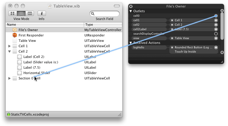
Also connect the
cell2Labeloutlet to the slider-value label. Note that giving views like these tags is not necessary with static content because you can make outlet connections to them.While you’re at it, implement the two action methods declared in Listing 5-6 and make target-action connections as shown in the above illustration.
Save the nib file, return to the Xcode project, and implement the data source methods for the table view. When the application delegate or previous table-view controller instantiates the current table-view controller, the nib file containing the table view and the table-view cells is loaded into application memory. Because the cells in the nib file are single-use cells, you need only return them to the table view (via their outlets) when it asks for them in the tableView:cellForRowAtIndexPath: method, as shown in Listing 5-7.
Listing 5-7 Passing nib-file cells to the table view
- (UITableViewCell *)tableView:(UITableView *)tableView cellForRowAtIndexPath:(NSIndexPath *)indexPath { |
if (indexPath.section == 0) { |
return cell0; |
} |
// section 1 |
if (indexPath.row == 0) { |
return cell1; |
} |
return cell2; |
} |
Even though the cells in the nib file are for static content, with each cell used only once in the table view, you can still dynamically modify their contents. For example, you could easily change the text value of the label in the first cell to a property of the current data item; Listing 5-8 illustrates how this might look.
Listing 5-8 Dynamically changing the content of a nib-file cell
// ... |
if (indexPath.section == 0) { |
UILabel *theLabel = (UILabel *)[cell0 viewWithTag:1]; |
theLabel.text = [self.currentAddress lastName]; |
return cell0; |
} |
// ... |
Subclassing UITableViewCell
Another way of customizing the appearance of cell objects is to create a custom subclass of UITableViewCell that draws its own content. You then use instances of this class to populate the rows of a table view. This approach also gives you greater control over how the cells behave, for instance, when the table view enters editing mode. (In editing mode, the area for content shrinks.) Figure 5-8 gives an example of a custom table-view cell object.

Before you write the first line of subclassing code, carefully consider some design aspects and performance constraints of UITableViewCell subclasses.
Draw the entire cell only when appropriate. Your subclass of
UITableViewCellcould draw all of its content in itsdrawRect:method, but you should be aware of the potential drawbacks of this approach. Custom drawing applies to the cell’s layer, which can be obscured by any views placed over it. For example, in table views in the grouped style, the background view (thebackgroundViewproperty) obscures any drawing performed indrawRect:. The blue selection background will also obscure any drawing. Moreover, custom drawing that occurs during animation (such as when the table view enters and exits editing mode) drastically decreases performance.An alternative is a subclass that composes the content of the cell from subviews, laying those views out in the desired way. Because those views are cached, they can simply be moved around (when, for instance, the cell goes into editing mode). “Programmatically Adding Subviews to a Cell’s Content View” illustrates one such approach and notes another.
However, if the content of a cell is composed of more than three or four subviews, scrolling performance might suffer. In this case (and especially if the cell is not editable), consider drawing directly in one subview of the cell’s content view. The gist of this guideline is that, when implementing custom table-view cells, be aware that there is a tradeoff between optimal scrolling performance and optimal editing or reordering performance.
Avoid transparency. Subviews of table-view cells have a compositing cost that you can largely mitigate by making the views opaque. Even one transparent subview per cell impacts scrolling performance. Always use opaque subviews if at all possible.
Mark the cell as needing display when viewable properties change. If you have a custom reusable table cell and it displays a custom property as part of the cell content, you must be sure to send a
setNeedsDisplaymessage to the cell if the value of the property changes. Otherwise UIKit doesn’t know that the cell is “dirty” and therefore won’t invoke the cell’sdrawRect:method to have it redraw itself with the new value. A good place to callsetNeedsDisplayis in a (non-synthesized) setter method associated with the property.
The remainder of this section takes you on a guided tour of a the parts of the CustomTableViewCell project that implement a custom subclass of UITableViewCell. (This project is part of the TableViewSuite extended example.) This subclass implements a cell with complex content that, because it is complex, has a single custom view that draws itself. By examining how this project creates the custom cell object shown in Figure 5-8, you can gain a working understanding of how you might create your own custom subclasses of UITableViewCell.
The CustomTableViewCell project declares the interface of the TimeZoneCell subclass of UITableViewCell as shown in Listing 5-9. This interface is simple, consisting of a reference to a custom view class and two methods, one for setting the content that the custom view uses to draw and the other for redrawing the cell on demand.
Listing 5-9 Declaring the properties and methods of the TimeZoneCell class
@class TimeZoneWrapper; |
@class TimeZoneView; |
@interface TimeZoneCell : UITableViewCell { |
TimeZoneView *timeZoneView; |
} |
@property (nonatomic, retain) TimeZoneView *timeZoneView; |
- (void)setTimeZoneWrapper:(TimeZoneWrapper *)newTimeZoneWrapper; |
- (void)redisplay; |
@end |
The method setTimeZoneWrapper: takes as an argument a custom model object that represents a time zone and lazily creates and caches derived properties that are expensive to compute. The TimeZoneWrapper class is important because an instance of that class is the source for each cell’s content. (The implementation of the class is not shown here.)
In its implementation, the TimeZoneCell class overrides the initWithStyle:reuseIdentifier: initializer of its superclass, calling the superclass implementation as the first step. In this method it creates an instance of the TimeZoneView class sized to the bounds of the cell’s content view. It sets the autoresizing characteristics of the view and adds it as a subview of the cell’s content view. Listing 5-10 shows the initialization code.
Listing 5-10 Initializing an instance of TimeZoneCell
- (id)initWithStyle:(UITableViewCellStyle)style reuseIdentifier:(NSString *)reuseIdentifier { |
if (self = [super initWithStyle:UITableViewCellStyleDefault reuseIdentifier:reuseIdentifier]) { |
CGRect tzvFrame = CGRectMake(0.0, 0.0, self.contentView.bounds.size.width, |
self.contentView.bounds.size.height); |
timeZoneView = [[TimeZoneView alloc] initWithFrame:tzvFrame]; |
timeZoneView.autoresizingMask = UIViewAutoresizingFlexibleWidth | UIViewAutoresizingFlexibleHeight; |
[self.contentView addSubview:timeZoneView]; |
} |
return self; |
} |
The TimeZoneView class has an interface as shown in Listing 5-11. In addition to the instance of TimeZoneWrapper, it encapsulates a date formatter, an abbreviation, and two flags for indicating whether the cell is highlighted and whether editing mode is effect.
Listing 5-11 Declaring the interface of the TimeZoneView class
@interface TimeZoneView : UIView { |
TimeZoneWrapper *timeZoneWrapper; |
NSDateFormatter *dateFormatter; |
NSString *abbreviation; |
BOOL highlighted; |
BOOL editing; |
} |
@property (nonatomic, retain) TimeZoneWrapper *timeZoneWrapper; |
@property (nonatomic, retain) NSDateFormatter *dateFormatter; |
@property (nonatomic, retain) NSString *abbreviation; |
@property (nonatomic, getter=isHighlighted) BOOL highlighted; |
@property (nonatomic, getter=isEditing) BOOL editing; |
@end |
Recall that the TableViewCell class declared a method for setting a TimeZoneWrapper object. This method simply invokes the identical setter method (non-synthesized) of the TimeZoneView class encapsulated by TimeZoneCell. That setter method is implemented as shown in Listing 5-12. In addition to providing the standard memory-management code, this setter method associates the time zone with the data formatter, creates an abbreviation for the time zone, and marks the view for redisplay.
Listing 5-12 Setting the time-zone wrapper and related values
- (void)setTimeZoneWrapper:(TimeZoneWrapper *)newTimeZoneWrapper { |
// If the time zone wrapper changes, update the date formatter and abbreviation string. |
if (timeZoneWrapper != newTimeZoneWrapper) { |
[timeZoneWrapper release]; |
timeZoneWrapper = [newTimeZoneWrapper retain]; |
[dateFormatter setTimeZone:timeZoneWrapper.timeZone]; |
NSString *string = [[NSString alloc] initWithFormat:@"%@ (%@)", timeZoneWrapper.abbreviation, timeZoneWrapper.gmtOffset]; |
self.abbreviation = string; |
[string release]; |
} |
[self setNeedsDisplay]; |
} |
After the TimeZoneView class is marked for redisplay its drawRect: method is invoked. Listing 5-13 shows representative sections of the TimeZoneView implementation, eliding other parts for brevity. One of these elided parts is the initial code that defines both constants for laying out the fields of the view and colors for drawn text that is conditional on whether the cell is in a normal or highlighted state. The implementation uses the drawAtPoint:forWidth:withFont:fontSize:lineBreakMode:baselineAdjustment: method of NSString to draw the text and the drawAtPoint: method of UIImage to draw the image.
Listing 5-13 Drawing the custom table-view cell
- (void)drawRect:(CGRect)rect { |
// set up #define constants and fonts here ... |
// set up text colors for main and secondary text in normal and highlighted cell states... |
CGRect contentRect = self.bounds; |
if (!self.editing) { |
CGFloat boundsX = contentRect.origin.x; |
CGPoint point; |
CGFloat actualFontSize; |
CGSize size; |
// draw main text |
[mainTextColor set]; |
// draw time-zone locale string |
point = CGPointMake(boundsX + LEFT_COLUMN_OFFSET, UPPER_ROW_TOP); |
[timeZoneWrapper.timeZoneLocaleName drawAtPoint:point forWidth:LEFT_COLUMN_WIDTH withFont:mainFont minFontSize:MIN_MAIN_FONT_SIZE actualFontSize:NULL lineBreakMode:UILineBreakModeTailTruncation baselineAdjustment:UIBaselineAdjustmentAlignBaselines]; |
// ... other strings drawn here... |
// draw secondary text |
[secondaryTextColor set]; |
// draw the time-zone abbreviation |
point = CGPointMake(boundsX + LEFT_COLUMN_OFFSET, LOWER_ROW_TOP); |
[abbreviation drawAtPoint:point forWidth:LEFT_COLUMN_WIDTH withFont:secondaryFont minFontSize:MIN_SECONDARY_FONT_SIZE actualFontSize:NULL lineBreakMode:UILineBreakModeTailTruncation baselineAdjustment:UIBaselineAdjustmentAlignBaselines]; |
// ... other strings drawn here... |
// Draw the quarter image. |
CGFloat imageY = (contentRect.size.height - timeZoneWrapper.image.size.height) / 2; |
point = CGPointMake(boundsX + RIGHT_COLUMN_OFFSET, imageY); |
[timeZoneWrapper.image drawAtPoint:point]; |
} |
} |
An important aspect of this drawRect: implementation is the if statement that checks whether the cell’s table view is in editing mode. The view draws the content of its cell only if the cell is not in editing mode. If you wished, you could add an else clause to this statement that draws the cell when it is in editing mode; because the cell has a reduced content area in editing mode, you might have to move fields around, shrink font sizes, or even omit less-important fields. However, drawing in editing mode is not encouraged because, as you might recall, custom drawing while cells animate into and out of editing mode severely affects performance.
Finally, the data source provides its table view with the custom cell in the tableView:cellForRowAtIndexPath: method, as shown in Listing 5-14. For the cell content, it locates and sets the TimeZoneWrapper object that corresponds to the corresponding section and row of the table view.
Listing 5-14 Returning an initialized instance of the custom table-view cell
- (UITableViewCell *)tableView:(UITableView *)tableView cellForRowAtIndexPath:(NSIndexPath *)indexPath { |
static NSString *CellIdentifier = @"TimeZoneCell"; |
TimeZoneCell *timeZoneCell = (TimeZoneCell *)[tableView dequeueReusableCellWithIdentifier:CellIdentifier]; |
if (timeZoneCell == nil) { |
timeZoneCell = [[[TimeZoneCell alloc] initWithStyle:UITableViewCellStyleDefault reuseIdentifier:CellIdentifier] autorelease]; |
timeZoneCell.frame = CGRectMake(0.0, 0.0, 320.0, ROW_HEIGHT); |
} |
Region *region = [displayList objectAtIndex:indexPath.section]; |
NSArray *regionTimeZones = region.timeZoneWrappers; |
[timeZoneCell setTimeZoneWrapper:[regionTimeZones objectAtIndex:indexPath.row]]; |
return timeZoneCell; |
} |
A subclass of UITableViewCell may override the method prepareForReuse to reset attributes of the cell object. The table view invokes this method just before it returns a cell object to the data source in dequeueReusableCellWithIdentifier:. For performance reasons, you should only reset attributes of the cell that are not related to content, for example, alpha, editing, and selection state.
Cells and Table-View Performance
The proper use of table-view cells, whether off-the-shelf or custom cell objects, is a major factor in the performance of table views. You should ensure your application does the following three things:
Reuse cells. Object allocation has a performance cost, especially if the allocation has to happen repeatedly over a short period—say, when the user scrolls a table view. If you reuse cells instead of allocating new ones, you greatly enhance table-view performance.
Avoid relayout of content. When reusing cells with custom subviews, refrain from laying out those subviews each time the table view requests a cell. Lay out the subviews once, when the cell is created.
Use opaque subviews. When customizing table view cells, make the subviews of the cell opaque, not transparent.
Last updated: 2010-08-03