


MACINTOSH C CARBON: A Hobbyist's Guide To Programming the Macintosh in C
| |||||||||||||||||||||||||||||||||||||||||||||||||||||||||||||||||||||||||||||||||||||||||||||||||||||||||||||||||||||||||||||||||||||||||||||||||||||||||||||||||||||||||||||||||||||||||||||||||||||||||||||||||||||||||||||||||||||||||||||||||||||||||||||||||||||||||||||||||||||||||||||||||||||||||||||||||||||||||||||||||||||||||||||||||||||||||||||||||||||||||||||||||||||||||||||||||||||||||||||||||||||||||||||||||||||||||||||||||||||||||||||||||||||||||||||||||||||||||||||||||||||||||||||||||||||||||||||||||||||||||||||||||||||||||||||||||||||||||||||||||||||||||||||||||||||||||||||||||||||||||||||||||||||||||||||||||||||||||||||||||||||||||||||||||||||||||||||||||||||||||||||||||||||||||||||||||||||||||||||||||||||||||||||||||||||||||||||||||||||||||||||||||||||||||||||||||||||||||||||||||||||||||||||||||||||||||||||||||||||||||||||||||||||||||||||||||||||||||||||||||||||||||||||||||||||||||||||||||||||||||||||||||||||||||||||||||||||||||||||||||||||||||||||||||||||||||||||||||||||||


Bevel button |
Image well |
Tab |
Edit text |
Slider |
Group boxes |
Clock |
Progress and relevance bar |
Little arrows |
Disclosure triangle |
Picture |
Icon |
Window header |
Placard |
Static text field |
Separator line |
Pop-up arrow |
Radio group |
Chasing arrows |
User pane |
Scrolling text box |
Disclosure button |
Edit Unicode text |
Round button |
|
The data browser control is not addressed in this book. The one remaining control (the list box) is addressed at Chapter 22.
The progress bar will be described in this chapter and the indeterminate variant demonstrated in the associated demonstration program. However, because the use of the determinate variant is ordinarily associated with the matter of scanning for a Command-period event, the demonstration of that particular variant has been held over to the demonstration program associated with Chapter 25.
Preamble - Review of Control Basics
Recall from Chapter 7 that:
- Control definition functions (CDEFs) determine the appearance and behaviour of controls.
- Two new features introduced with Mac OS 8 were embedding and latency. Embedding hierarchies have implications for drawing order and hit testing.
- Another feature introduced with Mac OS 8 was read and write access to the various attributes of a control. Each piece of information that a particular CDEF allows access to is referenced by a control data tag. Control data tag constants are passed in the inTagName parameter of the getter and setter functions SetControlData and GetControlData.
- FindControl is used to determine whether a mouse-down event occurred in a control and, if so, which control. FindControl returns a control part code identifying the part of the control in which the mouse-down occurred. kControlNoPart (0) is returned if the mouse-down occurred where no enabled control exists. TrackControl or HandleControlClick are used to handle user interaction with a control as long as the user holds the mouse button down. These two functions return kControlNoPart if the cursor is outside the control or control part when the mouse button is released or the relevant control part code if the user releases the mouse button while the cursor is still inside the control or control part.
- The font for any control can be set independently of the system or window font.
- The pop-up menu button differs from the other basic controls in that the control's initial, minimum, and maximum values do not actually represent initial, minimum and maximum values as such. For example, the minimum value field of the 'CNTL' resource for a pop-up button is used to specify the resource ID of the 'MENU' resource utilised by the control.
The use of the initial, minimum, and maximum fields for purposes other than control values as such also applies to most of the controls addressed in this chapter.
More on Embedding
As stated at Chapter 8, if the kDialogFlagsUseControlHierarchy feature bit is set in a dialog's 'dlgx' resource, the Dialog Manager creates a root control in the dialog box and establishes an embedding hierarchy.
The Dialog Manager uses AutoEmbedControl to position dialog items in an embedding hierarchy based on both visual containment and the order of the items in the item list. As items are added to a dialog box during creation, controls that already exist in the window will be containers for new controls if they both visually contain the control and are themselves embedder controls. For this reason, you should place the largest embedder controls at the beginning of the item list. As an example, the Dialog Manager will automatically embed radio buttons in a group box if, firstly, the radio buttons visually "fit" inside the group box and, secondly, the group box precedes the radio buttons in the item list.
Control Descriptions
Bevel Buttons
A bevel button is a rectangular control with a bevelled edge that can include text, an icon, a picture, or a combination of text and an icon or picture. Bevel buttons can be made to behave in a number of different ways: they can behave like push buttons; in sets, they can behave like radio buttons or checkboxes; if a menu is attached, they behave like pop-up menu buttons. Typical bevel buttons are shown at Fig 1.
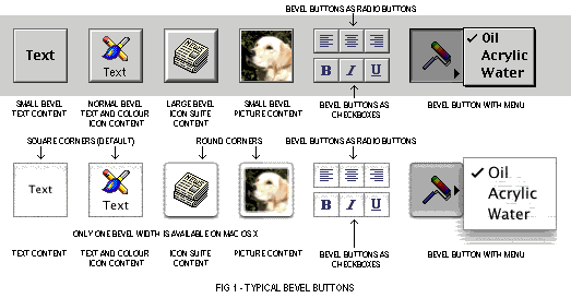
Note that, on Mac OS X, bevel button have square corners by default but can be made rounded using the function SetControlData with the kControlBevelButtonKindTag tag (see Other Control Data Tag Constants, below).
Note also that, while three bevel sizes are available on Mac OS 8/9, only one bevel size is available on Mac OS X.
Variants and Control Definition IDs
The bevel button CDEF resource ID is 2. The six available variants and their control definition IDs are as follows:
Variant |
Var Code |
Control Definition ID | |
|---|---|---|---|
With small (2 pixel wide) bevel. (Pop-up menu, if any, below.) |
0 | 32 | kControlBevelButtonSmallBevelProc |
With medium (3 pixel wide) bevel. (Pop-up menu, if any, below.) |
1 | 33 | kControlBevelButtonNormalBevelProc |
With large (4 pixel wide) bevel. (Pop-up menu, if any, below.) |
2 | 34 | kControlBevelButtonLargeBevelProc |
With small (2 pixel wide) bevel. Pop-up menu on right. |
4 | 36 | KControlBevelButtonSmallBevelProc + kControlBevelButtonMenuOnRight |
With medium (3 pixel wide) bevel. Pop-up menu, if any, on right. |
5 | 37 | KControlBevelButtonNormalBevelProc + kControlBevelButtonMenuOnRight |
With large (4 pixel wide) bevel. Pop-up menu, if any, on right. |
6 | 38 | KControlBevelButtonLargeBevelProc + kControlBevelButtonMenuOnRight |
Note that, while three bevel sizes are available on Mac OS 8/9, bevel button will always be displayed with one bevel size on Mac OS X regardless of which of the first three variants is used.
For bevel buttons containing text, if the constant kControlUsesOwningWindowsFontVariant is added to the variation code, the text will appear in the window's font.
Control Values
The following lists the initial, minimum, and maximum value settings for bevel buttons:
Control Value |
Content |
|---|---|
Initial |
If you wish to attach a menu, the menu ID. If no menu, 0. |
Minimum |
High byte specifies behaviour (see Bevel Button Behaviour Constants, and Bevel Button Menu Constants, below). |
Maximum |
Resource ID of bevel button's content if resource-based. |
Note that bevel buttons have two values: the value of the bevel button and, if a menu has been attached, the value of the menu.
Bevel Button Behaviour Constants
The following bevel button behaviour constants apply to the high byte of a bevel button's minimum value:
Constant |
Value |
Description |
|---|---|---|
| kControlBehaviorPushbutton | 0 | Button pops up after being clicked. |
| kControlBehaviorToggles | 0x0100 | Button toggles state automatically when clicked. |
| kControlBehaviorSticky | 0x0200 | When clicked, button stays down until application sets control's value to 0. This behaviour is useful in tool palettes. |
| kControlBehaviorOffsetContents | 0x8000 | Button contents are offset (one pixel down and to the right) when button is clicked. (Some users consider that this behaviour gives a bevel button a more realistic "feel".) |
Bevel Button Behaviour Constants (Menus)
The following bevel button behaviour constants (menus) apply to the high byte of a bevel button's minimum value:
Constant |
Value |
Description |
|---|---|---|
| kControlBehaviorSingleValueMenu | 0 | Menu contains commands, not choices, and should not be marked with a checkmark. Overrides the kControlBehaviorMultiValueMenu bit. |
| kControlBehaviorMultiValueMenu | 0x4000 | Menus are multi-valued. The user can toggle entries in the button's menu and have multiple items checked. The button does not maintain the menu value as it normally would. When this bit is set, the menu value accessed using GetControlData with the kControlBevelButtonMenuValueTag will return the value of the last menu item chosen. |
Button and Image Well Content Type Constants
The following button and image well content type constants apply to the low byte of a bevel button's minimum value:
Constant |
Value |
Description |
|---|---|---|
| kControlContentTextOnly | 0 | Content type is text only. |
| kControlContentIconSuiteRes | 1 | Content type is an icon suite resource ID. |
| kControlContentCIconRes | 2 | Content type is a colour icon resource ID. |
| kControlContentPictRes | 3 | Content type is a picture resource ID. |
| kControlContentIconSuiteHandle | 129 | Content type is an icon suite handle. |
| kControlContentCIconHandle | 130 | Content type is a colour icon handle. |
| kControlContentPictHandle | 131 | Content type is a picture handle. |
| kControlContentIconRef | 132 | Content type is an icon reference. |
You can also use these constants in the contentType field of the bevel button and image well content structure (see below). You can then pass a pointer to this structure in the inBuffer parameter of GetControlData and SetControlData to get and set the resource ID (for resource-based content), handle (for handle-based content), or reference (for reference-based content) of a colour icon, icon suite, picture, or icon reference in a bevel button.
 |
Note that resource-based content is owned by the control, while handle-based content is owned by you. The control definition function will not dispose of handle-based content. If you replace handle-based content with resource-based content on the �y, you must dispose of the handle properly to avoid a memory leak. |
Control Data Tag Constant - Content Type
The control data tag constant relevant to content type in bevel buttons is as follows:
Control Data Tag Constant |
Meaning and Data Type Returned or Set |
|---|---|
| kControlBevelButtonContentTag | Gets or sets a bevel button's content type for drawing. (See Bevel Button and Image Well Content Type Constants, above. See also The Bevel Button and Image Well Structure, below.) Data type returned or set: ControlButtonContentInfo structure |
Bevel Button Alignment and Placement Constants, and Associated Control Data Tag Constants
By calling SetControlData with certain control data tag constants, and with certain constants passed in the inData parameter, you can specify the alignment of icons, pictures, and text in a bevel button, and you can specify the placement of text in relation to an icon or picture. By calling GetControlData with these constants you can also ascertain alignment and placement.
Bevel Button Graphic Alignment Constants
The following constants are used to specify the alignment of icon suites, colour icons, and pictures:
Constant |
Value |
Description |
|---|---|---|
| kControlBevelButtonAlignSysDirection | -1 | Graphic is aligned according to the system default script direction (only left or right). |
| kControlBevelButtonAlignCenter | 0 | Graphic is aligned centre. |
| kControlBevelButtonAlignLeft | 1 | Graphic is aligned left. |
| kControlBevelButtonAlignRight | 2 | Graphic is aligned right. |
| kControlBevelButtonAlignTop | 3 | Graphic is aligned top. |
| kControlBevelButtonAlignBottom | 4 | Graphic is aligned bottom. |
| kControlBevelButtonAlignTopLeft | 5 | Graphic is aligned top left. |
| kControlBevelButtonAlignBottomLeft | 6 | Graphic is aligned bottom left. |
| kControlBevelButtonAlignTopRight | 7 | Graphic is aligned top right. |
| kControlBevelButtonAlignBottomRight | 8 | Graphic is aligned bottom right. |
Bevel Button Text Alignment Constants
The following constants are used to specify the alignment of text:
Constant |
Value |
Description |
|---|---|---|
| kControlBevelButtonAlignTextSysDirection | 0 | Text is aligned according to the current script direction (left or right). |
| kControlBevelButtonAlignTextCenter | 1 | Text is aligned centre. |
| kControlBevelButtonAlignTextFlushRight | -1 | Text is aligned flush right. |
| kControlBevelButtonAlignTextFlushLeft | -2 | Text is aligned flush left. |
Bevel Button Text Placement Constants
The following constants are used to specify the placement of text in relation to an icon suite, colour icon, or picture:
Constant |
Value |
Description |
|---|---|---|
| kControlBevelButtonPlaceSysDirection | -1 | Text is placed according to the system default script direction. |
| kControlBevelButtonPlaceNormally | 0 | Text is centred. |
| kControlBevelButtonPlaceToRightOfGraphic | 1 | Text is placed to the right of the graphic. |
| kControlBevelButtonPlaceToLeftOfGraphic | 2 | Text is placed to the left of the graphic. |
| kControlBevelButtonPlaceBelowGraphic | 3 | Text is placed below the graphic. |
| kControlBevelButtonPlaceAboveGraphic | 4 | Text is placed above the graphic. |
Control Data Tag Constants - Alignment and Placement
The control data tag constants relevant to the alignment and placement of graphics and text in bevel buttons are as follows:
Control Data Tag Constant |
Meaning and Data Type Returned or Set |
|---|---|
| kControlBevelButtonTextAlignTag | Gets or sets the alignment of text. (See Bevel Button Text Alignment Constants, above.) Data type returned or set: ControlButtonTextAlignment |
| kControlBevelButtonGraphicAlignTag | Gets or sets the alignment of graphics in relation to any text the button may contain. (See Bevel Button Graphic Alignment Constants.) Data type returned or set: ControlButtonGraphicAlignment |
| kControlBevelButtonTextPlaceTag | Gets or sets the placement of text. (See Bevel Button Text Placement Constants, above.) Data type returned or set: ControlButtonTextPlacement |
| kControlBevelButtonTextOffsetTag | Gets or sets the number of pixels that text is offset from the button's left or right edge. This is used with left, right, or system justification, but it is ignored when the text is centre aligned. Data type returned or set: SInt16 |
| kControlBevelButtonGraphicOffsetTag | Gets or sets the horizontal and vertical amounts that a graphic element is offset from the button's edges. This value is ignored when the graphic is specified to be centred on the button. Data type returned or set: Point |
The Button Content Info Structure
As previously stated, you can use bevel button and image well content type constants in the contentType field of the button content info structure and you can then pass a pointer to this structure in the inBuffer parameter of GetControlData and SetControlData. The button content info structure is as follows:
     struct ControlButtonContentInfo
     {
       ControlContentType  contentType;
       union {
         SInt16      resID;
         CIconHandle cIconHandle;
         Handle      iconSuite;
         IconRef     iconRef;
         PicHandle   picture;
         Handle      ICONHandle;
       } u;
     };
     typedef struct ControlButtonContentInfo ControlButtonContentInfo;
     typedef ControlButtonContentInfo *ControlButtonContentInfoPtr;
     typedef ControlButtonContentInfo ControlImageContentInfo;
     typedef ControlButtonContentInfo *ControlImageContentInfoPtr;
Field Descriptions
| contentType | Specifies the content type (see Bevel Button and Image Well Content Type Constants, above.) and determines which of the following fields are used. |
| resID | If the content type specified in the contentType field is kControlContentIconSuiteRes, kControlContentCIconRes, or kControlContentPictRes, this field should contain the resource ID of a picture, colour icon, or icon suite resource. |
| cIconHandle | If the content type specified in the contentType field is kControlContentCIconHandle, this field should contain a handle to a colour icon. |
| iconSuite | If the content type specified in the contentType field is kControlContentIconSuiteHandle, this field should contain a handle to an icon suite. |
| iconRef | If the content type specified in the contentType field is kControlContentIconRef, this field should contain an icon reference. |
| picture | If the content type specified in the contentType field is kControlContentPictHandle, this field should contain a handle to a picture. |
Other Control Data Tag Constants
The remaining control data tag constants relevant to bevel buttons are as follows:
Control Data Tag Constant |
Meaning and Data Type Returned or Set |
|---|---|
| kControlBevelButtonCenterPopUpGlyphTag | Gets or sets the position of the pop-up arrow when a pop-up menu is attached. Data type returned or set: Boolean. If true, glyph is vertically centred on the right; if false, glyph is on the bottom right. |
| kControlBevelButtonTransformTag | Gets or sets a transform that is added to the standard transform. See the Icons section at Chapter 13.) Data type returned or set: IconTransformType |
| kControlBevelButtonMenuValueTag | Gets the menu value. (See "Bevel Button Menu Constants, above.) Data type returned or set: SInt16 |
| kControlBevelButtonMenuRefTag | Gets the menu reference. Data type returned or set: MenuRef |
| kControlBevelButtonLastMenuTag | Gets the menu ID of the last menu selected in the submenu or main menu. Data type returned or set: Boolean |
| kControlBevelButtonMenuDelayTag | Gets or sets the delay (in number of ticks) before the menu is displayed. Data type returned or set: SInt32 |
| kControlBevelButtonScaleIconTag | Gets or sets whether, when the proper icon size is unavailable, the icon should be scaled. For use only with icon suites or the IconRef data type. Data type returned or set: Boolean. If true, indicates that if an icon of the ideal size is not available a larger or smaller icon should be scaled. If false, no scaling should occur; instead, a smaller icon should be drawn or a larger icon clipped. |
| kControlBevelButtonOwnedMenuRefTag | Sets the menu reference. (The control will dispose.) Data type set: MenuRef |
| kControlBevelButtonKindTag |
Data type set: ThemeButtonKind (kThemeSmallBevelButton, kThemeMediumBevelButton, kThemeLargeBevelButton, kThemeRoundedBevelButton). |
With regard to the kControlBevelButtonMenuDelayTag constant, setting a delay before the menu is displayed in a bevel button with sticky behaviour is useful for providing option sets in tool palettes. You can set up the bevel button so that:
- If the user clicks it once, it simply turns on the function represented by the button.
- If the user presses it for longer than the user-set double-click time, it displays a pop-up menu which offers further options for that function.
Helper Functions
The following helper functions may be used in lieu of SetControlData and GetControlData with the relevant control data tags:
     GetBevelButtonMenuValue
     SetBevelButtonMenuValue
     GetBevelButtonMenuHandle
     GetBevelButtonContentInfo
     SetBevelButtonContentInfo
     SetBevelButtonTransform
     SetBevelButtonGraphicAlignment
     SetBevelButtonTextAlignment
     SetBevelButtonTextPlacement
Control Part Codes
The following control part codes are relevant to bevel buttons:
Constant |
Value |
Description |
|---|---|---|
| kControlNoPart | 0 | For bevel buttons with a menu attached, this part code indicates that either the mouse was released outside the bevel button and menu or that the button was disabled. |
| kControlMenuPart | 2 | For bevel buttons with a menu attached, this part code indicates that the event occurred in a menu item of the bevel button. |
| kControlButtonPart | 10 | For bevel buttons with a menu attached, this part code indicates that the event occurred in the button but not in the attached menu. |
Bevel Button States
Bevel buttons can exist in five active states and two disabled states. The active states are off, pressed (was off), on, pressed (was on), and mixed. The mixed state is used, where appropriate, when the bevel button is behaving as a checkbox or radio button. Disabled bevel buttons can be shown as off or on.
Programmatic Creation
Bevel button controls may be created programmatically using the function CreateBevelButtonControl:
     OSStatus CreateBevelButtonControl(WindowRef window,const Rect *boundsRect,
                                       CFStringRef title,ControlBevelThickness thickness,
                                       ControlBevelButtonBehavior behavior,
                                       ControlButtonContentInfoPtr info,SInt16 menuID,
                                       ControlBevelButtonMenuBehavior menuBehavior,
                                       ControlBevelButtonMenuPlacement menuPlacement,
                                       ControlRef *outControl);
Relevant constants are:
Parameter |
Constants |
|---|---|
| thickness | kControlBevelButtonSmallBevel kControlBevelButtonNormalBevel kControlBevelButtonLargeBevel |
| behavior | See Bevel Button Behaviour Constants, above. |
| info.contentType | See Button and Image Well Content Type Constants, above |
| menuBehavior | See Bevel Button Behaviour Constants (Menus), above. |
| menuPlacement | kControlBevelButtonMenuOnBottom kControlBevelButtonMenuOnRight |
Image Wells
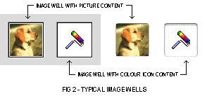
Image wells can be used to display icons or pictures. They are controlled in much the same way as bevel buttons, but with fewer options and states. They should not be used in place of push buttons or bevel buttons. Typical image wells are shown at Fig 2.
Variants and Control Definition IDs
The image well CDEF resource ID is 11. The one available variant and its control definition IDs is as follows:
Variant |
Var Code |
Control Definition ID | |
|---|---|---|---|
Image well. |
0 | 176 | kControlImageWellProc |
Image well with autotracking. |
1 | 177 | kControlImageWellAutoTrackProc |
Control Values
Control Value |
Content |
|---|---|
Initial |
Resource ID of image well's content ('cicn', 'PICT' or icon suite). |
Minimum |
Content type. (See Bevel Button and Image Well Content Type Constants, above.) After the image well is created, reset to 0. |
Maximum |
Ignored. Reset to 2 after creation. |
Bevel Button and Image Well Content Type Constants and The Button Content Info Structure
The bevel button and image well content type constants (see Bevel Buttons, above) apply to an image well's minimum value.
You can also use these constants in the contentType field of the button content info structure (see Bevel Buttons, above). You can then pass a pointer to this structure in the inBuffer parameter of GetControlData and SetControlData to get and set the resource ID (for resource-based content) or handle (for handle-based content) of a colour icon, icon suite, or picture in an image well.
Control Data Tag Constant |
Meaning and Data Type Returned or Set |
|---|---|
| kControlImageWellContentTag | Gets or sets the content. (See The Button Content Info Structure, above.) Data type returned or set: ControlButtonContentInfo structure |
| kControlImageWellTransformTag | Gets or sets a transform that is added to the standard transform. (See the Icons section at Chapter 13.) Data type returned or set: IconTransformType |
Helper Functions
The following helper functions may be used in lieu of SetControlData and GetControlData with the relevant control data tag constants:
     GetImageWellContentInfo
     SetImageWellContentInfo
     SetImageWellTransform
Control Part Codes
Constant |
Value |
Description |
|---|---|---|
| kControlImageWellPart | 26 | Event occurred in an image well. |
Programmatic Creation
Image well controls may be created programmatically using the function CreateImageWellControl: OSStatus CreateImageWellControl(WindowRef window,const Rect *boundsRect, const ControlButtonContentInfo *info, ControlRef *outControl);
Relevant constants are:
Parameter |
Constants |
|---|---|
| info.contentType | See Button and Image Well Content Type Constants, above. |
Tab Control (Embedding Control)
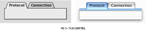
The tab control is an embedding control which provides a means of presenting information on multiple "pages". The user selects the desired "page" by clicking the appropriate tab.
A typical tab control is shown at Fig 3.
The content area of a tab is known as a pane. Controls which are embedded within an individual pane should only affect the settings displayed in that pane. Controls whose effect is intended to be global (that is, their setting are intended to affect all the panes in a set of tabs) should be located outside the tab control.
The tab information ('tab#') resource may be used to provide the tab names and icon suite IDs.
Variants and Control Definition IDs
The tab control CDEF resource ID is 8. The eight available variants and their control definition ID are follows:
Variant |
Var Code |
Control Definition ID | |
|---|---|---|---|
Large tab control, tabs at top. |
0 | 128 | kControlTabLargeProc |
Small tab control, tabs at top. |
1 | 129 | kControlTabSmallProc |
Large tab control, tabs at bottom. |
2 | 130 | kControlTabLargeProc |
Small tab control, tabs at bottom. |
3 | 131 | kControlTabSmallProc |
Large tab control, tabs at right. |
4 | 132 | kControlTabLargeProc |
Small tab control, tabs at right. |
5 | 133 | kControlTabSmallProc |
Large tab control, tabs at left. |
6 | 134 | kControlTabLargeProc |
Small tab control, tabs at left. |
7 | 135 | kControlTabSmallProc |
Control Values
Control Value |
Content |
|---|---|
Initial |
Resource ID of the 'tab#' resource you are using to hold tab information. Reset to the minimum setting after creation. A value of 0 indicates not to read a 'tab#' resource. (See The Tab Information Structure, below.) |
Minimum |
Ignored. Reset to 1 after creation. |
Maximum |
Ignored. Reset to the number of individual tabs in the tab control after creation. |
Control Data Tag Constants
Control Data Tag Constant |
Meaning and Data Type Returned or Set |
|---|---|
| kControlTabContentRectTag | Gets the content rectangle. Data type returned or set: Rect |
| kControlTabEnabledFlagTag | Enables or disables a single tab. Data type returned or set: Boolean; if true, enabled; if false, disabled. |
| kControlTabFontStyleTag | Gets or sets the font and font style. Data type returned or set: ControlFontStyleRec |
| kControlTabInfoTag | Gets or sets information for a tab in a tab control. (See The Tab Information Structure, below.) Data type returned or set: ControlTabInfoRec |
Helper Functions
The following helper functions may be used in lieu of SetControlData and GetControlData with the relevant control data tags:
     GetTabContentRect
     SetTabEnabled
The Tab Information Structure
If you are not creating a tab control with a 'tab#' resource, you can call SetControlMaximum to set the number of tabs in a tab control and then call SetControlData with the kControlTabInfoTag to set the information for an individual tab in a tab control. The tab information structure passed in the SetControlData call should be one of the following:
     struct ControlTabInfoRec
    {
      SInt16 version;      // Set to 0.
      SInt16 iconSuiteID;  // Set to 0 for no icon.
      Str255 name;         // Title for tab label.
    };
    typedef struct ControlTabInfoRec ControlTabInfoRec;

    struct ControlTabInfoRecV1
    {
      SInt16      version;     // Set to kControlTabInfoVersionOne.
      SInt16      iconSuiteID; // Set to 0 for no icon.
      CFStringRef name;        // Title for tab label.  (Should always be released)
    };
    typedef struct ControlTabInfoRecV1 ControlTabInfoRecV1;
An alternative tab information structure takes a CFString object in the name parameter:
     struct ControlTabInfoRecV1
     {
       SInt16      version;
       SInt16      iconSuiteID;
       CFstringRef name;
     };
     typedef struct ControlTabInfoRecV1 ControlTabInfoRecV1;
If this variant is used, kControlTabInfoVersionOne should be assigned to the version field.
The Tab Information Resource
You can use a tab information resource to specify the icon suite ID and name of each tab in a tab control. A tab information resource is a resource of type 'tab#'. All tab information resources must have resource ID numbers greater than 127. The Control Manager uses the information you specify to provide additional information to the corresponding tab control. Fig 4 shows the structure of a compiled 'tab#' resource.
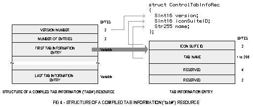
The following describes the fields of a compiled 'tab#' resource and one of its tab information entries:
Field |
Description |
|---|---|
VERSION NUMBER |
Version of the resource. |
NUMBER OF ENTRIES |
The number of tab information entries in the resource. |
ICON SUITE ID |
Icon suite resource ID. |
TAB NAME |
The tab name. |
Programmatic Creation
Tab controls may be created programmatically using the function CreateTabsControl:
     OSStatus  CreateTabsControl(WindowRef window,const Rect *boundsRect,ControlTabSize size,
                                 ControlTabDirection direction,UInt16 numTabs,
                                 const ControlTabEntry *tabArray,
                                 ControlRef *outControl);
Relevant constants are:
Parameter |
Constants |
|---|---|
| size | kControlTabSizeLarge kControlTabSizeSmall |
| direction | kControlTabDirectionNorth kControlTabDirectionSouth kControlTabDirectionEast kControlTabDirectionWest |
The tabArray parameter of takes a pointer to an array of tab entry structures:
     struct ControlTabEntry
     {
       ControlButtonContentInfo *icon;
       CFStringRef               name;
       Boolean                   enabled;
     };
     typedef struct ControlTabEntry ControlTabEntry;
Edit Text
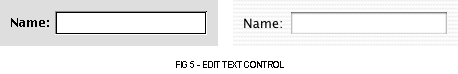
Edit text controls are rectangular areas in which the user enters text. Edit text controls supports keyboard focus, and a password entry variant is available. Fig 5 shows a typical edit text control.
Edit text controls can have an application-defined key filter function attached to filter key strokes or modify them on return.
Variants and Control Definition IDs
The edit text control CDEF resource ID is 17. The three available variants and their control definition IDs are as follows:
Variant |
Var Code |
Control Definition ID | |
|---|---|---|---|
Edit text control. |
0 | 272 | kControlEditTextProc |
Edit text control for passwords. This control is supported by the Script Manager. Password text can be accessed via the kEditTextPasswordTag constant. (See Control Data Tag Constants, below.) |
2 | 274 | kControlEditTextPasswordProc |
Edit text control for inline input. This control supports 2-byte script systems. |
4 | 276 | kControlEditTextInlineInputProc |
Control Values
Control Value |
Content |
|---|---|
Initial |
Reserved. Set to 0. |
Minimum |
Reserved. Set to 0. |
Maximum |
Reserved. Set to 0. |
Control Data Tag Constants
Control Data Tag Constant |
Meaning and Data Type Returned or Set |
|---|---|
| kControlEditTextTextTag | Gets or sets text. Data type returned or set: character buffer |
| kControlEditTextTEHandleTag | Gets a handle to the text edit structure. Data type returned or set: TEHandle |
| kControlEditTextSelectionTag | Gets or sets the selection. Data type returned or set: ControlEditTextSelectionRec structure. (See The Edit Text Selection Structure, below.) |
| kControlEditTextPasswordTag | Gets clear password text, that is, the text of the actual password typed, not the bullet text. Data type returned or set: character buffer |
| kControlKeyFilterTag | Gets or sets a key filter function. Data type returned or set: ControlKeyFilterUPP |
| kControlEditTextStyleTag | Gets or sets the font style. Data type returned or set: ControlFontStyleRec |
| KControlEditTextLockedTag | Gets or sets whether the text is currently editable. Data type returned or set: Boolean. If true, text is locked. If false, text is editable |
| kControlEditTextValidationProcTag | Gets or sets a universal procedure pointer to a callback function which can be used to validate editable text after an operation that changes the text, such as a cut or paste. Data type returned or set: ControlEditTextValidationUPP |
| kControlEditTextCFStringTag | Gets or sets text. (Mac OS X only.) Data type returned or set: CFStringRef |
Control Part Codes
Constant |
Value |
Description |
|---|---|---|
| kControlEditTextPart | 5 | Event occurred in an edit text control. |
The Edit Text Selection Structure
You can pass a pointer to the edit text selection structure to GetControlData and SetControlData to access and set the current selection range in an edit text control. An edit text selection structure is of type ControlEditTextSelectionRec:
     struct ControlEditTextSelectionRec
     {
       SInt16  selStart;
       SInt16  selEnd;
     };
     typedef struct ControlEditTextSelectionRec ControlEditTextSelectionRec;
     typedef ControlEditTextSelectionRec *ControlEditTextSelectionPtr;
Field Descriptions
| selStart | Beginning of the edit text selection. |
| selEnd | End of the edit text selection. |
Programmatic Creation
Edit text controls may be created programmatically using the function CreateEditTextControl:
     OSStatus  CreateEditTextControl(WindowRef window,const Rect *boundsRect,CFStringRef text,
                                     Boolean isPassword,Boolean useInlineInput,
                                     const ControlFontStyleRec *style,ControlRef *outControl);
Sliders
A slider control consists of a slider bar and an indicator. The user can drag the indicator to set a new value within the range represented by the slider bar.
Sliders can be oriented horizontally or vertically, and the indicator can point in any direction. The indicator can also be nondirectional if required. Typical sliders are shown at Fig 6.
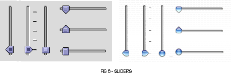
A slider can, optionally, display tick marks, and you can specify the number of tick marks required. If you specify tick marks, you should ensure that they are labelled.
A live feedback variant is available. This variant continually updates the value of the control as the indicator is dragged, as opposed to the standard behaviour of updating the value only when the mouse button is released.
Variants and Control Definition IDs
The slider CDEF resource ID is 3. The ten available variants and their control definition IDs are as follows:
Variant |
Var Code |
Control Definition ID | |
|---|---|---|---|
Slider. If the slider is horizontal, the indicator points down, and if the slider is vertical, the indicator points right. |
0 | 48 | kControlSliderProc |
Slider with live feedback. The value of the control is updated automatically by the Control Manager before your action function is called. If no application-defined action function is supplied, the slider draws ghosted image of the indicator as the user moves it. |
1 | 49 | kControlSliderProc + kControlSliderLiveFeedback |
Slider with tick marks. The control rectangle must be large enough to include the tick marks. |
2 | 50 | kControlSliderProc + kControlSliderHasTickMarks |
Slider with live feedback and tick marks. |
3 | 51 | kControlSliderProc + kControlSliderLiveFeedback + kControlSliderHasTickMarks |
Slider with indicator reversed. . If the slider is horizontal, the indicator points up, and if the slider is vertical, the indicator points left. |
4 | 52 | kControlSliderProc + kControlSliderReverseDirection |
Slider with live feedback and indicator reversed. |
5 | 53 | kControlSliderProc+ kControlSliderLiveFeedback + kControlSliderReverseDirection |
Slider with tick marks and indicator reversed. |
6 | 54 | kControlSliderProc + kControlSliderHasTickMarks + kControlSliderReverseDirection |
Slider with live feedback, tick marks and indicator reversed. |
7 | 55 | kControlSliderProc + kControlSliderLiveFeedback + kControlSliderHasTickMarks + kControlSliderReverseDirection |
Slider with a rectangular, non-directional indicator. |
8 | 56 | kControlSliderProc + kControlSliderNonDirectional |
Slider with live feedback and a rectangular, non-directional indicator. |
9 | 57 | kControlSliderProc + kControlSliderLiveFeedback + kControlSliderNonDirectional |
Control Values
Control Value |
Content |
|---|---|
Initial |
Appropriate value between -32768 and 32768. For the tick mark variant, the number of ticks required. Reset to the minimum setting after creation. |
Minimum |
-32768 to 32768. |
Maximum |
-32768 to 32768. When the maximum setting is equal to the minimum setting, the slider is inactive. |
Control Part Codes
Constant |
Value |
Description |
|---|---|---|
| kControlIndicatorPart | 129 | Event occurred in the indicator. |
Programmatic Creation
Slider controls may be created programmatically using the function CreateSliderControl:
     OSStatus  CreateSliderControl(WindowRef window,const Rect *boundsRect,SInt32 value,
                                   SInt32 minimum,SInt32 maximum,
                                   ControlSliderOrientation orientation,UInt16 numTickMarks,
                                   Boolean liveTracking,ControlActionUPP liveTrackingProc,
                                   ControlRef *outControl);
Relevant constants are:
Parameter |
Constants |
|---|---|
| orientation | kControlSliderPointsDownOrRight kControlSliderPointsUpOrLeft kControlSliderDoesNotPoint |
Group Boxes (Embedding Control)
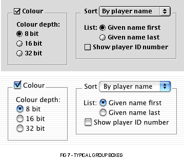
Group boxes are embedding controls used to group a number of related items. They may be either primary or secondary.
A group box can be untitled or it can have a text title, a pop-up menu title, or a checkbox title. Group boxes with a pop-up menu title are useful for displaying a variety of related settings in a limited space. Group boxes with a checkbox title are useful for indicating that a group of settings may be deactivated by the user.
Secondary group boxes are generally used for grouping subsidiary information.
Typical group boxes are shown at Fig 7.
Variants and Control Definition IDs
The group box CDEF resource ID is 10. The six available variants and their control definition IDs are as follows:
Variant |
Var Code |
Control Definition ID | |
|---|---|---|---|
Primary group box, text title. |
0 | 160 | kControlGroupBoxTextTitleProc |
Primary group box, checkbox title. |
1 | 161 | kControlGroupBoxCheckBoxProc |
Primary group box, pop-up button title. |
2 | 162 | kControlGroupBoxPopupButtonProc |
Secondary group box, text title. |
4 | 164 | kControlGroupBoxSecondaryTextTitleProc |
Secondary group box, checkbox title. |
5 | 165 | kControlGroupBoxSecondaryCheckBoxProc |
Secondary group box, pop-up button title. |
6 | 166 | kControlGroupBoxSecondaryPopupButtonProc |
Control Values
Control Value |
Content |
|---|---|
Initial |
Ignored if group box has text title. |
Minimum |
Ignored if group box has text title. |
Maximum |
Ignored if group box has text title. |
Control Data Tag Constant
Control Data Tag Constant |
Meaning and Data Type Returned or Set |
|---|---|
| kControlGroupBoxMenuHandleTag | Gets the menu handle of a group box. Data type returned or set: MenuHandle |
| kControlGroupBoxFontStyleTag | Gets or sets the font style. Data type returned or set: ControlFontStyleRec |
| kControlGroupBoxTitleRectTag | Gets the rectangle containing the group box title (and any associated control, such as a checkbox). Data type returned or set: Rect |
Control Part Codes
Constant |
Value |
Description |
|---|---|---|
| kControlNoPart | 0 | Returned if the group box title is a text title. |
| kControlButtonPart | 10 | The group box title is a checkbox title and the check box was hit. |
| kControlMenuPart | 2 | The group box title is a pop-up menu button and the mouse button was released in the menu. |
Programmatic Creation
Group box controls may be created programmatically using the functions CreateGroupBoxControl, CreateCheckGroupBoxControl, and CreatePopupGroupBoxControl:
     OSStatus  CreateGroupBoxControl(WindowRef window,const Rect *boundsRect,
                                     CFStringRef title,Boolean primary,
                                     ControlRef *outControl);

     OSStatus  CreateCheckGroupBoxControl(WindowRef window,const Rect *boundsRect,
                                          CFStringRef title,SInt32 initialValue,
                                          Boolean primary,Boolean autoToggle,
                                          ControlRef *outControl);

     OSStatus  CreatePopupGroupBoxControl(WindowRef window,const Rect *boundsRect,
                                          CFStringRef title,Boolean primary,SInt16 menuID,
                                          Boolean variableWidth,SInt16 titleWidth,
                                          SInt16 titleJustification,Style titleStyle,
                                          ControlRef *outControl);
Clock
Clock controls are a combination of an edit text control and little arrows (see below) which display date or time. The displayed date and time may be changed using the little arrows or by typing in the edit text control. Fig 8 shows a clock control displaying a date.
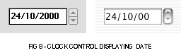
The clock control supports keyboard navigation and keyboard focus. If the control is made inactive, the user will be unable to change the displayed date or time values; however the correct date and time will continue to be displayed.
Variants and Control Definition IDs
The clock control CDEF resource ID is 15. The four available variants and their control definition ID are follows:
Variant |
Var Code |
Control Definition ID | |
|---|---|---|---|
Clock control displaying hour/minutes. |
0 | 240 | kControlClockTimeProc |
Clock control displaying hours/minutes/seconds. |
1 | 241 | kControlClockTimeSecondsProc |
Clock control displaying date/month/year. |
2 | 242 | kControlClockDateProc |
Clock control displaying month/year. |
3 | 243 | kControlClockMonthYearProc |
Control Values
Control Value |
Content |
|---|---|
Initial |
One or more of the clock value flags. (See Clock Value Flag Constants, below.) Reset to 0 after creation. |
Minimum |
Reserved. Set to 0. |
Maximum |
Reserved. Set to 0. |
Clock Value Flag Constants
Constant |
Value |
Description |
|---|---|---|
| kControlClockNoFlags | 0 | Indicates that clock is editable but does not display the current "live" time. |
| kControlClockIsDisplayOnly | 1 | When only this bit is set, the clock is not editable. When this bit and the kControlClockIsLive bit is set, the clock automatically updates on idle (clock will have the current time). |
| kControlClockIsLive | 2 | When only this bit is set, the clock automatically updates on idle and any changes to the clock affect the system clock. When this bit and the kControlClockIsDisplayOnly bit is set, the clock automatically updates on idle (clock will have the current time), but is not editable. |
Control Data Tag Constant
Control Data Tag Constant |
Meaning and Data Type Returned or Set |
|---|---|
| kControlClockLongDateTag | Gets or sets the clock control's time or date. Data type returned or set: LongDateRec structure. |
| kControlClockFontStyleTag | Gets or sets the font style. Data type returned or set: ControlFontStyleRec |
| kControlClockAnimatingTag | Starts and stops clock animation. Use only if a call to GetControlFeatures reveals that the control's kControlIdlesWithTimer flag is set. Data type returned or set: Boolean |
Control Part Codes
Constant |
Value |
Description |
|---|---|---|
| kControlClockPart | 8 | Event occurred in a clock control. |
| kControlClockHourDayPart | 9 | Event occurred in the part that contains the hour. |
| kControlClockMinuteMonthPart | 10 | Event occurred in the part that contains the minute or the month. |
| kControlClockSecondYearPart | 11 | Event occurred in the part that contains the second or the year. |
| kControlClockAMPMPart | 12 | Event occurred in the part that contains the AM/PM information. |
Programmatic Creation
Clock controls may be created programmatically using the function CreateClockControl:
     OSStatus  CreateClockControl(WindowRef window,const Rect *boundsRect,
                                  ControlClockType clockType,ControlClockFlags clockFlags,
                                  ControlRef *outControl);
Relevant constants are:
Parameter |
Constants |
|---|---|
| clockType | kControlClockTypeHourMinute kControlClockTypeHourMinuteSecond kControlClockTypeMonthDayYear kControlClockTypeMonthYear |
| clockFlags | See Clock Value Flag Constants, above. |
Progress and Relevance Bars
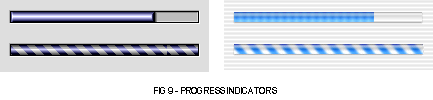
Progress bars are used to indicate capacity or the current status of a lengthy operation. Two types of progress bars can be used: an indeterminate progress bar, which shows that an operation is occurring but does not indicate its current status; a determinate progress bar, which shows how much of the operation has been completed. The two types are shown at Fig 9.
On Mac OS 8/9, the progress bar control is often used as a relevance bar. On Mac OS X, a separate relevance bar control, which can only be created programmatically, is available.
Variants and Control Definition IDs
The progress bar CDEF resource ID is 5. The two available variants and their control definition IDs are follows:
Variant |
Var Code |
Control Definition ID | |
|---|---|---|---|
Progress bar. To make the control determinate or indeterminate, set the kControlProgressBarIndeterminateTag constant. (See Control Data Tag Constant Relevant to Progress bars, below.) |
0 | 80 | kControlProgressBarProc |
Progress Bar Control Values
Control Value |
Content |
|---|---|
Initial |
Appropriate value between -32768 and 32767. |
Minimum |
-32768 to 32767. |
Maximum |
-32768 to 32767. |
Control Data Tag Constant
Control Data Tag Constant |
Meaning and Data Type Returned or Set |
|---|---|
| kControlProgressBarIndeterminateTag | Gets or sets whether a progress bar is determinate or indeterminate. Data type returned or set: Boolean. If true, switches to an indeterminate progress bar. If false, switches to an determinate progress bar. | kControlProgressBarAnimatingTag | Starts and stops progress bar animation. Use only if a call to GetControlFeatures reveals that the control's kControlIdlesWithTimer flag is set. Data type returned or set: Boolean |
Programmatic Creation
Progress bars may be created programmatically using the function CreateProgessBarControl:
OSStatus  CreateProgressBarControl(WindowRef window,const Rect *boundsRect,SInt32 value,
                                   SInt32 minimum,SInt32 maximum,Boolean indeterminate,
                                   ControlRef *outControl);
On Mac OS X only, relevance bars may be created programmatically using the function CreateRelevanceBarControl:
OSStatus  CreateRelevanceBarControl(WindowRef window,const Rect *boundsRect,SInt32 value,
                                    SInt32 minimum,SInt32 maximum,
                                    ControlRef *outControl);
Little Arrows
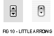
The little arrows control (see Fig 10), which consists of two opposing arrows, provide a means of increasing or decreasing values. They should always be accompanied by a label that identifies the content to which the control relates.
The displayed value is incremented or decremented by one unit of change when the user clicks the up or down arrow. If the user clicks an arrow and holds the mouse button down, the value increases or decreases until the user releases the button. The unit of change should depend on the content.
Variant and Control Definition ID
The little arrows CDEF resource ID is 6. The one available variant and its control definition ID is as follows:
Variant |
Var Code |
Control Definition ID | |
|---|---|---|---|
Little arrows. |
0 | 96 | kControlLittleArrowsProc |
Control Values
Control Value |
Content |
|---|---|
Initial |
Appropriate value between -32768 and 32767. |
Minimum |
-32768 and 32767. |
Maximum |
-32768 and 32767. |
Control Part Codes
Constant |
Value |
Description |
|---|---|---|
| kControlUpButtonPart | 20 | Event occurred in up arrow. |
| kControlDownButtonPart | 21 | Event occurred in down arrow. |
Programmatic Creation
Little arrows controls may be created programmatically using the function CreateLittleArrowsControl:
     OSStatus  CreateLittleArrowsControl(WindowRef window,const Rect *boundsRect,SInt32 value,
                                         SInt32 minimum,SInt32 maximum,SInt32 increment,
                                         ControlRef *outControl);
Disclosure Triangles
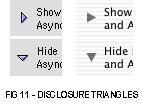
Disclosure triangles (see Fig 11) are used to display and hide additional information in a window and also to reveal the contents of folders in list views. They have two possible values: 0 for collapsed and 1 for expanded. The first click on the control rotates the triangle downwards. The second click rotates the triangle back to the original orientation.
Variants and Control Definition IDs
The disclosure triangle CDEF resource ID is 4. The four available variants and their control definition ID is as follows:
Variant |
Var Code |
Control Definition ID | |
|---|---|---|---|
Disclosure triangle. |
0 | 64 | kControlTriangleProc |
Left-facing disclosure triangle. |
1 | 65 | kControlTriangleLeftFacingProc |
Auto-tracking disclosure triangle. This variant maintains its last value, so it knows what transition is taking place when a SetControlValue is called on it (expanded to collapsed, or vice versa). (See Control Data Tag Constants, below.) |
2 | 66 | kControlTriangleAutoToggleProc |
Left-facing, auto-tracking disclosure triangle. |
3 | 67 | kControlTriangleLeftFacingAutoToggleProc |
Control Values
Control Value |
Content |
|---|---|
Initial |
0 (collapsed) or 1 (expanded) |
Minimum |
0 (collapsed) |
Maximum |
1 (expanded) |
Control Data Tag Constant
Control Data Tag Constant |
Meaning and Data Type Returned or Set |
|---|---|
| kControlTriangleLastValueTag | Gets or sets the last value of a disclosure triangle. Used primarily for setting up a disclosure triangle properly when using the kControlTriangleAutoToggleProc variant. Data type returned or set: SInt16 |
Helper Function
The helper function SetDisclosureTriangleLastValue may be used in lieu of SetControlData with the kControlTriangleLastValueTag control data tag.
Control Part Codes
Constant |
Value |
Description |
|---|---|---|
| kControlTrianglePart | 4 | Event occurred in a disclosure triangle. |
Programmatic Creation
Disclosure triangle controls may be created programmatically using the functionCreateDisclosureTriangleControl:
     OSStatus  CreateDisclosureTriangleControl(WindowRef window,const Rect *boundsRect,
                                             ControlDisclosureTriangleOrientation orientation,
                                             CFStringRef title,SInt32 initialValue,
                                             Boolean drawTitle,Boolean autoToggles,
                                             ControlRef *outControl);
Relevant constants are:
Parameter |
Constants |
|---|---|
| orientation | kControlDisclosureTrianglePointDefault kControlDisclosureTrianglePointRight kControlDisclosureTrianglePointLeft |
Picture
Picture controls display pictures.
Variants and Control Definition IDs
The picture control CDEF resource ID is 19. The two available variants and their control definition IDs are as follows:
Variant |
Var Code |
Control Definition ID | |
|---|---|---|---|
Picture control. |
0 | 304 | kControlPictureProc |
Non-tracking picture control. If hit, immediately returns the control part code kControlNoPart and does not track. |
1 | 305 | kControlPictureNoTrackProc |
Control Values
Control Value |
Content |
|---|---|
Initial |
Resource ID of the 'PICT' resource you wish to display. Reset to 0 after creation. |
Minimum |
Reserved. Set to 0. |
Maximum |
Reserved. Set to 0. |
Control Data Tag Constant
Control Data Tag Constant |
Meaning and Data Type Returned or Set |
|---|---|
| kControlPictureHandleTag | Sets picture. Data type set: PicHandle |
Control Part Codes
Constant |
Value |
Description |
|---|---|---|
| kControlPicturePart | 6 | Event occurred in a picture control. |
Programmatic Creation
Picture controls may be created programmatically using the function CreatePictureControl:
     OSStatus  CreatePictureControl(WindowRef window,const Rect *boundsRect,
                                    const ControlButtonContentInfo *content,Boolean dontTrack,
                                    ControlRef *outControl);
Icon
Icon controls display colour icons and icons from an icon suite.
A non-tracking variant is available for use in dialogs which have an embedding hierarchy and want an icon. This variant just returns the part hit immediately; it does not actually track the mouse.
Variants and Control Definition IDs
The icon CDEF resource ID is 20. The four available variants and their control definition IDs are as follows:
Variant |
Var Code |
Control Definition ID | |
|---|---|---|---|
Icon control. |
0 | 320 | kControlIconProc |
Non-tracking icon. If hit, immediately returns the control part code kControlIconPart without tracking. |
1 | 321 | kControlIconNoTrackProc |
Icon suite. |
2 | 322 | kControlIconSuiteProc |
Non-tracking icon suite. If hit, immediately returns the control part code kControlIconPart without tracking. |
3 | 323 | kControlIconSuiteNoTrackProc |
Supports all standard types of icon-based content. |
4 | 324 | kControlIconRefProc |
Supports all standard types of icon-based content. Non-tracking variant. |
5 | 325 | kControlIconRefNoTrackProc |
Control Values
Control Value |
Content |
|---|---|
Initial |
Resource ID of the 'cicn', 'ICON', or icon suite resource you wish to display. (The icon suite variant looks for an icon suite. If not found, it looks for a 'cicn' or 'ICON' resource.) Reset to 0 after creation. |
Minimum |
Reserved. Set to 0. |
Maximum |
Reserved. Set to 0. |
Control Data Tag Constants
Control Data Tag Constant |
Meaning and Data Type Returned or Set |
|---|---|
| kControlIconTransformTag | Gets or sets a transform that is added to the standard transform for an icon. (See Chapter 13.) Data type returned or set: IconTransformType |
| kControlIconAlignmentTag | Gets or sets an icon's position. (See Chapter 13.) Data type returned or set: IconAlignmentType |
| kControlIconResourceIDTag | Gets or sets the resource ID of the icon to use Data type returned or set: Sint16 |
| kControlIconContentTag | Gets or sets the type of content to be used in an icon control. Data type returned or set: ControlButtonContentInfo |
Control Part Codes
Constant |
Value |
Description |
|---|---|---|
| kControlIconPart | 7 | Event occurred in an icon control. |
Programmatic Creation
Icon controls may be created programmatically using the function CreateIconControl:
     OSStatus  CreateIconControl(WindowRef window,const Rect *boundsRect,
                                 const ControlButtonContentInfo *icon,Boolean dontTrack,
                                 ControlRef *outControl);
Window Headers (Embedding Control)
Window headers are rectangular embedding controls which should be located at the top of a window's content region and used to provide information about the window's contents.
The list view header variant is similar to the main variant, but removes the line that separates a standard window header from the content area.
Variants and Control Definition IDs
The window header CDEF resource ID is 21. The two available variants and their control definition IDs are as follows:
Variant |
Var Code |
Control Definition ID | |
|---|---|---|---|
Window header. |
0 | 336 | kControlWindowHeaderProc |
Window list view header. |
1 | 337 | kControlWindowListViewHeaderProc |
Control Values
Control Value |
Content |
|---|---|
Initial |
Reserved. Set to 0. |
Minimum |
Reserved. Set to 0. |
Maximum |
Reserved. Set to 0. |
Programmatic Creation
Window header controls may be created programmatically using the function CreateWindowHeaderControl:
     OSStatus  CreateWindowHeaderControl(WindowRef window,const Rect *boundsRect,
                                         Boolean isListHeader,ControlRef *outControl);
Placard (Embedding Control)
Placards are rectangular embedding controls used to display information. They can also be used simply as background fill for a control area. Typically, placards are used as a small information panel placed at the bottom of a window.
Variants and Control Definition IDs
The placard CDEF resource ID is 14. The one available variant and its control definition ID is as follows:
Variant |
Var Code |
Control Definition ID | |
|---|---|---|---|
Placard. |
0 | 224 | kControlPlacardProc |
Future versions will provide a push button variant.
Control Values
Control Value |
Content |
|---|---|
Initial |
Reserved. Set to 0. |
Minimum |
Reserved. Set to 0. |
Maximum |
Reserved. Set to 0. |
Programmatic Creation
Placard controls may be created programmatically using the function CreatePlacardControl.
Static Text
Static text controls display static text, that is, text that cannot be changed by the user.
Variant and Control Definition ID
The static text control CDEF resource ID is 18. The one available variant and its control definition ID is as follows:
Variant |
Var Code |
Control Definition ID | |
|---|---|---|---|
Static text control. |
0 | 288 | kControlStaticTextProc |
Control Values
Control Value |
Content |
|---|---|
Initial |
Reserved. Set to 0. |
Minimum |
Reserved. Set to 0. |
Maximum |
Reserved. Set to 0. |
Control Data Tag Constants
Control Data Tag Constant |
Meaning and Data Type Returned or Set |
|---|---|
| kControlStaticTextTextTag | Gets or sets text. Data type returned or set: character buffer |
| kControlStaticTextTextHeightTag | Gets the height of text. Data type returned or set: SInt16 |
| kControlStaticTextStyleTag | Gets or sets the font style. Data type returned or set: ControlFontStyleRec |
| kControlStaticTextTruncTag | Gets or or sets how text is truncated at the end of a line. Data type returned or set: TruncCode. The value truncEnd indicates that characters are truncated off the end of the string. truncMiddle indicates that characters are truncated from the middle of the string. The default is -1, which indicates that no truncation occurs and, instead, the text is wrapped. |
| kControlStaticTextCFStringTag | Gets or sets a CFString reference. Data type returned or set: CFStringRef |
Programmatic Creation
Static text controls may be created programmatically using the function CreateStaticTextControl:
     OSStatus  CreateStaticTextControl(WindowRef window,const Rect *boundsRect,
                                       CFStringRef text,const ControlFontStyleRec *style,
                                       ControlRef * outControl);
Separator Lines
Separator lines are vertical or horizontal lines used to visually separate groups of controls. The orientation of the bounding rectangle determines the orientation of the line.
Variants and Control Definition IDs
The separator line CDEF resource ID is 9. The one available variant and its control definition ID is as follows:
Variant |
Var Code |
Control Definition ID | |
|---|---|---|---|
Separator line. |
0 | 144 | kControlSeparatorLineProc |
Control Values
Control Value |
Content |
|---|---|
Initial |
Reserved. Set to 0. |
Minimum |
Reserved. Set to 0. |
Maximum |
Reserved. Set to 0. |
Programmatic Creation
Separator line controls may be created programmatically using the function CreateSeparatorControl:
     OSStatus  CreateSeparatorControl(WindowRef window,const Rect *boundsRect,
                                      ControlRef *outControl);
Pop-up Arrows
The pop-up arrow control simply draws the pop-up glyph.
Variants and Control Definition IDs
The pop-up arrow CDEF resource ID is 12. The eight available variants and their control definition IDs are as follows:
Variant |
Var Code |
Control Definition ID | |
|---|---|---|---|
Large, east-facing pop-up arrow. |
0 | 192 | kControlPopupArrowEastProc |
Large, west-facing pop-up arrow. |
1 | 193 | kControlPopupArrowWestProc |
Large, north-facing pop-up arrow. |
2 | 194 | kControlPopupArrowNorthProc |
Large, south-facing pop-up arrow. |
3 | 195 | kControlPopupArrowSouthProc |
Small, east-facing pop-up arrow. |
4 | 196 | kControlPopupArrowSmallEastProc |
Small, west-facing pop-up arrow. |
5 | 197 | kControlPopupArrowSmallWestProc |
Small, north-facing pop-up arrow. |
6 | 198 | kControlPopupArrowSmallNorthProc |
Small, south-facing pop-up arrow. |
7 | 199 | kControlPopupArrowSmallSouthProc |
Control Values
Control Value |
Content |
|---|---|
Initial |
Reserved. Set to 0. |
Minimum |
Reserved. Set to 0. |
Maximum |
Reserved. Set to 0. |
Programmatic Creation
Pop-up arrow controls may be created programmatically using the function CreatePopupArrowControl:
     OSStatus  CreatePopupArrowControl(WindowRef window,const Rect *boundsRect,
                                       ControlPopupArrowOrientation orientation,
                                       ControlPopupArrowSize size,ControlRef *outControl);
Relevant constants are:
Parameter |
Constants |
|---|---|
| orientation | kControlPopupArrowOrientationEast kControlPopupArrowOrientationWest kControlPopupArrowOrientationNorth kControlPopupArrowOrientationSouth |
| size | kControlPopupArrowSizeNormal kControlPopupArrowSizeSmall |
Radio Groups (Embedding Control)
Radio groups are embedding controls which relieve your application of much of the work involved in managing a group of radio buttons (or bevel buttons which are intended to operate like radio buttons). For example, if a group of radio buttons are embedded in a radio group control, the radio group control handles the checking and unchecking of the radio buttons when the user clicks on one of them. The current value of the radio group control represents the radio button currently selected.
Variant and Control Definition ID
The radio group CDEF resource ID is 26. The one available variant and its control definition ID is as follows:
Variant |
Var Code |
Control Definition ID | |
|---|---|---|---|
Radio group. |
0 | 416 | kControlRadioGroupProc |
Control Values
Control Value |
Content |
|---|---|
Initial |
Set to 0 on creation. Reset to the index of the currently selected embedded radio control after creation. If the currently selected control does not support radio behaviour, this value will be set to 0 and the control will be deselected. To deselect all controls, set to 0. |
Minimum |
Set to 0. |
Maximum |
Set to 0 on creation. Reset to the number of embedded controls as controls are added. |
Control Part Codes
Constant |
Value |
Description |
|---|---|---|
| kControlRadioGroupPart | 27 | Event occurred in a radio group. |
Programmatic Creation
Radio group controls may be created programmatically using the function CreateRadioGroupControl:
     OSStatus  CreateRadioGroupControl(WindowRef window,const Rect *boundsRect,
                                       ControlRef *outControl);
Chasing arrows
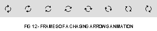
Chasing arrows (see Fig 12) are a simple animation used to indicate that an asynchronous background process is occurring, in other words a process which does not display a dialog containing a progress bar.
Variant and Control Definition ID
The chasing arrows CDEF resource ID is 7. The one available variant and its control definition ID is as follows:
Variant |
Var Code |
Control Definition ID | |
|---|---|---|---|
Chasing arrows. |
0 | 112 | kControlChasingArrowsProc |
Control Values
Control Value |
Content |
|---|---|
Initial |
Reserved. Set to 0. |
Minimum |
Reserved. Set to 0. |
Maximum |
Reserved. Set to 0. |
Control Data Tag Constants
Control Data Tag Constant |
Meaning and Data Type Returned or Set |
|---|---|
| kControlChasingArrowsAnimatingTag | Starts and stops chasing arrows animation. Use only if a call to GetControlFeatures reveals that the control's kControlIdlesWithTimer flag is set. Data type returned or set: Boolean |
Programmatic Creation
Asynchronous arrow controls may be created programmatically using the function CreateChasingArrowsControl:
     OSStatus  CreateChasingArrowsControl(WindowRef window,const Rect *boundsRect,
                                          ControlRef *outControl);
User Panes (Embedding Control)
The user pane has two main uses:
- It can be used as an embedding control, that is, other controls may be embedded within it. It is thus particularly useful for grouping together the controls belonging to an individual pane of a tab control or pop-up button group box.
- It provides a way to hook in application-defined (callback) functions, known as user pane functions (see below), which perform actions such as drawing, hit testing, tracking, etc.
Variants and Control Definition IDs
The user pane CDEF resource ID is 16. The one available variant and its control definition ID is as follows:
Variant |
Var Code |
Control Definition ID | |
|---|---|---|---|
User pane. |
0 | 256 | kControlUserPaneProc |
Control Values
Control Value |
Content |
|---|---|
Initial |
One or more of the control feature constants. (See Defining Your Own User Pane Functions, below.) Reset to 0 after creation. |
Minimum |
Ignored. After user pane creation, reset to a setting between -32768 to 32767. |
Maximum |
Ignored. After user pane creation, reset to a setting between -32768 to 32767. |
Control Data Tag Constants
The control data tag constants relevant to user panes all relate to user pane functions. See Defining Your Own User Pane Function, below.
Programmatic Creation
User Pane controls may be created programmatically using the function CreateUserPaneControl:
     OSStatus  CreateUserPaneControl(WindowRef window,const Rect *boundsRect,
                                     UInt32 features,ControlRef *outControl);
Scrolling Text Box (Embedding Control)
The scrolling text box implements a scrolling box of non-editable text. There are two variants:
- The standard variant, which has a scroll bar.
- The auto-scrolling variant, which does not have a scroll bar. This variant needs two pieces of information to work: the delay (in ticks) before the scrolling starts; the time (in ticks) between scrolls. By default, the text will scroll one pixel at a time, although this may be changed via SetControlData.
Variants and Control Definition IDs
The scrolling text box CDEF resource ID is 27. The two available variants and their control definition IDs are as follows:
Variant |
Var Code |
Control Definition ID | |
|---|---|---|---|
Standard. |
0 | 432 | kControlScrollTextBoxProc |
Auto-scrolling. |
1 | 433 | kControlScrollTextBoxAutoScrollProc |
Control Values
Control Value |
Content |
|---|---|
Initial |
Resource ID of a 'TEXT' and, optionally, a 'styl' resource. |
Minimum |
For the standard variant, set to 0. For the auto-scrolling variant , the delay (in ticks) before scrolling begins. (This delay is also used between when the scrolling completes and when it begins again.) |
Maximum |
For the standard variant, set to 0. For the auto-scrolling variant, the delay (in ticks) between each unit of scrolling. |
Control Data Tag Constant |
Meaning and Data Type Returned or Set |
|---|---|
| KControlScrollTextBoxDelayBefore AutoScrollTag | Gets or sets the number of ticks of delay before the initial scrolling of an auto-scrolling text box begins. Data type returned or set: UInt32 |
| KControlScrollTextBoxDelay BetweenAutoScrollTag | Gets or sets the number of ticks of delay between each unit of scrolling in an auto-scrolling text box. Data type returned or set: UInt32 |
| KControlScrollTextBoxAutoScroll AmountTag | Gets or sets the number of pixels by which an auto scrolling text box scrolls. (The default is 1.) Data type returned or set: UInt16 |
| kControlScrollTextBoxContentsTag | Sets the ID of a 'TEXT' resource and, optionally, a 'styl' resource, to be used as the content of a standard or auto-scrolling text box. Data type returned or set: Sint16 |
Programmatic Creation
Scrolling text box controls may be created programmatically using the function CreateScrollingTextBoxControl:
     OSStatus  CreateScrollingTextBoxControl(WindowRef window,const Rect *boundsRect,
                                             SInt16 contentResID,Boolean autoScroll,
                                             UInt32 delayBeforeAutoScroll,
                                             UInt32 delayBetweenAutoScroll,
                                             UInt16 autoScrollAmount,ControlRef *outControl);
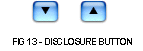
Disclosure Button
The disclosure button (see Fig 13) is available only on Mac OS X, and can only be created programmatically using the function CreateDisclosureButtonControl:
     OSStatus  CreateDisclosureButtonControl(WindowRef inWindow,const Rect *inBoundsRect,
                                             SInt32 inValue,Boolean inAutoToggles,
                                             ControlRef *  outControl);
The height of the button is fixed, and the button will be centred in the specified rectangle. Relevant constants are:
Parameter |
Constants |
|---|---|
| inValue | kControlDisclosureButtonClosed |
Edit Unicode Text
The edit Unicode text control is available only on Mac OS X, and can only be created programmatically using the function CreateEditUnicodeTextControl:
     OSStatus  CreateEditUnicodeTextControl(WindowRef window,const Rect *boundsRect,
                                            CFStringRef text,Boolean isPassword,
                                            const ControlFontStyleRec *style,
                                            ControlRef *outControl);
The control data tags applicable to the edit text control also apply to the edit Unicode text control, except that the kControlEditTextTEHandleTag tag must not be used.
Round Button
The round button is available only on Mac OS X, and can only be created programmatically using the function CreateRoundButtonControl:
     OSStatus  CreateRoundButtonControl(WindowRef nWindow,const Rect *inBoundsRect,
                                        ControlRoundButtonSize inSize,
                                        ControlButtonContentInfo *inContent,
                                        ControlRef *outControl);
Relevant constants are:
Parameter |
Constants |
|---|---|
| inSize | kControlRoundButtonNormalSize (20-pixel diameter) |
Control Data Tag Constants
Control Data Tag Constant |
Meaning and Data Type Returned or Set |
|---|---|
| kControlRoundButtonContentTag | Sets button content. Data type set: ControlButtonContentInfo |
| kControlRoundButtonSizeTag | Sets button size. Data type set: ControlRoundButtonSize |
Small Versions of Controls
Human Interface Guidelines permit the use of small versions of certain controls, which should only be used when space is at a premium. Full size and small controls should not be mixed in the same window.
The following lists those controls described in this chapter that are available in small versions, and describes how to create them.
Control |
Mac OS X |
Mac OS 8/9 |
|---|---|---|
Tab |
Pass kControlTabSizeSmall in CreateTabsControl call or use a small variant if creating from a 'CNTL' resource. Alternatively, if the control is created large, call SetControlData with the kControlSizeTag tag. |
Pass kControlTabSizeSmall in CreateTabsControl call or use a small variant if creating from a 'CNTL' resource. |
Edit text |
Make the control's rectangle 13 pixels high and call SetControlFontStyle to set the control's font to the small system font. |
Make the control's rectangle 13 pixels high and call SetControlFontStyle to set the control's font to the small system font. |
Slider |
Call SetControlData with the kControlSizeTag tag. |
(Not available.) |
Pop-up arrow |
Pass kControlPopupArrowSizeSmall in CreatePopupArrowControlcall or use a small variant if creating from a 'CNTL' resource. Alternatively, if the control is created large, call SetControlData with the kControlSizeTag to make the it small. |
Pass kControlPopupArrowSizeSmall in CreatePopupArrowControlcall or use a small variant if creating from a 'CNTL' resource. |
Round button |
Call SetControlData with the kControlSizeTag tag. |
(Not available.) |
Idle Processing
The following four controls need to perform idle processing for the reasons indicated:
Control |
Reason For Idle Processing |
|---|---|
Progress bar (indeterminate variant). |
Animate the bar. |
Clocks (when the kControlClockIsLive clock value flag constant is used). |
Update the clock. |
Chasing arrows. |
Animate the arrows. |
Edit text control. |
Cause TextEdit to be called to blink the insertion point caret. |
Scrolling text box (auto-scrolling variant). |
Scroll the text automatically. |
When these controls are displayed in a document window, your application may need to call IdleControls at the appropriate interval in your event loop, otherwise the animations, etc., will not occur. IdleControls sends a particular message to the CDEF, which responds appropriately.
The call to IdleControls is not necessary on Mac OS X because Mac OS X controls idle themselves automatically using their own internal timers. However, as of the time of writing, the call is necessary on Mac OS 8/9 because controls on Mac OS 8/9 do not yet have internal timers.
When these controls are displayed in a dialog on Mac OS 8/9, ModalDialog calls IdleControls for you.
You can determine whether a control has an internal timer by calling GetControlFeatures and testing for the kControlIdlesWithTimer bit.
Defining Your Own Key Filter Function
You can attach a key filter function to edit text controls to filter key strokes or modify them on return. . Your key filter function can change the keystroke, leave it alone, or block the CDEF from receiving it. For example, an edit text control could use a key filter function to allow only numeric values to be input in its field.
You would declare your key filter function as follows:
     ControlKeyFilterResult  myKeyFilterFunction(ControlRef controlRef,SInt16* keyCode,
                                                 SInt16 *charCode,EventModifiers *modifiers);
The Control Manager defines the data type ControlKeyFilterUPP to identify the universal procedure pointer for this application-defined (callback) function:
typedef STACK_UPP_TYPE(ControlKeyFilterProcPtr) ControlKeyFilterUPP;
As stated at Edit Text, above, the control data tag constant for getting and setting a key filter function is kControlKeyFilterTag and the data type returned or set is ControlKeyFilterUPP.
Example
The following example relates to an edit text control and assumes an application-defined key filter function named numericFilter.
#define kLeftArrow 0x1C
#define kRightArrow 0x1D
#define kUpArrow 0x1E
#define kDownArrow 0x1F
#define kBackspace 0x08
...
ControlKeyFilterUPP numericFilterUPP;
ControlRef controlHdl;
...
// ................................................. get universal procedure pointer
numericFilterUPP = NewControlKeyFilterProc(numericFilter);
// ....................................... attach key filter function to the control
GetDialogItemAsControl(dialogPtr,itemNumber,&controlHdl);
SetControlData(controlHdl,kControlNoPart,kControlEditTextKeyFilterTag,
sizeof(numericFilterUPP),(Ptr) &numericFilterUPP);
...
// ������������������������������������������������������������������� numericFilter
//
// This function will be called each time the edit text control receives a keystroke.
// Keystrokes that are to be accepted must return kControlKeyFilterPassKey.
// Keystrokes that are to be blocked must return kControlKeyFilterBlockKey. This
// function blocks all but the numeric keys, the "dash" key, and the arrow keys.
pascal ControlKeyFilterResult numericFilter(ControlRef control,SInt16* keyCode,
SInt16 *charCode,SInt16 *modifiers)
{
if(((char) *charCode >= '0') && ((char) *charCode <= '9'))
return kControlKeyFilterPassKey;
switch(*charCode)
{
case '-':
case kLeftArrow:
case kRightArrow:
case kUpArrow:
case kDownArrow:
case kBackspace:
return kControlKeyFilterPassKey;
break;
default:
SysBeep(10);
return kControlKeyFilterBlockKey;
break;
}
}
Defining Your Own Edit Text Validation Function
A key filter function, however, does not cater for the case of pasting text to an edit text item. Accordingly, you will ordinarily want to combine an edit text validation function with the key filter function for a specific edit text control.
You would declare your edit text validation function as follows:
void myEditTextValidationFunction(ControlRef controlHdl);
The following example ensures that, if a user supplied filename pasted to the edit text item contains one or more colons, those colons will be replaced with dashes.
     ControlEditTextValidationUPP editTextValidatorUPP;
     ControlRef                   controlHdl;
     ...

     // ................................................. get universal procedure pointer

     editTextValidatorUPP = NewControlEditTextValidationProc(editTextValidator);

     // ............................. attach edit text validation function to the control

     GetDialogItemAsControl(dialogPtr,iEditText1,&controlHdl);
     SetControlData(controlHdl,kControlNoPart,kControlEditTextValidationProcTag,
                    sizeof(editTextValidatorUPP),&editTextValidatorUPP);
     ...

     pascal void  editTextValidator(ControlRef controlHdl)
     {
       Str31  theText;
       Size   actualSize;
       UInt8  a;

       // ................................. Get the text to be examined from the control

       GetControlData(controlHdl,kControlNoPart,kControlEditTextTextTag,
                      sizeof(theText) -1,(Ptr) &theText[1],&actualSize);

       // ............................................ Set the length byte to the number
       // ...... of characters in the text, limited to the current maximum for filenames

       if(actualSize <= 31)
         theText[0] = actualSize;
       else
         theText[0] = 31;

       // ............................................... Replace any colons with dashes

       for(a=1;a<=theText[0];a++)
       {
         if(theText[a] == ':')
           theText[a] = '-';
       }

       // .............................................. You might want to add code here
       //  here to check whether any characters were replaced before bothering to redraw

       // ................ Put the replaced text into the control and redraw the control

       SetControlData(controlHdl,kControlNoPart,kControlEditTextTextTag,theText[0],
                      (Ptr) &theText[1]);

       Draw1Control(controlHdl);
     }
Defining Your Own User Pane Functions
As previously stated, one of the functions of a user pane is to provide a way to hook in application-defined (callback) functions which perform actions such as drawing, hit testing, tracking, etc. Such application-defined (callback) functions are called user pane functions. User pane functions provide you with the ability to create a custom control without writing your own control definition function.
User Pane Functions
User pane functions are categorised as follows:
Function |
Description |
|---|---|
Draw |
Draws the content of a user pane control. |
Hit test |
Returns the part code when the mouse-down event occurs. |
Tracking |
Tracks a control while the user holds down the mouse button. The function should track the control by repeatedly calling the action function specified in the actionProc parameter until the mouse button is released. When the mouse button is released, your function should return the part code of the control part that was tracked. This function will only get called if you have set the kControlHandlesTracking control feature bit on creation of the user pane control. |
Idle |
Performs idle processing. This function will only get called if you have set the kControlWantsIdle control feature bit on creation of the user pane control. |
Key Down |
Handles keyboard event processing. The function should handle the key pressed or released by the user and return the part code of the control where the keyboard event occurred. This function will only get called if you've set the kControlSupportsFocus control feature bit on creation of the user pane control. |
Activate |
Handles activate and deactivate event processing. The function should perform any special processing before the user pane becomes activated or deactivated. For example, it should deactivate its TEHandle or ListHandle if the user pane is about to be deactivated. This function will only get called if you have set the kControlWantsActivate control feature bit on creation of the user pane control. |
Focus |
Handle keyboard focus. The function is called in response to a change in keyboard focus. It should respond by changing keyboard focus based on the part code passed in the action parameter. This function will only get called if you have set the kControlSupportsFocus control feature bit on creation of the user pane control. |
Background |
Sets the background colour or pattern (only for user panes that support embedding). The function should set the user pane background colour or pattern to whatever is appropriate given the bit depth and device type passed in. This function will only get called if you have set the kControlHasSpecialBackground and kControlSupportsEmbedding control feature bits on creation of the user pane control. |
Control Data Tag Constants and Universal Procedure Pointers
Once you have provided a user pane function, you call SetControlData with the control data tag constant representing the user pane function you wish to set passed in the inTagName parameter and a universal procedure pointer to the user pane function passed in the inData parameter.
Control Data Tag Constants
The control data tag constants relating to user pane functions are as follows:
Control Data Tag Constant |
Meaning and Data Type Returned or Set |
|---|---|
| kControlUserPaneDrawProcTag | Gets or sets a drawing function. Indicates that the Control Manager needs to draw a control. Data type returned or set: ControlUserPaneDrawingUPP |
| kControlUserPaneHitTestProcTag | Gets or sets a hit-testing function. Indicates that the Control Manager needs to determine if a control part was hit. Data type returned or set: ControlUserPaneHitTestUPP |
| kControlUserPaneTrackingProcTag | Gets or sets a tracking function. The tracking function will be called when a control definition function returns the kControlHandlesTracking feature bit in response to a kControlMsgGetFeatures message. Indicates that a user pane handles its own tracking. Data type returned or set: ControlUserPaneTrackingUPP |
| kControlUserPaneIdleProcTag | Gets or sets an idle function. The idle function will be called when a control definition function returns the kControlWantsIdle feature bit in response to kControlMsgGetFeatures message. Indicates that a user pane performs idle processing. Data type returned or set: ControlUserPaneIdleUPP |
| kControlUserPaneKeyDownProcTag | Gets or sets a key down function. The key down function will be called when a control definition function returns the kControlSupportsFocus feature bit in response to a kControlMsgGetFeatures message. Indicates that a user pane performs keyboard event processing. Data type returned or set: ControlUserPaneKeyDownUPP |
| kControlUserPaneActivateProcTag | Gets or sets an activate function. The activate function will be called when a control definition function returns the kControlWantsActivate feature bit in response to a kControlMsgGetFeatures message. Indicates that a user pane wants to be informed of activate and deactivate events. Data type returned or set: ControlUserPaneActivateUPP |
| kControlUserPaneFocusProcTag | Gets or sets a keyboard focus function. The keyboard focus function will be called when a control definition function returns the kControlSupportsFocus feature bit in response to a kControlMsgGetFeatures message. Indicates that a user pane handles keyboard focus. Data type returned or set: ControlUserPaneFocusUPP |
| kControlUserPaneBackgroundProcTag | Gets or sets a background function. The background function will be called when a control definition function returns the kControlHasSpecialBackground and kControlSupportsEmbedding feature bits in response to a kControlMsgGetFeatures message. Indicates that a user pane can set its background colour or pattern. Data type returned or set: ControlUserPaneBackgroundUPP |
Creating and Disposing of Universal Procedure Pointers
The following functions create and dispose of universal procedure pointers for user pane functions:
     NewControlUserPaneDrawUPP         DisposeControlUserPaneDrawUPP
     NewControlUserPaneHitTestUPP      DisposeControlUserPaneHitTestUPP
     NewControlUserPaneTrackingUPP     DisposeControlUserPaneTrackingUPP
     NewControlUserPaneIdleUPP         DisposeControlUserPaneIdleUPP
     NewControlUserPaneKeyDownUPP      DisposeControlUserPaneKeyDownUPP
     NewControlUserPaneActivateUPP     DisposeControlUserPaneActivateUPP
     NewControlUserPaneFocusUPP        DisposeControlUserPaneFocusUPP
     NewControlUserPaneBackgroundUPP   DisposeControlUserPaneBackgroundUPP
Main Constants, Data Types and Functions
Constants
Control Definition IDs
KControlBevelButtonSmallBevelProc         = 32
KControlBevelButtonNormalBevelProc        = 33
KControlBevelButtonLargeBevelProc         = 34
kControlSliderProc                        = 48
kControlSliderLiveFeedback                = (1 << 0)
kControlSliderHasTickMarks                = (1 << 1)
kControlSliderReverseDirection            = (1 << 2)
kControlSliderNonDirectional              = (1 << 3)
kControlTriangleProc                      = 64
kControlTriangleLeftFacingProc            = 65
kControlTriangleAutoToggleProc            = 66
kControlTriangleLeftFacingAutoToggleProc  = 67
kControlProgressBarProc                   = 80
kControlLittleArrowsProc                  = 96
kControlChasingArrowsProc                 = 112
kControlTabLargeNorthProc                 = 128
kControlTabSmallNorthProc                 = 129
kControlTabLargeSouthProc                 = 130
kControlTabSmallSouthProc                 = 131
kControlTabLargeEastProc                  = 132
kControlTabSmallEastProc                  = 133
kControlTabLargeWestProc                  = 134
kControlTabSmallWestProc                  = 135
kControlSeparatorLineProc                 = 144
kControlGroupBoxTextTitleProc             = 160
kControlGroupBoxCheckBoxProc              = 161
kControlGroupBoxPopupButtonProc           = 162
kControlGroupBoxSecondaryTextTitleProc    = 164
kControlGroupBoxSecondaryCheckBoxProc     = 165
kControlGroupBoxSecondaryPopupButtonProc  = 166
kControlImageWellProc                     = 176
kControlPopupArrowEastProc                = 192
kControlPopupArrowWestProc                = 193
kControlPopupArrowNorthProc               = 194
kControlPopupArrowSouthProc               = 195
kControlPopupArrowSmallEastProc           = 196
kControlPopupArrowSmallWestProc           = 197
kControlPopupArrowSmallNorthProc          = 198
kControlPopupArrowSmallSouthProc          = 199
kControlPlacardProc                       = 224
kControlClockTimeProc                     = 240
kControlClockTimeSecondsProc              = 241
kControlClockDateProc                     = 242
kControlClockMonthYearProc                = 243
kControlUserPaneProc                      = 256
kControlEditTextProc                      = 272
kControlEditTextDialogProc                = 273
kControlEditTextPasswordProc              = 274
kControlEditTextInlineInputProc           = 276
kControlStaticTextProc                    = 288
kControlPictureProc                       = 304
kControlPictureNoTrackProc                = 305
kControlIconProc                          = 320
kControlIconNoTrackProc                   = 321
kControlIconSuiteProc                     = 322
kControlIconSuiteNoTrackProc              = 323
kControlIconRefProc                       = 324
kControlIconRefNoTrackProc                = 325
kControlWindowHeaderProc                  = 336
kControlWindowListViewHeaderProc          = 337
kControlListBoxProc                       = 352
kControlListBoxAutoSizeProc               = 353
kControlRadioGroupProc                    = 416
kControlScrollTextBoxProc                 = 432
kControlScrollTextBoxAutoScrollProc       = 433
Control Variants
kControlNoVariant                         = 0
kControlUsesOwningWindowsFontVariant      = 1 << 3
Control Part Codes
kControlNoPart                  = 0
kControlLabelPart               = 1
kControlMenuPart                = 2
kControlTrianglePart            = 4
kControlEditTextPart            = 5
kControlPicturePart             = 6
kControlIconPart                = 7
kControlClockPart               = 8
kControlClockHourDayPart        = 9,
kControlClockMinuteMonthPart    = 10
kControlClockSecondYearPart     = 11
kControlClockAMPMPart           = 12
kControlListBoxPart             = 24
kControlListBoxDoubleClickPart  = 25
kControlImageWellPart           = 26
kControlRadioGroupPart          = 27
kControlButtonPart              = 10
kControlCheckBoxPart            = 11
kControlRadioButtonPart         = 11
kControlUpButtonPart            = 20
kControlDownButtonPart          = 21
kControlPageUpPart              = 22
kControlPageDownPart            = 23
kControlIndicatorPart           = 129
kControlDisabledPart            = 254
kControlInactivePart            = 255
Bevel Button Graphic Alignment
KControlBevelButtonAlignSysDirection  = -1
KControlBevelButtonAlignCenter        = 0
KControlBevelButtonAlignLeft          = 1
KControlBevelButtonAlignRight         = 2
KControlBevelButtonAlignTop           = 3
kControlBevelButtonAlignBottom        = 4
kControlBevelButtonAlignTopLeft       = 5
kControlBevelButtonAlignBottomLeft    = 6
kControlBevelButtonAlignTopRight      = 7
kControlBevelButtonAlignBottomRight   = 8
Bevel Button Text Alignment values
KControlBevelButtonAlignTextSysDirection  = teFlushDefault
KControlBevelButtonAlignTextCenter        = teCenter
KControlBevelButtonAlignTextFlushRight    = teFlushRight
KControlBevelButtonAlignTextFlushLeft     = teFlushLeft
Bevel Button Text Placement
KControlBevelButtonPlaceSysDirection      = -1
KControlBevelButtonPlaceNormally          = 0
KControlBevelButtonPlaceToRightOfGraphic  = 1
KControlBevelButtonPlaceToLeftOfGraphic   = 2
KControlBevelButtonPlaceBelowGraphic      = 3
KControlBevelButtonPlaceAboveGraphic      = 4
Bevel Button Behaviour
kControlBehaviorPushbutton      = 0
kControlBehaviorToggles         = 0x0100
kControlBehaviorSticky          = 0x0200
kControlBehaviorSingleValueMenu = 0
kControlBehaviorMultiValueMenu  = 0x4000
kControlBehaviorOffsetContents  = 0x8000
kControlBehaviorCommandMenu     = 0x2000
Bevel Button Content Type
kControlContentTextOnly         = 0
kControlContentIconSuiteRes     = 1
kControlContentCIconRes         = 2
kControlContentPictRes          = 3
kControlContentIconSuiteHandle  = 129
kControlContentCIconHandle      = 130
kControlContentPictHandle       = 131
kControlContentIconRef          = 132
Bevel Button Thickness
kControlBevelButtonSmallBevel   = 0
kControlBevelButtonNormalBevel  = 1
kControlBevelButtonLargeBevel   = 2
Bevel Button Menu Placement
kControlBevelButtonMenuOnBottom = 0
kControlBevelButtonMenuOnRight  = (1 << 2)
Tab Size
kControlTabSizeLarge = 0 kControlTabSizeSmall = 1Tab Direction
kControlTabDirectionNorth = 0 kControlTabDirectionSouth = 1 kControlTabDirectionEast = 2 kControlTabDirectionWest = 3Clock Value Flag Constants
kControlClockNoFlags        = 0
kControlClockIsDisplayOnly  = 1
kControlClockIsLive         = 2
Control Data Tags
kControlFontStyleTag                            = FOUR_CHAR_CODE('font')
kControlKeyFilterTag                            = FOUR_CHAR_CODE('fltr')
kControlBevelButtonContentTag                   = FOUR_CHAR_CODE('cont')
kControlBevelButtonTransformTag                 = FOUR_CHAR_CODE('tran')
kControlBevelButtonTextAlignTag                 = FOUR_CHAR_CODE('tali')
kControlBevelButtonTextOffsetTag                = FOUR_CHAR_CODE('toff')
kControlBevelButtonGraphicAlignTag              = FOUR_CHAR_CODE('gali')
kControlBevelButtonGraphicOffsetTag             = FOUR_CHAR_CODE('goff')
kControlBevelButtonTextPlaceTag                 = FOUR_CHAR_CODE('tplc')
kControlBevelButtonMenuValueTag                 = FOUR_CHAR_CODE('mval')
kControlBevelButtonMenuRefTag                   = FOUR_CHAR_CODE('mhnd')
kControlBevelButtonMenuRefTag                   = FOUR_CHAR_CODE('mhnd')
kControlBevelButtonOwnedMenuRefTag              = FOUR_CHAR_CODE('omrf')
kControlBevelButtonKindTag                      = FOUR_CHAR_CODE('bebk')
kControlBevelButtonCenterPopupGlyphTag          = FOUR_CHAR_CODE('pglc')
kControlBevelButtonLastMenuTag                  = FOUR_CHAR_CODE('lmnu')
kControlBevelButtonMenuDelayTag                 = FOUR_CHAR_CODE('mdly')
kControlBevelButtonScaleIconTag                 = FOUR_CHAR_CODE('scal')
kControlTriangleLastValueTag                    = FOUR_CHAR_CODE('last')
kControlProgressBarIndeterminateTag             = FOUR_CHAR_CODE('inde')
kControlTabContentRectTag                       = FOUR_CHAR_CODE('rect')
kControlTabEnabledFlagTag                       = FOUR_CHAR_CODE('enab')
kControlTabFontStyleTag                         = kControlFontStyleTag
kControlTabInfoTag                              = FOUR_CHAR_CODE('tabi')
kControlGroupBoxMenuHandleTag                   = FOUR_CHAR_CODE('mhan')
kControlGroupBoxFontStyleTag                    = kControlFontStyleTag
kControlGroupBoxTitleRectTag                    = FOUR_CHAR_CODE('trec')
kControlImageWellContentTag                     = FOUR_CHAR_CODE('cont')
kControlImageWellTransformTag                   = FOUR_CHAR_CODE('tran')
kControlClockLongDateTag                        = FOUR_CHAR_CODE('date')
kControlClockFontStyleTag                       = kControlFontStyleTag
kControlClockAnimatingTag                       = FOUR_CHAR_CODE('anim')
kControlUserItemDrawProcTag                     = FOUR_CHAR_CODE('uidp')
kControlUserPaneDrawProcTag                     = FOUR_CHAR_CODE('draw')
kControlUserPaneHitTestProcTag                  = FOUR_CHAR_CODE('hitt')
kControlUserPaneTrackingProcTag                 = FOUR_CHAR_CODE('trak')
kControlUserPaneIdleProcTag                     = FOUR_CHAR_CODE('idle')
kControlUserPaneKeyDownProcTag                  = FOUR_CHAR_CODE('keyd')
kControlUserPaneActivateProcTag                 = FOUR_CHAR_CODE('acti')
kControlUserPaneFocusProcTag                    = FOUR_CHAR_CODE('foci')
kControlUserPaneBackgroundProcTag               = FOUR_CHAR_CODE('back')
kControlEditTextStyleTag                        = kControlFontStyleTag
kControlEditTextTextTag                         = FOUR_CHAR_CODE('text')
kControlEditTextTEHandleTag                     = FOUR_CHAR_CODE('than')
kControlEditTextKeyFilterTag                    = kControlKeyFilterTag,
kControlEditTextSelectionTag                    = FOUR_CHAR_CODE('sele')
kControlEditTextPasswordTag                     = FOUR_CHAR_CODE('pass')
kControlEditTextLockedTag                       = FOUR_CHAR_CODE('lock')
kControlEditTextValidationProcTag               = FOUR_CHAR_CODE('vali')
kControlEditTextCFStringTag                     = FOUR_CHAR_CODE('cfst')
kControlStaticTextStyleTag                      = kControlFontStyleTag
kControlStaticTextTextTag                       = FOUR_CHAR_CODE('text')
kControlStaticTextTextHeightTag                 = FOUR_CHAR_CODE('thei')
kControlStaticTextTruncTag                      = FOUR_CHAR_CODE('trun')
kControlIconTransformTag                        = FOUR_CHAR_CODE('trfm')
kControlIconAlignmentTag                        = FOUR_CHAR_CODE('algn')
kControlIconResourceIDTag                       = FOUR_CHAR_CODE('ires')
kControlIconContentTag                          = FOUR_CHAR_CODE('cont')
kControlListBoxListHandleTag                    = FOUR_CHAR_CODE('lhan')
kControlListBoxKeyFilterTag                     = kControlKeyFilterTag
kControlListBoxFontStyleTag                     = kControlFontStyleTag
kControlListBoxDoubleClickTag                   = FOUR_CHAR_CODE('dblc')
kControlScrollTextBoxDelayBeforeAutoScrollTag   = FOUR_CHAR_CODE('stdl')
kControlScrollTextBoxDelayBetweenAutoScrollTag  = FOUR_CHAR_CODE('scdl')
kControlScrollTextBoxAutoScrollAmountTag        = FOUR_CHAR_CODE('samt')
kControlScrollTextBoxContentsTag                = FOUR_CHAR_CODE('tres')
kControlRoundButtonContentTag                   = FOUR_CHAR_CODE('cont'
kControlRoundButtonSizeTag                      = FOUR_CHAR_CODE('size'
Slider Orientation
kControlSliderPointsDownOrRight                = 0
kControlSliderPointsUpOrLeft                   = 1
kControlSliderDoesNotPoint                     = 2
Clock Control Type
kControlClockTypeHourMinute                    = 0
kControlClockTypeHourMinuteSecond              = 1
kControlClockTypeMonthDayYear                  = 2
kControlClockTypeMonthYear                     = 3
Disclosure Triangle Orientation
kControlDisclosureTrianglePointDefault         = 0
kControlDisclosureTrianglePointRight           = 1
kControlDisclosureTrianglePointLeft            = 2
Popup Arrow Orientation
kControlPopupArrowOrientationEast              = 0
kControlPopupArrowOrientationWest              = 1
kControlPopupArrowOrientationNorth             = 2
kControlPopupArrowOrientationSouth             = 3
Key Filter Result Codes
kControlKeyFilterBlockKey  = 0
kControlKeyFilterPassKey   = 1
Control Feature Bits
kControlSupportsGhosting      = 1 << 0
kControlSupportsEmbedding     = 1 << 1
kControlSupportsFocus         = 1 << 2
kControlWantsIdle             = 1 << 3
kControlWantsActivate         = 1 << 4
kControlHandlesTracking       = 1 << 5
kControlSupportsDataAccess    = 1 << 6
kControlHasSpecialBackground  = 1 << 7
kControlGetsFocusOnClick      = 1 << 8
kControlSupportsCalcBestRect  = 1 << 9
kControlSupportsLiveFeedback  = 1 << 10
kControlHasRadioBehavior      = 1 << 11
Focusing Part Codes
KcontrolFocusNoPart    = 0
KControlFocusNextPart  = -1
kControlFocusPrevPart  = -2
Disclosure Button State
kControlDisclosureButtonClosed                 = 0
kControlDisclosureButtonDisclosed              = 1
Round Button Size
kControlRoundButtonNormalSize                  = 0
kControlRoundButtonLargeSize                   = 2
Control Feature Bit � Internal Timer
kControlIdlesWithTimer = 1 << 23
Control Kind (Mac OS X Only)
kControlKindBevelButton                        = FOUR_CHAR_CODE('bevl')
kControlKindImageWell                          = FOUR_CHAR_CODE('well')
kControlKindTabs                               = FOUR_CHAR_CODE('tabs')
kControlKindEditText                           = FOUR_CHAR_CODE('etxt')
kControlKindSlider                             = FOUR_CHAR_CODE('sldr')
kControlKindCheckGroupBox                      = FOUR_CHAR_CODE('cgrp')
kControlKindPopupGroupBox                      = FOUR_CHAR_CODE('pgrp')
kControlKindClock                              = FOUR_CHAR_CODE('clck')
kControlKindProgressBar                        = FOUR_CHAR_CODE('prgb')
kControlKindRelevanceBar                       = FOUR_CHAR_CODE('relb')
kControlKindLittleArrows                       = FOUR_CHAR_CODE('larr')
kControlKindDisclosureTriangle                 = FOUR_CHAR_CODE('dist')
kControlKindPicture                            = FOUR_CHAR_CODE('pict')
kControlKindIcon                               = FOUR_CHAR_CODE('icon')
kControlKindWindowHeader                       = FOUR_CHAR_CODE('whed')
kControlKindPlacard                            = FOUR_CHAR_CODE('plac')
kControlKindStaticText                         = FOUR_CHAR_CODE('stxt')
kControlKindSeparator                          = FOUR_CHAR_CODE('sepa')
kControlKindPopupArrow                         = FOUR_CHAR_CODE('parr')
kControlKindRadioGroup                         = FOUR_CHAR_CODE('rgrp')
kControlKindChasingArrows                      = FOUR_CHAR_CODE('carr')
kControlKindScrollingTextBox                   = FOUR_CHAR_CODE('stbx')
kControlKindDisclosureButton                   = FOUR_CHAR_CODE('disb')
kControlKindRoundButton                        = FOUR_CHAR_CODE('rndb')
Data Types
typedef SInt16 ControlFocusPart;
typedef SInt16 ControlKeyFilterResult;
typedef SInt16 ControlButtonGraphicAlignment;
typedef SInt16 ControlButtonTextAlignment;
typedef SInt16 ControlButtonTextPlacement;
typedef SInt16 ControlContentType;
typedef SInt16 ControlVariant;
typedef UInt16 ControlSliderOrientation;
typedef UInt16 ControlClockType;
typedef UInt16 ControlDisclosureTriangleOrientation;
typedef SInt16 ControlRoundButtonSize;
Button Content Info Structure
struct ControlButtonContentInfo
{
  ControlContentType  contentType;
  union {
    SInt16      resID;
    CIconHandle cIconHandle;
    Handle      iconSuite;
    IconRef     iconRef;
    PicHandle   picture;
    Handle      ICONHandle;
  } u;
};
typedef struct ControlButtonContentInfo ControlButtonContentInfo;
typedef ControlButtonContentInfo *ControlButtonContentInfoPtr;
typedef ControlButtonContentInfo ControlImageContentInfo;
typedef ControlButtonContentInfo *ControlImageContentInfoPtr;
Tab Information Structures
struct ControlTabInfoRec
{
  SInt16 version;
  SInt16 iconSuiteID;
  Str255 name;
};
typedef struct ControlTabInfoRec ControlTabInfoRec;

struct ControlTabInfoRecV1
{
  SInt16      version;
  SInt16      iconSuiteID;
  CFStringRef name;
};
typedef struct ControlTabInfoRecV1 ControlTabInfoRecV1;
Tab Entry Structures
struct ControlTabEntry
{
ControlButtonContentInfo *icon;
CFStringRef name;
Boolean enabled;
};
typedef struct ControlTabEntry ControlTabEntry;
Edit Text Selection Structure
struct ControlEditTextSelectionRec
{
SInt16 selStart;
SInt16 selEnd;
};
typedef struct ControlEditTextSelectionRec ControlEditTextSelectionRec;
typedef ControlEditTextSelectionRec * ControlEditTextSelectionPtr;
Functions
Give Idle Time To Controls
void IdleControls(WindowPtr inWindow);
Send Keyboard Event to Control With keyboard Focus
Sint16 HandleControlKey(ControlRef inControl,SInt16 inKeyCode,SInt16 inCharCode,
SInt16 inModifiers);
Set the Background For a Control
OSErr SetUpControlBackground (ControlRef inControl,SInt16 inDepth,
Boolean inIsColorDevice);
KeyBoard Focus
OSErr GetKeyboardFocus(WindowPtr inWindow,ControlRef *outControl);
OSErr SetKeyboardFocus(WindowPtr inWindow,ControlRef inControl,ControlFocusPart inPart);
OSErr AdvanceKeyboardFocus(WindowPtr inWindow);
OSErr ReverseKeyboardFocus(WindowPtr inWindow);
OSErr ClearKeyboardFocus(WindowPtr inWindow);
Control Features
OSErr GetControlFeatures(ControlRef inControl,UInt32 *outFeatures);
Validating Controls
Boolean IsValidControlhandle(ControlRef theControl);
Creating Controls Programmatically
OSStatus CreateBevelButtonControl(WindowRef window,const Rect *boundsRect,
CFStringRef title,ControlBevelThickness thickness,
ControlBevelButtonBehavior behavior,ControlButtonContentInfoPtr info, SInt16 menuID,
ControlBevelButtonMenuBehavior menuBehavior,
ControlBevelButtonMenuPlacement menuPlacement,ControlRef *outControl);
OSStatus CreateImageWellControl(WindowRef window,const Rect *boundsRect,
const ControlButtonContentInfo *info,ControlRef *outControl);
OSStatus CreateTabsControl(WindowRef window,const Rect *boundsRect,ControlTabSize size,
ControlTabDirection direction,UInt16 numTabs,const ControlTabEntry *tabArray,
ControlRef *outControl);
OSStatus CreateEditTextControl(WindowRef window,const Rect *boundsRect, CFStringRef text,
Boolean isPassword,Boolean useInlineInput,const ControlFontStyleRec *style,
ControlRef *outControl);
OSStatus CreateSliderControl(WindowRef window,const Rect *boundsRect,SInt32 value,
SInt32 minimum,SInt32 maximum,ControlSliderOrientation orientation,
UInt16 numTickMarks,Boolean liveTracking,ControlActionUPP liveTrackingProc,
ControlRef *outControl);
OSStatus CreateGroupBoxControl(WindowRef window,const Rect *boundsRect, CFStringRef title,
Boolean primary,ControlRef *outControl);
OSStatus CreateCheckGroupBoxControl(WindowRef window,const Rect *boundsRect,
CFStringRef title,Boolean primary,Boolean autoToggle,ControlRef *outControl);
OSStatus CreatePopupGroupBoxControl(WindowRef window,const Rect *boundsRect,
CFStringRef title,Boolean primary,SInt16 menuID,Boolean variableWidth,
SInt16 titleWidth,SInt16 titleJustification,Style titleStyle,ControlRef *outControl);
OSStatus CreateClockControl(WindowRef window,const Rect *boundsRect,
ControlClockType clockType,
ControlClockFlags clockFlags,ControlRef *outControl);
OSStatus CreateProgressBarControl(WindowRef window,const Rect *boundsRect,SInt32 value,
SInt32 minimum,SInt32 maximum,Boolean indeterminate,ControlRef *outControl);
OSStatus CreateLittleArrowsControl(WindowRef window,const Rect *boundsRect,SInt32 value,
SInt32 minimum,SInt32 maximum,SInt32 increment,ControlRef *outControl);
OSStatus CreateDisclosureTriangleControl(WindowRef window,const Rect *boundsRect,
ControlDisclosureTriangleOrientation orientation, CFStringRef title,
Boolean drawTitle,Boolean autoToggles,ControlRef *outControl);
OSStatus CreatePictureControl(WindowRef window,const Rect *boundsRect,
const ControlButtonContentInfo *content,Boolean dontTrack,ControlRef *outControl);
OSStatus CreateIconControl(WindowRef window,const Rect *boundsRect,
const ControlButtonContentInfo *icon,Boolean dontTrack,ControlRef *outControl);
OSStatus CreateWindowHeaderControl(WindowRef window,const Rect *boundsRect,
Boolean isListHeader,ControlRef *outControl);
OSStatus CreatePlacardControl(WindowRef window,const Rect *boundsRect,ControlRef *outControl);
OSStatus CreateStaticTextControl(WindowRef window,const Rect *boundsRect,
CFStringRef text,const ControlFontStyleRec *style,ControlRef *outControl);
OSStatus CreateSeparatorControl(WindowRef window,const Rect *boundsRect,
ControlRef *outControl);
OSStatus CreatePopupArrowControl(WindowRef window,const Rect *boundsRect,
ControlPopupArrowOrientation orientation,ControlPopupArrowSize size,
ControlRef *outControl);
OSStatus CreateRadioGroupControl(WindowRef window,const Rect *boundsRect,
ControlRef *outControl);
OSStatus CreateChasingArrowsControl(WindowRef window,const Rect *boundsRect,
ControlRef *outControl);
OSStatus CreateUserPaneControl(WindowRef window,const Rect *boundsRect,UInt32 features,
ControlRef *outControl);
OSStatus CreateScrollingTextBoxControl(WindowRef window,const Rect *boundsRect,
SInt16 contentResID, Boolean autoScroll,UInt32 delayBeforeAutoScroll,
UInt32 delayBetweenAutoScroll, UInt16 autoScrollAmount,ControlRef *outControl);
Creating Controls Programmatically (Controls Available on Mac OS X Only)
OSStatus CreateRelevanceBarControl(WindowRef window,const Rect *boundsRect,SInt32 value,
SInt32 minimum,SInt32 maximum,ControlRef *outControl);
OSStatus CreateDisclosureButtonControl(WindowRef inWindow,const Rect *inBoundsRect,
SInt32 inValue,Boolean inAutoToggles,ControlRef * outControl);
OSStatus CreateEditUnicodeTextControl(WindowRef window,const Rect *boundsRect,
CFStringRef text,Boolean isPassword,const ControlFontStyleRec *style,
ControlRef *outControl);
OSStatus CreateRoundButtonControl(WindowRef nWindow,const Rect *inBoundsRect,
ControlRoundButtonSize inSize,ControlButtonContentInfo *inContent,
ControlRef *outControl);
Helper Functions
OSErr GetBevelButtonMenuValue ControlRef inButton,SInt16 * outValue);
OSErr SetBevelButtonMenuValue ControlRef inButton,SInt16 inValue);
OSErr GetBevelButtonMenuHandle ControlRef inButton,MenuHandle * outHandle);
OSErr GetBevelButtonContentInfo ControlRef inButton,
ControlButtonContentInfoPtr outContent);
OSErr SetBevelButtonContentInfo ControlRef inButton,ControlButtonContentInfoPtr inContent);
OSErr SetBevelButtonTransform ControlRef inButton,IconTransformType transform);
OSErr SetBevelButtonGraphicAlignment ControlRef inButton,
ControlButtonGraphicAlignment inAlign,SInt16 inHOffset,SInt16 inVOffset);
OSErr SetBevelButtonTextAlignment ControlRef inButton,ControlButtonTextAlignment inAlign,
SInt16 inHOffset);
OSErr SetBevelButtonTextPlacement ControlRef inButton,ControlButtonTextPlacement inWhere);
OSErr GetImageWellContentInfo(ControlRef inButton,ControlButtonContentInfoPtr outContent);
OSErr SetImageWellContentInfo(ControlRef inButton,ControlButtonContentInfoPtr inContent);
OSErr SetImageWellTransform(ControlRef inButton,IconTransformType inTransform);
OSErr GetTabContentRect(ControlRef inTabControl,Rect * outContentRect);
OSErr SetTabEnabled(ControlRef inTabControl,SInt16 inTabToHilite,Boolean inEnabled);
OSErr SetDisclosureTriangleLastValue(ControlRef inTabControl,SInt16 inValue);
Application-Defined (Callback) Functions
ControlKeyFilterResult myKeyFilterFunction(ControlRef controlRef,SInt16* keyCode,
SInt16 *charCode,EventModifiers *modifiers);
void myEditTextValidationFunction(ControlRef controlHdl);
Creating and Disposing of Universal Procedure Pointers � User Pane Functions
ControlUserPaneDrawUPP NewControlUserPaneDrawUPP(ControlUserPaneDrawProcPtr
userRoutine);
ControlUserPaneHitTestUPP NewControlUserPaneHitTestUPP(ControlUserPaneHitTestProcPtr
userRoutine);
ControlUserPaneTrackingUPP NewControlUserPaneTrackingUPP(ControlUserPaneTrackingProcPtr
userRoutine);
ControlUserPaneIdleUPP NewControlUserPaneIdleUPP(ControlUserPaneIdleProcPtr
userRoutine);
ControlUserPaneKeyDownUPP NewControlUserPaneKeyDownUPP(ControlUserPaneKeyDownProcPtr
userRoutine);
ControlUserPaneActivateUPP NewControlUserPaneActivateUPP(ControlUserPaneActivateProcPtr
userRoutine);
ControlUserPaneFocusUPP NewControlUserPaneFocusUPP(ControlUserPaneFocusProcPtr
userRoutine);
ControlUserPaneBackgroundUPP NewControlUserPaneBackgroundUPP(ControlUserPaneBackgroundProcPtr
userRoutine);
void DisposeControlUserPaneDrawUPP(ControlUserPaneDrawUPP userUPP);
void DisposeControlUserPaneHitTestUPP(ControlUserPaneHitTestUPP userUPP);
void DisposeControlUserPaneTrackingUPP(ControlUserPaneTrackingUPP userUPP);
void DisposeControlUserPaneIdleUPP(ControlUserPaneIdleUPP userUPP);
void DisposeControlUserPaneKeyDownUPP(ControlUserPaneKeyDownUPP userUPP);
void DisposeControlUserPaneActivateUPP(ControlUserPaneActivateUPP userUPP);
void DisposeControlUserPaneFocusUPP(ControlUserPaneFocusUPP userUPP);
void DisposeControlUserPaneBackgroundUPP(ControlUserPaneBackgroundUPP userUPP);


- SPREAD THE WORD:

- Slashdot

- Digg

- Del.icio.us


- Newsvine
