Transforms
CSS transform properties provide powerful formatting possibilities without having to resort to using images or Flash. Using the transform properties, elements can be translated, rotated, and scaled in 2D and 3D space. Perspective can also be applied to elements giving a sense of depth to the way they are rendered.
The CSS visual formatting model defines a coordinate system for each element. This coordinate space can be thought of as being expressed in pixels, starting in the upper-left corner of the parent with positive values proceeding to the right and down. In the basic formatting model, it is possible to set only the position and size of elements. Using CSS transforms, you can position elements in 2D and 3D space.
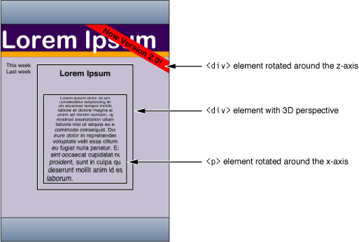
For example, Figure 1 shows a simple HTML document rendered using CSS transform properties. The "Now Version 2.0!” element is rotated around the z-axis. The “Lorem Ipsum” element specifies a 3D perspective for its children elements. The containing text element is rotated around the x-axis.
Before using transform properties, you should understand how the coordinate systems and rendering work. Then use CSS transform properties to set the transform function per element. Use additional transform properties to set the origin and set other rendering attributes.
iPhone OS Note: In iPhone OS, transitions and animations of the -webkit-transform and opacity properties are performance-enhanced.
Coordinate Systems and Rendering
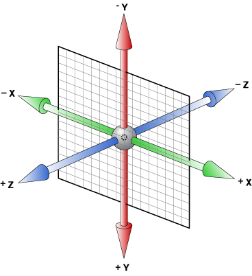
Transformed coordinate spaces behave differently in 2D and 3D. In 2D, the transformed coordinate space behaves as described in the coordinate system transformations section of the Scalable Vector Graphics (SVG) 1.1 Specification. This is a coordinate system with two axes: The x-axis increases horizontally to the right; the y-axis increases vertically downwards. In 3D, a z-axis is added, with positive z-values conceptually rising perpendicularly out of the window toward the user and negative z-values falling into the window away from the user as illustrated in Figure 2.
Setting a transform property for an element establishes a new local coordinate system for that element. You can apply multiple transforms to parent and child elements. Transformations are cumulative. That is, elements establish their local coordinate system within the coordinate system of their parent. In this way, a transform property effectively accumulates all the transform properties of its ancestors. The accumulation of these transforms defines a current transformation matrix (CTM) for the element.
A transform property does not affect the flow of the content surrounding the transformed element. However, the value of the overflow area takes into account transformed elements. This behavior is similar to what happens when elements are translated via relative positioning. Therefore, if the value of the overflow property is scroll or auto, scroll bars appear as needed to see content that is transformed outside the visible area.
If a transform, other than the identity transform, is set for an element, a stacking context and a containing block is created for that element. The object acts as though position: relative has been specified, but also acts as a containing block for fixed-positioned descendants. The z-position of a transformed element (its location on the z-axis) does not affect the order within a stacking context. With elements at the same z-index, objects are drawn in order of increasing z-position.
Note that elements are flat, planar surfaces with no z-depth in their default orientation. The transform property can be used to change their size, position, and orientation to position them in 3D space. However, though elements can be positioned to intersect, they are always rendered fully above or below each other. Which elements are rendered later (and therefore above elements rendered earlier) is determined by which is “closer” to the viewer.
Setting Transform Functions
A 2D or 3D transform is applied to an element using the -webkit-transform property. The parameter to this property is a list of transform functions, described in “Visual Effects Timing Functions” in Safari CSS Reference. The set of transform functions is similar to those allowed by SVG, although there are additional functions to support 3D transforms.
Rotating an Element
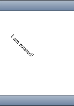
Listing 1 rotates a div element by 45 degrees around the z-axis using an inline style.
Listing 1 Rotating an element
<div style = "width: 12em; |
margin-top: 5em; |
-webkit-transform: rotate(45deg)"> |
I am rotated! |
</div> |
The results on iPhone OS are shown in Figure 3.
The rotate() function is just one of a number of functions you can apply using the -webkit-transform property. For a complete list of transform functions, see “Visual Effects Transform Functions” in Safari CSS Reference.
Setting Multiple Transforms
You can apply multiple transforms to the same element and apply transforms to parent and child elements. The -webkit-transform property accepts a single transform function or a whitespace-separated list of functions. When a list of functions is provided, the final transformation value for the element is obtained by performing a matrix concatenation of each entry in the list.
Listing 2 sets an element’s transform to a list of transform functions and Listing 3 produces the same results by applying different transforms to nested elements.
Listing 2 Setting multiple transforms using a whitespace-separated list
<div style="-webkit-transform:translate(-10px,-20px) |
scale(2) rotate(45deg) translate(5px,10px)"/> |
Listing 3 Nesting transforms
<div style="-webkit-transform:translate(-10px,-20px)"> |
<div style="-webkit-transform:scale(2)"> |
<div style="-webkit-transform:rotate(45deg)"> |
<div style="-webkit-transform:translate(5px,10px)"> |
</div> |
</div> |
</div> |
</div> |
Changing the Origin
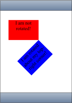
Use the -webkit-transform-origin property to change the origin of transforms applied to an element from the center default. The origin is expressed as a percentage of the size of the element. For example, the default value 50% 50% causes transformations to occur around the center of the element. Changing the origin to 100% 0% causes transformation to occur around the top-right corner of on element.
The code in Listing 4 rotates the second box in Figure 4 around the top-right corner.
Listing 4 Rotating an element around the top-right corner
<div style="height: 200px; |
width: 300px; |
font-size:300%; |
text-align:center; |
background-color:red;"> |
I am not rotated! |
</div> |
<div style="height: 200px; |
width: 300px; |
font-size: 300%; |
text-align: center; |
background-color: blue; |
-webkit-transform: rotate(-45deg); |
-webkit-transform-origin: 100% 0%;"> |
I am rotated about my top-right corner! |
</div> |
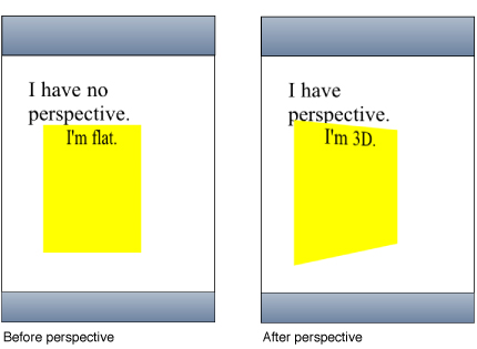
Setting the Perspective
Use the -webkit-perspective property to change the perspective in 3D and give a sense of depth to a scene by causing elements further away from the viewer to appear smaller. The -webkit-perspective property applies the same transform as the perspective transform function, except that it applies only to the children of the element, not to the transform applied to the element itself.
The code fragment in Listing 5 sets the parent element’s -webkit-perspective property to 500 causing the child element to appear in 3D.
Listing 5 Adding perspective
<html> |
<head> |
<meta name="viewport" content="user-scalable=no, width=device-width"/> |
<title>Setting the Perspective</title> |
</head> |
<body> |
<div style="font-size: 200%; margin: 1em 1em; -webkit-perspective: 500;" > |
I have perspective. |
<div style="height: 6em; width: 6em; text-align:center; background-color: yellow; -webkit-transform: rotateY(40deg);"> |
I'm 3D. |
</div> |
</div> |
</body> |
</html> |
Figure 5 shows the before and after results of setting the perspective of a parent element.
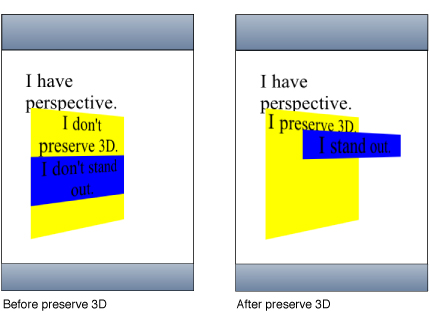
Setting the Transform Style
Use the -webkit-transform-style property to change how nested elements are rendered in 3D space. If -webkit-transform-style is flat, all children of this element are rendered flattened into the 2D plane of the element. Therefore, rotating the element about the x-axes or y-axes causes children positioned at positive or negative z positions to appear on the element's plane, rather than in front of or behind it. If -webkit-transform-style is preserve-3d, this flattening is not performed, so children maintain their position in 3D space.
This flattening takes place at each element, so preserving a hierarchy of elements in 3D space requires that each ancestor in the hierarchy have -webkit-transform-style set to preserve 3D. But -webkit-transform-style affects only an element's children; the leaf nodes in a hierarchy do not require the preserve-3d style.
The code in Listing 6 shows how to set the transform style of the parent element.
Listing 6 Setting the transform style
<div style="font-size: 200%; margin: 1em 1em; |
-webkit-perspective: 500;" > |
<div style="height: 8em; |
width: 6em; |
text-align:center; |
background-color: yellow; |
-webkit-transform-style: preserve-3d; |
-webkit-transform: rotateY(40deg);"> |
I am the parent, and have perspective. |
<div style="-webkit-transform: translateZ(3em); |
background-color: blue;"> |
I stand out from my parent element. |
</div> |
</div> |
</div> |
Figure 6 shows the before and after results of setting this property when the parent element has no perspective.
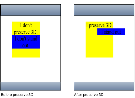
Figure 7 shows the before and after results of setting this property when the parent element has perspective too.
Note that it’s possible for the elements in a 3D tree to be located behind an ancestor element and therefore, be invisible or hidden. To prevent this, ensure that ancestor elements in a 3D tree that uses preserve-3d set -webkit-transform-style to flat (the default).
Also, the effect of setting -webkit-transform-style to preserve-3d may not be possible for all elements. Elements that have overflow set to hidden are unable to render their child elements in 3D. In this case, the element behaves as if the property is set to flat.
Back Face Visibility
Use the -webkit-backface-visibility property to set whether or not the “back side” of a transformed element is visible when facing the viewer. If the identity transform is set, the front side of an element faces the viewer. Applying a rotation about the y-axis of 180 degrees (for instance) causes the back side of the element to face the viewer. For example, you might use this setting to create a box out of six elements, but where you want to see the inside faces of the box. You also need this property when creating a backdrop for a 3D stage.
Another example is when you want to place two elements back to back, as in the CardFlip sample code project. Without this property, the front and back elements of the face card could at times switch places during the flip transition causing a flicker. Listing 7 shows the style settings of the face card that sets the -webkit-backface-visibility property to hidden. Figure 2 shows the results of setting this property—a smooth flip transition with no flicker.
Listing 7 Hiding the back side of a face card
/* Styles the card and hides its "back side" when the card is flipped */ |
.face |
{ |
position: absolute; |
height: 300px; |
width: 200px; |
/* Give a round layout to the card */ |
-webkit-border-radius: 10px; |
/* Drop shadow around the card */ |
-webkit-box-shadow: 0px 2px 6px rgba(0, 0, 0, 0.5); |
/* Make sure that users will not be able to select anything on the card */ |
/* We create the card by stacking two div elements at the exact same location. The back of the card |
is shown when we rotated the card 180 degrees along the y-axis. Setting this property to hidden |
ensures that the "back side" is hidden when the card is flipped. |
*/ |
-webkit-backface-visibility: hidden; |
} |
Creating Transforms in JavaScript
There are also a few JavaScript classes that you can use to access and manipulate transforms. Use the WebKitCSSMatrix class to create either a 4x4 matrix for 3D or a vector for 2D and the WebKitCSSTransformValue class to get and set the transform. There are also methods added to DOMWindow to convert points that use instances of the WebKitPoint class as parameters. This section presents some examples of manipulating transforms in JavaScript. Refer to Safari DOM Additions Reference for details on all these classes.
Use the window’s getComputedStyle() method to get an element’s style and the webkitTransform property to get an element’s transform as follows:
var theTransform = window.getComputedStyle(element).webkitTransform; |
The webkitTransform property is a string representation of a list of transform operations. Usually this list contains a single matrix transform operation. For 3D transforms, the value is "matrix3d(...)" with the 16 values of the 4x4 homogeneous matrix between the parentheses. For 2D transforms, the value is a "matrix(...)" string containing the 6 vector values.
Similarly, use the webkitTransform property to set the transform of an element as follows:
var box2 = document.getElementById('box2'); |
box2.style.webkitTransform = theTransform; |
You can also use this string representation of a transform to create an instance of WebKitCSSMatrix as follows:
var matrix = new WebKitCSSMatrix(theTransform); |
Once you create a WebKitCSSMatrix object, you can apply transform functions to it in JavaScript using the multiply(), inverse(), translate(), scale(), rotate(), and rotateAxisAngle() methods. This code fragment sets the transform of another element to a scaled version of the matrix above:
var box3 = document.getElementById('box3'); |
box3.style.webkitTransform = matrix.scale(0.5, 0.5); |
See the documentation for WebKitCSSMatrix in Safari DOM Additions Reference for more details on these methods.
Last updated: 2010-05-26