Transitions
Transitions are implicit animations that occur when you change an animatable CSS property. Normally when the value of a CSS property changes, the affected elements are rendered immediately using the new property value. Using CSS transitions, the element automatically transitions from its current state to its new state when you set the property value.
To create a transition, you first create a style that sets up a transition—for example, you specify the element’s property that triggers the transition and the duration of the transition. Then you apply the style to an element and set the element’s property value. Changing the property value starts the transition from the old to the new value.
Not all element properties are animatable. In general, any CSS property that accepts values that are numbers, lengths, percentages, or colors is animatable. Some CSS properties that accept discrete values, such as the visibility property, are animatable too, but they display a jump between values rather than a smooth transition when changed. See Safari CSS Reference for which properties are animatable.
Note: There are actually two types of animations: declared animations and implicit animations. This article describes implicit animations, which are called transitions. Read “Animations” for details on declared animations.
iPhone OS Note: In iPhone OS, transitions and animations of the -webkit-transform and opacity properties are performance-enhanced.
How Transitions Work
Normally when the value of a CSS property changes, the result is rendered immediately. When applying a transition to an element’s property, the change animates smoothly from the old value to the new value over time. The property values are computed over time. Therefore, if you query the value of a property during a transition, you may get an intermediate value that is the current animated value, not the old or new value.
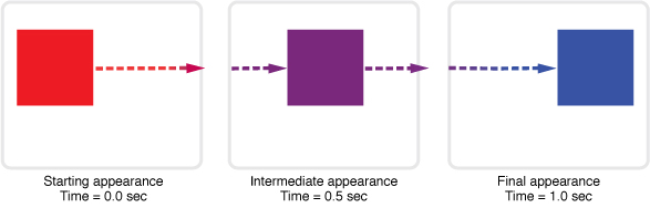
For example, suppose you define a transition for the left and background-color properties and then set both property values of an element at the same time. The element’s old position and color transition to the new position and color over time as illustrated in Figure 1. If you query the properties in the middle of the transition, you get an intermediate location and color for the element.
You can also control how these intermediate values are computed over time using a timing function. Read “Using Timing Functions” to learn more about timing functions.
Transitions are powerful if you combine them with 2D and 3D transforms. For example, Figure 2 shows the results of applying a transition to an element in 3D space. See the CardFlip sample code project for the complete source code for this example.
Setting Transition Properties
You use the CSS transition properties to set parameters of a transition. Typically, you need to set the element’s property that the transition applies to and the duration of the transition. You don’t need to set the element’s property if you want the transition to apply to all properties. In addition, you can set a timing function (how intermediate values are distributed over the duration) and a delay before the transition begins.
Each parameter has a corresponding CSS property beginning with -webkit-transition. Use the -webkit-transition-property property to set the element’s property and the -webkit-transition-duration property to set the duration of the transition. In addition, you can use the -webkit-transition property as a shorthand to set all the transition parameters using one style rule.
For example, Listing 1 defines a simple 2 second transition when the opacity property of an element is set.
Listing 1 Setting transition properties
div { |
-webkit-transition-property: opacity; |
-webkit-transition-duration: 2s; |
} |
You can also pass multiple comma-separated parameters to the -webkit-transition-... properties to set up multiple transitions at once. The order of the parameters determines which transition the settings apply to. For example, in Listing 2, the first parameter of each line applies to a -webkit-transform transition and the second parameter applies to an opacity transition.
Listing 2 Creating multiple transitions at once
div.zoom-fade { |
-webkit-transition-property: -webkit-transform, opacity; |
-webkit-transition-duration: 4s, 2s; |
-webkit-transition-delay: 2s, 0; |
} |
Listing 3 creates a 500 millisecond transition for the opacity property in one style rule using the -webkit-transition shorthand.
Listing 3 Setting all transition properties at once
div.sliding { |
-webkit-transition: opacity 500ms ease-out 100ms; |
} |
Using Timing Functions
Timing functions allow a transition to change speed over its duration. The timing function is a mathematical function that provides a smooth curve or path for the transition. These effects are commonly called easing functions.
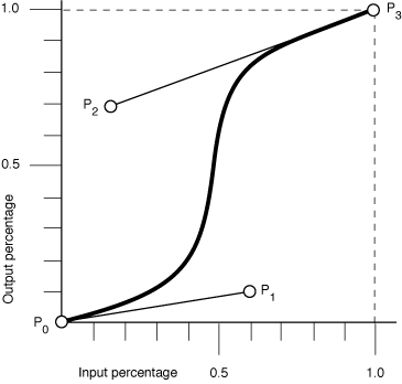
You set a timing function using the -webkit-transition-timing-function property. For example, you can define a timing function that starts out slowly, speeds up, and slows down at the end. The timing function is specified using a cubic Bezier curve, which is defined by four control points, as illustrated in Figure 3. The first and last control points are always set to (0,0) and (1,1), so you just need to specify the two in-between control points. The points are specified as a percentage of the overall duration.
You can set your control points by passing the cubic-bezier function as the parameter with your custom control points as arguments or by using constants for common timing effects. For example, in Listing 4, transitions are created for the -webkit-transform and opacity properties. The -webkit-transform transition is 4 seconds and uses an ease-out timing function. The opacity transition is 2 seconds and uses a custom Bezier path.
Listing 4 Setting a transition’s timing function
div.zoom-fade { |
-webkit-transition-property: -webkit-transform, opacity; |
-webkit-transition-duration: 4s, 2s; |
-webkit-transition-timing-function: ease-out, cubic-bezier(0.5, 0.2, 0.3, 1.0); |
} |
The default value for the timing function is ease, where the control points are (0.25, 0.1) and (0.25, 1.0) respectively.
Starting Transitions
Once you define a transition, you need to apply it to an element to start the transition. For example, normally, changing the value of an element’s left style property causes the element to jump to the new location. Although this is fine for static pages, it provides for a limited user-interface experience for rich web applications. A JavaScript function could be used to iterate over an array of intermediate values, constantly updating the left property with new values, but this is computationally expensive and requires significantly more code. Instead you define a transition as described in “Setting Transition Properties” and apply it to an element as follows.
Define the transition in CSS.
This code fragment defines a 2 second opacity transition.
div {-webkit-transition-property: opacity;
-webkit-transition-duration: 2s;
}
Create a corresponding style in CSS that can be applied to an element.
This code fragment sets the
opacityproperty to0causing a fade away effect.div.fadeAway {opacity:0;
}
Apply the style to an element in HTML.
This code fragment uses the
onclickhandler to trigger the fade away effect on the element.<div style="width:100px;
height:100px;
background-color:blue;"
onclick="className = 'fadeAway'">
Listing 5 shows the complete HTML for this simple web application that displays a 100 x 100 box that fades away when clicked.
Listing 5 Simple fade away effect
<html> |
<head> |
<meta name="viewport" content="width=device-width, initial-scale=1, user-scalable=no"/> |
<style type="text/css" media="screen"> |
div { |
-webkit-transition-property: opacity; |
-webkit-transition-duration: 2s; |
} |
div.fadeAway { |
opacity:0; |
} |
</style> |
</head> |
<body> |
<div style="width:100px; |
height:100px; |
background-color:blue;" |
onclick="className = 'fadeAway'"> |
Tap to fade |
</div> |
</body> |
</html> |
Handling Transition Events
You can set a handler for a DOM event that is sent at the end of a transition. The event is an instance of WebKitTransitionEvent and its type is webKitTransitionEnd in JavaScript.
For example, the JavaScript code in Listing 6 displays an alert panel whenever a transition ends.
Listing 6 Handling transition end event
box.addEventListener( 'webkitTransitionEnd', function( event ) { alert( "Finished transition!" ); }, false ); |
Last updated: 2010-05-26