
 Step-by-Step Instructions are provided for this
applet and the entire PageCharmer Designer Applet set. Or check out the LiveG-Map:
Glossary of Terms to review the rest of this applet's
unique properties.
Step-by-Step Instructions are provided for this
applet and the entire PageCharmer Designer Applet set. Or check out the LiveG-Map:
Glossary of Terms to review the rest of this applet's
unique properties.
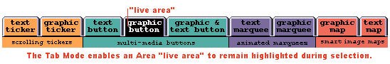
 Tab
Mode: The Tab Mode takes LiveG-Map applets to a different dimension. When working
within a framed site or a non-framed site, start by selecting the Tab Mode check-box
in the AppletSet'r. This will keep the highlighted "live area" of your
image map visible the entire time you are at that URL
(address). Simply click on another region and the Tab Mode ensures that this
new "live area" remains highlighted.
Tab
Mode: The Tab Mode takes LiveG-Map applets to a different dimension. When working
within a framed site or a non-framed site, start by selecting the Tab Mode check-box
in the AppletSet'r. This will keep the highlighted "live area" of your
image map visible the entire time you are at that URL
(address). Simply click on another region and the Tab Mode ensures that this
new "live area" remains highlighted.
Menus:
A LiveG-Map can also have a pop-up menu associated with any "Area" (live
area). A pop-up menu can be defined to have one or more items. Each "Item" can have a unique URL (address), status message, and more. If only one "Item" is defined, the pop-up menu can be used to create a kind of pop-up help message.
To learn how to create a pop-up menu, following the Step-by-Step
Instructions. You can set time values for when a pop-up menu appears, and how
long it will remain displayed. View this example working.

Drawing
Shapes: The LiveG-Map AppletSet'r allows you to create a set of live "Areas" on an image. By selecting the "Draw Shapes" check-box and then choosing
from one of the available shapes: Polygon, Rectangle and Circle in the "Area
Data" tab, you can define each "Area". These Areas can then be assigned
a URL (address), a sound that plays when the cursor enters the area, a sound that
plays when a user clicks in an area, and more. The image can be a single image, or
a multi-tiled image. Multi-tiled images can be two- or three-tiles. Two-tile images
will animate when a user moves their cursor into a defined Area by drawing the corresponding
Area from the second image tile in place of the visible image. A three-tiled image
adds the ability to draw the corresponding Area from the third image tile when a
user clicks the "live area". For more information on how to create single,
as well as multi-tiled images, see the section named "Creating and Using Images:
LiveG-Button, LiveGT-Button, and LiveG-Map Images."
HTML
Image Maps: If you have an existing HTML image map and would like to create a
LiveG-Map from it, you can easily do this without losing the look or performance
of your Web site for those visitors with non-Java capable browsers. By using the
"ALT" (alternative) tags every visitor
can have the same experience; only your Java-capable visitors will have the added
treat of PageCharmer's interactive applets with optional sounds. Your Web site will
stand out with a look of professionalism and state-of-the-art technology. Check out
the instructions on how to create LiveG-Map images
that can add life to your standard HTML image maps.
Step-by-Step Instructions are provided for this
applet and the entire PageCharmer Designer Applet set. Or, check out the LiveT-Map:
Glossary of Terms to review the rest of this applet's
unique properties.
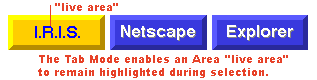
Tab
Mode: The Tab Mode takes an LiveT-Map applets to a new dimension. When working
within a framed site or a non-framed site, start by selecting the Tab Mode check-box
in the "Tab Mode" tab of the LiveT-Map AppletSet'r. This will keep the
highlighted "live area" of your image map visible the entire time you are
at that URL (address). Simply click on another button and the Tab Mode ensures that
the next button will remain highlighted while at that URL.
Width
and Height: It is important to realize that the size, "Width" and "Height" properties, of the LiveT-Map applet is independent of the number of buttons it displays.
Buttons are evenly distributed in the allotted applet space.
Add
and Delete: The "Add" and "Delete" buttons increase and decrease
the number of buttons in the applet--thus, adding a button without changing the dimensions
of the applet will make each button smaller and vice-versa.
Up
and Down: The "Up" and "Down" buttons are a quick way to
change the placement of the buttons. Simply select the button name, then choose the
direction that you want that button move until it reaches the desired position.
Step-by-Step Instructions are provided for this
applet and the entire PageCharmer Designer Applet set. Or, check out the LiveG-Marquee:
Glossary of Terms to review the rest of this applet's
unique properties.
Message:
A LiveG-Marquee message is a series of GIF or JPEG files. You can display as my of
these images as you desire. Each image can be displayed by choosing between a variety
of motion effects. These images can be created
by you or you can use the foreground and background images provided within PageCharmer.
XSpeed
and YSpeed: The XSpeed and YSpeed of a message can have a positive, negative,
or zero value. The larger the absolute value, the faster the image will move. A zero
value in either the X or YSpeed will center the image in the applet dimension. For
example, a non-zero XSpeed combined with a zero YSpeed will center the image vertically
within the applet as it moves across the screen horizontally. A non-zero YSpeed combined
with a zero XSpeed will center the image horizontally within the applet as it moves
across the screen vertically.
BGXSpeed
and BGYSpeed: The "BGXSpeed" and "BGYSpeed" is the background
speed of the LiveG-Marquee. It can have a positive, negative, or zero value. The
larger the absolute value, the faster the background image will move across the applet.
A zero value in either the X or YSpeed will center the background image in the applet
dimension. For example, a non-zero XSpeed combined with a zero YSpeed will center
the background image vertically within the applet as it moves across the screen horizontally.
A non-zero YSpeed combined with a zero XSpeed will center the background image horizontally
within the applet as it moves across the screen vertically.
Step-by-Step Instructions are provided for this
applet and every PageCharmer Designer Applet set. Or check out the LiveT-Marquee:
Glossary of Terms to review the rest of this applet's
unique properties.
Message:
A message in the LiveT-Marquee is text that is entered into the "Text" field. A message behaves in the following manner:
Frames:
A LiveT-Marquee comes in three sizes: small, medium, and large. The PageCharmer Graphics
Library includes three sizes for every image style. For information on creating your
own LiveT-Marquee frames see Creating and Using: LiveT-Marquee
Frames.