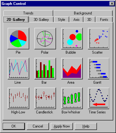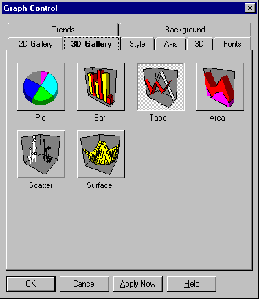
The first two tabs displayed on the Graph Property window are the 2D and 3D Gallery tabs. From these tabs you select the type of graph you want. Once you select a graph type, the Style tab displays any options available.
The pie chart, one of the simplest graph types, consists of a circle (or pie) divided into two or more sections (slices). Pie charts show the proportion of parts to the whole. By labeling each pie slice with the quantity it represents, you can compare slices with each other, although not as effectively as you could with a bar graph or other graph type.

Pie-chart options are described in the following table.
|
Setting |
Description |
|
Off
|
Select this option to draw a pie chart with no labels for the slices. Deselect it to draw labels. |
|
Connecting Lines
|
Select this option to draw connecting lines drawn between pie slices and their labels. Deselect it to remove connecting lines. |
|
Colored as Slices
|
Select this option to have pie labels drawn in the same colors as their corresponding slices. Deselect it to have every label drawn in a single color (black by default, or as specified on the Fonts Property tab). |
|
Select this option to have pie labels show the percentage values of their slices (relative to the whole). Deselect it to have labels show the actual values of their slices. | |
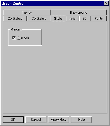
The polar graph is a line graph drawn on a circular grid. The magnitude of the dependent variable is represented by the distance of the line from the center of the grid. Like logarithmic graphs, polar graphs are useful primarily in mathematical and statistical applications.
Polar graph options are described in the following table.
|
Setting |
Description |
|
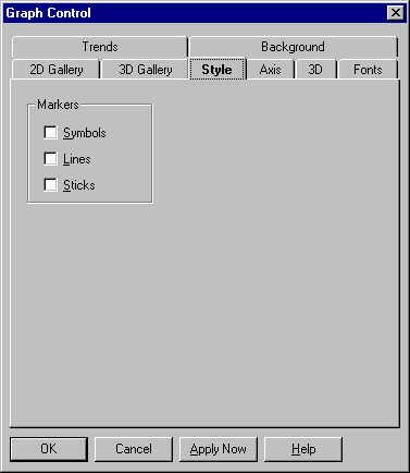
Symbols
|
Select this option to draw a symbol at the position of each data point. Deselect it to remove the symbols. |
|
Select this option to draw lines between data points. Deselect it to remove the lines. |
|
|
Select this option to draw a line from each data point to the origin. Deselect it to remove the lines. | |
The 2D scatter graph consists of plotted points "scattered" around an X-Y grid. The pattern may reveal a relationship between the two variables measured by the X and Y axes. You can illustrate trends in the plotted points by adding a curve. (See the Trends property section.)
The only 2D scatter graph style setting is described below.
|
Setting |
Description |
|
Symbols
|
This option matters only if you've enabled curve fitting for the graph in the Trends property page. In that case, select Symbols to draw symbols along with curves and deselect it to draw curves only. If you haven't enabled a curve, symbols are drawn in any case. |
The 3D scatter graph consists of plotted points "scattered" around an X-Y-Z space. The pattern may reveal a relationship among the variables plotted on X, Y, and Z axes.

The 3D scatter graph settings are described in the following table.
|
Setting |
Description |
|
Markers group |
All 3D scatter graphs are drawn with symbols representing data points. In the Markers group, you can also enable vertical "sticks" for the graph. |
|
Sticks
|
Select this option to draw a vertical line between each data point and the Y origin plane. Deselect it to remove the sticks. |
The line graph consists of one or more lines (or sequences of symbols) drawn on an X-Y grid. These graphs let you show trends in values over a continuous scale.

Line graph settings are described in the following table.
|
Setting |
Description |
|
Symbols
|
Select this option to draw a symbol at the position of each data point. Deselect it to remove the symbols. |
|
Select this option to draw lines between data points. Deselect it to remove the lines. |
|
|
Select this option to draw a vertical "stick" between each data point and the Y origin. Deselect it to remove the sticks. |
|
|
Select this option for a logarithmic Y axis. If you select Y Axis and leave X Axis off, you'll get a log/lin graph; if you select both, you'll get a log/log graph. |
|
|
Select this option for a logarithmic X axis. If you select X Axis and leave Y Axis off, you'll get a lin/log graph; if you select both, you'll get a log/log graph. | |
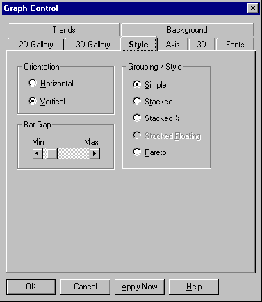
A bar graph consists of two or more parallel bars of equal width drawn on an X-Y grid. Bar graphs compare amounts to each other. They can also suggest trends.
The 2D bar graph settings are described in the following table.
|
Setting |
Description |
|
Horizontal |
Select this option for a graph with bars drawn horizontally. |
|
Select this option for a graph with bars drawn vertically, which is sometimes called a column graph. |
|
|
Select this option to draw one bar per data point. If you have more than one data set, corresponding points from each set are shown as clustered bars. |
|
|
Select this option to divide bars into segments, showing multiple data sets at corresponding data points. |
|
|
Select this option to divide bars into segments representing percentages of a whole. Each complete bar will be the same length, but the breakdown of segments will vary according to their percentages at each data point. | |
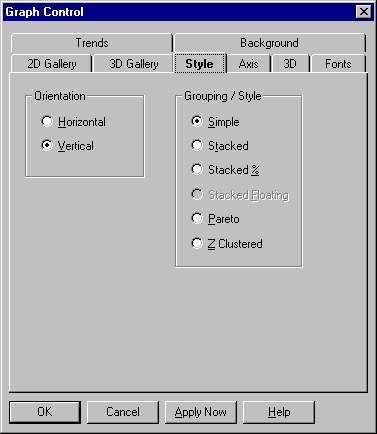
A bar graph consists of two or more parallel bars of equal width drawn on an X-Y grid. Bar graphs compare amounts to each other. They can also suggest trends.
The 3D bar graph settings are described in the following table.
|
Setting |
Description |
|
Horizontal |
Select this option for a graph with bars drawn horizontally. |
|
Vertical
|
Select this option for a graph with bars drawn vertically, which is sometimes called a column graph. |
|
Simple
|
Select this option to draw one bar per data point. If you have more than one data set, corresponding points from each set are shown as clustered bars. |
|
Stacked |
Select this option to divide bars into segments, showing multiple data sets at corresponding data points. |
|
Stacked % |
Select this option to divide bars into segments representing percentages of a whole. Each complete bar will be the same length, but the breakdown of segments will vary according to their percentages at each data point. |
|
Z-Clustered |
Select this option to draw multiple sets of bars, one bar per data point, with subsequent sets drawn in front of previous ones. In this form, smaller bars may be hidden behind larger values. |
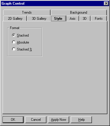
An area graph consists of one or more lines drawn on an X-Y grid with the area between the line and the X axis filled in. Like line graphs, area graphs show trends in values but give greater emphasis to quantities.
Area graph settings are described in the following table.
|
Setting |
Description |
|
Stacked
|
Select this option for stacked (cumulative) layers. Each data set is drawn on top of any previous ones. |
|
Select this option to draw each data set from the Y origin. This form is much more readable in 3D. |
|
|
Select this option to draw each data set as a percentage of a whole. | |
The Gantt chart is a specialized version of the horizontal bar graph in simple or stacked form. It's used almost exclusively to show a project schedule, with each bar or bar segment marking the start time, duration, and completion time of a task.
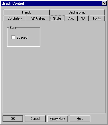
The Gantt chart style setting is described below.
|
Setting |
Description |
|
Spaced
|
Select this option to place spaces between Gantt bars. Deselect it to draw all bars adjacent to each other. |
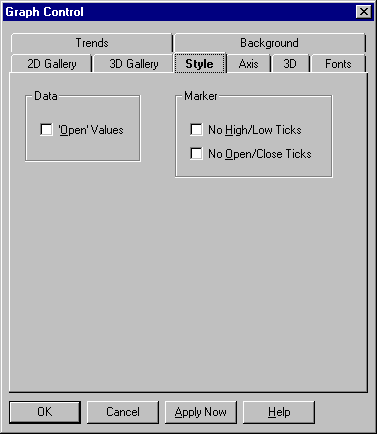
The high-low-close (HLC) graph lets you chart a range of values on an X-Y grid. The range is shown as a vertical bar, with horizontal crossbars for the high, the low, and a normative value usually called the close. An alternate version, the open-high-low-close (OHLC) graph, adds a fourth crossbar for another normative value usually called the open.
High-low-close graph settings are described in the following table.
|
Setting |
Description |
|
Data group |
By default, a high-low-close graph charts three data sets: high values, low values, and closing values. In the Data group, you can enable a fourth data set for opening values, creating an open-high-low-close graph. |
|
'Open' Values (default is off) |
Select this option for an open-high-low-close graph. Deselect it for a high-low-close graph. |
|
Select this option to disable high and low ticks. Deselect it to show those ticks. |
|
|
Select this option to disable open and close ticks. Deselect it to show those ticks. | |
The candlestick graph is an alternative to the open-high-low-close graph. It consists of a series of boxes with lines extending up and down from the ends, drawn on an X-Y grid. The top and bottom of each box indicate the open and close values. If the open value is higher, the box is filled with a color; if the close value is higher, the box is filled with white. The ascending and descending lines indicate the high and low values for that point.
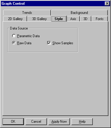
The box-whisker graph illustrates the spread of data groups around their medians, using a "box" and "whiskers" to break down each data group by percentile.
You can either specify the seven percentile parameters for each symbol (parametric data) or supply raw data for the Graph Control to process and graph.
Box-whisker graph settings are described in the following table.
|
Setting |
Description |
|
Parametric Data |
Select this option to specify the seven values making up the box-whisker graph. |
|
Select this option if you want the Graph Control to process a group of data and produce the seven values making up the box-whisker graph. |
|
|
Select this option to show the actual data values (samples) from which the box-whisker graph is produced, superimposed as symbols over the box-whisker graphics. Deselect it to remove the samples. | |
A bubble graph charts three variables in two dimensions. It's a special form of the scatter graph showing "bubbles," which are circular markers of variable size plotted on an X-Y grid. The size of each bubble is typically used to show the data point's relative importance, such as the percentage of gross sales it represents.
A time-series graph consists of a X-Y grid in which points are added one at a time to the right-hand edge. When the graph reaches the limit of points it can show, the oldest data begins to drop off the left edge.
The tape graph is a 3D form of the line graph. It gives you only one styling option—tapes—drawn between data points.
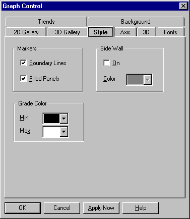
The surface graph lets you represent data topographically in three dimensions. The graph uses an X-Z grid drawn at regular increments in the X and Z directions, with one Y value for each X-Z intersection. The color scale of the graph is automatically keyed to the height of points, helping the viewer differentiate between higher and lower values.
Surface graph style settings are described in the following table.
|
Setting |
Description |
|
Select this option to fill in the cells of a surface graph grid with panels of color. Deselect it to remove the panels. The color range of panels is determined by your settings in the Grade Color group. |
|
|
Boundary Lines
|
This option lets you draw lines along the edges of each cell of the surface graph grid. If Filled Panels is selected, select Boundary Lines to draw lines (which are always black); deselect it to remove the lines. If Filled Panels is deselected, lines are drawn in any case. Their color range is determined by the settings in the Grade Color group. |
|
Sets the color for the lowest point on the surface graph. |
|
|
Sets the color for the highest point on the surface graph. |
|
|
Select this option to draw side walls around the perimeter of the graph in the X and Z planes. Deselect it to remove the side walls. |
|
|
Sets the color for the side walls. |