CSS Recipes for WebKit
You can bring a new level of excitement to your websites and web applications using the advanced CSS features available in Safari and WebKit. WebKit is the layout engine that powers Safari on Mac OS X, Windows, and the iPhone OS.
Since web browsers simply ignore any CSS properties that they don't support, most of these recipes will degrade gracefully other browsers. Webpages using properties that are only supported in Safari will have an exceptional look and feel in Safari, and will be functional in other browsers.
Note: The -webkit prefix seen in this article illustrates a common practice used by web browser vendors to indicate that a CSS property or rule is not part of a final W3C standard. For example, the box-shadow property is part of the developing CSS3 standard. Mozilla-based browsers use a -moz prefix.
Simple Drop Shadows
Lets start by showing you how easy it is to add drop shadows to any webpage element. The code snippet below renders an image that is slightly rotated and has a drop shadow. Both of these effects are added with CSS.
					<img src="megan.jpg"
						style="-webkit-transform:rotate(5deg);-webkit-box-shadow:10px 10px 5px #888;">
The transform CSS property does the rotation, and the box-shadow property adds a shadow behind the image. You can change the amount of rotation, or the parameters of the shadow, just by tweaking the parameters in the CSS.
Try it, and you can see the rotated image as shown in the example below.
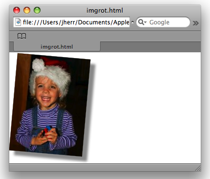
Figure 1. Image rotation and drop shadow provided by CSS
The CSS is in a style attribute, but you could put it in the style tag as a class, or an associated stylesheet.
In the past, server-side code was often required to do the image manipulation required for drop shadows. Now with the CSS extension you can do it right in the browser and it looks great.
Roll Over Pop Outs
The next example shows an image that pops out when you hover your mouse over it. All it takes is using a hover style, and a scale transform. The CSS for this effect is shown below.
					<style>
						img { -webkit-transform: scale(0.5); }
						img:hover { -webkit-transform: scale(1); }
					</style>
					<img src="megan.jpg" />
Role over the image and it pops out and becomes larger, as shown below.
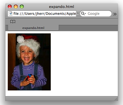
Figure 2. The image after the rollover
Roll away and it pops back down again.
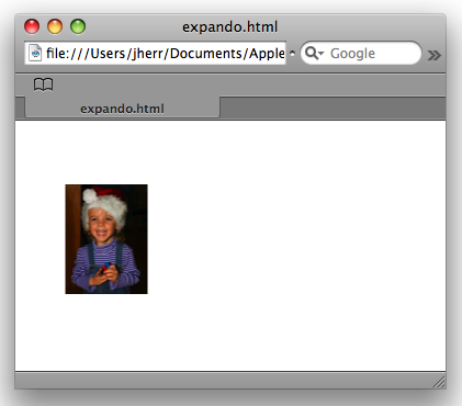
Figure 3. The image before the rollover
As you can see, you can achieve this effect with just a few lines of CSS.
Animated Image Rollovers
Another common practice for web developers is to exchange two images when the user mouses over them. In this recipe, instead of simply swapping the images we instead fade from one to another. The CSS to achieve this effect is below.
					<style type="text/css">
						div.swapper img { -webkit-transition: opacity 1s ease-in-out; }
						img.img1, div.swapper:hover img.img2 { opacity: 1.0; }
						div.swapper:hover img.img1, img.img2 { opacity: 0; }
					</style>
					<div class="swapper">
						<img class="img1" style="position: absolute;" src="megan.jpg">
						<img class="img2" src="megan2.jpg">
					</div>
Here the transition property uses shorthand notation to specify all the parameters for the transition. The first parameter specifies the property to animate, the second specifies the duration, and the third specifies the timing function for the transition. ease-in-out is just one of the potential timing functions you have at your disposal. You can also specify a linear change, ease in, ease out, or do an advanced cubic Bezier transform.
You can experiment with this effect yourself by mousing over the image; you get effects as shown in the image below.
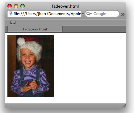
Figure 4. A CSS only rollover with a fading effect.
Imagine: Fading transitions with no JavaScript at all.
CSS Multicolumn Layouts That Work
Getting columns right on webpages using pure CSS instead of HTML tables has always been tricky. Since the CSS3 properties for multi-column layout are implemented in Safari and WebKit, you can clearly define the number of columns in the gap between the columns to get exactly the rendering you're aiming for. Have a look at the CSS in the code below.
					<style>
						#columns {
						-webkit-column-count: 3;
						-webkit-column-gap: 25px;
						-moz-column-count: 3;
						-moz-column-gap: 25px;
						column-count: 3;
						column-gap: 25px;
						}
					</style>
					<div id="columns">
						<p>Column A</p>
						<p>Column B</p>
						<p>Column C</p>
					</div>
This code defines that the HTML in the columns div tag should be presented in three columns. Each paragraph is its own column.
This code also illustrates an appropriate fallback mechanism when using CSS properties that are not yet part of a finalized W3C standard. This code specifies the column-count and column-gap properties with both the -webkit and -moz prefixes, and without any prefixes. This means that this code will work in Safari and WebKit as well as Mozilla-based browsers that support these properties, and continue to work once the CSS3 standard is finalized and the prefixes are dropped.
You can see the multicolumn layout shown below.
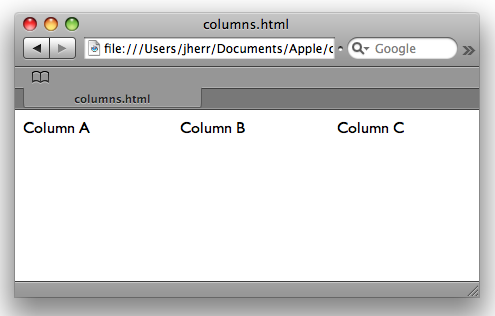
Figure 5. Multiple columns done the easy way
With this approach, paragraphs are shown one after the other if the browser does not support multi-column layout. As mentioned earlier in this article, these recipes gracefully degrade in browsers that don't support these properties.
Simple CSS Rounded Boxes
Rounded boxes may pose problems for HTML pages, as they usually result in having small images for each of the corners that can cause rendering issues. The CSS3 border-radius properties implemented in WebKit make it easy to create nicely rounded boxes with just a few lines of CSS. This technique is illustrated below.
					<style>
						#boxes div { border: 2px solid black; padding: 10px; margin:5px; width:200px;
							text-align:center; background:#eee; }
					</style>
					<body>
					<div id="boxes">
					<div style="-webkit-border-radius:15px;">
						All sides
					</div>
					<div style="-webkit-border-bottom-left-radius:15px;-webkit-border-top-right-radius:15px;">
						Opposite corners
					</div>
					<div style="-webkit-border-top-left-radius:15px;-webkit-border-top-right-radius:15px;">
						Top
					</div>
					<div style="-webkit-border-top-right-radius:15px;-webkit-border-bottom-right-radius:15px;">
						Side
					</div>
					</div>
This style tag defines that all of the divs within the boxes div should have a big border, margins, width, background and so on. Then on each of the individual div tags the border radius is set in various ways. You can see the result below.
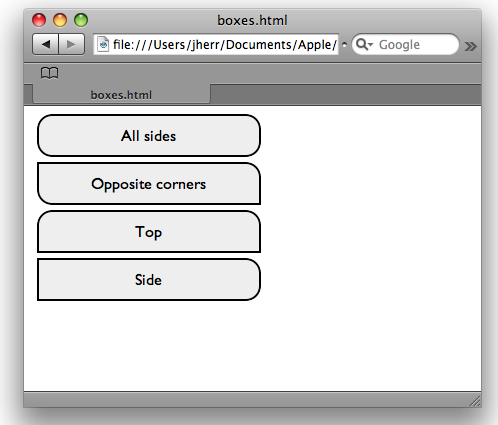
Figure 6. Round cornered boxes using just CSS
On the first div the border radius is set in on all sides. Then on the second div, it is set on just the lower left and upper right corners. The third div is styled like a tab by just rounding the top corners. And the last div is styled like a side tab by rounding just the corners on the sides.
New Types of Form Controls
WebKit also gives you a number of new controls to use in your webpages. The example below presents a horizontal slider, some newly styled buttons, and a search field similar to the one shown in the Safari toolbar.
					<input type="range" style="-webkit-appearance:slider-horizontal;"><br/><br/>
					<button style="-webkit-appearance:button;width:200px;height:30px;">gradient button</button><br/><br/>
					<button style="-webkit-appearance:push-button;width:200px;">aqua button</button><br/><br/>
					<input type="text" style="-webkit-appearance:searchfield;" value="kitten"></input><br/>
You can see the appearance of these controls below.
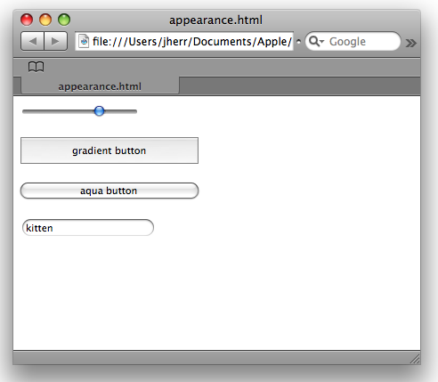
Figure 7. Some of the new button types available with WebKit
The new slider control is particularly handy, as this type of control is not easy to write in JavaScript and get correct on every browser.
A Simple Pop-out Box
The final example is of a simple pop-out box which uses some of the visual effects available in WebKit. The CSS and JavaScript code for this effect is shown below.
					<style>
					#box1 {
						z-index: 100;
						position:absolute;
						top:5px; left:5px;
						width:100px;
						height:250px;
						padding:5px;
						-webkit-border-radius:10px;
						border: 2px solid black;
						background: #dddddd;
						z-index: 200;
					}
					#slider {
						z-index: 100;
						position:absolute;
						top:30px; left:5px;
						height:200px;
						width:90px;
						padding-top:10px;
						padding-left:15px;
						-webkit-border-radius:10px;
						border: 1px solid black;
						background: #eeeeee;
						-webkit-transition: -webkit-transform 0.5s ease-in;
					}
					</style>
					<script>
					function popout() {
						document.getElementById('slider').style.webkitTransform = 'translate(105px,0)';
					}
					</script>
There is a parent box, and a slider box that sits underneath it. The transition property on the slider box defines that the transform should take half a second and use an ease-in timing function. JavaScript triggers the transition by setting the transform property on the slider when the user clicks on a link. That means that the animation is only applied after the user performs an action like clicking on the pop-out link.
The HTML code for this example is shown below.
					<div id="slider">
						Slider<br/>Content
					</div>
					<div id="box1">
						<a href="javascript:popout();">Popout</a>
					</div>
You can play with this example, as shown below.
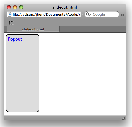
Figure 8. The slider before it pops out
If you click on the pop up then the slider element will slide out quickly.
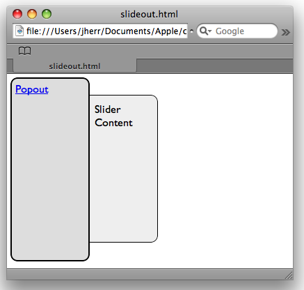
Figure 9. The slider after it pops out
Most of the functionality here is implemented in CSS, with just a touch of JavaScript.
Where to Go from Here
When it comes to using CSS in new and unique ways in Safari and WebKit, this article only begins to describe the possibilities. There are all kinds of new CSS attributes that you can make use of either individually or in combinations, to create unique, visually compelling effects. The web developer community can't wait to see what you come up with.
Posted: 2009-02-24