Views and View Controllers
In iOS 3.2, the UIKit framework includes new capabilities to help you organize and present content on an iPad. These capabilities range from new view controller classes to modifications to existing interface features. For additional information about when it is appropriate to incorporate these features into your applications, see iPad Human Interface Guidelines.
Designing for Multiple Orientations
With few exceptions, applications should support all interface orientations on iPad devices. The steps for supporting orientation changes are the same on iPad devices as they are on iPhone and iPod touch devices. The application’s window and view controllers provide the basic infrastructure needed to support rotations. You can use the existing infrastructure as-is or customize the behavior to suit the particulars of your application.
To implement basic support for all interface orientations, you must do the following:
Implement the
shouldAutorotateToInterfaceOrientation:method in each of your custom view controllers and returnYESfor all orientations.Configure the
autoresizingMaskproperty of your views so that they respond to layout changes appropriately. (You can configure this property either programmatically or using Interface Builder.)
To go beyond the basic support, there are additional tasks you can perform depending on your needs:
For custom views that need to control the placement of subviews more precisely, override the
layoutSubviewsmethod and put your custom layout code there.To perform tasks before during or after the actual rotation of your views, use the one-step rotation notifications of the
UIViewControllerclass.
When an orientation change occurs, the window works with its frontmost view controller to adjust the content to match the new orientation. During this process, the view controller receives several notifications to give you a chance to perform additional tasks. Specifically, the view controller’s willRotateToInterfaceOrientation:duration:, willAnimateRotationToInterfaceOrientation:duration:, and didRotateFromInterfaceOrientation: methods are called at appropriate points to give you a chance to perform tasks before and after the rotation of your views. You can use these methods to perform any tasks related to the orientation change. For example, you might use them to add or remove views, reload the data in any visible tables, or tweak the performance of your code during the rotation process.
For more information about responding to orientation changes in your view controllers, see View Controller Programming Guide for iOS.
Creating a Split View Interface
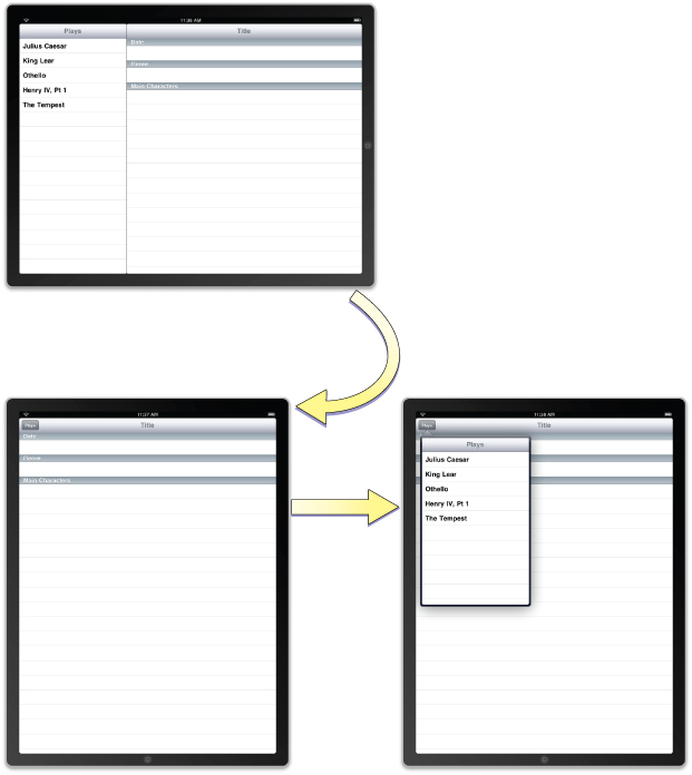
A split view consists of two side-by-side panes separated by a divider element. The first pane of a split view controller has a fixed width of 320 points and a height that matches the visible window height. The second pane fills the remaining space. In iOS, split views can be used in master-detail interfaces or wherever you want to display two different types of information side-by-side. When the device is in a landscape orientation, the split view shows both panes. However, in portrait orientations, the split view displays only the second pane, which grows to fill the available space. If you want the user to have access to the first pane, you must present that pane yourself. The most common way to display the first pane in portrait mode is to add a button to the toolbar of your second pane and use it to present a popover with the first pane contents, as shown in Figure 4-1.
The UISplitViewController class manages the presentation of the side-by-side panes. The panes themselves are each managed by a view controller that you provide. The split view controller handles rotations and other system-related behaviors that require coordination between the two panes. The split view controller’s view should always be installed as the root view of your application window. You should never present a split view inside of a navigation or tab bar interface.
The easiest way to integrate a split view controller into your application is to start from a new project. The Split View-based Application template in Xcode provides a good starting point for building an interface that incorporates a split view controller. Everything you need to implement the split view interface is already provided. All you have to do is modify the array of view controllers to present your custom content. The process for modifying these view controllers is virtually identical to the process used in iPhone applications. The only difference is that you now have more screen space available for displaying your detail-related content. However, you can also integrate split view controllers into your existing interfaces, as described in “Adding a Split View Controller in Interface Builder.”
For more information about configuring view controllers in your application, see View Controller Programming Guide for iOS.
Adding a Split View Controller in Interface Builder
If you do not want to start with the Split View-based Application template project, you can still add a split view controller to your user interface. The library in Interface Builder includes a split view controller object that you can add to your existing nib files. When adding a split view controller, you typically add it to your application’s main nib file. This is because the split view is usually inserted as the top-level view of your application’s window and therefore needs to be loaded at launch time.
To add a split view controller to your application’s main nib file:
Open your application’s main nib file.
Drag a split view controller object to the nib file window.
The split view controller object includes generic view controllers for the two panes.
Add an outlet for the split view controller in your application delegate object and connect that outlet to the split view controller object.
In the
application:didFinishLaunchingWithOptions:method of your application delegate, install the split view controller’s view as the main view of the window:[window addSubview:mySplitViewController.view];
For each of the split view controller’s contained view controllers:
Use the Identity inspector to set the class name of the view controller.
In the Attributes inspector, set the name of the nib file containing the view controller’s view.
The contents of the two view controllers you embed in the split view are your responsibility. You configure these view controllers just as you would configure any other view controllers in your application. Setting the class and nib names is all you have to do in your application’s main nib file. The rest of the configuration is dependent on the type of view controller. For example, for navigation and tab bar controllers, you may need to specify additional view controller information. The process for configuring navigation, tab bar, and custom view controllers is described in View Controller Programming Guide for iOS.
Creating a Split View Controller Programmatically
To create a split view controller programmatically, create a new instance of the UISplitViewController class and assign view controllers to its two properties. Because its contents are built on-the-fly from the view controllers you provide, you do not have to specify a nib file when creating a split view controller. Therefore, you can just use the init method to initialize it. Listing 4-1 shows an example of how to create and configure a split view interface at launch time. You would replace the first and second view controllers with the custom view controller objects that present your application’s content. The window variable is assumed to be an outlet that points to the window loaded from your application’s main nib file.
Listing 4-1 Creating a split view controller programmatically
- (BOOL)application:(UIApplication *)application didFinishLaunchingWithOptions:(NSDictionary *)launchOptions |
{ |
MyFirstViewController* firstVC = [[[MyFirstViewController alloc] |
initWithNibName:@"FirstNib" bundle:nil] autorelease]; |
MySecondViewController* secondVC = [[[MySecondViewController alloc] |
initWithNibName:@"SecondNib" bundle:nil] autorelease]; |
UISplitViewController* splitVC = [[UISplitViewController alloc] init]; |
splitVC.viewControllers = [NSArray arrayWithObjects:firstVC, secondVC, nil]; |
[window addSubview:splitVC.view]; |
[window makeKeyAndVisible]; |
return YES; |
} |
Supporting Orientation Changes in a Split View
A split view controller relies on its two view controllers to determine whether interface orientation changes should be made. If one or both of the view controllers do not support the new orientation, no change is made. This is true even in portrait mode, where the first view controller is not displayed. Therefore, you must override the shouldAutorotateToInterfaceOrientation: method for both view controllers and return YES for all supported orientations.
When an orientation change occurs, the split view controller automatically handles most of the rotation behaviors. Specifically, the split view controller automatically hides the first view controller in its viewControllers array when rotating to a portrait orientation and shows it when rotating to a landscape orientation.
When in a portrait orientation, if you want to display the first view controller using a popover, you can do so using a delegate object. When the view controller is hidden or shown, the split view controller notifies its delegate of the occurrence. When the view controller is hidden, the delegate is provided with a button and popover controller to use to show the view controller. All your delegate method has to do is add the specified button to the a button to a visible toolbar so as to provide access to the view controller. Similarly, when the view controller is shown again, the delegate is given a chance to remove the button. For more information about the delegate methods and how you use them, see UISplitViewControllerDelegate Protocol Reference.
Using Popovers to Display Content
A popover is a special type of interface element that you use to layer information temporarily on top of the current view. Popovers provide a lightweight way to present or gather information in a way that does not require user action. For example, popovers are ideally suited for the following situations:
To present part of a split view interface when the device is in a portrait orientation
To present a list of actions to perform on objects inside one of your views
To display information about an object on the screen.
To manage frequently accessed tools or configuration options
In an iPhone application, you might implement some of the preceding actions using a modal view. On iPad devices, popovers and modal views really have different purposes. In an iPad application, you would use modal views to interrupt the current workflow to gather some required piece of information from the user. The interruption is punctuated by the fact that the user must expressly accept or cancel the action. A popover provides a much less intrusive form of interruption and does not require express acceptance or cancellation by the user. The popover is displayed on top of the user’s content and can be dismissed easily by tapping outside the popover’s bounds. Thus, selecting items from a popover is an optional affair. The only time the state of your application should be affected is when the user actually interacts with the popover’s contents.
A popover is displayed next to the content it is meant to modify and typically contains an arrow pointing to that content. The size of the popover itself is configurable and is based on the size of the view controller, although you can change that size as needed. In addition, the popover itself may change the size of the presented content in order to ensure that the popover fits neatly on the screen.
Figure 4-2 shows an example of a popover used to display the master portion of a split view interface. In portrait orientations, a custom button is added to the detail pane’s toolbar. When the button is tapped, the application displays the popover.

For more information about when to use popovers, see iPad Human Interface Guidelines.
Creating and Presenting a Popover
The content of a popover is derived from the view controller that you provide. Popovers are capable of presenting most types of view controllers, including custom view controllers, table view controllers, navigation controllers, and even tab bar controllers. When you are ready to present that view controller in a popover, do the following:
Create an instance of the
UIPopoverControllerclass and initialize it with your custom view controller.(Optional) Customize the size of the popover using the
popoverContentSizeproperty.(Optional) Assign a delegate to the popover. For more information about the responsibilities of the delegate, see “Implementing a Popover Delegate.”
Present the popover.
When you present a popover, you associate it with a particular portion of your user interface. Popovers are commonly associated with toolbar buttons, so the presentPopoverFromBarButtonItem:permittedArrowDirections:animated: method is a convenient way to present popovers from your application’s toolbar. If you want to associate the popover with the contents of one of your views, you can use the presentPopoverFromRect:inView:permittedArrowDirections:animated: method to present instead.
The popover derives its initial size from the contentSizeForViewInPopover property of the view controller being presented. The default size stored in this property is 320 pixels wide by 1100 pixels high. You can customize the default value by assigning a new value to the contentSizeForViewInPopover property. Alternatively, you can assign a value to the popoverContentSize property of the popover controller itself. If you change the content view controller displayed by a popover, any custom size information you put in the popoverContentSize property is replaced by the size of the new view controller. Changes to the content view controller or its size while the popover is visible are automatically animated. You can also change the size (with or without animations) using the setPopoverContentSize:animated: method.
Listing 4-2 shows a simple action method that presents a popover in response to user taps in a toolbar button. The popover is stored in a property (defined by the owning class) that retains the popover object. The size of the popover is set to the size of the view controller’s view, but the two need not be the same. Of course, if the two are not the same, you must use a scroll view to ensure the user can see all of the popover’s contents.
Listing 4-2 Presenting a popover
- (IBAction)toolbarItemTapped:(id)sender |
{ |
MyCustomViewController* content = [[MyCustomViewController alloc] init]; |
UIPopoverController* aPopover = [[UIPopoverController alloc] |
initWithContentViewController:content]; |
aPopover.delegate = self; |
[content release]; |
// Store the popover in a custom property for later use. |
self.popoverController = aPopover; |
[aPopover release]; |
[self.popoverController presentPopoverFromBarButtonItem:sender |
permittedArrowDirections:UIPopoverArrowDirectionAny animated:YES]; |
} |
To dismiss a popover programmatically, call the dismissPopoverAnimated: method of the popover controller. Dismissing the popover is required only if you want taps within the popover content area to cause the popover to go away. Taps outside the popover automatically cause it to be dismissed. In general, dismissing the popover in response to taps inside the content area is recommended, especially if those taps trigger a selection or some other change to the underlying content. However, it is up to you to decide whether such a behavior is appropriate for your application. Be aware, though, that it is your responsibility to store a reference to the popover controller so that you can dismiss it. The system does not provide one by default.
Implementing a Popover Delegate
When a popover is dismissed due to user taps outside the popover view, the popover automatically notifies its delegate. Before the popover is dismissed, the popover controller sends a popoverControllerShouldDismissPopover: message to its delegate. If your delegate’s implementation of this method returns YES, or if the delegate does not implement the method at all, the controller dismisses the popover and sends a popoverControllerDidDismissPopover: message to the delegate.
In most situations, you should not need to override the popoverControllerShouldDismissPopover: method at all. The method is provided for situations where dismissing the popover might cause problems for your application. In such a situation, you can implement it and return NO. However, a better approach is to avoid putting your application into such a situation.
By the time the popoverControllerDidDismissPopover: method of your delegate is called, the popover itself has been removed from the screen. At this point, it is safe to release the popover controller if you do not plan to use it again. You can also use this message to refresh your user interface or update your application’s state.
Tips for Managing Popovers in Your Application
Consider the following when writing popover-related code for your application:
Dismissing a popover programmatically requires a pointer to the popover controller. The only way to get such a pointer is to store it yourself, typically in the content view controller. This ensures that the content view controller is able to dismiss the popover in response to appropriate user actions.
Cache frequently used popover controllers rather than creating new ones from scratch. Similarly, feel free to reuse popover controllers in your application rather than create new ones for each distinct popover. Popover controllers are fairly malleable objects and can be reused easily. They are also easy objects to release if your application receives a low-memory warning.
When presenting a popover, specify the
UIPopoverArrowDirectionAnyconstant for the permitted arrow direction whenever possible. Specifying this constant gives the UIKit the maximum flexibility in positioning and sizing the popover. If you specify a limited set of permitted arrow directions, the popover controller may have to shrink the size of your popover before displaying it.
Configuring the Presentation Style for Modal Views
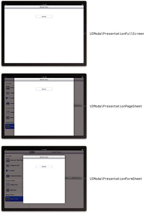
In iOS 3.2, there are new options for presenting view controllers modally. Previously, modally presented views always covered the visible portion of the underlying window. Now, the UIViewController class has a modalPresentationStyle property that determines the appearance of the view controller when it is presented modally. The different options for this property allow you to present the view controller so that it fills the entire screen, as before, or only part of the screen.
Figure 4-3 shows the core presentation styles that are available. (The UIModalPresentationCurrentContext style lets a view controller adopt the presentation style of its parent.) In each modal view, the dimmed areas show the underlying content but do not allow taps in that content. Therefore, unlike a popover, your modal views must still have controls that allow the user to dismiss the modal view.
For guidance on when to use the different presentation styles, see iPad Human Interface Guidelines.
Making Better Use of Toolbars
Although toolbars have been supported since iOS 2.0, they have a more prominent role in iPad applications. Prior to iOS 3.2, the user interface guidelines encouraged the placement of toolbars at the bottom of the application’s window. The upper edge of the window was reserved for a navigation bar, which provided common navigation to and from views. With the expanded space available on iPad devices, toolbars can now be placed along the top edge of the application’s window in place of a navigation bar. This positioning lets you give your toolbar commands more prominence in your application.
For guidelines about the configuration and usage of toolbars in your application, see iPad Human Interface Guidelines.
Last updated: 2010-04-13