|
|
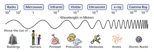
More About Spectra and How They are Represented
When you look at the light of the sun through a prism, you see a wonderful
display of all of the colors of the rainbow. Separating the combined
colors (or energies) of the Sun like this gives you a "spectrum", which is
just a measure of light emission as a function of energy (or wavelength, or
frequency, which are all uniquely related). This spectrum of the sun is
known as the visible spectrum and it is a small part of the light in the
electromagnetic spectrum, which spans energies from radio waves to
gamma-rays.
The spectrum of the Sun is a continuous spectrum and is
frequently represented as shown below. This type of spectum is called an
emission spectrum because what you are seeing is the acutal radiation
emitted by the radiation source. In the case of the Sun, light is emitted
at almost all energies in the visible spectrum, which is why you see all of
the colors in the Sun's spectrum.

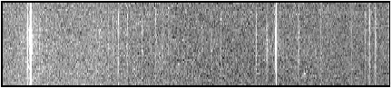
Consider another spectrum as shown below:

Certainly this is not a continuous spectrum, yet it represents some visible
radiation which has been separated by means of a prism or a diffraction
grating. In this view, the horizonatal axis shows the energy (or color) of
the light, the same as the spectrum above, and it's easy to see that light
is emitted only at particular "discrete" energies corresponding to the
bright lines, and not continuously at all energies. But what kind of light
source emits this pattern of discontinuous radiation? Many lab
based elements can emit this type of pattern, and in fact, each element has
its own characteristic patten. The one that is shown is characteristic of
the hydrogen alpha ( Ha) atom. This also is an
emission spectrum and the bright colored lines which show up are called
emission lines. These type of spectra can be generated for many elements by
vaporizing the element in a flame.
Yet while the colors are pretty, this representation doesn't tell us much
about how much light there is of the colors that we see,
(they seem about equally bright, but it is hard to make a quantitative
comparison) and would convey no information at
all if it weren't viewed within the limits of the human eye.
Consider yet another spectrum as shown below. This is a narrow segment of
the spectrum of the sun in the ultarviolet (UV) range which has been
modeled in the same manner as a continuous visible spectrum. (Remember,
we can't see UV as it is above the frequencies that the human eye can see.)
The spectrum covers wavelengths of energy between 300 and 350 angstroms.
Again, we can see where the emission by the sun is most active (the light
regions) but again we see little about the intensity of the radiation.
There is no quantitative measure of the light emitted as a function of
energy.
Wavelength in Angstroms
But suppose we were to look at the data of the image above in a format
that more closely resembles the raw data which was collected.
And....instead of just indicating via light bands where there are regions
of activity, we could represent the intensity of the radiation as well.
Many instruments which generate spectra have the ability to measure
quantitatively the amount (or intensity) of light received at each energy.
Examine, for example, the spectrum below, which is of the Sun in the same
range as the UV spectrum above:
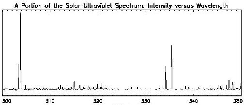
Wavelength in Angstroms
You see...while this isn't as colorful as either of the spectra shown in a
"photographic" format, this representation tells us much about the emission
of the sun in this wavelength area. Not only do we know at what wavelength
emission occurs, but we also know about the intensity of the emission in
those areas. Compare these two representations of the same solar spectrum.
Notice that where the first spectrum shows a bright line, the second shows
a peak in the graph. In the second representation, the vertical axis is in
units of intensity, while the horizontal axis remains the same. This type
of spectrum shows us not only where the Sun emits light, but also gives a
measure of how much light is emitted as a function of energy.
Absorption Spectra
Both of the examples thus far have been examples of emission spectra.
Sometimes when we view sunlight through a gas, we get a spectrum which is
continuous except for the regions in which the gaseous element
would have emitted its signature spectra if heated. For clarification,
the diagram below of sodium is provided; the top spectrum shows the
emissioni lines of heated sodium, while the bottom spectrum shows
absorption by sodium of a continuous source.
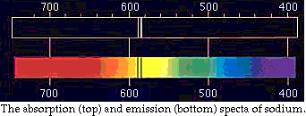
Notice that the dark bands in the emission spectrum correspond to the
same exact position and therefore wavelength of the bright bands in the
emission spectra.
Here is another example of an absorption spectrum presented in a
simulaneous "photographic" format and "graphical" format.

At the bottom you will see a graphical representation of the radiation. In
the second representation, there is a dip in the graph corresponding to
energies where we see dark "absorption lines" in the first representation.
This obviously corresponds to the photographic representation at the top of this
diagram. This time the regions where the balck bands occur correspond to
the portion of the spectrum where incident radiation is absorbed.
Generally, because scientists observe at many energies of light (and not
just the visible portion of the spectrum), and because it is important to
know the relative intensities and exact shape of of emission and absorption
features (as well as the emission's energy), most spectra used in
astronomy look like graphs, similar to the second representations above.
These graphical representations have two labelled axes; energy (or
equivalently frequency or wavelength), along the
horizontal, and intensity (or photon counts or some such thing) along the
vertical axis.
|