


|
Volume Number: 23 (2007)
Issue Number: 01
Column Tag: Statistics
The R statistics package
What is R and how you can use it.
By Mihalis Tsoukalos
Introduction
The R language of statistical computing is a free implementation of the S language, also used for statistical computing. Rick Becker, John Chambers and Allan Wilks developed S at the famous AT&T Bell Labs. The commercial version of S is called S-PLUS and the problem with S-PLUS is that it is very expensive.
Version 1.00 of R was first released on February 2000 and the latest version of R, at the time of writing this article, is 2.4.0. Version 2.3.1 is used for the purposes of this article.
R and S-PLUS can be used for statistical analysis and graphics. Put simply, you insert datasets that you want to analyze and visualize in creative ways.
What, a statistics package in MacTech?
Well, you may wonder what is a statistics package doing in MacTech so I think that I have to explain some things to you. First, let me tell you that statistics are not that difficult in all of their aspects -you can use a small division of statistics that are incredibly simple. Second, I should add that statistics can be very useful for systems administration purposes including Mac OS X. Last, you should know that statistics are particularly useful when you want to generate a report for your boss that usually does not understand technical information very well.
If you still feel uncomfortable with statistics, please have in mind that this article is not going to use higher-level statistics. What will be used are straightforward statistical methods and some R commands that generate a lot of handy and impressive graphical images.
Introducing R
The good news is that there is a Macintosh version of R that can either run as a console or a graphical application. R can also run on Windows as well as other UNIX machines.
Figure 1 shows the console version of R whereas figure 2 shows the graphical version of R. In order to run the console version you just have to type R provided that the directory of the R command is included in your PATH variable.

Figure 1: Running R from the console
As you can see both versions of R have a similar text window that you enter your commands. Nevertheless, the GUI version is more elegant and offers more options. By typing q() -this works for both versions- you can quit R. Additionally, you can quit the GUI version from its usual Mac-related menus.

Figure 2: The R GUI
R can also be used as a simple calculator. The following examples illustrate it:
> 1 + 5
[1] 6
> abs(-1.4)
[1] 1.4
R can also be used in a batch mode -only the command line version of it- where you store the desired commands in a file and execute them from the command line or a cron job. The following commands demonstrate it:
$ cat example.R
1 + 1;
5 - 8;
$ R CMD BATCH example.R
$ cat example.Rout
R : Copyright 2006, The R Foundation for Statistical Computing
Version 2.3.1 (2006-06-01)
ISBN 3-900051-07-0
R is free software and comes with ABSOLUTELY NO WARRANTY.
You are welcome to redistribute it under certain conditions.
Type 'license()' or 'licence()' for distribution details.
  Natural language support but running in an English locale
R is a collaborative project with many contributors.
Type 'contributors()' for more information and
'citation()' on how to cite R or R packages in publications.
Type 'demo()' for some demos, 'help()' for on-line help, or
'help.start()' for an HTML browser interface to help.
Type 'q()' to quit R.
[Previously saved workspace restored]
> invisible(options(echo = TRUE))
> 1 + 1;
[1] 2
> 5 - 8;
[1] -3
>
> proc.time()
[1] 0.634 0.169 0.818 0.000 0.000
>
$
As you can see, the output for the example.R batch file is stored in a file called example.Rout. If the batch executed commands generate any graphics files, those graphics files should have been created as well.
Learning more about R and Statistics
One of the most important things that you have to learn is how to insert external data inside R. This can be made using the read.table() command. The following example shows how to use it:
$ cat TEST.data
Name       Salary  Age
Mike       100000  25
Eugenia    200000  22
John       125000  26
PIK        250000  38
Antonis    180000  30
$ R
...
> SAL <- read.table("TEST.data", header=TRUE)
> SAL
     Name    Salary Age
1    Mike    100000  25
2 Eugenia    200000  22
3    John    125000  26
4     PIK    250000  38
5 Antonis    180000  30
>
In this example, a table was saved in a text file called TEST.data and loaded into R. Notice the header=TRUE parameter that tells that the first line of the TEST.data file is the header row of the table and therefore should be treated in a different way. Also notice that the SAL variable holds the whole table.
Imagine that you want to learn some information about your SAL data. The summary() command can be used as follows:
> summary(SAL)
      Name       Salary            Age
 Antonis:1   Min.   :100000   Min.   :22.0
 Eugenia:1   1st Qu.:125000   1st Qu.:25.0
 John   :1   Median :180000   Median :26.0
 Mike   :1   Mean   :171000   Mean   :28.2
 PIK    :1   3rd Qu.:200000   3rd Qu.:30.0
             Max.   :250000   Max.   :38.0
>
As you will understand, this is a great way to summarize your data. Now, let us explain the output.
The Name column does not contain numbers so R sums the occurrences (considering each value as a string) of each "string" and prints the top numbers. As far as Salary and Age columns are concerned, which are both numeric, R calculates and displays the following six values:
- Min.: This is the minimum value of the whole data set.
- Median: It is an element that divides the data set into two subsets (left and right subsets) with the same number of elements. If the data set has an odd number of elements, then the Median is part of the data set. If the data set has an even number of elements, then the Median is the mean value of the two center elements of the data set.
- 1st Qu.: The 1st Quartile (q1) is a value, that does not necessarily belong to the data set, with the property that at most 25% of the data set values are smaller than q1 and at most 75% of the data set values are bigger than q1. Simplistically, you can consider it as the Median value of the left half subset of the sorted data set.
In the case that the number of elements of the data set is such that q1 does not belong to the data set, it is produced by interpolating the two values at the left (v) and the right (w) of its position to the sorted data set as:
q1 = 0.75 * v + 0.25 * w
- Mean: This is the mean value of the data set (the sum of all values divided by the number of the items in the data set).
- 3rd Qu.: The 3rd Quartile (q3) is a value, not necessarily belonging to the data set, with the property that at most 75% of the data set values are smaller than q3 and at most 25% of the data set values are bigger than q3. Put simply, you can consider the 3rd Quartile as the Median of the right half subset of the sorted data set.
In the case that the number of elements of the data set is such that q3 does not belong to the data set, it is produced by interpolation of the two values at the left (v) and the right (w) of its position to the sorted data set as:
q3 = 0.25 * v + 0.75 * w
- Max.: This is the maximum value found in the data set.
Please note that there exist many practices for finding Quartiles. In you try another statistical package, you may get slightly different results.
Creating Graphics with R
In the main part of the article I am going to tell you how to generate creative graphics with R. R has amazing graphical capabilities. Please look at the Bibliography and References section for more information. Also, the presented examples are real examples, using real data.
WWW server example
For this example, I used some old web server log data from a real web server. The duration of the logs is one week. Let me explain all the required steps.
First, let me show you some things about the log files using the wc command:
$ wc *.log
416041  6656584   119534721 day1.log
429039  6864552   123800090 day2.log
1185958 18975185  338653060 day3.log
1162803 18604776  330550972 day4.log
1157444 18519068  329710792 day5.log
1209289 19348537  342242234 day6.log
1078902 17262326  307343799 day7.log
6639476 106231028 1891835668 total
The wc command provides us counts of lines, words and bytes of each file. As you can see, the web log files are big as this is a very popular web server.
The log file format is the "standard" Apache "combined" format as follows:
#Fields: date time c-ip cs-username s-ip ¬
cs-method cs-uri-stem cs-uri-query sc-status sc-bytes ¬
cs-bytes time-taken cs-version cs(User-Agent) cs(Cookie) cs(Referer)
I have now to decide which fields to use and extract from the log files. I will use the following fields:
time: the time of the request
sc-bytes: a number that shows the server to client bytes
cs-bytes: a number that shows the client to server bytes
time-taken: the time -in milliseconds- it took the web server to process the request. Please note that a 0 value may declare that the requested resource was stored in a cache memory and therefore the web server did not have to process it.
The following UNIX shell script does what we want:
$ cat WWW.sh
#!/bin/bash
grep -v '^#' day1.log | awk '{print $2, $10, $11, $12}'¬
 | sed 's/:/ /g' | awk '{print $1 ":" $2, $4, $5, $6}'
Its output, for the day1.log file, begins as follows:
00:00 137   465 0
00:00 142   471 0
00:00 13449 338 0
00:00 140   471 0
00:00 142   476 0
00:00 141   468 15
00:00 142   474 0
00:00 466   228 0
00:00 139   465 0
00:00 140   464 0
Of course, you have to change the day1.log string to fit your own filename. I did so for the rest of the web server log files. The files created are as follows (again using the output of the handy wc command):
$ wc *.data
 416033 1664132 6816604 day1.data
 429031 1716124 7026785 day2.data
1185942 4743768 19385103 day3.data
1162795 4651180 19041770 day4.data
1157440 4629760 18933110 day5.data
1209281 4837124 19748074 day6.data
1078894 4315576 17627914 day7.data
6639416 26557664 108579360 total
If you want to have header data in your files, you can do it by manually editing the output files. I put the "Time sc cs timeTaken" line at the beginning of each of the daily data files.
Now, we are finally ready to use R to process some of our data. I used the Misc, Change Working Directory (or Command-D) option to change my working directory so that I will not have to use full paths for my data files.
First, I am going to use the summary() command to overview my day1 data.
> day1 <- read.table("day1.data", header=TRUE)
> summary(day1)
      Time              sc                cs           timeTaken
 18:05  :   775   Min.   :      0   Min.   :   0.0   Min.   :      0.0
 17:32  :   708   1st Qu.:    141   1st Qu.: 378.0   1st Qu.:      0.0
 12:21  :   697   Median :    142   Median : 431.0   Median :      0.0
 17:07  :   696   Mean   :   2997   Mean   : 428.9   Mean   :    253.3
 10:15  :   693   3rd Qu.:    842   3rd Qu.: 464.0   3rd Qu.:      0.0
 18:15  :   687   Max.   :5686096   Max.   :2340.0   Max.   :1908734.0
 (Other):411777
>
You can easily see the moments that were very busy: 18:05, 17:32, 12:21, 17:07, 10:15 and 18:15. You can also understand from the timeTaken column output that your web server was serving requests pretty fast (because the 3rd Qu. value is 0).
There is also a very quick way to represent a data set graphically. It can be done with the pairs(<dataset_name>) command which plots pairs of the columns in a data set. The output of the
> pairs(day1)
can be seen in figure 3. Isn't it worth every statistical definition you have read in this article?

Figure 3: the output of pairs(day1) command
The attach() command takes a data set as its argument, and lets you use the columns of the data set separately. In this example, I will use the day2 data. Also, check the objects() and search() commands that help you discover existing objects.
> day2 <- read.table("day2.data", header=TRUE)
> attach(day2)
> objects()
[1] "day2"
> search()
 [1] ".GlobalEnv"        "day2"              "tools:RGUI"
 [4] "package:methods"   "package:stats"     "package:graphics"
 [7] "package:grDevices" "package:utils"     "package:datasets"
[10] "Autoloads"         "package:base"
> objects(2)
[1] "Time"      "cs"        "sc"        "timeTaken"
>
The plot(Time) command will produce figure 4. This figure shows the total number of connections per time. It makes sense that after midnight there are less connections than the rest of the day. On the other hand, unreasonable outputs may be the cause of a network attack.
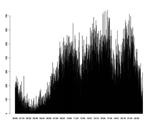
Figure 4: The output of the plot(Time) command
Last, imagine that you want to limit the output values for both x and y variables. You can do that by using the xlim and ylim parameters of the plot command. The following example shows this (the output can be seen in figure 5):
> plot(cs, sc, xlim=c(450, 500), ylim=c(450,500))
Network data example
In this example, I will use network data. As many of you already know, the usual way to capture network data is the tcpdump tool. The output of the tcpdump utility is difficult to read but there are many tools (i.e. tcpshow, ethereal/wireshark) that will help you parse it. Anyway, imagine that you have readable tcpdump output that contains the following fields:

Figure 5: Limiting the values of the output
Packet Number: column title "Packet"
Time: column title "Time"
Time Difference from Previous Packet: column title "dt"
Source Port: column title "sp"
Destination Port: column title "dp"
I used the tcpshow package which produces output that looks as follows:
-----------------------------------
Packet 171
TIME:    15:00:15.367367 (0.000190)
LINK:    00:60:97:DE:54:36 -> 00:00:0C:04:41:BC type=IP
  IP:    207.46.130.139 -> 172.16.117.52 hlen=20 TOS=00 dgramlen=40 id=003A
    MF/DF=0/1 frag=0 TTL=64 proto=TCP cksum=C797
 TCP:    port http -> 1024 seq=1274940435 ack=3183900831
    hlen=20 (data=0) UAPRSF=010000 wnd=32735 cksum=2A2F urg=0
DATA:    <No data>
-----------------------------------
Packet 172
TIME:    15:00:15.455012 (0.087645)
LINK:    00:00:0C:04:41:BC -> 00:C0:4F:A3:58:23 type=IP
  IP:    172.16.112.20 -> 192.168.1.10 hlen=20 TOS=00 dgramlen=60 id=0080
    MF/DF=0/0 frag=0 TTL=63 proto=UDP cksum=9D5A
 UDP:    port domain -> domain hdr=8 data=32
DATA:    .9..........
    hostmaster.com.....
-----------------------------------
I used a small Perl script to extract the data (TCP traffic only) that I wanted from the tcpshow command output. Remember that you may have to replace text values like http, telnet, etc., found in tcpshow output with their service numbers so that R can use it.
This time, I will also bring into play a new R package for creating graphics called lattice. The following command shows how to load the lattice package in R.
> library(lattice)
In order to get some help about the lattice package, you can type the following command:
> help(lattice)
After executing the last command inside the graphical version of R, you will get the output shown in figure 6.

Figure 6: help(lattice) graphical output
For the first example, I will use the data from the first three columns (Packet, Time, and dt) of the extracted data (C3.data file). I executed the following three commands:
> c3 <- read.table("C3.data", header=TRUE)
> attach(c3)
> c3m <- as.matrix(read.table("C3.data", header=TRUE))
You already know the first command. The second command inserts the data as a matrix (as.matrix() command) because some graphics functions that plot more than two variables will only accept data as a matrix. Do not forget to also run the library(lattice) command.
Write the following commands in a text editor. After that, copy them and paste them inside R. You will get figure 7! This example is based on an existing example that uses the volcano data set.
x <- 10*(1:nrow(c3m))
y <- 10*(1:ncol(c3m))
image(x, y, c3m, col = terrain.colors(100), axes = FALSE)
contour(x, y, c3m, add = TRUE, col = "peru")
axis(1, at = seq(100, 800, by = 100))
axis(2, at = seq(100, 600, by = 100))
box()
title(main = "c3m plot", font.main = 4)
Do not ask me about the physical meaning of that graph. If you know your data, you can tell more about this image. This is just an example about getting an idea of R capabilities.
Now, I am going to show you a more down-to-earth example. The following commands
> plot.new()
> xyplot(Packet ~ Time)
> title(main = "Packet vs Time", font.main = 4)
will plot Packet number versus Time -using data from the c3 dataset- as can be seen in Figure 8. Straight lines may

Figure 7: Plotting the c3m data set
represent complete HTTP transactions. You can see that there are moments that there is not so much TCP traffic whereas other times the TCP traffic is very high.

Figure 8: Packet vs Time plot
For the last example I will use the data from the last two columns (sp, and dp) of the extracted information (C2.data file). First, run the following commands:
> c2 <- read.table("C2.data", header=TRUE)
> attach(c2)
> c2m <- as.matrix(read.table("C2.data", header=TRUE))
> summary(c2)
       sp             dp
 http   :2472   http   :1923
 smtp   : 202   smtp   : 223
 telnet :  39   telnet :  42
 1024   :  31   1024   :  38
 2615   :  22   1306   :  36
 1026   :  21   4233   :  27
 (Other):2124   (Other):2622
As you can easily understand, the summary command is very useful and meaningful this time. This traffic has many HTTP, SMPT and TELNET requests. If you are concerned about security, you may try to lower the TELNET connections and replace them with secure connections (ssh).
As this sample contains non-numeric values, there are not so many things to do. Plotting your data set is something you can do (figure 9):
> plot(c2)
> title(main = "dp vs sp plot", font.main = 4)
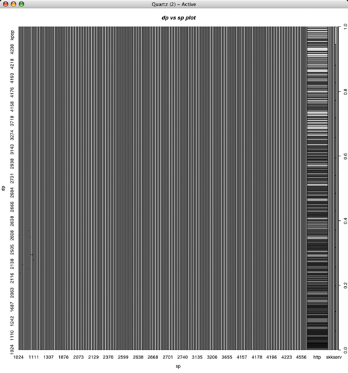
Figure 9: dp vs sp plot
One more thing
You may wonder by now, why did I talk about web log files for seven days although I used only two of them! Well, the answer is that I am going to use them now.
Run the following commands for each one of the seven web log data files:
head -n 1 day1.data > hour1
grep "^13:" day1.data  >> hour1
This will create seven files, each of them containing the web log data between 13:00 and 13:59, one for each weekday. Also, execute the following command:
$ wc -l hour*
  25647 hour1
  23211 hour2
  70192 hour3
  67904 hour4
  59699 hour5
  60121 hour6
  58629 hour7
 365403 total
$ wc -l hour* > hour13.data
$ head -n 7 hour13.data > hour13
Now, let us go back to R and execute the following commands:
> hours <- read.table("hour13")
> attach(hour)
> barplot(V1, angle=c(45,135), density=20, col="grey", ¬
names=c("Sunday", "Monday", "Tuesday", "Wednesday", ¬
"Thursday", "Friday", "Saturday") )
> title(main="Web server connections from 13:00 to 13:59", font=5)
The output can be see in Figure 10.

Figure 10: A bar plot
This procedure can be easily automated (and also run using cron) and therefore you can have a report of your data every day at your email account!
What else can R do?
Now that you have learned more things about R, let me briefly tell you what else can R do. Well, R can also perform the following:
1. Advanced data analysis.
2. Advanced statistics.
3. R has an object oriented programming language that you can write your own programs.
Summary
In this article you learned a lot - you learned some basic things about R, how to import data into R, and how to create graphics with R.
Those things can be very valuable for regular users and, especially, for system administrators.
Conclusions
I hope that this article did not contain too much statistics. I also hope that you have, by now, understood some of the capabilities of R. If you want to learn more about R then visit its home page, and check out some of the proposed books.
The output of R should help you prove your points to either your colleagues or your manager and get a general overview of your data.
Please let me know if you have any questions or if you want another article about R and its rich graphical capabilities.
Bibliography and References
R home page: http://www.R-project.org/
S-PLUS home page: http://www.insightful.com/products
/splus/default.asp
R and DBMSs page: http://developer.R-project.org/db/
Venables, W.N. and Ripley, B.D., Modern Applied Statistics with S, 4th Ed., Springer Verlang, 2002
Venables, W. N., Smith, D. M., An Introduction to R, Network Theory Ltd., 2002
Murrel, Paul, R Graphics, Chapman & Hall/CRC, 2006
Crawley, Michael, Statistics: An introduction using R, Wiley, 2005
Dalgaard, Peter, Introductory Statistics with R, Springer, 2004
Venables, W.N. and Ripley, B.D., S Programming, Springer, 2004
Tom Christiansen and Nathan Torkington, Perl Cookbook, 2nd Ed., O'Reilly, 2003
Mihalis Tsouklos lives in Greece with his wife Eugenia and enjoys digital photography and writing articles. You can reach him at tsoukalos@sch.gr.


- SPREAD THE WORD:

- Slashdot

- Digg

- Del.icio.us


- Newsvine
