The permanent URL for this article is: http://db.tidbits.com/article/10219
Include images: Off
Navigating the Next Generation of Mac Twitter Apps
As a Twitter addict and power user, I have long been on the lookout for killer desktop software to turbocharge my microblogging. Yet, again and again, I've been disappointed. While I love Twitter apps for the iPhone, nothing on the Mac has ever quite satisfied me.
A recent crop of Mac-based Twitter clients, however, gives me reason to hope that my days of tweeting from a Web browser might, at last, be numbered. The recent releases of Tweetie, Lounge, and Nambu provide power and flexibility, along with the elegance and flair Mac users demand.
Tweetie [1] is the hottest news here. Released today, the Atebits app by Loren Brichter is a companion to the popular Tweetie for iPhone [2]. I've been working with pre-release builds of the Mac version for more than a week and appreciate how it masks power-user features with its minimalist facade - the same formula that has made Tweetie such a hit on the iPhone. Despite one major issue I will describe shortly, the desktop version of Tweetie is growing on me.
Nambu [3] and Lounge [4] also look appealing, even though they remain in beta form and suffer a few nagging issues. These three are more capable than simple apps like Iconfactory's Twitterrific [5], which many love but others find limiting. As a result, these next-generation Twitter programs have the potential to become Twitterverse dashboards for Twitteraholic superusers.
The new Mac apps are also, well, Mac apps. This can't be said of the feature-rich but un-Mac-like Twhirl [6], Seesmic Desktop [7], and TweetDeck [8], which run atop Adobe AIR software that also enables their use on Windows PCs. Many Apple aesthetes loathe AIR apps for their odd appearances and interface behavior.
Note that Nambu [9] and Lounge [10] also are available in iPhone incarnations, but only the Lounge apps are meant to be used as a combo.
So has my dream Twitter app for the Mac finally come? To find out, I spent tons of time tweeting with Nambu, Lounge, and Tweetie, and gathered impressions from a few friends.
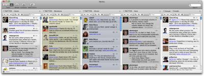
Nambu -- An Apple-centric friend of mine recently test-drove the tricked-out TweetDeck but couldn't stomach the experience. Never mind that its multi-column makeup allows for such customizations as Twitter groups, keyword tracking, and optional Facebook-friend monitoring. He found the AIR application aesthetically revolting. (I suspect he'd detest the new, TweetDeck-style Seesmic Desktop, as well.)
So he was thrilled when I turned him on to Nambu. Like TweetDeck, it has multiple columns that show a user's primary Twitter-friend timeline, private (or "direct") messages, public mentions of that user's Twitter handle, and so on. As with TweetDeck, subgroups of favorite Twitter friends are readily placed in their own columns. So are columns displaying custom searches or trends.
For my pal, Nambu has the added benefit of a Mac-like look and feel. And while it lacks Facebook access, it does boast support for FriendFeed and identi.ca accounts (at least, that's the promise; both were grayed out in the beta versions I evaluated for this article).
Nambu surpasses TweetDeck in some ways. It supports multiple Twitter accounts, for one thing. Those like me who juggle more than one account can get all column-crazy with Nambu, setting up as many viewing options as the widths of our displays will permit.
The app has other nice touches like Twitter-name autocompleting in the composing field, along with the now-common features such as URL shortening and TwitPic posting. Each column has a word-filtering field to narrow down the tweets that appear within. Double-click in the blank area in any tweet to reply to it, or double-click the author's picture to open a window with that person's info. There is even conversation threading in the main interface, with replies embedded beneath the original tweets.
Nambu really shines with its alternate-view options. Its second option provides a Mail-like view with a sidebar showing icons for all key functions. A third option distills Twitter into a single river of information. With three Nambu modes, you can use the app as the mood strikes you.
But my pal is no longer happy with Nambu, due to its "often-flaky personality," he said. Another pal said Nambu "is crazy slow and kept pushing me over 100 requests per hour no matter how I set the time interval." (He's referring to limits Twitter places on client software to keep from overtaxing the ever-shaky service.) He is back to using the AIR-based Twhirl.
If Nambu can work through its problems, however, it has promise for those who require the most malleability and control in their Twitter use.
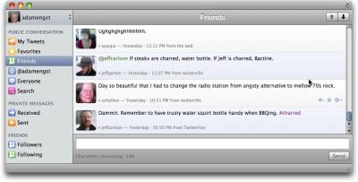
Lounge -- Taking a simpler approach than Nambu, Lounge offers only a single mode with a main window and a sidebar. This sports colorful, whimsical buttons for "My Tweets" (your tweets), replies (which pulls up all public mentions of your Twitter handle), private or "direct" messages, favorites, search and the like. You can easily add search buttons with customized criteria.
Clicking tweets or direct messages (DMs) in the main window expands them to show the author's details. Each of these entries also sports a minimalist row of buttons (invisible until your pointer hovers nearby) for retweeting, DM-ing and other tasks.
The top-left corner of the Lounge interface is a drop-down menu for switching among two or more Twitter accounts (which, at press time, could be added but not deleted). The tweet-composing field is at the bottom, a la Nambu, with a similar name-autocompletion feature. Lounge, like Nambu, supports Growl [13] notifications that alert you to new replies and so on.
Lounge, though, is a work in progress. It's a performance laggard, and it lacks obvious features like URL shortening or picture posting via TwitPic or a similar service. Forget about setting up subgroups, customizing your interface, or doing keyword filtering. Judged on its own, Lounge might be regarded as a Twitter-app also-ran.
But developer Goose Apps is deploying a possibly groundbreaking feature: Twitter syncing. That's where Lounge for iPhone comes in.
Nearly identical to its Mac sibling in appearance and functionality, the mobile app is intended to be wielded in tandem with the desktop incarnation. Customized searches set up on the Mac application, for instance, would show up on the iPhone app, or vice versa. Tweets viewed in one place would be marked as viewed in the other place.
This all sounds great, but there was a catch as I finished this article: An updated version of the iPhone app with that syncing capability enabled had been submitted to the App Store but not yet gone live, so I don't know how well the syncing works. I'm eager to find out.
Tweetie -- The iPhone version of Tweetie has been my favorite mobile Twitter app for a bit because of its near-perfect blend of simplicity and complexity. It does not pack in features like Twittelator Pro but is far more capable than Twitterrific for iPhone. It feels... just right.
So, like thousands of other Mac-using Twitteraholics, I'm ecstatic that a desktop version of Tweetie has arrived. Deceptively simple in appearance, Tweetie for Mac is a worthy rival to Nambu and Lounge, even though it does not match them feature for feature. That has been the genius of developer Loren Brichter - he seems to know just what to integrate, in terms of raw functionality, and what to leave out.
Tweetie is a triumph of Macintosh interface design. Consisting of a single vertical window with just four toolbar buttons (the main timeline, replies, direct messages and searching), it boasts the kind of clean and elegant appearance I crave in a Macintosh application.
It's snappy, too. After my time with the lumbering Nambu and Lounge, I am astounded at the speed with which Tweetie operates. When I scroll downward to the last tweet in the viewing window, Tweetie promptly fetches the next batch of tweets in the timeline.
Moving from one toolbar option to another triggers a vertical fast-slide effect I find delightful. Click a user's avatar or name and a fade-zoom effect reveals his or her particulars. More fast-sliding (horizontal, now) moves you among that user's tweets, favorites, and info.
Double-click a public reply and the entire back-and-forth conversation is revealed in threaded form. Your private exchanges also are threaded (but, strangely, with iChat-style color bubbles that deviate jarringly from Tweetie's otherwise-consistent interface guidelines).
Though Tweetie lets you drill deep into the Twitterverse via willy-nilly clicking, it will always guide you back to your point of origin. It does this cleverly by displaying every step you took, each as its own clickable hyperlink, along the top edge of the application window.
The tweet-posting interface is even more minimalist; it's a little window that swoops to the center of the Mac desktop (via a customized keyboard combo, if you like). This is a swell touch, especially when you do not want to be distracted by the tweeting of others. Tweetie lets you send direct messages in a similar fashion, and the posting window opens with an autocomplete field for entering the recipient's user name.
Tweetie does clever things with photos, too. Click a TwitPic link or a user's avatar photo within his or her info page, and the enlarged image appears in a slick-looking standalone window that zooms to the center of the Mac screen. You can easily upload photographs by dropping them into the posting window; they are then pushed up to the any of four photo-hosting services Tweetie supports.
Tweetie handles Twitter searches with grace, as well. A pull-down menu shows recent searches as well as Twitter trends. And, in a nice touch, searches can be opened in their own standalone windows (handy for monitoring hashtag-fests, for instance).
Tweetie, like Nambu and Lounge, supports multiple Twitter accounts, though not groups like Nambu and TweetDeck. For those who like to follow a fair number of people but focus on subsets, this may be a significant lack. As an alternative that might work for some people, Brichter suggests creating a separate Twitter account [15].
It's with Tweetie's multiple-account functionality that I ran into trouble: On several of the Macs I used, I was unable to enter a second or third Twitter account after a set-up routine that asked me for an initial identity. This is the first time I've run into an issue like this, with any Twitter app. Brichter said he's aware of the glitch, which others have run into in the release version, and is working on it. (As I filed this article, he appeared to be making headway since I was able to get my accounts into the program with a bit of persistence.)
On Macs that did take more than one account, I could easily move among these via avatar icons displayed in the toolbar (and double-clicking any of these fade-zoomed me to the info page for that account). The avatar icons can be reordered in Tweetie's preferences.
There are other things I'd like to see in Tweetie, such as support for Growl notifications, grouping features, and a refresh button. Brichter is fighting his users on these last two, and I grudgingly compliment him on this; making strict, smart calls about what to put into Macintosh software, and what to leave out in spite of user pressure, is how fine applications get made.
As for notifications, Tweetie has a sweet-looking menu bar item that turns from neutral gray to glowing blue when there's new activity (this can be customized to include or omit new tweet, reply or DM notifications). You can click the menu bar icon to hide and show Tweetie's main window.
So, has my dream Twitter desktop app arrived? I think so, and thy name is Tweetie, assuming that multiple account glitch will be fixed soon. (Lounge's syncing potential has me intrigued, though.)
I'm hardly alone in embracing this Mac companion to the celebrated Tweetie for iPhone. There was an unbelievable amount of Twitter chatter about the Mac app in the days before its release. I have a hunch Twitter diehards using Windows will be extremely jealous today.
[Julio Ojeda-Zapata is the author of "Twitter Means Business: How Microblogging Can Help or Hurt Your Company" (learn about the book at twitin.biz [16]), as well as a consumer-technology columnist at the St. Paul (Minn.) Pioneer Press. Get his latest writing at yourtechweblog.com [17] and twincities.com/techtestdrive [18].]
[1]: http://www.atebits.com/tweetie-mac
[2]: http://www.atebits.com/tweetie-iphone
[3]: http://www.nambu.com/
[4]: http://loungeapp.com/mac/
[5]: http://iconfactory.com/software/twitterrific
[6]: http://www.twhirl.org/
[7]: http://www.tweetdeck.com/
[8]: http://desktop.seesmic.com/
[9]: http://itunes.com/apps/nambu
[10]: http://itunes.com/apps/lounge
[11]: http://www.tidbits.com/resources/2009-04/Nambu-window.png
[12]: http://www.tidbits.com/resources/2009-04/Lounge-window.png
[13]: http://growl.info/
[14]: http://www.tidbits.com/resources/2009-04/Tweetie-window.png
[15]: http://blog.atebits.com/2009/02/twitter-groups
[16]: http://twitin.biz/
[17]: http://yourtechweblog.com/
[18]: http://twincities.com/techtestdrive


