


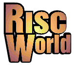
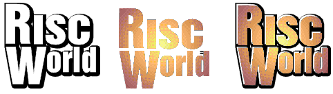
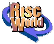
The new RISC World logo
Aaron introduces the new logo.
I was sitting at my desk yesterday and looking and doing the first assembly work on this issue of RISC World when something struck me. Unusually for our house it wasn't a greyhound doing 40mph in a 5mph zone, but it was the RISC World logo, quite frankly it was rubbish. Will someone please explain to me how I have been able to get away putting this awful thing on RISC World for the last two and a half years? What was I thinking?
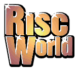
The "old" RISC World logo - yuk!
I seem to recall that I even wrote an article at the time explaining the new design. I know why it was done the way it was, it was designed to render correctly in a 16 colour screen mode. However these days even VirtualA5000 users (and yes we do have quite a few subscribers who don't have a "real" Acorn) can run 800x600 in 256 colours. So sitting here yesterday afternoon I decided that instead of doing a sensible editing type job I would re-design the RISC World artwork, after all it's the start of a new volume so it does make some sort of sense.
Planning pays dividends
The HTML templates for RISC World are very simple, for a number of reasons. The first of these is speed. A simple HTML page will load a lot more quickly than a complex one that uses lots of frames and tables and has cunning "join-up" bits of artwork that mesh the whole thing together. When I first came on board as editor with Issue 4 I dumped the existing design produced by David Matthewman in order to "stamp my mark". I also wanted a more cohesive layout so that the main index looked like an index, and so that each article had a definite design. Secondly a simple HTML template is much easier to change than a complex one, the complete look and feel of a design can be changed easily and quickly.
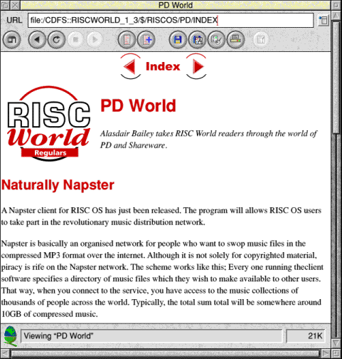
A page from RISC World Volume 1 Issue 3
The aim of the exercise was to produce an HTML template that could have its appearance changed just by altering the graphics, leaving the HTML code the same.
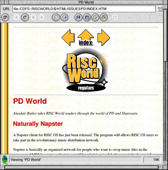
A page from RISC World Volume 1 Issue 3 using the new HTML template
This new layout (from issue 4 onwards) was applied to the earlier articles for the Volume 1 compilation, so unless you were a subscriber right at the start of RISC World you may have never seen the original design. Although the HTML design has remained the same since issue 4 the graphics themselves and the font colours used have not. If you look closely at the screen shot above you can see a white area around the RISC World logo. This is caused because the early versions of the graphics used did not have a mask. The graphics were masked at some point during volume 2 after Andrew Harmsworth pointed it out! You may also notice that the headings are in red, whereas now the RISC World headings are in blue. This change gradually occurred during the first and second volumes. Indeed at one point we were going to switch to black for the headings, so in some issues some articles have blue headings, and some have black ones. Which is an excellent example of inconsistency.
However as far as I was concerned the design looked dated and an overhaul was long overdue.
The new graphics
Since the HTML template was designed to make later changes easy (because only the graphics would need to be altered) the new design could easily be adopted for each issue of RISC World and for the website. Indeed in the case of the website all that had to be done to apply the "new look" was upload a new set of graphics. None of the HTML pages needed to be changed at all.
A page from RISC World Volume 1 Issue 3 using the new graphics
The trick in making changes like this is to ensure that all the new graphics have the same dimensions as the old ones. This does not mean that they can't be visually bigger or smaller, just that their size in pixels matches. Some of the existing graphics had quite a lot of white space (or mask) around them which means that the new designs could be visually quite different, yet still fit correctly.
When you place a graphic on an HTML page you can specify the size the graphics will be, or you can leave the graphics size unspecified.
<IMG SRC="IMAGES/FIG3.GIF" BORDER=0>
The HTML above displays a graphic but leaves the size unspecified. This means the browser cannot format the page correctly until it has fetched the graphic.
<IMG SRC="IMAGES/FIG3.GIF" WIDTH=75 HEIGHT=74 BORDER=0>
In the example above the size of the graphic is specified. This means the browser can correctly allocate space for it and then carry on formatting the rest of the page before the graphic has loaded.
RISC World actually uses both methods. The graphics that are "editorial" such as the forward and back buttons, the RISC World logo and some other formatting parts are specified in the HTML with a fixed size. Graphics that form the body of an article no longer have their sizes specified since they shouldn't alter the page formatting greatly. Actually that's not strictly true. I long ago discovered that not having to specify the size of each graphic by hand speeded up the editing process for RISC World by a surprising amount, but at least I have a partially believable excuse.
Since the size of the "editorial" graphics was fixed in the HTML it would be a simple matter to make new ones. The new graphics were constructed mainly using Draw and DrawWorks. To ensure the sizes were consistent I made a set of grey coloured sprites that were the same size as the old graphics. It is then easy to scale the new designs to ensure they fit correctly.
The old graphics, the grey sizing sprites and the new graphics in Draw
The picture above shows how the size were kept the same. All I had to do was ensure that any new design would fit inside one of the grey sprites. The amount of white space around the graphic doesn't matter, all that matters is that the finished design fits inside the available space.
The new logo
I really wasn't too sure what I wanted for the new logo but then I had a stroke of good fortune. Rooting around the RISC World hard drive revealed an aborted re-design that had originally been intended for Volume 3. However this design was rejected as it was frankly naff, and looked worse than the design we were already using. However among the aborted logos was this little item produced using ArtWorks.
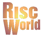
A RISC World logo constructed using ArtWorks
This had been rejected as it was too flat and lifeless. However it wasn't a great deal of work to add a drop shadow and a black border to give it a bit more depth. In this case all I did was copy the logo in Draw, give it a fill colour and line colour of black then give it a line width of 6. Placing this behind the coloured version of the logo produced this.
Slightly better
However I still wasn't happy with this design and decided it needed a highlight coming from the top left. This was accomplished by moving the coloured part of the logo down and to the right and by then placing a white version of the same logo on top of the black one.
Slightly better
All that was needed now was a bit of "sparkle", in this case all I did was draw a star shape, fill it white and then shrink it down and copy it too add some glossy highlights.
Looking much better now
Having designed the main logo I then had a go at a number of different versions of it. Embarrassment prevents me showing them all here but with hindsight I was going down a dead end road. I got fixated on the "World" part of RISC World and started going all planetary with the RISC World text part of the logo in orbit around a planet. The original logo had been designed as a whole planet with the sun coming up behind, so I thought I could keep this idea but extend the planet part of it somewhat.
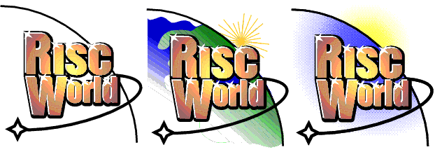
The least embarrassing new designs
At this point I got stuck, and so walked away. Coming back an hour or so later I decide to leave the main logo and fiddle with the arrows as I had a much clearer idea what I wanted. I was after a more 3D type effect with a drop shadow. By this point I had already decided that the new background for the pages would be white with a blue border on the left, so the new 3D arrows needed to be blue. Now normally I don't like clip art, after all most clip art collection will generally provide the wrong clip for any occasion. However I remembered that DrawWorks comes with a set of rather nice arrows and so I dug out a DrawWorks CD. I altered several of the arrows to come up with a number of alternatives.
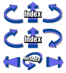
Three of the arrow sets
Then suddenly I realised that I had got too fixated on the "world" concept. I could produce the logo I wanted using an arrow motif. All I had to do was flip over the Index arrow from the bottom set and put that behind the RISC World logo.
So close, but yet...
I still wasn't totally happy with this and then realised why. The arrows were all three dimensional in some way, but the RISC World logo wasn't. However it was time for DrawWorks to come to the rescue (after all what's the point of being a designer, writing your own design tools and then not using them). All I need to do was use DrawTrix to bulge the RISC World logo out a bit.
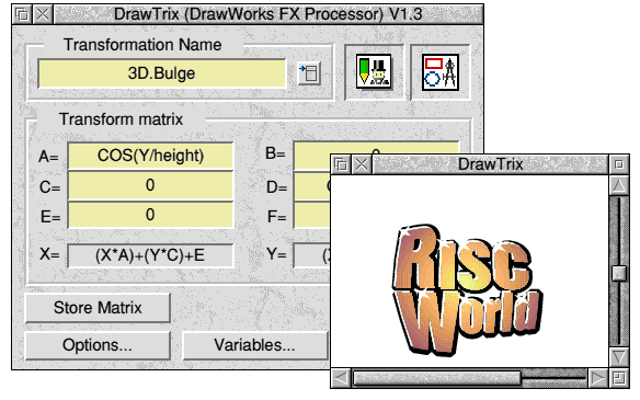
Bulging with DrawTrix
Assembling the whole lot together produce a logo I was finally happy with.
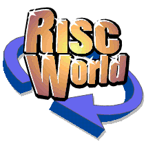
Got it!
It was now quite easy to put together the other required bit following the same sort of idea. All of this was done with DrawWorks apart from the "MainIndex" graphic on the RISC World title page which had its text distorted by ArtWorks, simply because that was the quickest way of doing it.
The end bit
So that sums up the RISC World re-design. At this rate you can look forward to another of these articles at the start of volume 7 explaining how bad this design is and asking what on earth I was thinking at the time.
Aaron