


DTP for beginners
Or How to Communicate a Simple Message on the Prevention of Alzheimer's with Nobilangelo Ceramalus
In the last issue of RiscWorld I described the first stages of designing a single-sided A5 leaflet that would tell people what they could do, using the latest and best in scientific findings, to minimise the risk of going down with Alzheimer's. This article will finish the task.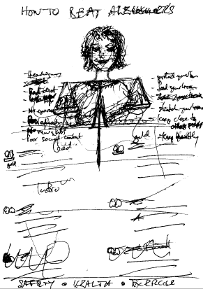
Figure 1
Figure 1 is where we got to last time: a quick sketch jotted down on the ferry as I was being whisked into the city (Auckland city, that is--New Zealand's largest--whilst travelling in from Waiheke Island).
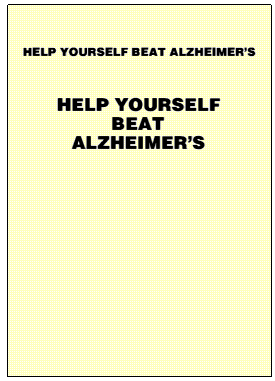
Figure 3
For Figure 3 I have shown the canvas set to A4. Why, you may ask, use A4, when the leaflet is to be A5? The answer is because I shall be using an inkjet printer for proofs, and because I need to print right to the edges of the paper, which no printer can manage, it will be loaded with A4 paper, which I shall then trim back to A5 with guillotine. Printing right to the edges is called a bleed, because you actually print outside the edges on over-sized paper then bring them back to where they should via that post-printing guillotine trick.
Talking of guillotines, if you intend doing a reasonable amount of DTP, or even just a reasonable amount of printing, you should get one. Scissors and Stanley knives come nowhere near them, and being able to slice paper accurately and easily at perfect right-angles is necessary for anyone who puts words and graphics on paper.
Far and away the best kind of guillotine, and the safest, are the ones that cut with a rotating blade running along a metal edge. The worst--and they are downright dangerous--are the kind that use a descending scimitar hinged at the top end. With them, if you make a small error in positioning the hand that holds the work you will suddenly lose weight by a slice of flesh and bone, you will shed a lot of red stuff, and you will rend the air with screams and other expressions of vexation and discontent.
There is--alas!--no Undo button for such occurrences. I shall never forget coming in to work at a computer centre several aeons ago and seeing a trail of blood from that kind of guillotine wending its way across the floor to the ladies. A young woman had taken the end off a finger. The red splashes on the linoleum made a succession of patterns that are still embedded in my mind.
So stick with the rotary sort. With them you can cut nothing but your work, and `bleed' will mean only what it means in printing; it will not be translated into unforgettable splashes on the floor.
Back to Alzheimer's. On my A4 canvas (210x297) I made a centred A5 rectangle (148.5x210), simply by making a rectangle that size and centering it with the nifty addition that Martin Wuerthner made earlier this year to his Translate module. It adds to the Artworks menu `Centre on page'--`Horizontal' `Vertical' `Both'. Very handy, and a far cry from the tedious old work around of creating a rectangle as wide/long as the page, centering the object on it, then deleting it. I make heavy use of it and would not be without it.
I made the A5 rectangle white by clicking the white patch in Martin's ColourBar, then made the corners the way they should be by setting Join Style to Mitre--for about the millionth time. Why, why, oh why did Computer Concepts make Bevel the default? I almost never use it, so I am forever changing it to Mitre.
There is an old saying that a bad workman blames his tools. The opposite, presumably, is that a good workman praises them. You will have to decide at the end of this short series what sort of workman I am, but I cannot help but praise one very valuable aspect of the present Artworks continuum: Martin Wuerthner's excellent series of plugin modules, now some twenty in number. Without that impressive array, every Artworks task would be less easy, less enjoyable, more time-consuming, and, very often, so difficult that you would be disinclined to bother doing it.
He has now very aptly grouped them under the title `Masterworks'--MWs from MW. They are indeed the works of a master, a programmer with a rare combination of gifts--he knows how to make bits and bytes dance and he invariably makes good, intuitive user-interfaces. His modules certainly give the ancient Artworks warhorse a rich new lease on life. It is a very different animal from what it was before he started adding to it.
Singling out one module from so much excellence is unfair, but the recent addition mentioned above, ColourBar, could be called NecessaryBar. It is such a joy to use and fits so naturally into Artworks that every user--serious or dabbler--should get it. It makes your work flow; you wish Artworks had always been like that. Being able, for instance, to select- drag a colour-blob to change a fill, or adjust-drag it to change an outline, rather than mess with the menu every tedious time is wunderbar.
Martin has added so much to Artworks, and is so frequently issuing upgrades to both his Masterworks modules and Artworks itself, that keeping up with the deluge became a problem. So to make AW/MW housekeeping easy and straightforward he has issued a Updater program for registered users. Its size (a 739k Archive file) and content starkly show the enormous difference this one man has made to Artworks. A total of 25 modules in the Auto directory (23 if you are below RISC OS 3.5), either entirely new facilities or greatly enhanced versions of original AW facilities; plus several patches to Artworks proper; plus a number of re-engineered RMs; plus many additions to the Artworks menu. It all adds up to a staggering feat, an array of graphical riches that Martin can justly be proud of and that all Artworks users can be very, very grateful for. Anyone who has not added MW to AW is missing out on a whole new graphical world.
One of the latest additions to the MW repertoire, and one particularly welcome, is a replacement for Precision, which was a very useful, but extremely annoying facility, because it was riddled with bugs that chewed holes in other facilities. Even better, it is better than Precision, with extra goodies, such as being able to lock the thickness of lines and the size of arrows.
In this leaflet, as you will see, much use was made of the MasterWorks TextArea module, which makes text-editing in Artworks a doddle instead of a painful hobble. So much so that I did the whole job in Artworks, where I would normally have gone only so far then shifted to Impression Publisher Plus.
Now I have a blank A5 staring at me--what I referred to last time as the stare of the snake. But I am not afraid. I know how to annihilate it--I hope--them snakes have weird ways.
The headline, and subheading were decided in Part I--`HELP YOURSELF BEAT ALZHEIMER'S' and `Shift The Balance of Probabilities In Your Favour'--but we now have to choose the typeface, the point-size, the colour and the positions on the page. Start simply was the advice given in Part I, and it applies here just as much. Put something down, something simple, see how it looks, and change it if necessary later on. Much--often most--of the work will be done in the polishing. But before you can start polishing you must have something to polish, so get something down. The snake will then get thoroughly ashamed of itself, go away, and in some lonely corner self- destruct in under than thirty seconds. So sad.
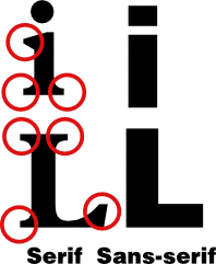
Figure 2
A bold sans-serif font is good for headlines. Serifs, if you have not yet been introduced to them, are the little extensions at the ends and joints of letters; a sans-serif font has none. See Figure 2, in which the serifs are circled in red. Bold sans-serif is easy to read at a glance, which is what a headline should be, and it contrasts well with a serif font, which is good for body copy, especially in a case like this where you want the text to look authoritative so as to match and underline the scientific authority of the content.
I chose Hull for the headline (which outside RISC OS is Helvetica Bold-- or is it Extra Bold?), then tried the two settings shown in Figure 3. I was working at 50% zoom so that I could see the whole A5 on screen, so I kept toggling to a lifesized zoom every so often to see what it would look like when printed. That is the equivalent of reading things over aloud when writing text. Always check to see what things look like lifesize. Do it on screen; do it via test-prints (aka proofs) on paper.
To be able to do it on screen, experiment with Zoom (preferably MW's nifty super-enhanced version) till you know which value displays at exactly lifesize on your monitor--hold up an A4 sheet and change zoom till the width of the A4 canvas on screen is the same (do not hold up a metal ruler, because that will mess up your screen, and a degaussing may be needed to unmess it).
In this case it is obvious which form of the headline is best. The second. The snake took one look at it and retired to Alpha Centauri at lightspeed. The first is bland and boring, and as weak as Ezekiel's `strengthless dead'. The second is strong, it delivers the words `BEAT' and `ALZHEIMER'S' with appropriate emphasis, and it has a far more interesting, and therefore better, shape. Putting it on three lines also means that it can be 28pt, not 18pt--and this is a message that deserves to be shouted out.
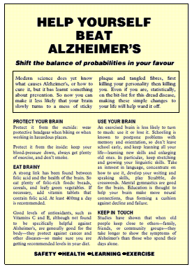
Figure 4
Figure 4, then, starts with that. Now for the subheading. To avoid the cluttered look of having lots of fonts, I stuck to three. One for the heading and subheading, one for the body, and one for the crossheads and summary-headings. The subheading is a smaller version of Hull (14pt), but Oblique for emphasis and contrast. And here it is right to put everything on one line. It then contrasts with the headline, it can be assimilated with one sweep of the eyes, and the shape it makes with the headline adds the graphic force we are building up.
Body copy is in Monotype Plantin, 11.75pt, with the X:Y set to 95% to make it a bit more readable and provide more space. Plantin is a very good font for body copy. The first thing, of course, is the introductory paragraph. You may notice that the wording here is slightly different to what was planned in Part I, but that often happens. The effect of putting your words into a new font and a new setting makes you see them afresh, and enables you to polish them as if they were written by someone else. Here, the changes slightly improved the flow and bite.
The above effect (seeing things afresh when they are put into a new garb) can be employed deliberately. After you have written what you think is the best text, change the font, and/or the setting. That forces you to take a fresh look at it. It may surprise you how much polishing you will then find needs to be done, and how much easier it is.
Some changes will also be forced by the layout. For example, there may be a paragraph that will not fit, so you will need to reword it to shed a word or two. Sometimes you can shoehorn it in by tweaking the compression- -in this case, say, from an X:Y of 95% down to 94%, or expand it out a notch by cranking the compression up to 96%. But you should not stray too far from what you have chosen as your normal compression otherwise the variation will show in the text.
In this case the order of the sections had to be changed to make them fit, and some tweaking had to be done to the text within two sections so that they enlarged to fit the hole.
Figure 4 finally made it to the end of the process of setting the text, only to discover that there was no room for the graphics--the pair of scales and the person holding them that had been planned. Oh dear! But much work has still been done, which means that adding the graphics will be that much easier. Obviously a single-sided A5 leaflet is not enough for everything, unless your client wanted nothing more than a monochrome publication on coloured paper as in Figure 4.
Some ideas that seemed promising in the theory of Part I have already fallen by the wayside when they came up against the practice of Part II, and more will fall as we go on, but that always happens. It underlines the point: be flexible, treat nothing as fixed in the concrete of your own brilliance.
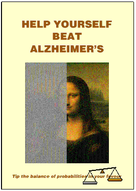
Figure 5a
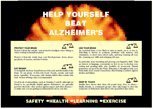
Figure 5b
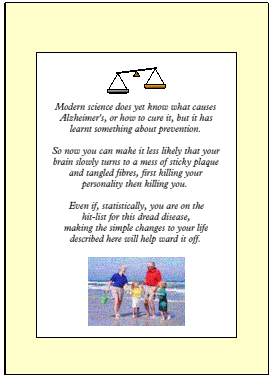
Figure 5c
Figures 5a, 5b and 5c, arrange the same material in a different way, this time a folded A4--still A5 pages, but four of them, which gives plenty of room for adding graphics (from now on the A5 figures are shown on A5 canvases to save space, but in real life they too would be proofed on A4 because of the need to bleed).
In this new layout, the headline, subheading and introduction move to the covers, the first two to the front (Figure 5a), the third to the back (Figure 5c), which makes it a summary rather than an introduction. The four chunks spread themselves across the inner pages (Figure 5b), but with the headline repeated above them. All the graphics that were planned in Part I can now be put in appropriate places.
But not, as you can see, exactly as planned, which underlines the point that you have to be willing to drop or modify your first ideas. It also adds an inadvertent lesson to this tutorial: recasting material into a far more sophisticated production.
What caused the changes that you see in Figure 5? In a word: material. I decided that budget or no, model or no, photographer or no, I would put a real image on the front cover. So I went looking for one in advertising catalogues, disks, anywhere, and finally came across a downloaded image of the Mona Lisa buried away on disk. I quickly realised that a well-known image like that, suitably altered, would make a powerful symbol of the way Alzheimer's turns life from 3D gold to a flat fog of grey.
So I took the image into Photodesk, cropped it a bit to make it more suitable for this purpose, masked half of it, then overlaid the other half with grey and piled up percentages of Enhance/Shadow and Math/Grey Noise till I had what you see in Figure 5a.
I also found a site on the Internet that generates MRI images of the brain. I used a horizontal scan of a normal one, but greatly enlarged and thus suitably pixellated to appear to threaten abnormality. That, after a little experimentation, became the background of the inner spread.
An image of healthy grandparents playing with their grandchildren made a very appropriate final point. The recurrent pair of scales formed the motif that was originally conceived, but in a more restrained way. Using the cream colour on every page gave the publication unity.
The original idea thus remains in essence, but the material from the Internet was allowed to lift it to a higher plane. The original desire to present factual material in a compelling, authoritative way--which means without flashy histrionics--has been achieved, but far better than was first imagined. And, thanks to Martin Wuerthner's modules, it was all done in Artworks.
Nobilangelo Ceramalus