


FontFiend
The complete manual for them most advanced Font Editor for RISC OS.
FontFiend Main Menu
The FontFiend main menu is opened by clicking MENU over the main character table.
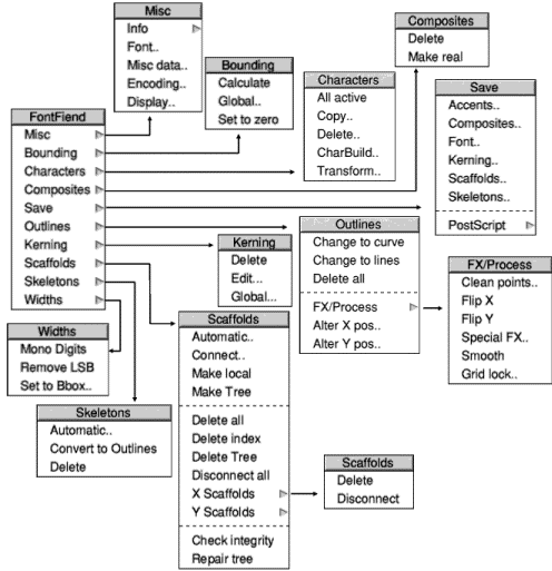
The illustration above shows the main menu tree. Each of these sections will be covered in the next few pages.
The Misc submenu
This sub menu leads to a number of dialogue boxes. The top option "Info" opens a copy of FontFiend's info dialogue box. This is the same as the one opened from the icon bar menu. The info dialogue box is opened by moving past the arrow.
All of the other options work by clicking on them, rather than moving past them. This is indicated in FontFiend by having some ... characters after the menu entry. For example Misc data...
Misc Font information
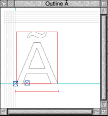
This dialogue box provides miscellaneous information about the font you are editing.
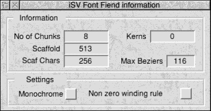
This includes the number of chunks in the font (each chunk contains 32 characters), the scaffold area size and the number of characters that have an index in the scaffold area. Note that just because a character has an index into the scaffold area does not mean that it actually has any scaffolds!
This window also displays the number of kern pairs and the maximum number of bezier curves that can be used in each characters outlines.
There are also two option buttons. Setting Monochrome on will disable the font managers anti-aliasing when the font is rendered. The Non zero winding rule button alters the fonts winding rule. If this button is on then the font will be rendered using a non zero winding rule system. With this button off the font will be rendered using an even-odd winding rule.
Setting this button on can cause some letters to be rendered wrongly.
Misc data
RISC OS 3 & PostScript fonts have a misc data area, this contains information about the font that does not have any other place to live. This includes the underline position and the underline thickness. If the font you are loading into FontFiend has a misc data area then its contents will be displayed here. If the font does not have a misc data area then FontFiend will automatically fill in this window by reading the information directly from the font.
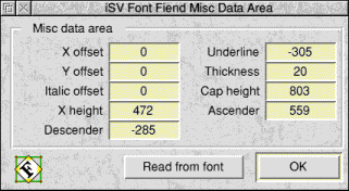
Some PD fonts may have a misc data area, but with all the settings set to zero. If this is the case then just click on the Read from font button to get FontFiend to replace these zero values.
Misc data offsets
The most useful sections of the misc data area are the offsets. The X offset is added to the width of all characters when they are rendered by the font manager. So, for example, you can make a monospaced font by giving all characters a width of zero and then setting the default X offset to a reasonable value.
The Y offset works in a similar way, however it alters the amount the next character is rendered up or down from the last character. Unless you want to seriously confuse the font manager always leave this at zero.
Italic offset is the most useful offset. If FontFiend is building letters then it needs to know if the font is Italic or straight. If your font is Italic or Oblique then you must set this value. If you transform an existing font to make it Oblique using FontFiend then this value will be automatically set for you. A good starting value for an Oblique/Italic font is 0.15. See the section on the Transform window in Chapter 5 for more details.
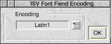
Encoding
The encoding window allows you to select an encoding to use when building letters. The built in encodings are for Latin 1,2,3 and 4. You can also drag a custom encoding file into here to load that instead. For normal use this can be left set to latin1.
Display (Rendering preferences)
This window allows you to alter how FontFiend displays information in the outline windows. You can also access this window from the preferences window which is found by clicking MENU on the FontFiend icon on the icon bar. For more information see the chapter about Preferences.
The Bounding sub menu
This sub menu is concerned with the bounding boxes for the entire font.
Bounding calculate
The first option "Calculate" will simply make FontFiend check every single character in the font and re-calculate its bounding box. You will not normally need to do this very often as FontFiend automatically calculates bounding boxes as it is working.
Note that for bounding boxes to be re-calculated the "Re-calculate bounding boxes" button in preferences must be on.
Bounding Global
Clicking on this option will open the global bounding box display window.
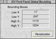
This shows the global bounding box for the font. This is the smallest possible box that can enclose any letter in the font (including accented letters). You can recalculate the global bounding box by clicking on the Recalculate button.
Set to zero
This final option simply clears all bounding boxes so that they are blank. A font will not work in this state, its primary purpose is to ensure that FontFiend does recalculate all boxes correctly. Unless you are sure what you are doing we do not recommend that you use this option. If you do accidentally click on it then simply go and click on the "Calculate" option to restore all the bounding boxes to sensible values.
The characters sub menu
This menu is concerned with entire characters, including outlines, skeletons, composites and scaffolds.
All active
Clicking on this option will turn on all the characters in a font. This does not mean that the character will be defined, just that the Font will then contain offsets to all characters.
Some PD fonts can cause problems because not all of the characters are actually defined in the main table inside the font. For example dragging letters around the font in FontED can cause FontED to crash. If this happens you can load the font into FontFiend, click on the "All active" option then save the font back out. The font will then be editable by FontED.
Copy
Clicking on this option will open up the FontFiend copy characters dialogue box.
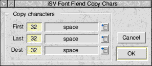
You can use this dialogue to copy blocks of letters inside the font. For example to copy upper case A to Z on top of lower case a to z you would enter the following:
- First character to copy - 65 (ASCII value for A)
- Last character to copy - 90 (ASCII value for Z)
- Destination start character - 97 (ASCII value for a)
You can enter these values by either typing in the number of the character or by choosing the character by name from a menu.
Delete
Clicking on this will open the delete characters window. This is similar to the copy window but allows you to delete characters from a start value to an end value. To delete all upper case letters you would enter the From value as 65 and the To value as 90 (see copy above).
Char build
Clicking on this option will open the FontFiend Character Builder. This is the part of FontFiend that can fill in missing letters in a font.
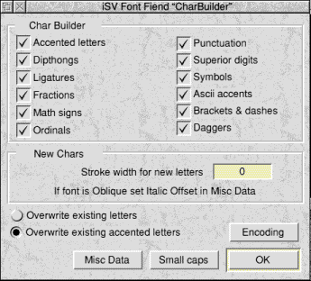
The first part of this window control what sorts of characters FontFiend will make. If a button is on for this type of character then FontFiend will make it. If it is off then FontFiend won't.
All of these characters are made according to the currently loaded encoding, by default this is Latin 1.
Char build stroke width
This is the stroke width of any new letters that FontFiend might add to the font. For fonts that do not have an Oblique/Italic offset (i.e. do not slope) you can leave this value at 0. FontFiend will scan the font itself and work out the stroke width of any new letters automatically.
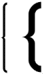
The example above shows two brackets drawn by FontFiend. The first was drawn with a stroke width of 25. The 2nd with a stroke width of 80. As you can see the bolder your font the higher the stroke width will be.
Italic offsets
If you are working on an Oblique or Italic font then you will need to set the Italic Offset in the Misc Data window before using the Character Builder. This is so that FontFiend knows that the font has an angle and can adjust its stroke width and the angle of new letters it produces automatically. This also allows FontFiend to offset any accents it places over characters so that they are above the visual centre of the letter.
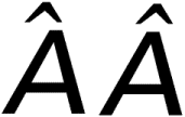
The example above shows two accented letters in an oblique font. The first was produced without setting the Italic offset in Misc Data. As you can see the accent is in the wrong place. The second was produced with the Italic offset correctly set up.
Setting the Italic offset is best done by trial and error.
Overwrites
There are two buttons that control how FontFiend behaves if it finds that a letter already exists.
Turning on Overwrite existing letters will allow FontFiend to replace any letters in the font with the ones it has made itself. If this button is off then only those letters that do not exist in the font will be drawn by FontFiend. Existing letters will be left alone.
For example say that you wanted to add all the math signs to a font. You could turn on just the Math Signs button and the Overwrite existing letters button. Then clicking on OK would just add math signs to the font, replacing any existing math signs with the new ones.
Overwrite existing accented letters should be left on most of the time. This allows FontFiend to replace any accented letters with its own. However other characters will only be replaced if the Overwrite existing letters button is on.
Misc Data button
Clicking on this button will open the misc data window. This is covered earlier in this chapter.
Encoding button
Clicking on this button will open the encoding window dialogue box from where you can choose a different encoding.
Small Caps
Clicking on this button will open the small caps window. From here you can produce small caps in your font.
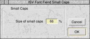
Small caps are just that. Small versions of capital letters instead of having specially designed lower case letters. The size of the small caps should be between 66% and 80% for most fonts. Clicking OK in this window will generate the small caps. If you are going to add small caps to a font then you must do this before using the main char builder.
You may also need to alter the weight of each of the small caps using the Alter Weight option from the Outlines.FX Process.Special FX dialogue box. This can be used to make the small caps bolder so that their visual weight is consistent with other characters in the font.
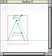
Building characters
Once you have set up the Character Builder you can then click on the OK button. FontFiend will then check to see if the font has the required accents. If not, a confirmation window will open asking if you want to load one of the default sets of accents. Click on Continue to load the accents suggested by FontFiend. The hourglass will then appear and FontFiend will build the letters you have requested.
It may seem obvious but FontFiend cannot produce miracles. In order for the Character Builder to work you will need a font with at least upper case letters, numbers and some symbols such as full stop and an exclamation mark. You cannot expect FontFiend to be able to produce missing lower case letters, or draw upper case letters in the style you have designed the rest of the font. Character Builder can save many hours of work. However you still have to do some of the work yourself when you are designing a font.
Transform
Clicking on this option will open the character transformation editor.
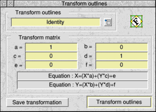
This dialogue box allows you to alter the appearance of a font and to make new font weights easily and quickly. The transformation used is a simple 6 entry one and is shown in the window in the X and Y equations sections.
If mathematical transformations are not your cup of tea then don't worry. FontFiend has a number of built in transformations, and extra ones available on disk in the examples directory.
You can choose a built in transformation by clicking on the menu button and choosing one from the menu that opens. Once you have chosen the transformation you wish to use click on the Transform outlines button.
If you have made your own transformation then you can save it to disk by clicking on the Save transformation button. A save dialogue box will then open from where you can drag the transformation to a filer window.
When you transform a font it is not just the outlines that are changed. Composite character inclusions will be re-calculated, accents will be re-centered over letters, scaffolds will be shifted so that they correctly fit the changed font. Also if you alter the X/Y oblique angle of the font the relevant scaffolds will be automatically disconnected as they will no longer be valid. Users of FontTrix and FontTrix Pro should be familiar with transformation matrices. Also see Appendix 5 for some hints on dealing with stoke width problems in transformed fonts.
Transformation examples
The following set of diagrams show some of the built in transformations and the effect they have on characters.
The Composites sub menu
This sub menu only has two entries.
Delete
Clicking on this option will delete all composites from the font. This may well include all accented letters and quite a few symbols. Only click on this if you are sure you need to get rid of all the composites
Make real
Clicking on this option will also also delete any composites in the font. Any composite character inclusions will be converted into real outlines.
The example above left shows an accented letter. This composite character is produced from two normal characters. The position of the composites is marked by the two rectangles near the bottom left corner. The example above right is the same letter after Make real has been clicked on. The character now consists of outlines & skeletons.
The Save sub menu
This menu allows you to save out an entire font, or parts of a font. Any files you save out will be filetyped as a font. However only the Font option will save out a file that can be used by another application.
Accents
Clicking on this will open a save dialogue box that allows you to save just the accents from the font you are working on to disk. They can then be imported into another font at a later date. Note that this file does not contain any accented letters, just the accents required to make accented letters.
Composites
Clicking on this will open a save dialogue box from where you can save the composites in your font to disk. Note that this file will only contain composite inclusions not actual letter shapes. So, for example, it may not contain definitions for most characters, accented letters may be defined as a copy of character n1 and a copy of character n2.
Font
When you click on this FontFiend will re-compile the font you are working on back into Acorn format. You can then save the font to disk. If the version number is shown as 6 in the FontFiend button bar then the font will work on any RISC OS computer. If the font is saved in version 8 format it will only work on RISC OS 3 or later, also version 8 fonts will be saved with misc data & kerning.
Kerning
Allows you to save the fonts kerning to disk. For example to keep the kerning intact before loading the font into FontED. You can also load this kerning file into iSV Products FontKern� kerning editor. Although you may need to change the file type of the saved kerning to data (FFD) before FontKern will be able to load it.
Scaffolds
Allows you to save a fonts scaffolds to disk. You could then import these into another font at a later date. The scaffolds file will contain all the scaffolds in a font, complete with the scaffold tree. When a scaffolds file is re-loaded the scaffolds are re-calculated to fit the new fonts bounding boxes.
Skeletons
Allows you to save the fonts skeletons to disk for later use. This can be very useful as the skeletons from one sans-serif font will very often be quite a good match for those from another sans-serif font. Also skeletons from one weight of a font can often be fitted to another weight by FontFiend.
See the section in this manual called "Importing other files" for more information.
PostScript
If the version of FontFiend you are using has a PostScript sub heading then FontFiend may be able to save out the following other types of files.
AFM
Adobe Font Metrics. This is the equivalent of an Acorn fonts Intmetrics file. It includes data on bounding boxes, widths, composites and kerning.
PFB
The PostScript equivalent of an Outlines file
Type 3
A complete Type 3 font
The base version of FontFiend (FontFiend8) can only save AFM files. These other files will be covered in an addendum to the manual supplied with the PostScript version of FontFiend.
The Outlines sub menu
This sub menu is entirely concerned with the outlines of a font. Most of the options on this menu will have no effect on skeletons, scaffolds or composite inclusions.
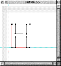
Change to Curve
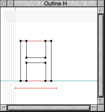
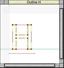
Clicking on this option will convert all of the straight lines in a font to curves. If you click on this you may not see any change to the outlines in the font. However characters such as H which may be made of just straight lines (with no bezier control points) will now have bezier control points.
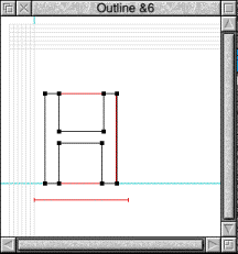
Change to line
This option is the exact opposite of the last one. Any curves in the outlines of the font will be converted to straight lines.
Delete all
Clicking on this option will delete all outlines from the font. This may not initially seem very useful since surely a font without outlines will be invisible, but it can be used for some interesting effects.
Try this for example, open the automatic skeleton window for the entire font from the FontFiend main menu. Now choose Copy Outlines as the skeleton model and click on OK.
This will produce a copy of the outlines as skeletons. Now delete the outlines from the font. The result is a font with a 1 pixel line making the shapes of the letters.
FX Process Sub Menu
The FX Process option leads to another sub menu concerned with special effects that can be applied to the fonts outlines. These effects will only apply to the outlines of the characters. They will have no effect on the skeletons or scaffolds.
Clean Points
Clicking on this option will open the clean points dialogue box for the font.
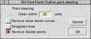
This can be used to try and tidy up badly auto traced outlines in a font. Note that it should be used with caution, if it is used on a well designed serif font the serifs can get damaged.
Clean within sets the minimum number of design units that can exist between two control points. Setting this value to 100 on a font with a design size of 1000 would cause points less than 0.1em apart to be removed from the outlines.
If the Remove close bezier curves option is ticked then FontFiend will try and remove bezier curves that are less then the clean within value. With clean within set to 100 curves less than 0.1em would be removed (on a font with a design size of 1000).
Straighten lines will attempt to straighten any lines that FontFiend thinks should be straight but in fact have a very slight curve.
Remove double points will try and remove 2 points that sit almost on top of each other.
Clicking on OK will start the point cleaning process. On a well designed non decorative font using point cleaning may have no effect since points will not be close enough to be cleaned. On imported PostScript fonts that have been converted with Acorns Type1toFont application you may well find two control points almost on top of each other at the edges of curved character shapes. These points were inserted by Fontographer (a Macintosh font editor) to enable it to auto-scaffold the font. Clean points can be used to remove these points. Fonts with many very close control points can also crash PostScript devices and fail to render correctly using the Acorn font manager.
FlipX
FlipX does just that, it flips the outlines of a letter over so that what you get is a mirror image of the original letter.

FlipY
FlipY is very similar to Flip X except the outlines are changed as though they were reflected in water.
SpecialFX
Clicking on this option will open up the SpecialFX dialogue box. This contains a number of special effects that can be applied to the entire font. The effects listed will depend on which version of FontFiend you have. To open a menu of effects click on the menu button.
The following effects are standard on all copies of FontFiend. Some helpful hints on using SpecialFX can be found in Appendix 5.
Make Open
The X and Y thickness are an offset from the original outlines of the characters.

Shown above are the original character and the result of using Make Open set to an X and Y thickness of 15. Increasing the X and Y thickness will increase the thickness of the black sections in the 2nd letter.
Alter Weight
The alter weight option allows you to alter the weight of a character in either or both of the X or Y directions.
This example show the original character and the result of increasing the weight by 20 in the X axis. As you can see the second character appears much bolder, but has the same cap height as the original character.

Altering the weight of a character in just one direction can be very useful, for example when making small caps you will ideally want to alter the weight of these letters to match the rest of the font.
Alter weight can also be used to make a "lighter" version of an existing font.

In the example above the "lighter" character has been made by altering the weight of the original character by -10 in both the X and Y axis. However trying to go too far and make a character too light can corrupt its outlines.
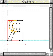
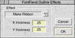
Make Ribbon
Make Ribbon will turn the outlines of the font into a ribbon effect.

In this example the second character is produced using Make ribbon with a setting of 20 in both the X and Y Axis. This type of effect can be used to produce quite dramatic looking characters.

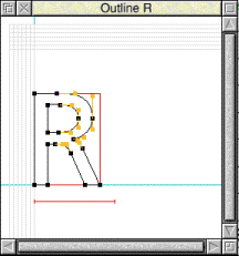
The W character above was produced using Make Ribbon with a change of 50 in the X axis, but with no change in the Y axis.
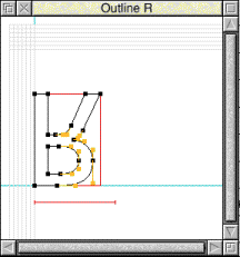
This example is the same letter as above, however after using Make Ribbon the Make Open effect has also been applied using offsets of 5 units in both the X and Y axis.
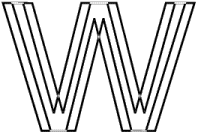
You can try just setting one of the offsets and putting the other one to zero for some interesting effects. You can also combine the effects together as in the example W above.
After using one of these effects you may need to re-apply skeletons to the font as they may no longer be valid.
Thin Shadow
This option will copy the outlines of the characters as skeletons and then shift them by the required amount in the X and Y axis.

In this example a Thin Shadow has been added with an offset of 20 in both the X and Y axis. This produces a kind of 3D letter effect. Using the Thin Shadow option will overwrite any existing skeletons in the font.
Combination effects
As we saw on the previous page the effects can be combined together

In this example the original character B has had its weight altered in the X axis and then been made open by 20 in both the X and Y axis.
The best way to get familiar with the Special Fx available is to play with them. A copy of this dialogue box can also be used from the single character menus (later in the manual).
Smooth
This tries to smooth out the outlines to remove any ugly pips or badly designed bezier curve joins. It works in a similar way to the flatten joint option in Draws edit menu. Smooth is only designed to be used on decorative fonts and not on serif or sanserif fonts.
Grid lock
Clicking on this option will open the gridlock dialogue box, this is designed to attempt to tidy up slightly messy outlines by locking all of the control points to an invisible grid.
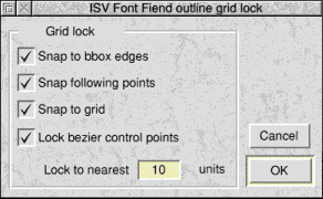
The lock to nearest value determines the size of the grid. The default is 10 which on a font with a design size of 1000 would be 1000/10 or a 1/100 of an em. The larger this value to courser the grid will be.
Snap to bbox edges will force control points within the lock to nearest value of the bounding box to be snapped to the bounding box.
Snap following points will go around the letter and try and ensure that each point around the letter snaps to the same X or Y value as the previous control point.
Snap to grid will snap control points to the grid positions. You can, for example, have this option off and the snap to bbox edges option on. If this is the case then only those points within the lock to nearest value of the bounding box will be moved.
Lock bezier control points if selected will also snap all bezier control points, as well as normal control points, to the grid. If this option is off then bezier control points will not be snapped to the grid but will instead be moved by the same amount as their control point was moved by.
You can of course use the grid lock with any combination of these options. Generally the default (with all these options selected) works well. Note however that you may still have to do a little manual tidying yourself after grid locking a fonts outlines.
Alter X Pos
This option will alter the X position of the outlines of the font.
This dialogue box works in a similar way to the copy and delete characters dialogue boxes. You enter the first character you want to move and the last one. You then enter a change in design units, all characters covered will then be altered.
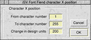
In the example above all characters would have a 200 unit offset added to the start of the character. Also all the widths would be increased by this value. Adding an offset to the left side of the character is called a left side bearing.
Entering a positive value will move all letters towards the right and entering a negative value will move them to the left.
Alter Y Pos
This works in exactly the same way as the Alter X pos dialogue box but moves the characters up and down. A positive value will move the characters up and a negative one will move them down.
The Kerning sub menu
The kerning menu has three options, if the font you have loaded has no kerning then all of these options will be greyed out.
Delete
Clicking on this option will delete all kerning from the font. Normally this option would only be used if the font has very badly corrupted kern pairs or you wish to replace all kern pairs and start again from scratch using the kerning editor.
Edit
Clicking on this option will open the kerning editor for the font.
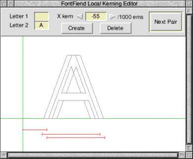
Using this window you can edit any existing kern pairs in the font, add new kern pairs or delete any kern pairs that are not required. The FontFiend kerning editor is very similar to the FontKern application supplied with iSV Products Font Designers Toolkit.
The kern pairs menu
Pressing MENU over this window will open a menu showing all the kern pairs in the font. Any kern pair can then be chosen by clicking on the menu. The menu is arranged so that each character that has kerning has an associated submenu. Any kern pairs that a character has will be shown in the submenu. Any kern pair selected from the menu will be displayed in the kerning editor window.
Create
Clicking on this button will create a kern pair from the two characters shown in the writable icons in the top left of the kerning editor window. If the pair already exists then instead of creating a new pair the existing pair will be displayed in the editor.
Delete
This option will delete the kern pair currently shown in the editor.
Next Pair
Clicking on this button will display the next kern pair in the font.
Editing kerning
Kern pairs can be edited easily using either the mouse or keyboard shortcuts. The amount of kerning applied to this character pair is shown in the toolbar at the top of the kerning editor window. Clicking on either the left or right arrows either side of the value will increase or decrease the amount of kerning.
The following keyboard shortcuts can also be used to edit the kerning.
- Cursor left - Increase kerning by 1 unit.
- Cursor right - Decrease kerning by 1 unit.
- Shift cursor left - Increase kerning by 4 units.
- Shift cursor right - Decrease kerning by 4 units.
- Ctrl cursor left - Increase kerning by 16 units.
- Ctrl cursor right - Decrease kerning by 16 units.
- Return - Finish editing this pair and display next pair.
Kerning is specified in terms of 1/1000 of an em, for example a kern amount of -50 will alter the gap between a pair of characters by 1/20th of an em when it is rendered
When you change the kerning you will see that the outline versions of the characters in the kerning editor window change, as do the width bars shown underneath them.
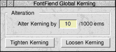
Global
Clicking on this option will open the global kerning editor dialogue box. This dialogue can be used to tighten or loosen all kern pairs in a font by a particular amount.
The Scaffolds sub menu
This menu is entirely concerned with scaffolds for the entire font.
Automatic
Clicking on this option will open the global font automatic scaffolder.
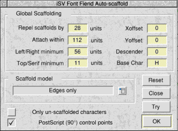
This was covered very briefly in the tutorial section of the manual. This is used to automatically scaffold an entire font.
Scaffold model
This is the current scaffolding system that will be used. You can change the scaffold model by clicking on the menu button. The default models are Edges only, Wide edges, Sans-Serif and Serif.
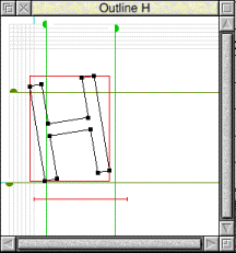
Edges only and Wide edges are designed to hint complex decorative fonts that cannot be hinted in the traditional manner. Basically these place scaffolds along each edge of the characters bounding box. They then attach control points in the character to the nearest scaffold. Edges only uses just tangent links, Wide edges uses wide links.
Font purists may be a little reluctant to use these settings since the results may not look correct. You may have read literature from some font suppliers claiming that only "hand-crafted" hinting is good enough for a font. This is not true. Both of the edges type scaffolding models can produce quite remarkable effects, this is because of the way the Acorn font manager works. In many cases adding edges only scaffolding will work as well or better than so called "hand-crafted" hinting.
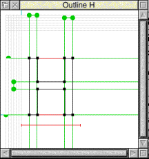
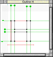
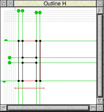
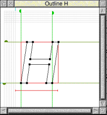
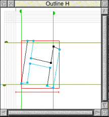
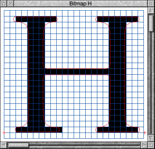
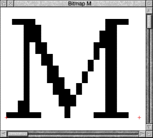
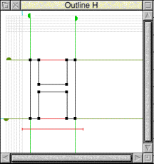
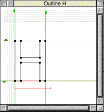
For example here is a letter H from a commercial font supplied by another company. You can clearly see the curves of the serifs. Note that the cross bar of he letter is roughly half the width of the vertical strokes.

Shown below are two bitmap characters produced by FontED. The one on the left is the original character from the font with "hand crafted" hinting. Note the fact that the curves of the serifs have been squared off. Also note that one of the base serifs is longer on one side than the other. The difference in the stroke widths is also artificially exaggerated.
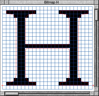
This example was produced from the same font re-hinted using Edges only scaffolding by FontFiend. The curves on the serifs have now been reproduced correctly and all the serifs are the same size. The proportions between the horizontal and vertical strokes are now more consistent with the original letter shape.
Both samples above were produced at the equivalent of 6pt on a 360 dpi printer. This is about as small as font would normally be printed.
FontFiend also incorporates sans serif and serif hinting models. These are designed to reproduce the "hand crafted" style of hinting. These scaffold models can hint a font with over 95% accuracy. Some manual adjustment of the scaffolds may be required in a few cases but this is still far quicker than doing the job totally by hand.
Obviously if your font is sans serif (like Homerton) you could use the sans serif hinting model, if your font has serifs (like Trinity) you could use the serif model.
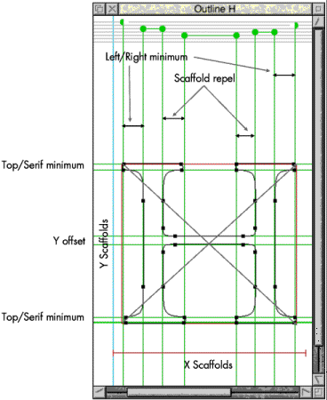
Global scaffolding settings
These control how the automatic scaffolder works. Whenever a font is loaded into FontFiend it will be scanned and FontFiend's best guess for these values will be automatically inserted in the writable icons.
- Repel scaffolds - this controls how close together two scaffolds can get. Scaffolds will not be allowed to go closer together than this value.
- Attach within - any control point within this distance to a scaffold will be attached to it.
- Left/Right minimum - this is the minimum width that a wide link can be if it is at either the left or the right side of a character.
- Top/Serif minimum - this is the minimum height of a wide link running across the letter at the top or the bottom.
- X offset - this is the offset in the X direction to the visual centre of the letter. For most fonts this should be left at zero.
- Y offset - this is the offset in the Y direction to the visual centre of the letter.
- Descender - this is the amount that the letter can be allowed to descend below the base line before another Y scaffold is added under the baseline. Most rounded letter shapes such as C and O will descend below the base line. If this value is left as zero then FontFiend will automatically place a scaffold for rounded letters and then link this scaffold to the one on the base line.
The illustration below should make these settings clearer.
- Base Char - this is not the scaffold tree base character as you might expect but actually the character from which the values in the Global Scaffold dialogue box were taken. In the tutorial example earlier in this manual you will have tried scaffolding single letters in a font as a test before scaffolding the entire font. This character is the one that was last scaffolded when the Copy to Global button was pressed in the local character scaffolder.
- Only un-scaffolded characters - if this option is selected then only characters in the font that do not already have scaffolds will be automatically scaffolded.
- PostScript control points - click this button on if your font has PostScript control points. If the font has Acorn control points then we recommend you leave the button off. FontFiend has in fact been designed from the outset to work with either type.
- Reset - Clicking on this button will reset all of the values in the writable icons to the default for this font.
- Close - This will close the auto-scaffolder.
- Try - this will scaffold the entire font but leave the scaffolder window open afterwards in case the results were not quite correct.
- Ok - this is scaffold the font according to the settings given and then close the automatic scaffolder window.
When FontFiend scaffolds a font it also attaches all the control points in both the outlines & skeletons. This means that FontFiend can save even more time by performing another time consuming operation automatically.
Connect
Clicking on this option from the menu will open the automatic scaffold connections dialogue box.
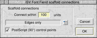
This contains a small subset of the contents of the main automatic scaffolder. You can choose the scaffold model that was used to hint the font and the distance to connect scaffolds within.
Normally you will not need to use this dialogue since FontFiend will automatically connect scaffolds when it hints a font. However supposing some letters had been exported as drawfiles, altered and then re-imported, they would then not be connected to the scaffolds. You can then use this dialogue box to re-connect all scaffolds in the font easily and quickly.
Make Local
This option will convert all global scaffolds in the font to local ones. Obviously this will also remove the scaffold tree as there will no longer be any global scaffolds to make the tree. What will happen to the font is that wherever a character has a global scaffold it will be replaced with an identical local scaffold. All scaffold connections in the outlines and skeletons will stay intact.
Make Tree
This option will scan all the scaffolds in the font and attempt to replace as many local scaffolds as possible with global scaffolds. FontFiend automatically does this when scaffolding a font. However if you have hinted a font by hand this can save a great deal of effort.
Clicking on this option after automatically scaffolding a font, or on some commercial fonts will do nothing as the font will already have a well defined scaffold tree.
Delete all
This will delete all scaffolds in a font, both global and local and will also remove any scaffold tree present. This option is quite useful when you have a font that cannot load into FontED because the scaffolding is corrupted. Corrupted fonts usually report errors such as "Cyclic Scaffold Link".
Delete index
This option will delete the link index between scaffolds. For example on the character E the top and bottom scaffolds may be linked, and the centre scaffold linear linked between the top and bottom. Some fonts cannot be loaded into FontED because they produce the error "Invalid linear link". Loading the font into FontFiend clicking on this option and saving it back out will repair it so that it can then be used.
Disconnect all.
This option will leave all scaffolds in place but disconnect them from the outlines and skeletons. This is useful when scaffolds have been badly defined in a font. For example Y scaffold number 1 should ideally sit exactly on the base line of the character or the font may not work correctly. Some PD fonts have scaffolds arranged in the wrong place, Y scaffold 1 for instance could be at the top, rather than the baseline of the letter. The font may then suffer from strange rendering errors. Clicking on this option will get the font working again.
X & Y scaffolds
These two options on this sub menu lead to another sub menu. These extra sub menus allow you to delete or disconnect either X or Y scaffolds. For example if you took a normal font and turned it into Oblique you would then probably want to disconnect just the X scaffolds since if not disconnected they could have detrimental effects.
Check Integrity
This option will check the entire scaffold tree for errors. If any characters are found to have faulty scaffolds then FontFiend will report those that require attention. For example if you have accidentally corrupted the scaffold tree in a font by dragging characters around on the main table then FontFiend will be able to tell you which characters are faulty.
Repair Tree
This option will repair any damaged global scaffolds, and hence repair the scaffold tree. Any invalid scaffold references will be removed from the font so that the font will then work correctly. We recommend that if you have a font with faulty scaffolding (e.g. one that makes FontED report a "Cyclic Scaffold Link" error) that you first click on the "Check Integrity" option. Make a note of any characters that are reported as faulty. Now click on "Repair Tree" and the tree will be repaired. Now check each of the characters that were reported faulty by hand to see if any scaffolds are missing. If any are missing then add them by hand.
The skeleton sub menu
The skeleton sub menu is concerned with skeletons for the entire font.
Automatic
Clicking on this option will open the automatic skeleton dialogue box for the entire font.
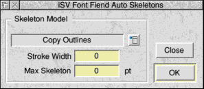
This dialogue allows you to apply automatic skeletons to an entire font easily and quickly. The standard version of FontFiend has two built in skeleton models.
Copy outline - this will produce a copy of the outlines of the font as skeletons. This means that each edge of any character is always rendered. The result is similar to that produced using a Type 3 PostScript font.
NDT V3 - this will copy 1 side of any stroke of the character as a skeleton. This ensures that no part of the character can "drop out" at any size since all strokes are always rendered at least 1 pixel thick.
This dialogue also contains two writable icons. Stroke width is currently not used and should be left at 0. Max skeleton is the largest size a font will be rendered with skeletons. If the font is rendered larger than this size then the skeletons will be ignored. If this value is left at 0 then skeletons will always be rendered by the font manager, this is the recommended setting.
To apply skeletons to the entire font click on the OK button. To close with window without applying skeletons click on Close.
Although automatic skeletons are not quite as good as hand produced ones they still work very well at most sizes. The example below shows two 6pt letters reproduced at 300dpi. The sample on the left is with the original "hand-crafted" skeletons, the one on the right is with FontFiend skeletons.
FontFiend can apply skeletons to a font that has already been scaffolded by hand and attach the skeletons to the scaffolds with a high degree of accuracy.
Convert to Outlines
This option will replace the outlines in a font with a copy of the skeletons. If you click on this option when you have a font that has no skeletons then all outlines will disappear. If you have a font with a full set of skeletons then these will become the outlines and there will be no skeletons.
This option is generally only useful in very special circumstances, one of the FontFiend beta testers requested it for a problem they were having with a font that had a complete set of outlines which were defined in the font as skeletons!
Delete
This option will delete all skeletons in the font. This can be used to remove faulty skeletons, for example those that extend beyond the filled character shapes.
The widths sub menu
This menu controls the widths for the entire font.
Mono Digits
Clicking on this option will make FontFiend examine the numbers in the font and attempt to set their widths to be identical. This will involve moving some of the number characters left or right to centre them inside the new widths. For example the widest number in a font may be 8. This would then be used as a base for the other numbers. Character 1 would have to be moved so that it was exactly centred in the width of character 8.
Remove LSB
Clicking on this option will remove the LSB (Left Side Bearing) of the font. Many fonts will have no left side bearing. The left side bearing is the gap between the position 0,0 in the letter space and the start of the character in the letter space.
Removing the left side bearing on a font will also adjust all of the widths appropriately and will normally have the effect of tightening the character spacing.
Normally this option will not have to be used on a font. It is provided to help recover fonts that have badly corrupted widths, or no widths at all. FontFiend can sets widths automatically using the Set to Bbox option shown on the next page. If the characters in the font have different left side bearings this may not produce sensible results. In this instance the existing LSB can be removed, then a fixed LSB added using the Alter X Pos dialogue box. Now FontFiend can set the widths to sensible values using the Set to Bbox option.
Set to Bbox
Clicking on this option will open the FontFiend character widths dialogue box. This is used to set widths for the entire font. This can be very useful when you have a font with corrupted widths, or indeed no widths at all. Some fonts converted with Acorns Type1 to Font application can suffer from this problem.
As you can see this dialogue lets you set the widths of all characters to their bounding box (the characters size) plus a value. An initially starting value of around 20 to 50 will often produce reasonable results.
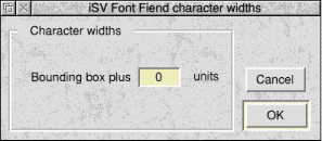
Clicking OK will set all the widths in the font. We recommend that having done this you then check the font and make any adjustments that may be necessary by hand.
This option can also be useful when you are making a font from scratch as you can quickly give the font a set of widths to check it.
APDL and Foundation RISCWorld