Masks
Masks allow you to block out or obscure areas of an image before rendering it. An alpha mask is an image containing alpha values ranging from 0 to 1. When an alpha mask is applied to an image, the image is not visible in the areas where the alpha values are 0 and visible in the areas where the alpha values are 1. In areas where the alpha value is between 0 and 1, the image appears semitransparent depending on the value.
Masks can be stacked in a way similar to how opacity, transforms, and reflections work. A parent’s mask is applied to its children and their descendants. The final mask, used to clip an element, is built from concatenating all the masks together, tiling and stretching them as specified. At a minimum, the mask knocks out everything outside of the border box of an object.
The -webkit-mask... CSS properties are analogous to the background and border-image properties. You can set the mask’s origin, position, and size, and specify how it is used. The -webkit-mask property is a shortcut for setting all the other -webkit-mask... properties.
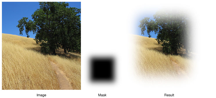
For example, if you apply a mask that is solid black in the center and semitransparent around the border as in Listing 1, then the image is rendered with a fuzzy border as shown in Figure 1.
Listing 1 Creating a fuzzy border
<img src="field.png" style="-webkit-mask-box-image: url(mask.png) 75 stretch;"> |
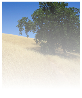
Because gradients can be used in place of any image, gradients can be passed as a mask to -webkit-mask-image as well, shown in Listing 2. Figure 2 shows the results of applying this gradient to the image.
Listing 2 Applying a gradient mask
<img src="field.png" style="-webkit-mask-image: |
-webkit-gradient(linear, left top, left bottom, from(rgba(0,0,0,1)), to(rgba(0,0,0,0)))"> |
Masks respect the -webkit-border-radius property setting of an element too. If you add a border radius to the previous example as shown in Listing 3, then you get the gradient effect but with rounded corners.
Listing 3 Applying a mask to an image with a border radius
<img src="field.png" style="-webkit-border-radius: 10px; -webkit-mask-image: |
-webkit-gradient(linear, left top, left bottom, from(rgba(0,0,0,1)), to(rgba(0,0,0,0)))"> |
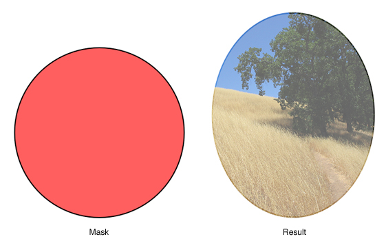
SVG images can be used as masks too. A semitransparent circle mask can be applied to an image as shown in Listing 4, producing the results shown in Figure 3.
Listing 4 Applying a SVG mask
<img src="field.png" style="-webkit-mask-box-image: url(circle.svg)"> |
Last updated: 2010-05-26