Graphics tips
Get your Web graphics into shape with these hints from Helen Bradley.
Every time you save an image as a JPG file, you'll lose some of its definition. The JPG file format compresses the data in your image and, even using low compression, high image quality as your settings you'll lose something. If you're working on a graphic you'll lose more of your image's definition every time you save it as a JPG format.
To avoid this happening don't work on a graphic in a JPG format. Instead use a bitmap format such as BMP to save your file. Wait until you're finished and ready to upload it to the Net before you save it as a JPG. Keep the BMP format file in case you need to make changes later and then you'll always work on the best quality image. Give both files the same name (but different extensions) so you'll have little trouble identifying which BMP file goes with which JPG file.
| Note: These effects can all be created using Paint Shop Pro v
4. You can download the program from www.jasc.com or find it in the Online Tools section of this CD-ROM. |

Antialiasing is a useful technique to use when you're working on Web graphics. Because the images are rendered at a small number of dots per inch on the screen, without antialiasing you'll get jagged edges on even the simplest line drawing. To eliminate these, antialiasing results in the edges of a line being filled with a pattern of coloured pixels so that the impression is that the line is quite smooth. However, the downside is that if the graphic is placed on a dark background the antialiasing can give the unwanted impression that there's a halo around the graphic.
To eliminate the problem, open the graphic in a paint program and fill the background with the same colour you're using as the background colour of your page. If you're using a textured background choose a colour from the texture (experiment to find the one that gives the best results). Increase the colour depth of your image to 16.7 million colours using Colors, Increase Color Depth, 16 Million Colors (24 bit). Using the Retouch tool drag your mouse over the 'halo' area to smooth out the difference in colours. The settings you'll need depends on the graphic itself. For the bird in the figure we set the Retouch mode to Darken, the Size to 2 pixels, the Shape to Round, the Opacity to 80% and Paper Texture to None. You may need to experiment with these settings to get the best result. To finish, return the colour depth to 256 colours using Colours, Decrease Color Depth, 256 Colors (8 bit) and then save the file, setting the transparent colour to the background colour.
| Fonts & colours to try You will find the Sponge font file (sponge.zip) and Netscape's palette zip file (netpal.zip) in the \interact\ folder on this CD. |
If you're creating an image for a Web page, where possible, create it on a document which has been set with a background colour the same as the one you'll use for your page. If you're using a textured background then use a colour representative of the background as the image's background colour. This way, if you resample your image to 2 in an image before you save it. In Paint Shop Pro, select Colors, Decrease Color Depth or Increase Color Depth to alter the number of colours in an image. If you're editing a graphic from a clip art collection, you can increase the colours, edit the graphic and then reduce them to make the most of what your paint program has to offer.

You can easily create a different text effect in Paint Shop Pro 4.0 by putting an image or texture under your text.
Step 1: Open the graphic you'll use -- it will need to be large enough for you place the text over it. If it isn't you may be able to increase the image using Image, Enlarge Canvas and copy and paste part of the image to make a version large enough to use.


There are 216 'browser safe' colours which are rendered by browsers without needing to be dithered. Dithering is the process of representing a colour by a combination of other colours. For example, if you alternate dots of blue and dots of yellow and stand away from it, it will look green. The browser tries to do this when it encounters a colour that is not in its palette. In photographs this won't usually cause problems but in line drawings the effects can be quite unsatisfactory. You can stop this happening by creating any Web graphics such as line art, logos and buttons using a palette of the 216 colours.
You can create this palette yourself and save it as a palette file. Each colour in the palette is made up of a combination of 00, 33, 66, 99, CC, FF hexadecimal (0, 51, 102, 153, 204, 255 decimal). Alternately you can download the palette from the Internet. The palette is available from Jeff's Paint Shop Pro tips site at http://www.geocities.com/~jburton/tip6.html. Unzip and then open this file in Paint Shop Pro using Colours, Load Palette. If you have an existing graphic you can alter its palette to the browser safe one by opening the graphic and then loading the Netscape palette.

Using a piece of shadowed text anyone can create neat text buttons for a Web site. This is particularly useful if you can't find suitable buttons for your links or if you're graphically challenged! Open a new file in Paint Shop Pro and set the colours to 16.7 million. Before you begin choose your font carefully. This effect works well with an arty, slender font so one that resembles an architect's handwriting or a technical or geometric font will work well.
Select a foreground colour for your text (we used dark blue) and set the background colour of the image to that of your Web page or a colour from the texture you'll be using. Using the text tool, select the font and size (we used Mead Bold 22pt), check the Antialias and Floating checkboxes and type your text. With the text still selected, select Image, Special Effects, Add Drop Shadow. Set the Opacity to 200, the Blur to 5, the Colour to Black, the Vertical to -3, the Horizontal to 3 and click OK. An additional option is to add colour by selecting Selections, Modify, Feather, set the Feather to 6 and click OK. With the text still selected, press the Delete key to remove it. You may want to experiment with different colour combinations, for example, setting both the foreground and background colours in the Color palette to white works well on dark backgrounds.
If you create the buttons in a single graphic you can use it as a client side image map. Alternately create a separate graphic file for each button, use the selection tool and Image, Crop to remove any extra background before saving it. If you plan saving the graphic as a GIF file, reduce the number of colours using Colors, Decrease Color Depth, 256 colours (8-bit) before saving it. The figure shows the text effect created with feathering and without.
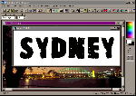
Large file sizes increase download times on Web pages. To reduce the size of a photograph, one option is to reduce the physical dimensions of the graphic by cropping the unimportant bits. However, this isn't an option if you don't want to lose large chunks of your picture. You can make significant reductions in file size (up to 30%) with minimal trade-off in quality by leaving the less important parts of the graphic there but blurring them.
To create this effect open your photograph in Paint Shop Pro and using the selection tool and a ellipse or circle shape, select the most important area of your graphic; this will remain as it is. Select Selections, Invert to select the remainder of your graphic and select Masks, New, From Selection. Use Paint Shop Pro's filters to blur this area by selecting Image, Normal Filters, Blur More. Repeat this over and over until you get a good blurred effect. To finish, choose Selections, None and save your file as a JPG file. This effect reduced the picture of Sydney (768 by 512) from 46Kb to 30Kb and the Wallaby (512 by 768) from 59Kb to 43Kb.
Top of page |
WEB: |What's New
| Net Guides | Web Workshop | Net Sites | About PC User |
|