A fax header can be quite boring but Annette Castles and Helen Bradley show how with a little time, effort and imagination, you can conjure up your own unique design.
In the \INTERACT \FAXSHEET folder on the CD you will find Faxsheet.doc and Faxsheet.lwp for MS Word and Word Pro respectively.
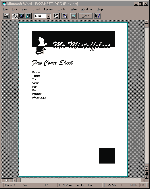
The idea for this design came from an advertising poster. The positive vs negative effect could be put to limitless uses but Annette thought it would be fun for a fax header. The stunning effect makes the most of the contrast between black and white, which is all fax printing has to offer.
The box in the bottom-right corner balances the page, without it the page would be top-heavy and feel incomplete. It's a perfect square of the same dimensions as the height of the top banner. This is essential for a perfect balance -- a bigger square would have made the page 'stodgy' and a smaller square would have felt too 'light'.
The main font is Brush Script which Annette chose because the thickness made it easy for lining up. There are a number of fonts that would be suitable, particularly Braggadocio, Greece Black and Poster Bodoni. But some, like Algerian and other hollow fonts, prove difficult and confusing and don't provide a really crisp finish. You'll need to experiment a little to find a font that suits your personality and then adjust its size to fit your name inside the black banner.
The other font Annette used is Century Gothic (although Arial, Bold is a suitable alternative). Being a sans serif font it accompanies Brush Script without stealing any of its limelight.

Figure 1a: This month's design project in Word for Windows.

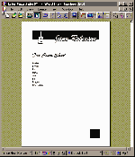
Figure 2a: Although you don't get quite the same drawing options in Lotus
Word Pro, you can get a similar and interesting effect.
The fax header is created using a number of boxes layered over the top of each other. Although it's a little fiddly to setup, once you've created it and saved it as a template, you'll never have to worry about creating it again.
Step 1: Begin by opening a new document, select A4 paper and set your top and bottom margins to 1.5cm and the left and right margins to 2.54cm.
Step 2: Create the large black box as a filled rectangle (in Word use the drawing toolbar). Then add a box for your name (in Word use a text box); it should contain your name in a suitable font and in a size large enough to fill most of the box with no fill colour (we used 60 point, Brush Script).
Step 3: Place the box containing the text on the black so you lose the top of the letters in the black box but see the bottom part of the type. Now copy this text box by holding down the Control key and click and drag a copy away, select the type in this copy and set it to white.
Step 4: Now place the box with the white type over the box with the black type until you have them lined up and the white type completely covers the black. To complete the effect, reduce the height of the box with the white type in it by dragging its bottom sizing handle up so that the bottom of the text box lines up with the base of the black box. See Figure 1a.
The boxes form layers on your document as if they're stacked on top of each other, so what you see on your screen is affected by the ordering of the layers. You may find when you select a box that is below another, the order of the layers changes. If you need to adjust this you can force a box to move below or above another (in Word use the drawing toolbar and the Send to Back and Bring to Front buttons). Spend some time getting the placement right and then put the layers in the correct order.
The graphic picture is done exactly the same way as the text and it is, in fact, a text character from the Milestones True Type collection printed at 100 points size. If you don't have this font, use any bullet or Wingdings character -- check out the symbol fonts you have on your system and find a suitable image in them.
Step 5: Create one text box and put your character in it. Position this over the black box, copy it, make it white and place and size the white version as you did with the earlier pair of text boxes. When it is all in position, select all four text boxes and your black rectangle (hold down Shift and click on each in turn) and use the Group button to 'group' them together so that if you move one they all move.
Step 6: To add the bottom box use a filled rectangle to create a square having the same length sides as the top box is deep (in Word you can check the dimensions of a rectangle by right-clicking on it, select Format Drawing Object and then select the Size and Position tab, the dimensions are the Height and Width settings). Line the right side of this box with the right edge of the top box.
Step 7: Add your text using Arial, Bold, Italic or another sans serif font. Save your document as a template and you're done.
You may find your software won't allow you to crop a text box without shrinking the text in it. If this is the case, check out the fax header design in Lotus Word Pro in Figure 2a. You'll get a similar and interesting effect using these instructions in most packages -- just experiment and have fun learning as you go.
Top of page |
WEB: |What's New
| Net Guides | Web Workshop | Net Sites | About PC User |
|