
AX version 4, 24th January 1999.
AX version 4, 24th January 1999.
Dear Developer:
Thank You for programming with TeeChart Pro v4 !
The New version of TeeChart Pro ActiveX Control contains more than 80 new features ! There is also a list below of pending bugs.
See the License.txt file for License, Disclaimer and Copyright information.
See the new "Tee F.A.Q" database at our web site.
Thank You for TeeCharting and Best Regards !
David Berneda
1) What's New in this version? Up
3D improvements
New Series types
All Chart components
All Series Marks
Other
2) New features and changes detailed Up
Porting Forms from TeeChart 3 to TeeChart 4:
100% compatibility with existing saved Forms containing TeeCharts is vital and
should work fine.
Simply open the Form containing your charts and save it again. It will be
automatically converted to use the new properties of TeeChart 4. Please backup projects before migrating them.
Projects saved with TeeChart Pro version 4 cannot be used with TeeChart Pro version 3.
*Note MS Visual Basic
No special action required
*Note MS Visual C++
Please backup your original version 3 project before upgrading to Version 4.
You will need to 're' "Add to Project" the TeeChart Pro AX Control to add the new properties and methods for TeeChart Pro version 4 classes.
This may require you to re-add these lines to the TChart.h file (for some projects this will apply to other TeeChart Classes) which are removed after importing the new class definition. An example is included below. This will be slightly different (CLSIDs) in your project so you should not use the example directly.
=============================
Beginning of file:
#if !defined(AFX_TCHART_H__FDFDC795_03EF_11D2_B7B6_DDA81BDA2709__INCLUDED_)
#define AFX_TCHART_H__FDFDC795_03EF_11D2_B7B6_DDA81BDA2709__INCLUDED_
#if _MSC_VER >= 1000
#pragma once
#endif // _MSC_VER >= 1000
End of file:
//{{AFX_INSERT_LOCATION}}
// Microsoft Developer Studio will insert additional declarations immediately before the previous line.
#endif // !defined(AFX_TCHART_H__FDFDC795_03EF_11D2_B7B6_DDA81BDA2709__INCLUDED_)
==============================
Source code changes:
Some properties are now obsolete or have been replaced, but they still exist for compatibility with TeeChart 3.0 version.
Some methods have been deleted or moved or replaced. These are not-frequently used methods, and an alternative way to do the same is described here.
The editor dialog now pops up in few tenths of a second both at design-time and run-time, and uses initially around 20Kb. Memory is dynamically allocated while the user navigates across the editor tabs because each tab is loaded the first time it's requested.
Specific changes by feature:
New in all chart components
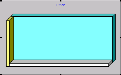
New BackWall ( Wall Interface ) property.
This subcomponent draws a back "wall" in the same way the LeftWall and BottomWall do:
Blue back wall with 3D :
The Frame (TPen ) and BackColor (OleColor ) properties still exist for compatibility, but now they should be replaced with Wall.Back.Pen and Wall.Back.Color respectively:
Old: Chart1.Frame.Width = 2
New: Chart1.Walls.Back.Pen.Width = 2
Old: Chart1.Walls.BackColor = vbWhite
New: Chart1.Walls.Back.Color = vbWhite
By default, the Walls.Back.Brush.Style property is set "bsClear", to make the default Chart back rectangle transparent. Now the Walls.Back.Pen (the old Chart1.Frame) is set to Visible according to the Walls.Visible property. So, if Visible is set to False, the back rectangle is no longer displayed.
All Chart Walls have now a new "Dark3D" property:
Chart1.Walls.Left.Dark3D = False
This property determines if the right and top sides of walls would be painted with a darker color or with the normal wall background Color.
It is used only in 3D mode and when the wall Size property is greater than zero.
New View3DOptions property
This Chart sub-component includes the properties used to control the 3D aspect.
It has the following properties:
|
Property |
Valid values |
|
|
|
|
Orthogonal |
Boolean |
|
Rotation |
Integer 270..360 degree ( 0..360 with OpenGL Canvas ) |
|
Elevation |
Integer 270..360 degree ( 0..360 with OpenGL Canvas ) |
|
Tilt |
Integer 0..360 degree (both normal and OpenGL Canvases) |
|
HorizOffset |
Integer +- ( default 0 ) |
|
Perspective |
Integer 0..+100 % ( default 15% ) |
|
VertOffset |
Integer +- ( default 0 ) |
|
Zoom |
Integer 1..+1000 % ( default 100% ) |
|
ZoomText |
Boolean |
The normal Canvas, using Windows GDI calls, allow 3D Rotation and Elevation of 90 degree (from 270 to 360) only. This is because there is no calculation of what to draw first and what next, depending on those angles.
With the OpenGL Canvas, full rotation and elevation is provided.
When Orthogonal is True in 3D mode, rotation and elevation are disabled.
Zoom is for 3D mode or 3D Orthogonal. Not for 2D mode (to not loose speed).
The "ZoomText" property controls if, when Zoom is applied to a chart, it’s fonts will be zoomed or not. When ZoomText is True (the default), all font sizes are changed according to the zoom quantity. When False, the current selected font sizes aren’t changed.
(This applies to all fonts like Legend, Marks, Axis labels, Title, etc).
Other already existing related properties are: Chart1.Aspect.View3D, Chart1.Walls.Visible, and Chart1.Aspect.Chart3DPercent. Functionality of them is maintained in this new version.
Example:
Chart1.Aspect.Zoom = 80 ' %
Chart1.Aspect.Rotation = 330 ' degrees
Chart1.Aspect.Elevation = 330 ' degrees
Chart1.Aspect.Orthogonal =False
Chart1.Aspect.View3D = True
Chart1.Walls.Visible = True
Chart1.Aspect.Chart3DPercent = 75 ' % depth
3D Rotated empty chart :
The Gradient has now three new styles:
gdFromCenter
gdFromTopLeft
gdFromBottomLeft
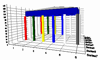
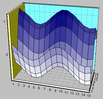
This new Axis, which is not visible by default, is used to display either the Series Titles or a 3D Series Z values in the "depth" dimension, along the right-bottom side of the Chart.
Chart1.Axis.Depth.Visible = True
The Surface Series now displays Z coordinates using this Axis. The DepthAxis has almost the same properties and methods as the other axes, like Increment, Minimum and Maximum, Label attributes, Ticks, Grids and so on.
It also works for DateTime "Z" coordinates.
Rotated Surface with 3 axis ( Left, Bottom and Depth axis ) :
The "DepthAxis" can also be "Inverted", but cannot be logarithmic.
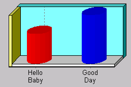
Now Axis labels can be displayed as multi-line text instead of a single line of text.
Lines are separated using ascii char #13).
Example for series labels:
TChart1.Series(0).Add 1234, "Hello" & chr$(13) & "Baby" , vbRed
TChart1.Series(0).Add 2000, "Good" & chr$(13) & "Day" , vbBlue
Multi-line axis labels:
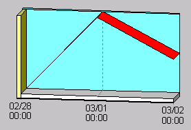
Example for DateTime labels:
The following will show the bottom axis labels in two lines of text, one
showing the month and day, and the second line showing the year:
Feb-28 Mar-1 ..
TChart1.Series(0).AddXY DateValue( "Feb-28-98" ), 100, "", clTeeColor
TChart1.Series(0).AddXY DateValue( "Mar-1-98"), 200, "", clTeeColor
TChart1.Series(0).AddXY DateValue( "Mar-2-98"), 150, "", clTeeColor
TChart1.Series(0).XValues.DateTime = True
TChart1.Axis.Bottom.Labels.DateTimeFormat = "dd/mm/yy hh:mm:ss" ' <-- space
If you set the Axis.LabelsMultiLine property to True, then the axis will
automatically split labels in lines where it finds an space.
TChart1.Axis.Bottom.Labels.MultiLine = True
Will use the formatting divided in two:
'mm/dd' for the first line
'hh:mm' for the second line
At run-time you can always split the label into lines programatically,
using the OnGetAxisLabel event:
Private Sub TChart1_OnGetAxisLabel(ByVal Axis As Long, ByVal SeriesIndex As Long, ByVal ValueIndex As Long, LabelText As String)
TeeSplitInLines(LabelText,' ');
end sub
Multi-line DateTime axis labels:
The global "TeeSplitInLines" procedure converts all spaces in "LabelText" to
line separators (returns).
The axis LabelsAngle property ( label rotation in degree angles 0, 90, 180 or 270 ), can
also be used with multi-line axis labels.
All axis now have the "GridCentered" boolean property, which, when True, will draw
the grid lines between every label and the previous one, instead of drawing the grid line
at the same label position.
By default is False. Setting it to True is very useful to separate intervals:
Chart1.Axis.Bottom.GridCentered = True
Centered bottom axis black Grid lines:
Both axes using the same Series
Now Series can define their HorizAxis and VertAxis properties to show both axes (left and right) and (top and bottom)
TChart1.Series(0).HorizAxis = aBothHorizAxis
TChart1.Series(0).VertAxis = aBothVertAxis
Showing all axes with the same Series:
Both axes will scroll or zoom as well.
Now all Axis have this new property to control where should the axis be located.
In this example, the axis is moved 50% of the total Chart width, so it is shown at the chart center:
Chart1.Axis.Left.PositionPercent = 50
Centered vertical axis:
The new "PositionPercent" property applies to all axis, the default ones (Left, Top, Right, Bottom) and the custom user-created ones. "PositionPercent" can also be a negative number, or a positive number greater than 100. This allows moving the axes outside the Chart rectangle:
Chart1.Axis.Left.PositionPercent = -10
Chart1.Panel.MarginLeft = 15
Axes can be resized (stretched)
Similar to the "Position" property described above, now all axes have the following properties to stretch them:
Chart1.Axis.Left.StartPosition = 20
Chart1.Axis.Left.EndPosition = 50
All Series associated to the "stretched" axis strech their drawings as well.
Left axis stretched:
These properties are also expressed in percent of the total default axis space.
They also apply to horizontal axes and to all custom-created axes (see below).
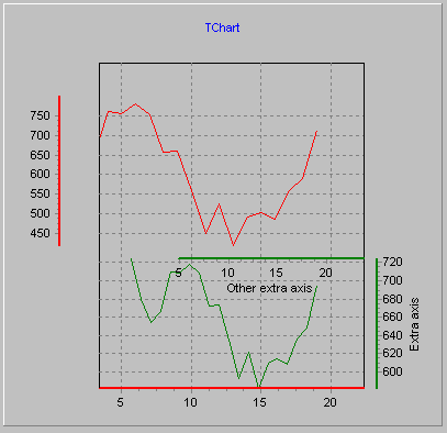
Unlimited multiple custom-created axes
This powerful new feature allows "extra" axes to be created and associated to any Series, and to any Series type (Line, Bar, Point, etc).
Together with the above "PositionPercent" and "stretching" new properties, now it’s possible to have unlimited axes floating anywhere on the chart.
Extra vertical axis associated to the green line Series:

Logarithmic Base
Axes have a new property which controls the logarithmic base ( 2, 10, etc) used to plot values and calculate label values:
Chart1.Axis.Left.Logarithmic = True
Chart1.Axis.Left.LogarithmicBase = 2
Only positive values are accepted.
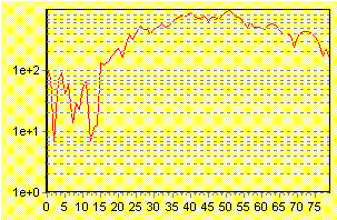
Improved Logarithmic labelling
In TeeChart Pro 3.0, logarithmic axes did not display labels with the expected logarithmic style (10,100,1000 and so on...)
New in this version, axes plot labels that correspond to each exponent of the logarithmic base ( by default the base is 10 )
It’s necessary for this automatic labelling to have the axes Increment property set to zero (the default Increment). Otherwise, labels will be calculated as with non-logarithmic style.
With Chart1.Axis.Left
 .Logarithmic = True
 .Increment = 0 ' the default
 .SetMinMax  1, 1E10
 .Labels.ValuesFormat = "#e+0" ' exponential format
End with
Logarithmic vertical labels:
Minor axis ticks are now displayed at logarithmic increments.
For example, in the above logarithmic example, setting MinorTickCount to 8 will display each tick at it’s correspondent logarithmic position:
Chart1.Axis.Left.MinorTickCount = 8
Chart1.Axis.Left.MinorTicks.Color =vbRed
Chart1.Axis.Left.MinorTickLength =6
Red color Minor ticks in logarithmic positions:
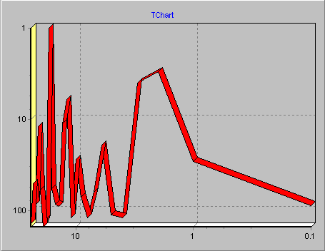
Logarithmic axes can now be Inverted
In TeeChart Pro 3.0 version, axes could not be both Logarithmic and Inverted at the same time. Now this feature is possible in TeeChart Pro 4.0:
Chart1.Axis.Left.Logarithmic=True
Chart1.Axis.Left.Inverted=True
Chart1.Axis.Bottom.Logarithmic=True
Chart1.Axis.Bottom.Inverted=True
Logarithmic and Inverted vertical and horizontal axes:
Legend Clicks
Now the Legend has a Clicked function to determine which Legend Item index is under the
mouse (or any other XY pixel coordinates):
Private Sub TChart1_OnClickLegend(ByVal Button As TeeChart.EMouseButton, ByVal Shift As TeeChart.EShiftState, ByVal X As Long, ByVal Y As Long)
Dim tmp As Integer
tmp = TChart1.Legend.Clicked(X, Y)
If tmp <> -1 Then
MsgBox ("Clicked legend item: " & (TChart1.Legend.FormattedValue(0, tmp)))
End If
End Sub
Multiple Legend rows
When the Legend is aligned horizontally (top or bottom), now the number of rows can be specified:
Chart1.Legend.MaxNumRows:=3;
By default, MaxNumRows is 10 (ten), meaning the Legend will show at maximum 10 rows.
Setting it to 0 (zero) will make the Legend to show as many rows as necessary.
Multiple Legend rows:
New Brush property
Legend now publishes a Brush property that can be used to fill the Legend background:
With Chart1.Legend
.Brush.Style = bsClear
end with
New BackImageLoad property
Now the Legend publishes a property that can be used to fill the Legend background with a Bitmap:
With Chart1.Legend
.BackImageLoad "myimage.bmp"
end with
This new Series type derives from a PointSeries, adding a "LinePen" Pen property to draw a Bezier line every 3 points.
A bezier line is a curve which passes over every 3 points of a Series.
There are several ways to calculate the bezier curve points. This Series uses the same method as Windows (GDI BezierTo function).
Bezier Series:
Use the Chart.Aspect.OpenGL.Active Boolean property to activate Open GL display.
Open GL Charts benefit from full 360º rotation.
Bubble Series with OpenGL rendering:
Changed the "Period" algorithm for "Moving" functions
In previous versions, the "Period" property for several functions was interpreted as "Period +1".
This applies to Momentum, RSI, MovingAverage and ExpAverage functions.
That means, for example, a MovingAverage of Period 3 was using 4 points for each calculation.
This design consideration was not perfect, so now in TeeChart Pro 4, the "Period" property is handled as it should be. A Period of value 3 will use 3 points for each calculation.
Begin and End Update methods
ITeeFunction.BeginUpdate;
ITeeFunction.EndUpdate;
These methods can be used when adding or modifying many values at once at a source Series, to recalculate the function just one time, when finished adding points:
TChart1.Series(0).FunctionType.BeginUpdate
...
many modifications...
...
TChart1.Series(0).FunctionType.EndUpdate
Function Period as Range
In version 3, the function "Period" property was expressed always in number of points.
Now in this new version Period can be defined to be a range. This is very useful when using Date-Time series and want to express the "Period" of the function in a date-time step like "OneMonth" or "OneDay".
There is a new property "PeriodStyle" which controls how is "Period" expressed.
So you can now plot, for example, the "monthly average of sales" function just using a normal "Average" function on a date-time source series and setting the function period to "one month":
{ Place a Series1 and fill it with datetime data values at runtime (or from a database) }
TChart1.Series(1).SetFunction tfAverage
TChart1.Series(1).FunctionType.PeriodStyle =psRange
TChart1.Series(1).FunctionType.Period = TChart1.GetDateTimeStep dtOneMonth
TChart1.Series(1).DataSource = "Series0"
This will result in several points, each one showing the "average" of each month of data in Series0.
It’s mandatory that points in the source Series0 should be sorted by date when calculating functions on datetime periods.
The range can also be used for non-datetime series:
TChart1.Series(1).SetFunction tfAverage
TChart1.Series(1).FunctionType.PeriodStyle =psRange
TChart1.Series(1).FunctionType.Period=100
TChart1.Series(1).DataSource= "Series0"
This will calculate an average for each group of points inside every "100" interval.
(Points with X >=0, X<100 will be used to calculate the first average, points with X >=100, X<200 will be used to calculate the second average and so on... )
Notice this is different than calculating an average for every 100 points.
Function Period Alignment
When the function "Period" is greater than zero (so it calculates by groups of points),
the function results are added to the series by default at the "center" position of the Function Period.
Now there is a new property which controls "where" to place function calculations inside the full period space.
TChart1.Series(1).FunctionType.PeriodAlign = paCenter ' <-- by default is centered
The "paFirst" and "paLast" constants will plot calculations at the start and end "X" coordinates of each "Period".
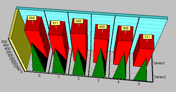
Every blue point shows the "average" using all points between the first day and the last day of the month.
PeriodStyle = OneMonth, and PeriodAlign = paLast
The "average" is plotted at the end of the month.
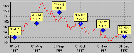
PeriodStyle = OneMonth, and PeriodAlign = paFirst
The "average" is plotted at the beginning of the month.
In version 3, the Trend was calculated using the CurveFitting algorithm.
This took a lot of CPU time. Now it calculates the Trend points using the standard formula, which results in a much faster calculation speed.
Null field values
Now ODBC Datasource connectivity detects NULL field values properly, and adds null points to the Series using the Series.AddNull method and / or AddNullXY methods.
Active Server Pages and ODBC datasources
Now you can connect directly to IIS ASP ODBC Datasources. The NoPromptDBConnect property permits fully parameterised connection via native TeeChart ODBC connection methods and ASP.
eg.
<%
	TChart1.AddSeries(1)
        TChart1.Environment.NoPromptDBConnect = True
        TChart1.Series(0).DataSource = "DSN=myDSN;UID=Myname;PWD=MyPassword; sql=SELECT Item, SUM(Sales) sumsales from Results where Region = 'North' group by Item"
        TChart1.Series(0).LabelsSource = "Item"
        TChart1.Series(0).YValues.ValueSource = "sumsales"
        TChart1.Series(0).CheckDatasource
   	TChart1.Export.SaveToFile "c:\WebOutputCharts\mychart.tee"
%>
<SCRIPT Language="VBScript">
  TChart1.Import.LoadFromURL( "http://myserver/charts/mychart.tee" )
</SCRIPT>
Editor Dialogs
(See also new TeeEditor and TeePreviewer components below )
Shows the user the dialog associated to the Series, without the whole Chart editor:
Procedure EditOneSeries(ASeries:Integer);
Example:
EditOneSeries(0)
The other one shows the user a "Save to..." dialog asking for a native TeeChart file name and path ( ie: c:\chart1.tee ). You can use the returning string to save it.
Function SaveChartDialog:String;
Example:
Var tmpName : String;
tmpName = TChart1.SaveChartDialog
If tmpName <> "" then
TChart1.Export.SaveToFile( tmpName )
End if
New method AddNullXY
This new method allows inserting null values when using XY coordinates:
TChart1.Series(0).AddXY 1.234, 5.678, "", vbRed
TChart1.Series(0).AddNullXY 2.2, 3.3, ""
TChart1.Series(0).AddXY 3.3, 8.8, "", vbRed
Now all Series classes maintain an internal list of Series Marks positions. This means you can, at run-time, modify the position of every point's Mark rectangle.
Note that, when Marks positions are customized, zooming or scrolling the Chart will not reposition those Marks.
Mark positions can be reverted back to automatic when desired.
( See included VB example of Mark dragging )
Rotated Pie, Mark dragging and slice exploding:
As with axes labels, now Marks can show text in multiple-lines.
TChart1.Series(0).Add 1234, "Hello" & Chr$(13) & "World!", vbRed
Mark showing "Hello World!" in two lines of text:

Detecting Mark clicks
The Marks sub-component has now a new "Clicked" function method, which returns if a Series Mark is under the mouse cursor (or any XY pair of pixel coordinates):
Dim tmp as Integer
tmp = TChart1.Series(0).Marks.Clicked( x,y )
if tmp<>-1 then MsgBox("Clicked Mark of point: " + TChart1.Series(0).XLabel(tmp))
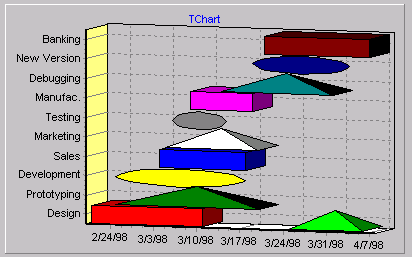
Custom Gantt bar formatting (and shape style for each point)
Now Gantt bars can be customized ( Color, Pen, Style, Brush pattern, etc ), by using the Gantt Series OnGetPointerStyle event:
Private Sub TChart1_OnGetSeriesPointerStyle(ByVal SeriesIndex As Long, ValueIndex:Integer):ESeriesPointerStyle;
if ValueIndex mod 2=0 then result=psRectangle
else result=psTriangle
end if
end sub
As the Pointer Style can now draw shapes in 3D, this also applies to Gantt Series. Gantt bars (or any shape) can be displayed like solids (cube, pyramid, etc).
Different styles for Gantt points:
Line, Area, Point, Bubble, Gantt, etc Series
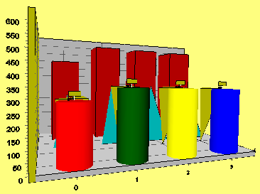
All Series derived from Point Series, (like Line, Area, Bubble, Gantt, Candle, etc),
have now a new boolean property "Dark3D" ( default True ).It controls if the point segments will be colored using a darker color than the Series color, thus giving a better 3D view effect.
3D Shadow filling:
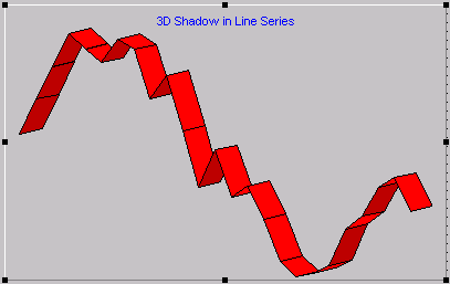
Shadowing can be enabled or disabled using the new Dark3D property:
TChart1.Series(0).asLine.Dark3D = False
New LineHeight property for 3D strip lines
This integer property controls the height of the line when Chart1.View3D is True:
TChart1.Aspect.View3D = True
TChart1.Series(0).asLine.LineHeight = 4
LineHeight = 4 in red line series
Improved Line Series Clicked method
Mouse clicks are now detected correctly when "Stairs" property is True.
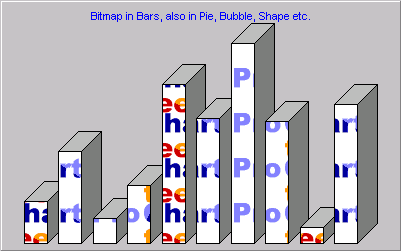
Picture filling for Bar's background
Now the Bitmap property of the BarBrush can be used to fill the Bar interiors with a bitmap pattern.
TChart1.Series(0).asBar.BarImageLoad "myImage.bmp"
A bitmap inside Bars:
Automatic-Bar width / height
With TeeChart Pro version 3, Bar width's were calculated in pixels.
Now in TeeChart Pro 4.0, Bar width's are calculated in axis scales, only when the new property "AutoBarSize" is set to True (by default is False).
TChart1.Series(0).asBar.AutoBarSize = True
This allows resizing the Bars when the chart is zoomed, thus giving Bars the appearance of being close or far away from the user, when the chart is zoomed in or zoomed out.
Setting AutoBarSize to False will calculate the Bar widths in pixels the first time the Series is displayed, and this width will be permanent even if you zoom or scroll (as TeeChart 3.0 did before ).
Now the Fast Line Series also draw Marks, like LineSeries or any other Series does:
TChart1.Series(0).Marks.Visible = True
FastLine Series with Marks:
Dramatic speed for real-time charting with FastLine Series
A new boolean property "AutoRepaint" controls if new points added to the FastLine will force a redisplay of the whole chart, or will just draw the new added points directly to the Canvas, with as much speed as possible.
When AutoRepaint is False, the Fast Line will draw new added points instead of redrawing the whole Chart and all points. ( Axis scales aren't changed when using this option )
This speeds up drawing a lot. Adding and drawing 15000 points takes one second on a Pentium 166 using Windows 95. ( 20000 points per second on a P200 with NT4 )
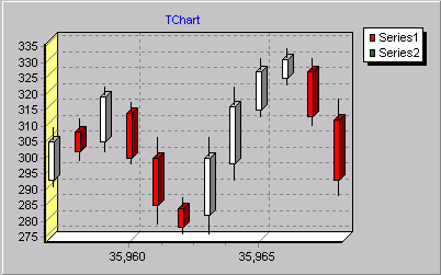
Candle Series has two new properties:
TChart1.Series(0).asCandle.Draw3D = True
TChart1.Series(0).asCandle.Dark3D = True
Note: 3D candles have effect only when Chart View3D is True, and only when the Candle Style property is "CandleBar".
This displays candle bars in 3D mode:
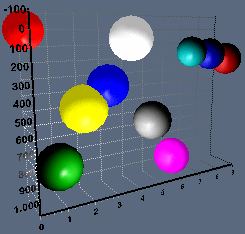
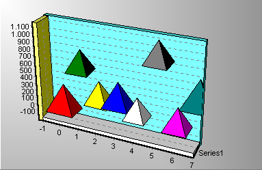
Now the Bubble Series makes a better use of the Pointer.Draw3D property.
Triangles and Inverted Triangles are now drawn as 3D Pyramids when Pointer.Draw3D is True:
TChart1.Series(1).asBubble.Pointer.Draw3D = True
3D Styles
As with all other Series derived from PointSeries, Bubbles can now be displayed
as 3D pyramids or cylinders.
Bubble Series as pyramids:
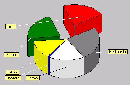
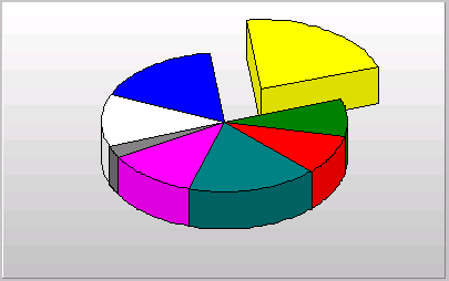
Now the Pie Series has a new List of values to determine the "Exploding" in percent ( 0..100%) for each individual Pie Slice.
This works both in 2D and 3D, and also allows Pie rotation.
The Pie automatically resizes to accomodate the space needed by the exploded slices:
TChart1.Series(0).asPie.ExplodedSlice.Value(0)=20 ' <-- 20% exploding for the first pie slice
ExplodeBiggest
This new property is a percent integer that is used to automatically explode the largest slice in the Pie:
TChart1.Series(0).asPie.ExplodeBiggest = 30 ' 30% exploding of the largest slice
Exploded Pie slices:
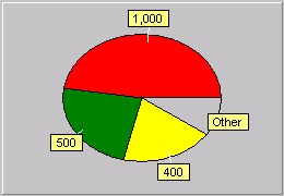
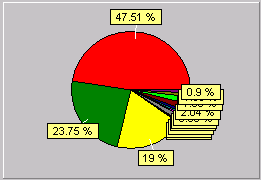
"Other" slice grouping
Now Pie slices below a user define percent or value can be grouped into a single slice.
The options are:
TChart1.Series(0).asPie.OtherSlice.Style = ( can be poNone, poBelowPercent or poBelowValue )
TChart1.Series(0).asPie.OtherSlice.Value = ( any value or percent )
TChart1.Series(0).asPie.OtherSlice.Text = "Other" ' ( Label text for the "Other" slice, by default is "Other" )
As existing slices are not removed, this allows to change on-the-fly both at design and run-time the OtherSlice properties, without having to re-fill again the Series with values.
Grouped slices also allow rotation and exploding.
With "Other" Without "Other"
You can also move each slice Mark to a custom position. See "Custom Mark positions" in this document.
Now Pie slices can be optionally sorted in Ascending or Descending order, using this property:
Series1.PieValues.Order := loAscending;
Possible values are loNone, loAscending or loDescending.
When Order is loNone (the default), slices are displayed in the same order they are added to the Pie Series.
Note: The slice colors are not preserved when switching the Pie Order. You should specify fixed Colors for each Pie slice to preserve them. (ie: TChart1.Series(0).Add( 123, 'Hello', clRed )
Some Pie properties and methods have no effect now, and have been removed:
These PieSeries properties have no sense with the current 3d changes.
They have been removed:
Old New
Offset3D Chart1.View3DOptions.Elevation
Color3D ( now it is always True )
ShadowColor ( has no effect now, should use Dark3D property )
Shadowed3D ( "" "" "" "" )
CirclePen ( has no effect, should now use the PiePen Pen property )
As with the Pie Series removed properties, now the Polar Series does not include the "PiePen" property.
This was wrongly inherited from ICircledSeries in TeeChart Pro 3. New projects should use the "CirclePen" property instead of "PiePen."
The Polar Series also supports rotation and elevation when in 3D mode.
Polar Series with rotation and elevation:
The PolarSeries "DrawRing" method has now an additional parameter:
Procedure PolarSeries.DrawRing(Const Value:Double; Z:Integer);
"Z" is the Z position where the ring will be displayed.
You can use PolarSeries "StartZ" or "EndZ" properties to draw rings at front and at back Z positions respectively:
TChart1.Series(0).asPolar.DrawRing 1234, TChart1.Series(0).asPolar.EndZ
Now the Brush and BackImageLoad can be used to place a Pattern/Back Image to fill the inside of the polar points:
Polar series filled with a hatched blue Brush:
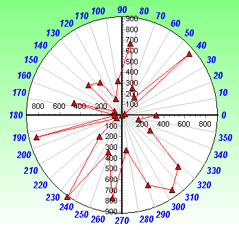
CircleLabels property to draw angles around Polar circle.
The Polar Series has two new properties to control displaying of polar point Angles around the circle perimeter:
TChart1.Series(0).asPolar.CircleLabels = True ' <-- show labels !
{ set font attributes... }
With TChart1.Series(0).asPolar.CircleLabels.Font
.Color=vbBlue
.Size=10
.Style.Italic = True
.Style.Bold = True
end with
The above code with a Polar Series displays this chart:
Two new properties control if "CircleLabels" will be rotated or not, and which character will be used to add to the resulting "degree" label string.
TChart1.Series(0).asPolar.Circlelabels.Rotated = False
TChart1.Series(0).asPolar.Circlelabels.DegreeSymbol = "º"
Rotated Angle labels with degree symbols:
This new "CircleLabels" feature also applies to the new Radar Series style.
Shape Series
Now it has new Styles:
3D
Cube, Pyramid, InvertPyramid
2D
Cross, DiagCross, Star
Shape size in pixels
Now the position ( Left, Top ) of a Shape can be specified as axis values, while the size of the Shape (Width and Height) can be specified in screen pixels:
TChart1.Series(0).asShape.XYStyle = xysAxisOrigin
TChart1.Series(0).asShape.X0 = DateValue( "1st Jan 1999" ) '<-- in BottomAxis scales
TChart1.Series(0).asShape.Y0 = 1234.56 ' <--- in LeftAxis scales
TChart1.Series(0).asShape.X1 = 100 ' <-- 100 pixels Width
TChart1.Series(0).asShape.Y1 = 30 ' <--- 30 pixels Height
Shape.ShapeImageLoad
As with BarSeries you may now load a BackImage for the Shape.
Shapes Z position
When the Shape position is expressed in pixels (that is, when the Shape property "XYStyle" is "pixels" ), the Z position is automatically set to zero (in front).
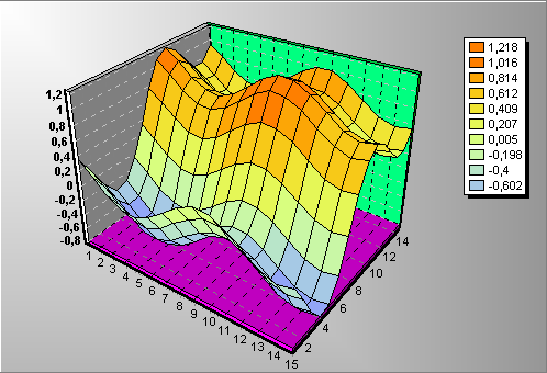
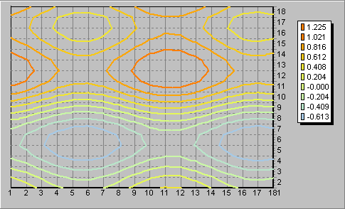
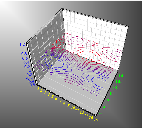
Surface Series
3D Rotation, elevation and zoom
The Surface has been rewritten so now supports Rotation, Elevation and Zoom (With OpenGL full 360º rotation and elevation) as with any other Series.
When elevation is maximum, we're seeing the surface from the top, thus seeing a "contour" map.
We can "fly" in between a surface from any angle (with OpenGL).
3D Perspective
Perspective is also supported by Surfaces, although depending on which combination of zoom, rotation and elevation, it might be necessary to make the Perspective smaller so all surface cells are drawn correctly.
Legend showing Surface Palette
Now the Chart Legend uses the Surface Palette of colors to show the Legend items.
Every legend item corresponds to a Palette item. It shows the Color and the UpToValue property.
You can still use the Chart OnGetLegendText event to customize the legend item text.
TChart1.Series(0).asSurface.PaletteSteps=10
Surface Legend:
This new Legend style also applies to the new TContourSeries. Setting the PaletteSteps property to the same value as Contour "NumLevels", will use a different color for each Contour "level" at the Legend:
TChart1.Series(1).asSurface.PaletteSteps = TChart1.Series(1).asSurface.NumLevels
Contour showing Legend
"Z" axis labelling and ticks
Using the new Chart1 DepthAxis sub-component (Axis.Depth), the Surface Z values are displayed along
the right-bottom side of the Chart box, in the "Z" (front to back) direction.
(See blue axis labels at Surface picture above).
No need to enter data sorted
Now it's possible to call AddXYZ to add Surface points in any order:
TChart1.Series(0).asSurface.AddXYZ 12, 100, 5 , "", clTeeColor
TChart1.Series(0).asSurface.AddXYZ 8, 100, 2 , "", clTeeColor
No need to enter all points.
Surfaces will draw "holes" where no point values have been added. That means you don’t need to call AddXYZ for all possible X and Z ranges.
This is compatible with setting the point color to "clNone" to draw holes too:
TChart1.Series(0).asSurface.AddXYZ 8, 0, 2 , "", clNone
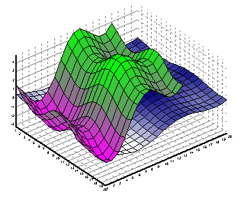
Multiple Surfaces per Chart
You can mix as many surfaces on the same chart, with same grid size or not.
As each Surface is as an individual component, all formatting / coloring properties
are individual for each Surface. Something like "stacked surfaces" is also allowed.
"Shape Series" or any other Series can be mixed with Surfaces. You can also add "shapes" (cubes, pyramids, rectangles, etc) at specific XYZ positions (for example you can represent "cities" over a "landscape" surface, each "city" with different size, color, text, etc ).
Multiple Surfaces of different dimensions:
Surface can now be "Z Inverted" (switch to view from back)
Using the new Chart "DepthAxis" property, now it's possible to draw Surface series "from the back" by setting the DepthAxis "Inverted" property to True:
TChart1.Axis.Depth.Inverted = True
This also works now for horizontal axis:
TChart1.Axis.Bottom.Inverted = True
Increased maximum Surface size
Now it's possible to configure a Surface Series to have up to a maximum of 500x500 cells.
Memory is dinamically allocated and deallocated.
This new Series is very similar to a PointSeries, adding Z values for each point:
TChart1.Series(0).asPoint3D.AddXYZ 123, 456, 789 , "Hello", vbRed
Unlike Surface or Contour Series, the Point3D Series does not impose any limit on the X,Y,Z coordinates or number of points. Think as it is the same as a normal Point Series, with each point located inside the chart axes in a different XYZ position.
Point3DSeries:
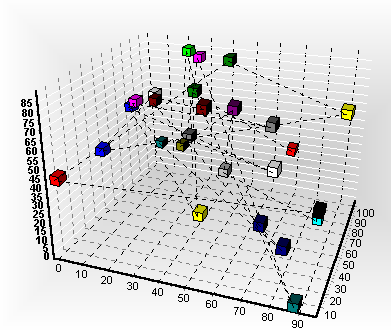
The LinePen property is used to select the pen to draw lines connecting the 3D points,
in the same order they were added to the Series:
TChart1.Series(0).asPoint3D.LinePen.Color = vbRed
This new function calculates the Standard Deviation ( also "Complete" StdDeviation ) of the source Series point values.
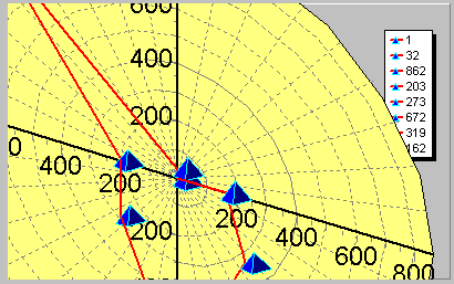
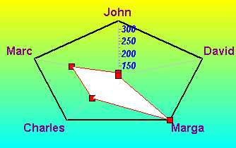
This new Series type is very similar to a Polar series (actually, both Polar and Radar derive from a common CustomPolarSeries class ).
Every point in the Radar series is drawn at a different angle ( 360 degrees divided by total number of points ).
Like Polar Series, more than one Radar series can be plotted together in the same chart (better if all Radar series have the same number of points).
Two Radar series:
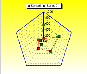
All properties of Polar Series also apply to Radar.
As with Polar series, Grid lines and labels are controlled by LeftAxis and BottomAxis axes.
The first Series controls the "CirclePen" property (shown in blue color above).
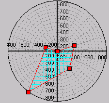
Both Polar and Radar can now fill the area bounded by points using the Brush property.
White filled Radar Series with "CircleLabels" property:
The inside area of the total Radar shape can also be filled using the "CircleBackColor" property.
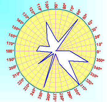
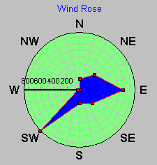
This new Series (located at "Extras" Chart gallery tab), is a small component which derives from Polar Series. It overrides the default labels around the polar circle perimeter to show "Wind" directions ( North, South, West, East, etc ).
It is provided as an example of Series customization.
The "AngleIncrement" property controls how many labels around the circle will be displayed.
WindRose is configured to plot labels every 30 degree.
TChart1.Series(0).asWindRose.AngleIncrement = 30
"Wind" data can be added using the AddPolar method:
MyAngle = 180 ' { wind coming from the south }
MyValue = 123 ' { wind speed value }
TChart1.Series(0).asWindRose.AddPolar MyAngle, MyValue, "", vbRed
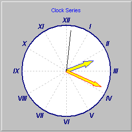
ClockSeries
This Series derives from Polar series and displays a "live" clock.
The "Style" property controls if the clock "numbers" will be "decimal 1,2,3...etc" or
"roman I,II,III,IV... etc".
ContourSeries
This new Series type is very similar to the 3D Surface Series.
ContourSeries:
Contour points can be assigned to a Surface and vice-versa:
TChart1.Series(0).AssignValues(1) 'Assigns Series(1)
The number of contour levels can be specified from 1 to 250.
The Surface's "UseColorRange" and "UsePalette" properties also apply to contour series.
Each contour Level can be coloured using a range (ie: from blue to white) or a "Palette", which can be customized for specific value intervals (ie: red from 100 to 200, green from 201 to 400 ). Same as with TSurfaceSeries.
Each Level can be colored using a different color by doing:
TChart1.Series(0).ColorEachPoint = True
Levels can be displayed at custom "Y" vertical positions:
TChart1.Series(0).asContour.YPosition = 123
Each Level can display at it's own Level "Y" position by setting this property:
TChart1.Series(0).asContour.YPositionLevel = True
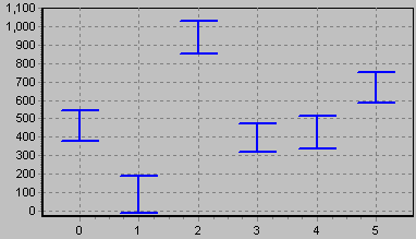
This new Series is similar to the already existing ErrorBar Series.
It has an additional "ErrorValues" property which is used to display an "error" shape at every point XY position:
TChart1.Series(0).asError.AddErrorBar 1,1234,50,"",vbBlue
This series has a property to control how the "error" shape is displayed:
TChart1.Series(0).asError.ErrorStyle = essTopBottom
"ErrorStyle" values can be: Left, Right, Top, Bottom, Left-Right or Top-Bottom.
Error Series in "top-bottom" style:
Both "ErrorBar" and "ErrorSeries" styles allow specifying the "error" dimension in fixed screen pixels or in axis scales values, using the ErrorWidth and ErrorWidthUnits properties.
Error points can be colored using the "ColorEachPoint" or "ValueColor" properties as usually.
TeeCommander is a visual Panel component containing several buttons to allow users at run-time to rotate, offset and zoom any Chart.
TeeCommander1.Panel = "Chart1"
TeeCommander panel:
Every button does the following ( in left to right order ) :
|
Description |
|
Zoom with left button, Scroll with right button ( like TeeChart 3.0 ). |
|
Drag the Chart to Rotate in 3D mode. |
|
Drag the Chart to Move in 3D or Orthogonal mode. |
|
Drag the Chart to Zoom in 3D or Orthogonal mode. |
|
Drag the Chart to Resize the Z dimension in 3D or Orthogonal mode. |
|
Show the Chart Editor dialog. |
|
Show the Chart Print Preview dialog. |
|
Copy the Chart to Clipboard as Bitmap picture format. |
Now the Print Preview dialog automatically changes the chart "PrintMargins" to show and print the chart matching the proportions of the screen chart.
It also improves what will be on paper will look as it is on screen (same proportions).
This feature can be enabled / disabled with the new TChart.PrintProportional property:
TChart1.Printer.PrintProportional = False
TChart1.Printer.MarginTop = 35
Dragging and resizing in the Preview dialog
Dragging and resizing the Chart using the mouse now does not repaint the chart so resizing and dragging is faster. The Chart is painted with the new size and position once the mouse dragging is finished.
Both the "Proportional" and "DragChart" new features can be enabled / disabled using the new TeePreviewer component.
These new non-visual components make easier to configure and use at run-time the Chart editor dialog and the Print Preview dialog. Using these components you have access to new options and features of the Editor and Print Preview dialogs.
The Preview dialog can now show the paper with your selected color:
TeePreviewer1.PaperColor = vbCyan
Other options let you allow moving and resizing the Chart at the Preview window, repaint the Chart while moving or resizing, disabling printer setup, disabling margins, making margins proportional to screen proportions, or printing the chart background.
See TeePreviewer component reference at help file.
These components can be tested double-clicking them at design-time.
They have properties to configure which editor Tabs are visible or not, window style (normal, maximized) , which buttons are visible to allow the end-user to add or delete Series, etc, etc.
Editor example:
TeeEditor1.Chart = TChart1
' + TeeEditor1.Options
TeeEditor1.Execute
Print preview example:
With TeePreviewer1
.Chart = TChart1
.PaperColor = vbYellow
.Options.DragImage = True
.Execute
End with
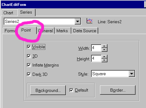
TeeChart Pro 4.0 now reuses editor dialogs for Series with common groups of properties.
For example, Line and Area Series now add a new "Point" sub-tab to edit the "Pointer" properties:
TeeListBox component
This new component is a normal ListBox with automatic filling with Series titles.
The listbox has a "Chart" property which should point to the desired Chart component:
TeeListBox1.Chart = TChart1
The listbox looks like this:
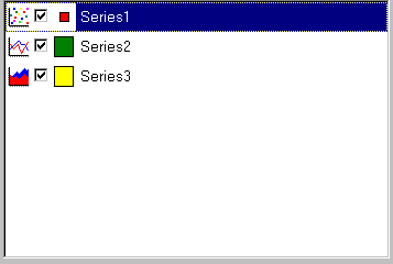
TeeListBox component offers the "Color" and "Font" properties to improve appearance:
TeeListBox1.Color=vbYellow
The listbox has this end-user interaction:
By double-clicking on the left-most Series icon
By checking / unchecking the checkbox
By double-clicking on the Series "legend" coloured rectangle.
By dragging a Series Title text with the left mouse button pressed, then dropping the Series on top or on below another Series title.
New methods:
New procedure ConvertTeeFileToText
The purpose of this method is to create a file containing a text ascii representation of a previously saved "*.tee" file.
TChart1.Export.SaveToFile "c:\mychart.tee"
TChart1.Export.ConvertTeeFileToText "c:\mychart.tee","c:\mychart.txt"
The "MyChart.tee" file will contain both Chart and Series properties and Series point values, while the text file "MyChart.txt" will contain only Chart and Series properties.
It can be used for debugging help.
New helpfile:
The new helpfile, 'Teeuser.hlp' may be used for runtime support of the Chart Editor. The help is opened from any Chart Editor help query at runtime only. For design time help queries from the Chart Editor continue to access teechartx.hlp. The source for the helpfile is supplied to allow tailoring of help to suit a project's specific requirements. To modify and recompile the helpfile you can use Microsoft's Word95 and 32bit Help workshop v4.00.0950 or Word97 and 32bit Help workshop v4.02.0060.
3) Advanced: changes to protected sections Up
Since version 3.0.0.3
5) Pending tasks and known bugs Up
Known bugs:
Notes:
* Changing to HP PostScript drivers or to new HP drivers from HP's www seem to fix this bug.
* Works fine with HP Deskjet
TeeOpenGL component specific
Appendix: Virtual Canvas and OpenGL Canvas detailed.
TeeChart now supports 2 basic Canvas types TeeCanvas3D (default) and OpenGL Canvas for 3D drawing.
Comparison between TeeCanvas3D and OpenGL Canvas:
The OpenGL canvas supports full rotation and elevation, while the TeeCanvas allows only 90 degree rotation and 90 elevation ( from 270 to 360 degrees).
The OpenGL canvas supports lighting ( lights , light colors, positions, etc ) while the TeeCanvas draws 3D sides with darker colors to simulate lighting. ( What is better depends on different chart needs ).
The OpenGL canvas does not support metafile creation so, for printing, a big, fat Bitmap is created and sent to the printer Canvas, which means it will works only with printers with good memory and sane drivers. Metafiles cannot be created, copied to clipboard, saved or printed.
The OpenGL canvas needs the OpenGL DLL's ( available in Windows NT, free to download from www.sgi.com both for NT and Windows 95 ).
Depending on your CPU and video hardware, it may be that the OpenGL Dll's from Silicon Graphics are faster than the ones from Microsoft.
The OpenGL canvas supports different Font Sizes and Colors, but it does not support more than one Font style. All characters of a Font are converted to drawing instructions. This takes quite a lot of memory and CPU time.