![[View INPRISE Home Page]](/file/31678/ENTER9_2.bin/prog_8/JBInfo/BOLUS.GIF) ![[View Product List]](/file/31678/ENTER9_2.bin/prog_8/JBInfo/PRODUCTS.GIF) ![[Search This Web Site]](/file/31678/ENTER9_2.bin/prog_8/JBInfo/SEARCH.GIF) ![[View Available Downloads]](/file/31678/ENTER9_2.bin/prog_8/JBInfo/downloads.gif) ![[Join Inprise Membership]](/file/31678/ENTER9_2.bin/prog_8/JBInfo/membership.gif) ![[Enter Discussion Area]](/file/31678/ENTER9_2.bin/prog_8/JBInfo/newsgroups.gif) ![[Send Email To Webmaster]](/file/31678/ENTER9_2.bin/prog_8/JBInfo/FEEDBACK.GIF) |
|
INPRISE Online And ZD Journals Present:
New Java programmers must adjust to the concept of using layout managers. Developers coming from Visual Basic, Windows SDK, or other windowed backgrounds are often surprised to find that with Java, the user interface is built dynamically by code at runtime. JBuilder assists programmers by generating the user interface layout code for them. However, you’ll want to understand all the layout managers available in the Java Development Kit and how to use them effectively. To place components in a grid pattern, the obvious layout manager is the GridLayout class. However, this class forces all the components in the grid to be the same size. If you want to use a grid pattern, but wish to place different sized components in this pattern, you’ll need to use the GridBagLayout class, along with associated GridBagConstraints objects for each component. As you might expect, the GridBagLayout class has the most flexibility and functionality of the layout managers included in the JDK. Unfortunately, it’s also the most complex. To simplify using it, Borland added the GridBag Constraints Property Editor, which generates the appropriate GridBagConstraints objects for the GridBagLayout object. Many programmers avoid using this layout completely, choosing either to use a simpler layout manager or none at all. In this article, we’ll explain how GridBagLayout works and how to use it within JBuilder. What’s the big
deal? GridBagLayout differs from all the other layout managers in the complexity of the layout. While other layout managers allow simpler, predictable positioning and sizing of components into fairly uniform layouts, GridBagLayout has the flexibility to lay out components of varied sizes into an aligned layout, without requiring that all rows and heights be identical. (Obviously, though, the heights of the cells in a given row must all be the same, as must the widths of the cells in a given column.) However, you can also maintain tight control of the relative position of each component in the layout. That’s an intimidating description—but the individual concepts are fairly easy to understand. Simple rules
Now let’s take a closer look at the GridBagConstraints class. The GridBagConstraints
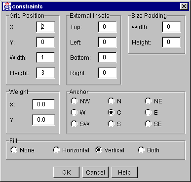
class If you’re using something other than JBuilder to program in Java, you must make an instance of a GridBagConstraints object in your application or applet, set the object variables appropriately, then associate the object with a component using GridBagLayout’s setConstraints() method. The setConstraints method then copies the GridBagConstraints object so you can change its contents after the setConstraints call without affecting the component layout. If you’re coding Java the old-fashioned way, you can reuse one GridBagConstraints object each time you add a component to the layout. However, JBuilder handles this for you and will create a new GridBagConstraints object for each component you place on the GridBagLayout. Setting or changing the constraints will often affect the sizing and positioning of other components in the layout. To see how they interact, let’s examine the 11 GridBagConstraints fields that control component position. In JBuilder, you’ll use the GridBag Constraints property editor, shown in Figure A, to modify these field values. Figure A: You’ll
use the GridBag Constraints property editor to modify
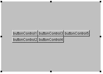
gridx and gridy The gridx and gridy variables indicate the horizontal and vertical location of the component within the grid. The GridBagConstraints constant RELATIVE indicates that the component should be placed to the right of (for gridx) or below (for gridy) the previous component. gridheight This variable has two special values identified by constants in the GridBagConstraints class: REMAINDER indicates that the component should be the last one in its column (and receive any remaining space). RELATIVE indicates that the component should be the next-to-the-last component in its column. gridwidth The constant REMAINDER indicates that the component should be the last one in its row (and receive any remaining space). RELATIVE indicates that the component should be the next-to-the-last component in its row. weightx and weighty To determine how the weightx values will affect the grid pattern, determine the largest weightx value for each column. (The GridBagLayout object will use the largest value for the entire column.) Then, repeat this for each column in the grid. When you have the maximum weightx values from each column, add them together to determine the total weightx of the grid. Next, determine the default width of the column, which is the width of the widest component in that column. Repeat this for each column, then add the default column width totals to determine the default grid width. The width of a given column will be equal to the ratio of that column’s weightx and the total weightx for the grid, multiplied by the difference between the width of the container and the default grid width. This means that columns in which all the items have a weightx value of 0.0 won’t be affected by changes in the width of the container. However, the width of columns that have a non-zero weightx value will grow or shrink in proportion to the amount of extra space around the grid cells. anchor You can use the GridBagConstraints constants—CENTER (the default), EAST, NORTH, NORTHEAST, NORTHWEST, SOUTH, SOUTHWEST, SOUTHEAST, or WEST—to set the value. Other values will cause the GridBagLayout manager to throw an IllegalArgumentException. fill Don’t confuse this with the gridwidth and gridheight fields, which cause a component to span cell boundaries. The fill field merely controls how a component’s size will change when its cell changes size. insets ipadx and ipady Putting it all together To begin, create a new applet, and use the Object Inspector to change the frame’s layout property to GridBagLayout. Then, place five ButtonControl components on the applet. Their position isn’t crucial, and depending on where you place them, they’ll align in a grid pattern. Next, open the Source view of the applet and modify the applet’s jbInit() method to resemble the one shown in Listing A. (We’ve highlighted in color the code you’ll need to change.) Listing A: The jbInit() method public void jbInit() throws Exception{ this.setSize(new Dimension(335, 237)); buttonControl1.setLabel("buttonControl1"); buttonControl2.setLabel("buttonControl2"); buttonControl3.setLabel("buttonControl3"); buttonControl4.setLabel("buttonControl4"); buttonControl5.setLabel("buttonControl5"); this.setLayout(gridBagLayout1); this.add(buttonControl1, new GridBagConstraints2(0, 0, 1, 1, 0.0, 0.0, GridBagConstraints.CENTER, GridBagConstraints.VERTICAL, new Insets(0, 0, 0, 0), 0, 0)); this.add(buttonControl2, new GridBagConstraints2(0, 1, 1, 1, 0.0, 0.0, GridBagConstraints.CENTER, GridBagConstraints.NONE, new Insets(0, 0, 0, 0), 0, 0)); this.add(buttonControl3, new GridBagConstraints2(1, 0, 1, 1, 0.0, 0.0, GridBagConstraints.CENTER, GridBagConstraints.NONE, new Insets(0, 0, 0, 0), 0, 0)); this.add(buttonControl4, new GridBagConstraints2(1, 1, 1, 1, 0.0, 0.0, GridBagConstraints.CENTER, GridBagConstraints.NONE, new Insets(0, 0, 0, 0), 0, 0)); this.add(buttonControl5, new GridBagConstraints2(2, 0, 1, 1, 0.0, 0.0, GridBagConstraints.CENTER, GridBagConstraints.NONE, new Insets(0, 0, 0, 0), 0, 0)); } Now, display the Design view of the applet. The arrangement of the ButtonControl components should resemble Figure B. Figure B: The initial arrangement of the ButtonControl components is a simple grid.
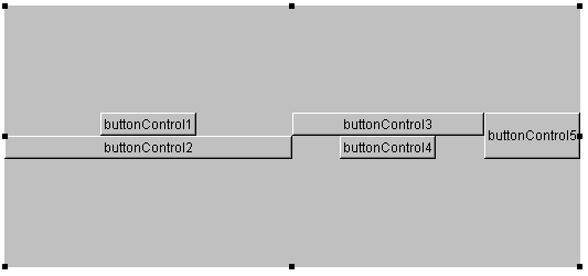
In the source code in Listing A, we’ve basically set the gridx and gridy fields of the GridBagConstraints objects that correspond to each ButtonControl object; the values we’ve chosen will align the buttons in a two-row, three-column grid. Initially, the cells of this grid are exactly the same size as the ButtonControl objects. The GridBagLayout object forces the components to the center, and any extra space (unused container real estate) appears around the edges of the grid. Next, select buttonControl5, and modify its constraints property by double-clicking on that value in the Object Inspector. When the Constraints property editor window appears, set the Grid Position Height value to 2 and select the S radio button in the Anchor group. Click OK to save the new constraint values. When the Constraints property editor closes, you’ll see that buttonControl5 now appears to be in a new position. In fact, it’s still at position 2,0 in the grid—but it now occupies both cell 2,0 and cell 2,1. Since the anchor constraint is now SOUTH, the ButtonControl appears at the bottom of its new display region. Reopen the Constraints property editor for buttonControl5, and select the Vertical radio button in the Fill group. Click OK to save the new constraint value. Now you’ll notice that buttonControl5 occupies the entire third column. This happens because the gridheight constraint value for this ButtonControl is still 2, but since we changed the fill constraint to VERTICAL, the layout manager resized the component to be as tall as the height of two rows. Return to the applet’s Source view, then modify the jbInit() method as shown in color in Listing B. (You’ll be changing the weightx and fill constraints for the first three ButtonControl objects.) Listing B: Revised jbInit() fragment this.add(buttonControl1, new GridBagConstraints2(0, 0, 1, 1, 1.0, 0.0, GridBagConstraints.CENTER, GridBagConstraints.NONE, new Insets(0, 0, 0, 0), 0, 0)); this.add(buttonControl2, new GridBagConstraints2(0, 1, 1, 1, 2.0, 0.0, GridBagConstraints.CENTER, GridBagConstraints.HORIZONTAL, new Insets(0, 0, 0, 0), 0, 0)); this.add(buttonControl3, new GridBagConstraints2(1, 0, 1, 1, 1.0, 0.0, GridBagConstraints.CENTER, GridBagConstraints. HORIZONTAL, new Insets(0, 0, 0, 0), 0, 0)); Return to Design view, click on the container background, and make the container much wider. As you resize the container, you’ll notice that the widths of the first two columns will change; the first widens twice as much as the second, as shown in Figure C. Figure C: Changing the weightx and fill constraints of a few components can dramatically affect the appearance of the entire layout.
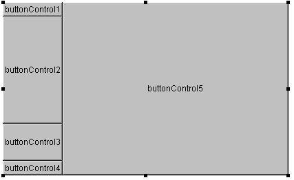
Finally, return to the applet’s Source view and make the changes to the jbInit() method that appear in Listing C. (We’ve highlighted the changes in color.) Listing C: Third version of jbInit() this.add(buttonControl1, new GridBagConstraints2(0, 0, 1, 1, 0.0, 0.0, GridBagConstraints.CENTER, GridBagConstraints.NONE, new Insets(0, 0, 0, 0), 0, 0)); this.add(buttonControl2, new GridBagConstraints2(0, 1, 1, 1, 0.0, 0.4, GridBagConstraints.CENTER, GridBagConstraints.VERTICAL, new Insets(0, 0, 0, 0), 0, 0)); this.add(buttonControl3, new GridBagConstraints2(0, 2, 1, 1, 0.0, 0.1, GridBagConstraints.CENTER, GridBagConstraints.VERTICAL, new Insets(0, 0, 0, 0), 0, 0)); this.add(buttonControl4, new GridBagConstraints2(0, 3, 1, 1, 0.0, 0.0, GridBagConstraints.CENTER, GridBagConstraints.NONE, new Insets(0, 0, 0, 0), 0, 0)); this.add(buttonControl5, new GridBagConstraints2(1, 0, GridBagConstraints.REMAINDER, GridBagConstraints.REMAINDER, 1.0, 0.0, GridBagConstraints.CENTER, GridBagConstraints.BOTH, new Insets(0, 0, 0, 0), 0, 0)); Return to the applet’s Design view. There, you’ll see that the ButtonControl objects are in dramatically different positions and have changed size, and have new constraints on their movement, as shown in Figure D. Figure D: The new constraints greatly alter the applet’s appearance and behavior.
Conclusion In this article, we’ve covered the basics of the GridBagLayout and GridBagConstraints classes and discussed how JBuilder uses them to lay out the components in a container. GridBagLayout is always full of surprises, however. To get comfortable with this class, you should spend a few hours playing with it. Simply modify constraints one at a time and observe the effect on the component, as well as all the other components in the layout. Once you’ve mastered GridBagLayout, you’ll find it a valuable tool for laying out dynamic user interfaces that must look good on a variety of platforms. Tom Mitchell is co-author of Professional Java Fundamentals, published by WROX Press. He's a senior product developer at The Molloy Group. You can reach him at tjmitch@nac.net. Tim Gooch is Editor-in-Chief of JBuilder Developer's Journal as well as several other journals published by ZD Journals. You can reach him at jbuilder_dev@cobb.com. Back to Top Back to Index of Articles Copyright © 1997, ZD Journals, a division of Ziff-Davis Inc. ZD Journals and ZD Jounals logo are trademarks of Ziff-Davis Inc. All rights reserved. Reproduction in whole or in part in any form or medium without express written permission of Ziff-Davis is prohibited. |