The results
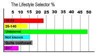
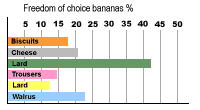
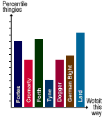
If nothing else, the Room Lifestyle report proves beyond a shadow of a doubt that not all Internet users are seriously deranged. And while those that are psychotic clearly form the majority, many would respond positively to a regime of major tranquillisers. And here's the proof of the pudding...Here are the results of our survey, broken down by race, age, socio-economic grouping, shoe size, cup size and frequency of bathing. It is clear from these charts that we were absolutely right in every respect. Anyone studying these figures cannot help but agree with us, for not to do so, would be an act of scientific folly, on an almost suicidal scale. A moment's reflection will look exactly like a moment but reversed from left to right, so that a right-handed moment will appear to be left handed and vice versa.
collated data
 |
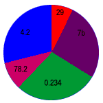
This second pie chart shows up the discrepancy between pies born on or before June 1984 and books by the author Jeffrey Archer. Of course, the word 'author' is used in a strictly non-scientific and inaccurate sense. This comparison is perhaps an unfair one, as of course pies are a much better read than anything by Jeffrey Archer, who is himself more of a pudding than anything else. Other factors accounted for include frequency of trouser press and width of leg-irons. But that is to digress. |
| Pie chart B: no discernable value |
