 Gantt charts in Excel
Gantt charts in Excel
Q I've heard you can create a Gantt chart using Excel, but Gantt charts are not listed as an option. Am I missing something? - Gail Buller A Nope. Excel doesn't offer Gantt as a chart type, but it's fairly easy to create such a chart by using a stacked bar chart. Follow these steps: 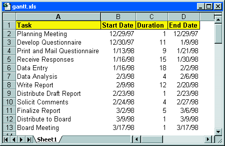 This data can be plotted in a format that resembles a Gantt chart 2. Create a stacked horizontal bar chart from the data in range A2:C13. The Chart Wizard will probably guess these series incorrectly, so you'll need to set the category axis labels and data series manually. The category (x-axis) labels should be range A2:A13; the Series 1 data, B2:B13; and the Series 2 data, C2:C13. 3. Remove the chart's legend, and adjust the chart's height (or change to a smaller font) so that all x-axis labels are visible. 4. In the Format Axis dialogue box, select the following Scale options for the x-axis: Categories in reverse order and Value (y) axis crosses at maximum category. This displays the tasks in order from top to bottom. 5. Access the Format Axis dialogue box for the y-axis. Set the Minimum and Maximum values to correspond to the earliest and latest dates in your project. Note that you can enter actual dates into this dialogue box. To display weekly intervals, set the Minimum to a Monday, the Maximum to a Sunday, and the Major Unit to 7. 6. Select the data series that corresponds to the data in Column B and go to the Format Data Series dialogue box. Set Border to None and Area to None. This hides the first data series -- the start dates -- making the chart resemble a Gantt chart. 7. Apply other formatting as desired. For example, you can add grid lines and a title. 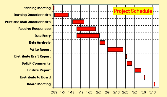 The completed chart after some touch-up work If you adjust your project schedule, the chart will be updated automatically. If you use dates outside the original date range, you'll need to change the scaling for the y-axis. - John Walkenbach | Category: Spreadsheet Issue: Feb 1998 Pages: 164-166 |
These Web pages are produced by Australian PC World © 1997 IDG Communications