 Timeline charts in 1-2-3 and Excel
Timeline charts in 1-2-3 and Excel
 I'd like to show the shift schedules of my staff in a timeline chart so that I can see at a glance how many people are available at any given time. How do I do this in 1-2-3? - Ashley Harvey
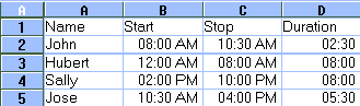 In 1-2-3, select range B2..C5, then select Style--Number Format. In the Number Format dialogue box, select Times from the Format list and 11:59 AM from the Times list. In Excel, select range B2:C5, select Format--Cells, click the Number tab if necessary, then choose Time from the Category list and 1:30 PM from the Type list and click OK. Next, enter the formula to calculate the duration. In 1-2-3, enter +C2-B2 in cell D2 and copy it to range D3..D5. Then select range D2..D5, choose Style--Number Format, and in the resulting dialogue box, select Times and 23:59. In Excel, enter =C2-B2 in cell D2 and copy it to range D3:D5. Next, select range D2:D5, select Format--Cells, click the Number tab, then choose Time from the Category list and 13:30 from the Type list and click OK. Now construct the chart: in 1-2-3, select range A1..B5, then press and hold <Ctrl> while you select D1..D5. Choose Tools--Chart, and drag a box on the worksheet. Click the chart to select it and select Chart--Type, click Horizontal in the Orientation box, select the stacked bar chart type and click OK. Now, click the first data series (one of the red bars). Select Style--Lines and Colors. In the Interior Pattern drop-down list, select T (for transparent); under Edge Style, select None; and click OK. Select Chart--Axis--Y Axis. In the Axis Title box, enter Shift Schedule. Set the Upper Limit to 1 and the Lower Limit to 0. In the Major Interval box, type 1/6 (to indicate one-sixth of a day, or four hours). Click OK. Now, click the Y axis. Select Style--Number Format, select Times, choose the format 23:59, and then click OK. At this point, you have the basic timeline chart. Continue as you wish to remove or modify the legend, change the font sizes, and so forth. To create a similar chart in Excel, select the ranges as described above, and click the Chart Wizard to create a horizontal bar chart. In Step 3 of the wizard, select option 3 for the stacked bar chart. In Step 4, under Data Series In, select Columns; enter 1 in both Use First boxes. In Step 5, select No for Legend, and enter appropriate titles. Click Finish. Double-click the chart to edit it, select the first data series, and select Format--Selected Data Series. Click None under Border and Area and click OK. Click the Y axis, select Format--Selected Axis, click the Scale tab, set the Minimum to 0, the Maximum to 1, and enter 0.166667 as the Major Unit. Click OK. - Richard Scoville | Category: Spreadsheet Issue: Feb 1997 Pages: 174 |
These Web pages are produced by Australian PC World © 1997 IDG Communications
