 Excel Charts:The Layout of the Land Excel Charts:The Layout of the Land |
|
The layout of a chart can make a big difference in its legibility. Consider the two charts shown in FIGURE 1. 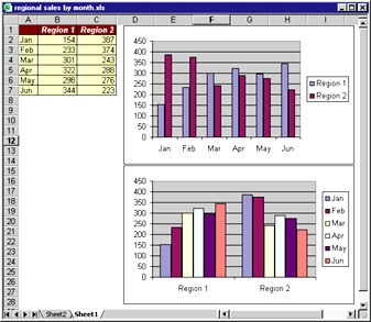 Both use the same data. The top chart contains two data series, one for each region. The bottom one uses six data series, one for each month. Which is better? There is no correct answer. If your goal is to make month-by-month comparisons, the top chart is a better choice. If you want to emphasise trends in each region, the bottom chart works better. When you create a new chart, you start by selecting the data to be plotted. Unless you tell Excel otherwise, it makes some assumptions to determine how your data is plotted. If the number of rows in your selected range exceeds the number of columns, the program uses the columns for the data series (as in the top chart shown in Figure 1). If the number of columns in your range exceeds or equals the number of rows, then Excel uses the rows for the data series. In Step 2 of Excel's Chart Wizard dialog box, you can specify how the data will be plotted. Choose either Rows or Columns for the 'Series in' option (you'll be able to preview your choice). To change the way the data in an existing chart is plotted, select the chart by clicking it, then choose ChartòSource Data. In the Source Data dialog box, click the Data Range tab and then make your selection. |
Category:Spreadsheets Issue: August 2000 |
These Web pages are produced by Australian PC World © 2000 IDG Communications