


ArtWorks Made Easy
RISCWorld
14: Preparation for Print
The previous chapter was concerned with producing single printouts on a desktop printer. This chapter, in contrast, is concerned with the reproduction of the documents you have created using ArtWorks for a wider readership. You are recommended to read the ArtWorks Commercial Printing Guide which contains a wealth of valuable practical information about the printing of graphics created in ArtWorks.
There are many different processes from the comparatively simple to the highly sophisticated; much will depend on your requirements and your budget.
If you need only a small number of copies, you may be content to leave your desktop printer to chum them out. If so, you need not at present be concerned with the contents of this chapter. However, if you need a larger number, you must either photocopy your document or print it using lithography. Using either process some forethought will pay dividends.
Monochrome Photocopying
For short runs of up to a few hundred copies photocopying is one economic means of reproduction. You may already have access to a suitable machine, but if not, and if you are likely to require multiple copies of documents frequently, you should consider purchasing such a machine. Like laser printers with which they have much in common, their price has fallen steadily in recent years. Otherwise you will need to find a commercial photocopying bureau. There are several in most towns; shop around to find the best deal.
Modern photocopiers generally give excellent results, but don't expect miracles. The most critical factor is the quality of the original that is copied. If the original is poor, all the copies will be similarly poor, if not worse. Photocopying is an excellent process for finding faults! For example, if the original was printed on a dot matrix printer with a worn ribbon, so that it looks rather pale, don't imagine that you can compensate for the the paleness by turning down the exposure control on the copier-the copies will almost certainly look far worse than the original! Always try one copy before committing yourself to a print run of several hundred.
For photocopying you need the best possible original, preferably made on a laser printer or an ink-jet printer. You need as much contrast as possible; black areas must appear solid on the original.
Take care with tints. If you have a laser printer that offers a 600 dpi or 800 dpi resolution, you may be tempted to use this as it offers such smooth tints. Unfortunately many photocopiers cannot reproduce such fine dot patterns satisfactorily; consequently you may obtain more attractive copies using an original that was printed at 300 or 400 dpi. Don't be afraid to experiment with the equipment available to you to find which combinations of choices produce the best results.
If You Don't Have a Printer
If you don't have a laser printer or an ink-jet printer capable of producing a suitable original, don't worry, there is still a way out of the situation. If you know someone who has a suitable printer, he may be able to do a printout for you, even if he does not have an Acorn computer.
There are several courses of action depending on the machine type, the printer type and the software available on the destination system. If the destination machine is an Acorn computer and ArtWorks is available on it, save your graphics as ArtWorks files. If ArtWorks is not available, save your graphics as Draw files. If your files include text in fonts which may not be available on the destination machine, convert that text to shapes before saving.
If the destination machine is an Apple Macintosh, check that it can read MS DOS discs.
If the destination machine is an IBM PC-compatible (or an Apple Macintosh that can read MS DOS discs) and CorelDraw, Adobe Illustrator or Aldus Freehand is available on it, save your file on an MS- DOS disc in the appropriate EPS format; Chapter 12 gives more information on this.
If no suitable package is available on the destination machine, you may still be able to make use of the printer. You must save to disc the data that the appropriate printer driver would normally send to the printer. The destination computer system is then required only to download the data from the disc to the printer. So you should load the printer driver appropriate to the destination printer type. On the printer driver's icon bar menu select the option to print to a file and insert a formatted MS DOS disc in your floppy drive, directing the output file to this by specifying the full path name. (Of course, if you are using RISC OS 2, you will need first to load a utility to enable your computer to read and write to MS DOS discs.) It also helps if you have a high- density floppy drive and use a 1.44 MB DOS floppy since a 720K floppy may have insufficient room for the printer image of a heavily used page of A4 at 300 dpi. You will probably need one disc for each page of A4, so you must 'print' each page separately. The owner of the printer prints the document by issuing a command such as PRINT A:page1 when page1 is the name of the file and the disc is in floppy drive A. The printing process is a 'background task' so the PC can be used for other purposes at the same time.
If the printer at the destination computer system is a PostScript printer, you should load the PostScript printer driver. PostScript has the advantage that the files are not unduly long, often about the same length as the ArtWorks document that produced them.
Colour Photocopying
Many high street print shops now advertise colour photocopying facilities, but colour photocopying is not simply a colour version of monochrome photocopying. Some machines actually consist of a scanner whose output is connected to a colour ink-jet printer. Some have a computer interface which may be connected to a PC or a Macintosh. Obviously it would be futile to scan your colour printout when the system may well be able to read the file from which it was made, so ask the shop if it can accept graphics on disc and, if so, which disc formats and file formats are acceptable. As usual, be sure to obtain a satisfactory sample copy before committing yourself to a long run.
Litho Printing
If you need more than a few hundred copies of your document, the most economic means of reproduction is by offset lithography or litho printing. There are many variation? of the litho process, but all have certain features in common.
The image to be primed is copied on to a plate which may be made of metal foil or paper, depending on the length of the print run; paper plates are suitable for shorter runs. The plate is often wrapped around a rotating drum and both oil-based printing ink and water are applied to it, but in some presses the plate remains flat and a roller called the blanket drum is passed over it. The ink and water do not mix; the ink is attracted to those parts of the plate where the image has been etched. The image is transferred to the blanket drum, on which it is now a mirror image of the original. The blanket drum in turn contacts the paper and transfers the image to it; in the process the image is restored to the right way round.
Each plate, of course, prints only a single colour. Some litho presses print just one colour at a time so that a two-colour printout will require the paper to be passed through the press twice, the plate and ink being changed between passes. Some presses, however, can print two colours in one pass and some can print up to six colours in one pass. In general only the larger printing companies, the kind who print full colour magazines and brochures, are likely to have such complex presses.
The litho plate is normally produced by a photographic process from an image on film, so that the printer's first task is to produce the film, unless the artwork is supplied to him on film.
You should liase with the printer (or with the publisher if you are preparing, say, an advertisement to appear in a magazine) to find out the form in which he prefers to receive copy and also some of the technical details that will affect the printout.
If you want truly professional quality you can send your document to a typesetting or imagesetting bureau for setting on a Linotron or other high-resolution machine. Most of these machines read MS DOS discs and use the PostScript page description language. There are some bureaux, however, who can handle Acorn format discs, they advertise their services in Acorn-related media. The bureau will offer the choice of output on bromide (photographic paper) or film. Film is more expensive, but you may save money at the printers.
Preparing for PostScript
In order to provide professional quality print, imagesetting equipment offers far higher resolution than most desktop printers: 1270 and 2540 dpi are commonly used. This high resolution has implications which easily take the newcomer unawares, but ArtWorks neatly overcomes these problems.
Firstly, in PostScript a 'thin line' is always the thinnest line that the device can reproduce. On an imagesetter a thin line might therefore be reproduced 1/1270 inch wide, so fine that it would be invisible to the human eye, even if the printing process could reproduce it. Although in Draw and some other drawing applications 'thin' is the default line width, ArtWorks defaults to an absolute line width of 0.25 pt which is both visible and printable.
ArtWorks allows you to specify your choice of halftone screen (in the Print dialogue box. described in the last chapter). The imagesetter will then generate mathematically the screen you requested. You are recommended to use a screen of 110 or 120 Ipi for monochrome prints and 150 Ipi for four-colour printouts.
Colour Separations
Eventually a separate litho plate will be needed for each coloured ink to be used. Obviously, a full-colour (four-colour) document will need four plates, while a spot-colour document (using, perhaps, black and red inks) will need two. Since the imagesetter will need to set the image for each plate separately, you will need to supply colour- separated data. Fortunately ArtWorks will generate this for you. In the Print dialogue box select the option Separations (not Full colour which creates a single file reflecting all the colour information).
With Separations selected you may now access the Separations dialogue box by clicking on the Separations icon in the bottom row of the Print dialogue box. The Separations dialogue box is shown below.
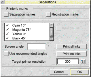
The top panel is concerned with printers' marks, that is, special marks added into the document which help the printer in various ways. These marks are near the edge of the output image, but outside the crop marks, so that they are trimmed off after printing. For this reason the document is printed on paper somewhat larger than its finished design would otherwise require.
Separation names writes the name of each colour separation, e.g. Magenta, on the printout. In some documents it is obvious which separation is which, but with others, the printer may be left in doubt. Registration marks prints registration targets on each separation. These consist of a circle and a pair of cross hairs. They appear in the same place on each separation and their purpose is to help the printer to set up his press so that the various coloured inks are accurately superimposed on the paper, that is, that they are in register. You should certainly include these in all work that is printed in more than one ink.
Since the registration marks appear in all separations, in the finished document they appear in the colour created by the superimposition of all the inks used. In a four-colour printout they appear in black (cyan, magenta, yellow and key superimposed). This special black is called registration black and it is available as standard from the colour menu. You may also use it if you wish to overprint black on an area of another colour such as red; it will ensure that the black overprint is blacker than the colour around it. You should avoid using it, however, for ordinary text and graphics because it wastes ink. It uses four times as much ink as process black which uses only the black (key) ink.
The next panel in the Separations dialogue box is concerned mainly with the inks to be used. It includes a list of them by name. Obviously, if the document is to be printed in standard four-colour, the list will show cyan, magenta, yellow and black. If your document uses spot colours, these are added to the list automatically.
A tick appears against each ink that will be printed and a circle against each ink that will overprint (more on what these mean later). You can toggle the ticks and the circles on and off by clicking on them or by clicking on the ink name to select it and then clicking on the Print this ink or Overprint ink, as appropriate.
There are several reasons why you may decide to print only certain inks. It could be that one of the process colours is not actually used (or is used so little that its absence would pass unnoticed) and you can therefore save time and expense by not producing a separation for it. Or it could be that the combined file containing the four separations is too big to fit on one floppy and so must be split into separate files. If two objects of different colours overlap, the object that is in front 'knocks out' the other object. That is, the part of the hidden object that is concealed is left uninked. But even small errors in registration can lead to thin white (uninked) borders on one side of the object and coloured borders on the opposite side where two different inks have overlapped.
ArtWorks offers two separate Overprint options which overcome this problem. If you select Overprint on an ink colour in the Separations dialogue box, that colour will overprint on to any underlying colours. You will have no uninked borders, but there will be colour shifts. For example, a magenta object overlaying a cyan one will appear purplish. For this reason this type of overprinting is normally used with black.
Trapping objects is another way of removing colour shifts which cause white lines between colours. A trap is applied to individual objects by selecting the Overprint option on the colour menu when creating or editing the object. You may apply it to the line colour or the fill colour or both, but for normal purposes it is sufficient to apply it to the line colour only; make the line 0.5 to 1.0 pt wide and set it to whichever is the paler of the object's fill colour or the colour of the object behind. The resulting line will be wide enough to mask unsightly uninked areas, but sufficiently thin to pass unnoticed.
Against each ink colour is an angle expressed in degrees, typically cyan 15 deg, magenta 75 deg, yellow 0 deg and black 45 deg. The values may change depending on the resolution of the destination device. These are the angles of the halftone screen lines on each plate. The inks each have a different angle to minimise the likelihood of interference patterns. Black, the most prominent colour, has an angle of 45 deg because that is the angle at which human vision is least responsive to repeating patterns. Yellow is at 0 deg, i.e. horizontal, because it is the palest colour and so patterns occurring in it are unlikely to be noticed even when horizontal.
You can change the screen angles of individual inks by selecting the ink and entering the new value in the editable icon. Your printer or typesetting bureau will give you the values to enter. You can also change the default values if you wish; the Commercial Printing Guide supplied with ArtWorks gives details of how to make these changes. But you are recommended to leave these unchanged unless you know what you are doing. You are advised to select the Use recommended angles option.
Incidentally you can preview your colour separations if you wish. From the main menu click on View, then on Separation and then on the particular ink you wish to see. You should load the process palette (ProcessPal) if you wish to see your separations in an approximation of their true colours.
Font Mapping
If your document contains text, you will also need to ensure that the fonts you have used correspond to or can be converted to fonts in the imagesetter. Although many Acorn fonts have equivalents in PostScript (see Chapter 12), they use different names.
If you have RISC OS 2 and you use the PrinterPS printer driver, you can edit the file (contained within the printer driver application) called PSprolog. This file, as its name suggests, is a prologue which is attached to the front of each PostScript file produced. You can edit it in Edit or any other text editor. At the end of the file is a list of Acorn font equivalents. You may already have edited this file to include other font equivalents; font suppliers often supply this information. It is vitally important that you ascertain from your typesetting bureau that the equivalent fonts are available and that you have spelt their names correctly. Various equivalents are available and your bureau may not have the one that you expect. Save the edited file back into PrinterPS.
If you have RISC OS 3 and you use the Generic PostScript printer driver, you can map your Acorn fonts on to their PostScript equivalents easily using the FontPrint application. Ensure that the printer driver is loaded, double-click on the FontPrint application and follow the instructions.
In RISC OS 3 (but not RISC OS 2) if your document uses any fonts whose PostScript equivalents are not known, the font itself will be included in the file and downloaded to the imagesetter. This has the disadvantage that it makes the file long and takes longer to load. Moreover, it may mean that your document will not fit on a floppy. It is possible to download fonts separately.
In either RISC OS 2 or RISC OS 3, if you have a short piece of text in a font whose equivalent you are uncertain about, you may convert it to graphics using the Make shapes menu option.
Remember that there are useful tables of Acorn and PostScript font equivalents in the Rough guide and also in the file Mapping in the TextTool application (see Chapter 12).
RISCWorld