


ArtWorks Made Easy
RISCWorld
5: Colour Handling
One of the most distinctive features of ArtWorks is its sophisticated colour handling. This becomes apparent when you load the application and see its title banner: this contains colours which you may not have seen before on your monitor. ArtWorks uses its own colour handling module which can simulate colours not available in the regular palette.
How We Perceive Colour
Let's begin, however, by looking at colour in Nature. Visible light consists of electromagnetic waves having wavelengths from about 450 to about 700 nm (nanometres). The actual colour of the light is a function of its wavelength, the longer wavelengths coming at the red end of the spectrum and shorter wavelengths at the violet end. The human eye, however, distinguishes colour by detecting just three wavelengths, namely those of the so-called primary colours: Red (c 650 nm), Green (c 560 nm) and Blue (c 470 nm). In fact the cells in the eye which respond to these colours are not sharply tuned; they have what engineers would call a good bandspread. And this is essential, for if they were highly tuned we should be unable to recognise any colours except the three primaries themselves: an object emitting or reflecting yellow light (c 600 nm) would appear white or grey (we have separate monochrome sensors).
By giving the sensors a broad bandspread. however, some useful compromises are possible. Yellow light is intermediate in wavelength between red and green bur in practice it activates both red and green sensors. So, when we see a yellow object, the eye sends a message to the brain saying 'this object is both red and green'. The part of the brain concerned with vision takes this information and interprets it saying, 'This object cannot be both red and green simultaneously; it must therefore be a composite colour containing both red and green; it is the colour we call yellow.'
Colour in Video
Video technology such as colour television and colour computer monitors uses this compromise to our advantage. The image on the monitor screen is made up of tiny phosphor dots which glow red, green or blue, as you can easily prove by examining a screen with a magnifying glass. So, despite the apparent multiplicity of colours in the picture, there are only three true colours present: red, green and blue. Even black and white are an illusion, white consisting of red, green and blue turned fully on while black areas are those where all three colours are turned off and so no light is emitted. The apparently full spectrum of colours in the display is a remarkable illusion obtained by varying the relative brightness of adjacent red, green and blue phosphor dots.
Radiant and Reflective Colour
Colour made up by combining primary light sources in this way is called radiant colour or, sometimes, additive colour because the primary colours add up to white. Computer graphics inhabit two very different worlds, however. Besides the radiant world of the monitor screen, there is that of the printed page, where a different set of rules applies.
Light is not radiated from the page, it is reflected and during reflection it may be subjected to filters, namely the coloured inks, which reduce or remove light having certain wavelengths. In theory, where all the primary inks are present light of all wavelengths is stopped, so that the area appears black. Colour made up in this way is called reflective colour or, sometimes, subtractive colour, because the resultant colour is calculated by subtracting the ink colour(s) from white.
This leads to a new set of rules about colour composition, but they are familiar as they are the rules learned by every child dabbling with crayons or paint: mix blue and yellow to make green and mix red and yellow to make orange. Full-colour printing uses a different set of primaries from those used on the monitor screen and we shall consider this again shortly.
Because of these differences, it is sometimes difficult to match a colour on paper with a colour on the screen. ArtWorks however does provide support for both radiant and reflective colour and is able to simulate on the screen the effect of combining different inks on paper. There is more about this later, when considering colour models.
Colour Levels
Besides colour the human eye is sensitive to brightness. In fact it can distinguish about 100 levels of brightness of a colour. So, if you have a monitor screen showing a monochrome picture using, say, eight shades of grey and you increase the resolution to, say, 128 shades of grey, the improvement will be noticeable. But if you further change it from 128 to 1024 shades of grey, you are unlikely to notice further improvement.
Since the same limit of about 100 shades applies to all three primaries, effectively the human eye can distinguish about 100 x 100 x 100 (=1,000,000) different colours.
In computer graphics, however, the ultimate colour resolution is generally accepted as 256 levels of each primary colour giving a total of 256 X 256 x 256 = l6,777,216 different colours. Because one 8-bit byte is used to store the level of each primary colour, this colour resolution is commonly called 24-bit colour. In practice a fourth byte is often used to store additional colour data. such as a transparency flag, and so colour definition often requires a full 32-bit word. This may seem to be wildly extravagant for two reasons: firstly the human eye, as we have seen, cannot appreciate such diversity; and secondly monitors cannot display such diversity. Even an ultra-high- resolution screen offering double VGA resolution (1280 x 960 pixels) has only 1,228,800 pixels, so that, if each pixel were made a different colour, there would still be only 1,228,800 colours on the screen, a small fraction of those offered by '24-bit colour'.
In practice it is very convenient to store colour in 24 bits, and it is always sound policy to work at a rather higher level of accuracy than the output device demands.
Colour in RISC OS
In order to keep the cost of their computers within the budgets of the education establishments which are their principal customers, Acorn adopted some compromises in the video circuitry of Archimedes machines. These machines offer screen modes having 2, 4, l6 and 256 colours only. Moreover its colour definition recognises just l6 levels of brightness per primary, making a total of 6x l6x 16= 4096 different colours available. In the 2-, 4- and 16-colour modes the palette may be adjusted to allow any selection from the 4096, but in the 256-colour modes the selection is effectively fixed.
Recently several third-party manufacturers have introduced colour cards which greatly extend the machines' colour facilities. Computer Concepts' Colour Card, for instance, allows the 256-colour modes to use any colours from a full 24-bit palette and some non-desktop modes having 15-bit colour have been incorporated; with 32 levels of each primary the resulting display is as good as that obtained from colour television or photography. Version 1.1 of ArtWorks has a preview facility which can use these modes so that you can view your creations in 15-bit colour.
With the introduction of the RiscPC and A7000 models these limitations were removed and true 24 bit colour can be used without any third party add-ons.
In common with Draw and other object-based applications, ArtWorks stores its colour data in 32-bit words including full 24-bit colour information. It actually carries out some colour calculations to even higher levels of accuracy. But lest you think that this accuracy is wasted when RISC OS is incapable of displaying more than 256 colours, bear in mind that much of the professional-quality work which ArtWorks has been designed to handle is destined for colour printing where 24-bit colour is the accepted standard. And if you are fortunate enough to have a colour printer such as the Canon BJC-800 with Computer Concepts' Turbodriver, this will print the graphics you create in ArtWorks using the full 24-bit colour data.
Dither Patterns
Even on the monitor screen, however. ArtWorks is able to overcome to some extent the limitations of RISC OS colour handling that were described above. The number of colours available on the screen is greatly extended through the use of dither patterns.
A dither pattern is a pattern made up of pixels in two or more alternating colours. Because pixels are so small, especially in the high resolution modes, dither patterns often pass for solid colours, especially when the colours in the pattern do not vary too widely in intensity. Through the judicious use of dither patterns, hundreds of colours can be made available in 16-colour modes and thousands in 256-colour modes.
RISC OS's colour handling routines support dithering on a 2 x 2-pixel matrix and this is used by Draw and many other applications to extend the number of colours available. ArtWorks provides its own colour handling module which uses dither patterns having a 4 x 4-pixel matrix.
This 4 x 4 pixel matrix has some startling implications. It makes available 15 intermediate shades between any pair of colours in the palette. And since mere are 120 possible colour pairs in a 16 colour palette, it follows that no fewer than 120 x 15 = 1800 different two-colour dither patterns are available, although not all of them are useful. There is, for instance, little advantage in using a dither pattern made up of black and white when there are six solid intermediate greys already in the palette. But, taking just the most closely matched pairs from black, the six grey shades and white makes possible a tone wedge from black to white with 113 steps, which is more than the human eye can distinguish. Furthermore, dither patterns may include more than two colours, greatly extending the subtle shades available, even with a 16 colour palette.
There is, of course, a price to be paid for this sophistication and that is in resolution. The 4 x 4 pixel matrix reduces the apparent screen resolution so that graphics appear coarser than they do in RISC OS's 2 x 2 dithering, which is hardly noticeable in modes 27 and 31. You can make the 4 x 4 dithering less obvious by switching to either mode 28 (256 colours), where the greater choice of palette colours allows dither patterns to be made from more closely matching shades, or to mode 31 (which Computer Concepts recommends) in which the pixels are smaller.
In practice, however, the 4 x 4 dithering is unlikely to cause major problems if Artworks is used as intended. Dither patterns are most noticeable when they appear in comparatively large expanses of flat, i.e. unchanging, colour. In nature such expanses rarely occur where because of shadows and angles of incidence, even smooth uniformly coloured surfaces show apparent gradations. The sky on a cloudless summer's day is not a uniform colour; it apparently changes in hue from an intense pale blue directly overhead to almost white just above the horizon. So. if you wish to produce graphics having a near photographic quality (like Alan Burns' famous drawings of cars), you should forget about flat colour fills. By providing both linear and radial graded fills, ArtWorks makes it easy for your graphics to simulate natural shade effects, while its blend facility can be used instead of a graded fill for handling very complex shapes. When you use these, there will be no large expanses of flat colour in your graphics and me coarseness of the dithering is actually an advantage in that it helps to conceal the 'steps' in the fill.
Anti-aliasing
One other colour feature of ArtWorks deserves mention here and that is anti-aliasing in the reproduction of lines and shapes. You may be familiar with anti-aliasing in the outline font system, if so, skip the rest of this paragraph. If you examine the pixel structure of some text on the screen (we'll assume black 12pt Trinity against a white background in a 16-colour high-resolution mode) you may be surprised to find that not all the pixels are black or white, there are intermediate greys in use. The reason for this is simple; it greatly enhances the appearance of the text on the screen. It fosters the illusion of far higher resolution and is especially helpful in the reproduction of fine lines and curves. The following shows 12 pt. text captured off the screen and enlarged to show the anti-aliasing.

ArtWorks uses exactly the same technique in its reproduction of lines and shapes on the screen but only at the highest setting of the WYSIWYG control. Again, it enhances the appearance of the graphic, creating the illusion of higher screen resolution by reducing the 'jagged' effect on oblique and curved edges.
The following picture shows a line drawn in ArtWorks and captured off the screen and magnified. With the top line the WYSIWYG control was set to 11 and so the line was anti-aliased. With the bottom line it was at 0, disabling the anti-aliasing.

Choosing Colours in ArtWorks
There are many occasions in ArtWorks when you need to choose a colour, such as when selecting line colours and fill colours for shapes. Colour selection in ArtWorks uses a colour menu which is totally unlike the colour selectors in other packages. For a start it is so long that in most screen modes you will need to use the scroll bar to see the whole of it, although in the recommended mode 31 it does fit on the screen. By default it offers a choice of 17 colours irrespective of the screen mode in use. These are black, white, nine intermediate greys in steps of 10% (in 16 colour modes all except 40% and 80% are dither patterns) and six primary colours. All are named. The naming of colours brings some significant advantages, as we shall see.
If you are using a 16 colour mode with the default RISC OS palette, the names of the colours in the menu will not match the colours themselves, for example, red and magenta will appear to be the same.
You should click MENU on the ArtWorks icon and select the option Primary palette. This loads a palette specially configured to allow dithering to simulate the widest possible range of colours. The default colour menu assumes that this palette is in use. The magenta will now be clearly a different colour from the red.
The currently selected colour is identified by a tick. To choose a different colour, click on it.
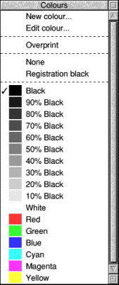
There are five special options at the top of the menu. Overprint and Registration black are used in colour printing and will be explained in Chapter 14. You should not use Registration black except for the special purposes described in Chapter l4.
None is the transparent option. When the fill colour of a shape is made None it is left unfilled: this is equivalent to deselecting the Filled option in the Shape info box. Of course, if no filling takes place, other objects behind the shape will be visible through it. When the line colour is made 'None' the outline of a shape is invisible and the shape appears simply as an area of fill colour.
New colour creates a new colour which is added to the menu, and Edit colour modifies an existing entry in the menu, leaving the length of the menu unchanged.
When you save your document, the list of colours used, including any new ones or ones you have edited, is saved with the document and will automatically be in force if you reload the document for further editing. If you wish to use the colours you have specially formulated in another document, you can do so very easily. You can save the current colour menu, including the specifications of new or edited colours, by choosing the Colour table option from the Export menu (from the File menu). You can load the resulting file into an ArtWorks document by dragging it into the window. If any colours in the file have the same names as colours in the document, those in the file will replace those in the document.
It is when you edit existing colours in ArtWorks that the benefits of naming the colours become apparent. In ArtWorks the colours used in objects are stored by their names and not, as in Draw and most other packages, by their raw RGB composition. So, if you create a new colour and name it, say, Pink and then use it in, say, 50 different objects and then you decide to edit the formulation of your Pink, your new formulation of Pink will be applied to every instance of Pink in your drawing automatically. In most other packages you would need to identify and then select each of the 50 objects individually before making the change.
Both the New colour and Edit colour options lead into identical colour mixing and blending facilities and here ArtWorks again shows its sophistication in that it offers three alternative colour models and two colour processes.
Colour Models
A colour model is simply a method of defining or describing a colour. We have already considered one colour model in this chapter, the 'RGB' model which regards all colours as mixtures of the three primaries red, green and blue. This is the model most commonly encountered in computer graphics because, as we have seen, it is the way colour monitors work. It is the model used, for instance, for editing colours in the RISC OS palette and in Draw. Colour editors usually provide three slide bars, one for each primary colour; typically these allow each component to be set at any of 256 positions, allowing full 24-bit mixing, although in the RISC OS palette there are only 16 positions for the reasons given earlier.
The ArtWorks RGB colour model works in much the same way. In fact its three slide bars can be dragged to any of 101 positions calibrated from 0% to 100%. It may seem that this makes full 24-bit colour definition impossible, since there are only 101 x 101 x 101 = 1,030,301 permutations available. But you can also adjust the levels of the components by typing values in the writable icons and these accept fractional percentages.
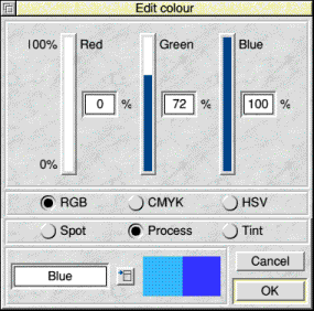
Three features are worthy of special note. Firstly, there is a writable icon for the colour's name. If you are creating your nth new colour, this will at first read 'New colour n ', but you are advised to give each colour you create a more meaningful name. If you are editing an existing colour, its name appears in the icon and you are free to change it if you wish.
Secondly, an example of the current state of the colour you are editing or creating appears in the left half of the central window beneath the sliders. In the right half the colour editor stores a sample of the original colour that you are editing, or the currently selected colour at the time that you started creating a new colour. This can be very useful for comparison purposes.
Thirdly, two rows of 'radio buttons' are provided. The upper row selects the colour model in use, and you can switch between colour models in the middle of colour editing if you wish, although you are recommended to use one model consistently in each document. If you don't, you may find that unsightly 'steps' appear between adjacent shades in graded fills and blends between two original colours defined using different colour models.
The second row switches between different colour processes (used in colour printing). Their use will be considered later in this Chapter and in Chapter 14.
The second colour model is called 'CMYK' (cyan/magenta/yellow/ key). This uses your primaries which are the colours of the inks used in colour printing (in both commercial colour presses and in desktop machines). Key, incidentally, is black. You will find this model particularly useful if you use ArtWorks to prepare graphics for colour printing. There are several fundamental differences between the RGB and the CMYK models. The RGB model assumes radiant colour; the colours are additive so that 100% of all three primaries is white and 0% of all three is black. CMYK, in contrast, uses reflective colour. The colours therefore are subtracted from white, so that 0% of all four is white, while 100% of the coloured primaries cyan, magenta and yellow (we'll ignore key for the moment) is black.
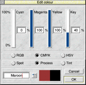
The somewhat strange choice of primaries, magenta instead of red and cyan instead of blue, is for a good reason. Originally colour printing used just three primary colours, but it proved difficult to obtain a convincing black by mixing three colours. Better blacks and a wider range of colours were obtained using cyan and magenta than from more conventional reds and blues. Even so, the quality of the black obtained was variable. Moreover, it used so much ink that mechanical problems such as paper buckling ensued. Consequently a separate black ink (key) was added for printing black items and for darkening other colours. History repeated itself when a black ink cartridge was introduced in the Hewlett-Packard colour DeskJet printers to supplement cyan, magenta and yellow
There are some colours that cannot be reproduced exactly in four- colour printing. For example, you cannot have a bright 'pillar box' red. The closest approach is the colour obtained bv mixing 100% magenta and 100% yellow which is a fairly bright crimson. Similarly the closest approach to a bright grass green is that obtained by mixing 100% cyan and 100% yellow. To get a deep blue, mix 100% cyan and 100% magenta, but when printed this colour tends towards purple. You really need a colour printer to try these out, the colours seen on the monitor screen, even with the primary palette loaded, do not correspond exactly to those on paper. There is an alternative palette called ProcessPal supplied with ArtWorks which allows the monitor in 16 colour modes to give a good approximation of the colours obtained from CMYK printing.
As with RGB you can enter fractional percentages, making 24-bit colour available using the cyan, magenta and yellow sliders alone. But the presence of the fourth primary, key or black, adds a new dimension to colour creation. There are now 'alternative recipes' for many colours. Remember that if you mix all three coloured primaries in equal proportions, you will in theory create a shade of grey and you could create the same shade of grey by using the same percentage of key and this would print using only one third the amount of ink. In the same way, if you create a new colour consisting of, say, 60% cyan, 30% magenta and 30% yellow, you can replace 30% of each coloured primary with 30% key. In other words, the same colour could be obtained by mixing just 30% cyan with 30% key (and only half as much ink would be used in printing).
Incidentally, when you print colours you have formulated using the RGB or HSV colour models, ArtWorks will check to see if there is a 'grey content' and, if so, will replace the grey with key, a process called grey component replacement. But if the colour was formulated using the CMYK model, the formulation is followed exactly. If you are preparing material for printing, especially on a colour desktop printer, you may need to choose the CMYK formulation of your colour very carefully. A colour printer can only print solid colour If it is a primary colour (cyan, magenta, yellow or key) or a colour obtained by overprinting two solid primaries (red, green or blue). When printing these solid colours, you can make full use of the printer's resolution, often 300 or 360 dots per inch.
For all other colours, however, the printer is obliged to use dither patterns. But these dither patterns are quite unlike those used on the screen. Known as clustered dithers, they vary the dot size in order to represent different colour intensities. Inevitably these variable-size dots are in fact clusters of the smaller dots that the print head actually lays down. So, depending on the printer driver software, the printer might actually print clusters forming a 6 x 6 dot pattern which repeats 50 or 60 times per inch, depending on printer resolution. Clearly, when printing this kind of colour, the printer resolution is quite coarse, typically 50 to 60 dots per inch.
So if you are printing a very intricate design, you should avoid clustered dithers bv restricting yourself to the primary colours if you can. You may get away with a dithered shade if one or more components of the dither pattern is a solid colour which can carry the detail. For example, an intricate shape in very dark blue might use 100% cyan plus 100% magenta plus 30% key. The 30% key will be a dither overlaying the solid blue which will carry the detail. The third colour model is called HSV which stands for hue, saturation, value. It is preferred by some users because it is claimed to be the most intuitive of the three models, mimicking the way in which the human brain perceives colour rather than the way in which it is created.
First let's sort out the terminology used. Hue is the actual colour or wavelength, such as red, purple, green. Saturation is the intensity of the colour. At full saturation the colour is at its richest, at low saturation the colour content is faint, perhaps just a hint of colour within a grey. When saturation is zero, the colour is altogether absent and what remains is monochrome. Value is the overall brightness of the colour. If value is zero, then the 'colour' is total darkness, that is, black. If the value is 100 per cent, the colour may be white (if saturation is zero) or any bright shade of the hue, depending on the saturation setting.
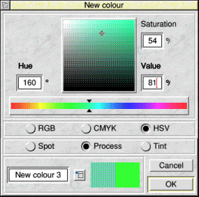
In its HSV editor (above) ArtWorks has departed from the multiple slider mechanism and adopted instead a colour cube . You select the hue from a central slider calibrated 0 to 359 degrees which follows a colour circle from red to red via yellow, green, blue and purple. This determines which 'slice' of the cube is opened. Within each slice the pointer's horizontal position determines saturation (the right is full saturation) and its vertical position determines value (the top is full brightness). You can enter numeric data in the writable icons, but fractional percentages are not accepted. The number of colour combinations is therefore 560 x 101 x 101 = 3,672,560 which falls short of true 24-bit colour, especially bearing in mind the redundancy in the system: with value at 0 the colour is black irrespective of the other settings and with value at 100% and saturation at 0% the colour is white irrespective of the hue setting. Nevertheless, colour matching is remarkably easy.
Colour Processes
ArtWorks has been designed to cater for the needs of graphic designers and illustrators preparing material for colour printing, as we have learned from its use of the CMYK colour model. In practice there are two colour printing systems. The CMYK system with its four inks is commonly called process colour and it can reproduce many different colours, although some, as we have seen, it can only simulate. The other system is called spot colour. Occasionally it is called second colour, although ironically you could have two or three 'second' colours. Spot colour simply adds an additional ink, and therefore an additional plate, to the printing process. The additional ink may be any colour you wish, perhaps that bright pillar box red that cannot be reproduced exactly by process colour. So you could perhaps reproduce a logo or pick out a line of text in your chosen spot colour.
Now spot colour not only offers you the opportunity to print in black (assuming that is your first colour) and the spot colour, but it also allows use of tints of black and of the spot colour as though they were colours in their own right. So using black and red inks you can also print many shades of grey and pink. Some comics, such as the Beano (until its facelift in 1988) regularly printed some pages using red as spot colour in this way.
ArtWorks allows you to prepare your document for print using spot colour. Actual print preparation will be described in detail in Chapter 14, but its implications for colour selection are described here. You can edit or formulate a new colour for use as a spot colour by clicking on the Spot button in any of the three colour editing windows. You can also designate any colour in the colour menu as a spot colour.
You can also select tints. Click on the Tint button and a new colour editing window as shown below will appear. This window also appears if you select Edit colour while a tint, such as one of the shades of grey, is the current colour.
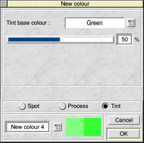
This is a simpler window than those considered earlier and that is hardly surprising since its sole function is to produce tints (.i.e. mixtures with white) of other existing colours. The Tint base colour is the colour (spot or process) on which the tint is based. Clicking on the menu button calls up the regular colour menu from which you choose or formulate your base colour. The slider allows you to choose the intensity of the tint; any whole- number percentage from 0% to 100% is permitted, although 0% is white and 100% is the base colour itself. You can give your tint a new name and it will thereafter be added to the colour menu like any other colour.
Flat Colours
To apply an ordinary 'flat' fill colour or line colour in ArtWorks you first select the object(s) to be changed in the usual manner. These may be lines, shapes or text. Then click on the flat colour change tool. This changes the info bar to the form shown. Click any mouse key over the Fill colour or Line colour icons. Either will call up the colour menu that we met earlier in the chapter. You may choose any existing colour from the menu, or you may create a new colour using any of the three colour models, or you may edit an existing colour using any of the three colour models.

Remember that you cannot normally see a fill colour applied to an (open) line. but a (closed) shape normally does take a fill colour. However, using the Line or Shape dialogue box you may over-rule these conventions and allow a line to be filled or a shape to be left unfilled. You can also leave a shape unfilled by selecting None as its fill colour.
If you apply a bright colour to a fairly thin line you may find that on screen the line appears to be the wrong colour. Don't worry about this, it's not a bug. This is a consequence of the on-screen anti-aliasing used by ArtWorks. If you use the zoom to increase the size of the line, you will see it in its proper colours and it will always print in the correct colour.
You may also find some strange colour effects when you change the fill colour of text. If you choose a pale colour such as cream or pink for your text, you may find that this appears on screen as pale grey, although the same colour is rendered correctly in lines and shapes. The reason for this is that ArtWorks uses the regular Acorn font manager to perform the simple text operations of which it is capable, such as changing the (fill) colour of text, but it uses its own font manager for more complex text handling operations such as giving text different outline and fill colours and also for processing the colouring of lines and shapes. Now the Acorn font manager uses the Acorn colour module while the ArtWorks font manager uses the ArtWorks colour module and these render colour differently. For example, the ArtWorks colour module uses a different type of dither pattern to simulate colours not available in the palette. For this reason the same colour may be rendered differently on screen in different parts of the document. In the printout, however, the same colour will be rendered consistently as the same 24-bit information is used throughout.
Graded Colour Fills
As any artist will tell you. shading is of fundamental importance when you are trying to represent a three-dimensional object on a two-dimensional medium such as a monitor screen or a printout, especially an object with curved surfaces such as a ball. ArtWorks allows you to give even the simplest drawings the illusion of depth by providing easy to use linear and radial graded fills. ArtWorks actually calls them graduated fills.
A graded fill is a fill with not one colour but a range of colours forming a gradual, smooth transition from a starting colour to a finishing colour. Ideally, adjacent colours should be so closely matched that the border between them is indistinguishable. Often the blend is from white or another pale shade to the object's natural colour, for example, when simulating a highlight, or from the object's natural colour to a darker shade, for example, when simulating shading. However, since ArtWorks allows you to grade from any colour to any other colour you may use graded fills to create all manner of special effects in your illustrations.
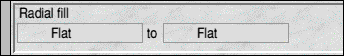
In a linear graded fill the colour changes take place in straight bands or strata. For example, you could use one in a landscape picture to reproduce the sky. This might range from pale blue at the top of the picture to white at the horizon. In a radial graded fill the colour changes take place in concentric circles so that the innermost colour (the starting colour) seems to spill out from a central point. Sometimes these are called fountain fills.
In ArtWorks these are very easy to use. Select the objects) to be filled and click on the linear or radial graded fill tool, as appropriate. The info bar changes to the form shown below. Clicking with the pointer over either icon calls up the familiar colour menu and allows you to select your start colour and destination colours. You may of course create new colours or edit existing ones if you wish. When you have chosen the start colour, ArtWorks will automatically set the finish colour to the object's current fill colour (if it has one), but you can choose a different colour if you wish. The graded fill replaces any previous flat fill colour.
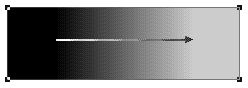
Next place the pointer in the object where you want your graded fill to begin, i.e. where you want the start colour. Hold down SELECT and drag to where you want your graded fill to end, then release SELECT . You will have dragged out an arrow (see below) whose tail sits on your start point and whose head is on your end point. If it is not in the right place, you can drag the arrow around with the pointer or you can drag it out again until your graded fill is exactly right. Incidentally, both start and end points can be outside the object being filled, if you wish.
When you are satisfied that the fill is correct, click on the Select tool and this will 'freeze' the fill in its present condition. Don't click anywhere else or this will be interpreted as a modification of the fill. If you subsequently decide that you wish to edit the graded fill, you may do so by selecting the object in the usual manner and then clicking on the appropriate graded fill tool. The arrow will reappear and you can move it or change the start or destination colours.
Incidentally, a graded fill only replaces an object's normal fill colour, it still has a separate line colour. If the line colour is inconvenient, you can get rid of it by changing it to 'None'.
Since it is a fundamental principle of vector (line) graphics that a shape can have only one fill colour, you may wonder how graded fills are possible. The answer is that the graded fill consists of a collection of separate temporary objects, each having its own fill colour calculated by the fill routines. In ArtWorks these objects are dynamic, that is, they are not stored in the data stack as separate objects and they cannot be selected or edited as ordinary shapes can, they are created temporarily by ArtWorks each time the object is drawn or printed. ArtWorks simply stores on the stack a note that there is a graded fill in the 'parent' object together with details of the start and finish locations and colours. This is sufficient to reproduce the graded fill. This method of storage takes very little memory and allows graded fills to be edited easily.
ArtWorks does, however, convert graded fills into separate objects when they are exported as Draw files. This is necessary because Draw does not support graded fills as such, but it simulates them using groups of discrete objects.
Blends
Blends are included in this chapter because they can be used as highly sophisticated graded fills, to provide lifelike shading of very complex subjects, such as folded garments or beads of water. They have many other uses, for example, in the multiple copying of shapes, 'inbetweening' (sometimes called 'tweening') in animations and many other special effects.
Blending takes two or more shapes or lines and produces from them a number of shapes that are intermediate in form, location and style, including colouring. If one parent shape is inside the other the resulting objects will be between them, resembling a graded fill. If the two parent shapes are widely separated, the 'offspring' shapes will be located along the hypothetical line between them. You can choose the number of intermediate shapes you want to produce, this is the 'number of steps' which defaults to five.
Similar facilities are provided by the Interpolate and Grade options in Draw, but in ArtWorks the facility is more versatile. Like the graded fill facilities, blending is dynamic, the intermediate shapes produced being temporary. They therefore reflect automatically any subsequent edits applied to either parent object. This is different from the facilities in Draw which produce discrete shapes so if a parent object is edited subsequently, the offspring objects are unchanged. With Draw if you require them to reflect the edit, you must delete them and apply the interpolation again.
Another difference between blends in ArtWorks and similar facilities in other packages is that the parent objects need not have the same number of control points; moreover one can be an open line and the other a closed shape if you wish. In practice ArtWorks will add or subtract control points as necessary.
The only essential requirement is that the parent objects must be lines or shapes. Text characters or tokenised shapes produced using the rectangle, rounded rectangle or ellipse tools are converted to shapes automatically. Only single objects can be blended, not groups. You can, however, blend between objects having different numbers of closed sub-paths (objects created using the Join shapes facility). This facility is described in the next chapter. In this type of blend some of the sub paths will be ignored. For example, Figure 5.14 shows the result of a blend from a rectangle to an object consisting of three circles merged using the Join shapes facility. Only the right-hand circle (the one originally nearest the front) has been used in the blend.
To create a blend, prepare your parent shapes, but you needn't select them. Then click on the blend tool. The info bar changes to the form shown below. Don't try to change any of the settings in the info bar at this stage, because you probably won't be able to. Since blends are dynamic in ArtWorks. you can change the number of steps subsequently whenever you wish.
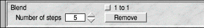
Next move the pointer on to the start object. Press SELECT and hold it down. Now drag until the pointer is over the destination object and release SELECT. If you are blending between more than two objects, repeat the process on to the third object and ad infinitum. If the blend is not visible, first check that the WYSIWYG control is on at least 6. Otherwise the problem may be the order (from front to back) of the parent objects. (See the next chapter for more on order.) When you create a blend, the object on which it ends moves to the front of the drawing (if it was not already there). If the start and finish objects overlap and the finish object is the largest, then the start object and the intermediate objects will be hidden beneath the front object. If this happens, click on Remove in the info bar. This removes the blend, restoring the parent objects. Now repeat the blending process, taking care to drag in the right direction.
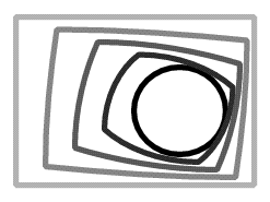
The picture below shows the result of a simple 3 step blend between a circle placed inside a square. You can see that both the shape and the colour alter with each step.
Once the blend is formed and visible you can experiment by trying differing settings on the number of steps control on the info bar. You do not have to drag out the blend again each time. As blends are dynamic, they instantly reflect such edits. Similarly, try editing the parent objects. You will find that all the blend steps change to reflect the edits to their 'parents'.
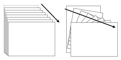
Between almost any pair of parent objects many different blends are possible. ArtWorks allows you to vary the form of the blend. When you drag from your start object to your end object, ArtWorks takes into account the control point nearest the pointer in each object. These control points are deemed to correspond with each other and corresponding control points on the intermediate objects in the blend will lie along the hypothetical line between the two. The figure below illustrates this. It shows two blends obtained using identical pairs of rectangular objects. On the left, the drag was from the top right corner to the top right corner, so all the intermediate rectangles are 'straight'; only the aspect ratio has changed. On the right, the drag was from the top left corner to the top right corner. Consequently the blend makes it look as though the rectangles have been rotated in successive stages through 45 degrees.
In general blends like that on the right (where different parts of the blend objects are visible) are less useful. You could not use a blend like this one to represent a highlight or shading! As a rule, if you wish to create a blend that will realistically simulate a highlight or a shadow, you should make the parent objects as similar in shape (and number of points) as possible and you should ensure that you drag between corresponding points.
Another variation is provided by the '1 to 1 ' button in the info bar. You can only select this if the objects being blended have the same number of control points. When selected, it prevents ArtWorks from adding or subtracting control points and so helps to keep the blend tidy. Technically, when you have created a blend from two shapes, what you have is one 'blend object'. When selected, the control points in both parent objects will be visible and both can still be edited. Indeed, both can be used as 'parents' in other blends. This is a very valuable feature in representing detail having combinations of highlight and shading. For example, the astonishingly realistic water droplets in the well-known drawing of the apple were produced using combinations of blends.
You can apply the Make shapes menu option to a blend to convert it to discrete shapes; it will occupy more memory and will no longer respond to changes to the parent objects. ArtWorks performs this conversion automatically on any blend objects in a document that is exported as a Draw file. You may also need to reduce the number of blend steps before producing PostScript files, otherwise these may become inconveniently long (several megabytes sometimes).
RISCWorld