|
|
Graphing Spectra - A Student Worksheet
Part I.
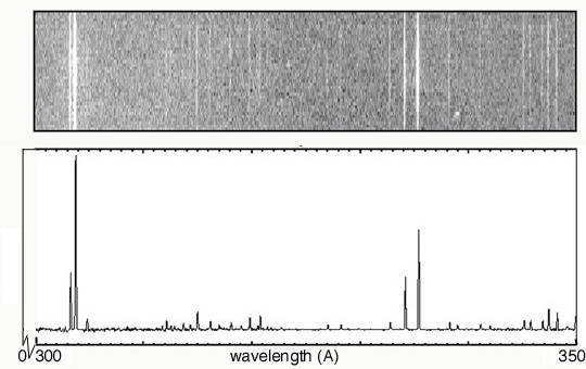
Below are two examples of the same emission spectrum. The first example
is
without any "quantitative" data, while the second shows light energy as a
function of wavelength. The x-axis has the same units (wavelength, in
this
case, although frequency or energy could also be used) in both cases, and
it runs from 300 to 350 Angstroms. In your group, discuss the following
questions, then write individual answers on paper.
- As you move along the wavelength axis from 300 Angstroms to 350
Angstroms, what will happen to the amount of energy emitted by the
source?
Explain why.
- In the second spectrum, explain why the emission lines are at
different heights.
- In order for bottom plot to include more
"quantitative" data, what variable should go along the y axis?
- How is this variable illustrated in both graphs?
- Describe how the second spectrum would
look if it was a function of energy (instead of wavelength).
- What types of information are gathered from both spectra?
|
Solar UV Spectra
|