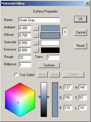
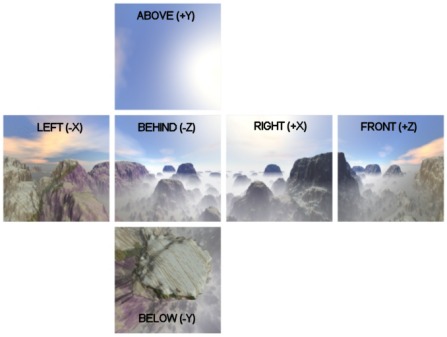
10 Materials


Every visible surface has a material. By changing their various properties, you set the look of your figures and objects. Materials provide a richness and detail that adds considerably to the realism of a scene. You can make them shiny, dull, transparent, and opaque. You can texture a surface with an image used as its material's color, or to lighten or darken its basic color. You can also use a texture to control the transparency.
You can't really design the look of a scene with materials alone. Its ultimate appearance also depends heavily on the lighting you choose.

Material Editor

You use the basic material editor is whenever you need to design the color, texture, transparency, and other visual properties of an object's appearance. You open the material editor either by double clicking on a material in the material toolbar, or from a specific object's editor dialog. An example is shown below.


Some of the entries should be fairly obvious to most of you. Others can probably use a bit of explanation, so there's a short description of them in the following table. You can see how each property affects the look of the sample material shown in the ball below. Its parameters are all set to the defaults shown above with just a single value changed for each one. Ambient and diffuse are not locked together.  The base colors of the material shown to the right are:

Ambient: R=0, G=92, B=224:

Diffuse: R=0, G=255, B=128:

Specular: R=255, G=255, B=255:

Emissive: R=255, G=0, B=0:


Name
The name of the material. This field can be left as the default "material00", but it is a good idea to give each material a useful name.
Ambient The ambient component is the color of a material in a shadow. Normally you want it to be the same as the diffuse component. In fact this is so common that there is a button that will lock all ambient and diffuse values together so you don't have update them both to make changes.

The number to the left is how much ambient component adds to the final color. The normal range for the ambient weight is from 0.0 to 1.0. 
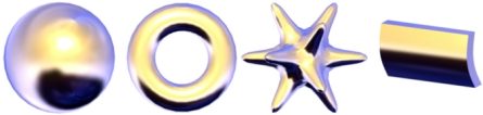
The row of materials below have an ambient value ranging from 0 on the left to 1 on the right:


Diffuse
The diffuse component is what you would normally call the “color” of a material. It is combined with the amount and color of light illuminating your model and added to the final color.

The normal range for the diffuse weight is from 0.0 to 1.0. These samples vary the diffuse value from 0 to 1:


Specular
The specular component is part of the “shininess” contribution. You normally set this color to white to reflect the light's color. For metallic surfaces you should change the color to something closer to the diffuse color.

The normal range for the specular weight is 0.0 to 1.0. These samples vary the specular value from 0 to 1:


Emissive
The emissive component represents light generated by a material. It is not affected by lighting. You use this for things like lava and eyes that glow in the dark.

The normal range for the emissive weight is 0.0 to 1.0. The default value is 0.0 to prevent glowing. These samples vary the emissive value from 0 to 1:


Rough The roughness of the material. A higher value makes the surface look shinier. It is tempered by the value of the Specular component. Values range from 1.0 (not at all shiny) to 100. These samples vary the value from 2 to 64 by multiples of 2, and have the specular weight increased from 0.2 to 0.6 to show the changes better:


Trans*
The transparency of the material. Actually, it's the opaqueness of the material. 1.0 is fully visible, while 0.0 is completely transparent.
Brilliance*
The brilliance factor. This setting changes the appearance of the diffuse component. Normal objects have a value of 1.0. If you increase it by a small amount to 1.5 or 2.0, the material takes on a sort of metallic sheen, or for brighter colors, a deeper, richer appearance. A value less that one flattens the look of the material. Here the value of brilliance changes from 0 to 2.5 in steps of 0.5:


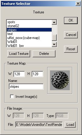
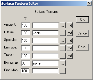
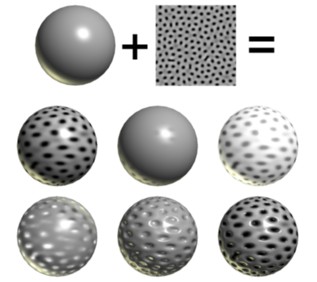
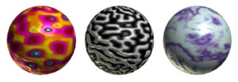
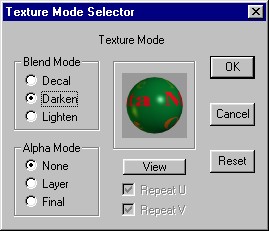
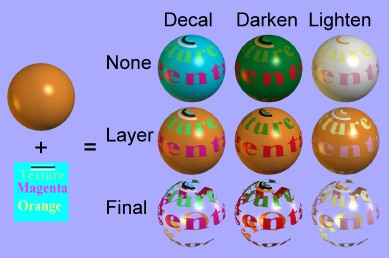
The texture button opens the general texture dialog for this material. You may use several textures on a single material, changing the diffuse color, transparency, emissive color, and more. You can also apply a bump map texture. See the Texture Dialog section for more details.
Two Sided
You can select this item, to give the material a different material for it front and back sized. The front and back buttons will show which side's properties are currently showing.

This button deletes a material. You will be notified if it is currently in use and given a chance to cancel the delete.

These four color patches show the current value for the ambient, diffuse, specular, and emissive colors. The currently active one is outlined and the lower part of the window shows its numeric value. You can change the active color to a different patch by clicking on it.

These buttons show you if a particular component uses a texture. If the button has a “T” on it then it uses a texture. If not then it doesn't. You can click on a button to set a particular texture.
*Note: Transparency and some more advanced texture modes may only affects rendered images. Its final effect can only be partially shown in interactive sessions. Some graphics cards can show more than others, depending on which features they support. You should render a test image to see the final look of your models.

A few simple material images and their settings are shown in the table below. Notice the values for Pearl are out of the normal range. The ambient weight is more than 1, the diffuse is negative (which means lights actually darken a surface), and the specular value is way more than 1. Donut be afraid to experiment!

Sample
Material
Ambient
Diffuse
Specular
Rough.
Brill.
R G B

Copper
0.3
0.7
0.6
6
1.8
228
123
87

Rubber
0.3
0.7
0.0
N/A
1
3
139
251

Brass
0.3
0.7
0.7
8
2
228
187
34

Glass
0.3
0.7
0.7
32
1
199
227
208

Plastic
0.3
0.9
0.9
32
1
0
19
252

Pearl 1.5
-0.5
2.0
99
1
255
138
138

Texture Selector

The texture selector allows you to load, view, and manage the textures that you use in your animations. You open this dialog from within the material editor with one of the 4 buttons: and . An example is shown below:

You can change the name of the texture in the Name field of the Texture Map area and can view the size of the image Anim8or uses to store it.
You can also invert the image in the texture by checking the Invert Image(s) check box.
The File Image area gives information about the file containing the texture. The Type field can be either RGB for normal images, or RGBA for .gif files with a transparent color. If your texture is type RGBA then you have more flexibility in what you can do with it.

Advanced Textures

You can use textures for more than simple diffuse color maps. For example, you can map the transparency or shininess of a material to a texture. You can also use multiple textures on a material. The most basic textures can be selected directly from the material editor but you need the more advanced Surface Texture Editor for more exotic uses. You invoke this dialog using the  button in the material editor dialog:
 
The example shows a normal diffuse texture named “spots” and a bump map texture named “noise”. The net effect is a bump mapped, spotty material. The following image shows some of the surfaces that you can make with a simple gray color and a single spotted texture:

The top row shows the basic gray color and simple spotted texture used for all the spheres. The first sphere on the middle row simply uses the texture as the diffuse color. The next sphere uses it as the specular map. Notice the faint spots where the surface isn't shiny. The last has an emissive texture. Note that the emissive weight must be set to something other than 0.0.
The bottom row shows the same texture used as a transparency map, and a bump map. In the final sphere as both the diffuse color and bump map. You can often use the same texture in this was to create a bump map. It doesn't always work, especially when there are strong shadows on the image. Here are some more examples where it works:

Environment Map textures are described next.

Environment Maps

An Environment Map texture is a representation of the surrounding world.  You use them to simulate shiny materials like chrome, and to show general reflections on an objects like the square shape of a window reflecting on a cue ball.  Environment maps are not actual reflections of the rest of a scene.  Instead they are intended to give the illusion that they are reflecting the scene.

For example, the image to the left uses an environment map of a view of mountains.  The sphere appears to be made of chrome and reflects a view of the mountains and a chrome  sphere would.  It does not reflect either the checkerboard ground or the nearby 3D letters.  These features are not present in the environment map so they aren't visible in the apparent "reflection".
The best way for you to create an environment map material is to use a cube map texture.  These textures are composed of six different images that form the sides of a cube.  Each one represents the view of the environment around  your scene in a different direction.  Think of it as if you are inside of a large cube.  The six images used in the example above are shown below.

The directions are relative to the an object within the scene when the viewer looking into the front modeling view.  So behind (-Z) means behind the object, in the -Z direction.
You add cube map textures by clicking on the button on the Env. Map row of the Surface Textures dialog.  This brings up the Texture Selector dialog in Environment Map mode.  There you click on the usual Load Texture  button but instead of prompting you for a single file you are asked for six files:

There are a few things that you need to know about cube maps:
  • The standard cube map format has the images flipped top-to-bottom.  So if you find a set of cube map images that appear upside down don't worry.  They will work just fine.  However you can use a right side up set as well.  Just check the "Invert Image(s)" box in the Texture Selector dialog and they will be flipped for you.
  • Cube map images should be square.  Rectangular images will not work properly, particularly in the working views.
  • All six faces should be the same size.  If any of the faces are a different size the texture won't draw properly. 
  • Cube maps require a lot of memory.  Use smaller images if you can get away with it.
  • As with all textures, you will get the best results if your images are a power of two in width and height.  So make your maps 256 by 256, 128 by 128, etc. if you can.
Environment Map textures are always added to any the base material color.  Thus you would normally set the color of a simple Chrome material to black if you are using an environment map.  Of course you can experiment with other settings too, to see what they will make.  Here are some other environment map textures:

You can also use a single image as an environment map.  In this form the image is used as a latitude-longitude map of the environment.  You can often paint a simple image to use for such a map.  The one at the right makes a reasonable chrome reflection for an illustration.

Note: longitude-latitude environment maps are not rendered in the working views.


Texture Mode

You can blend textures with the base color of a material in several ways. Textures with an alpha channel are even more versatile. You set the way textures behave in the texture mode dialog, which is reached with the  mode button in the material editor.

You use the blend mode to control how the color of the texture changes the base material color. Decal simply replaces the color with the texture. Darken multiplies the value of each color component which tends to darken the image. Lighten adds the two values which can only make the image brighter
If the texture has an alpha channel (such as a transparent .gif has) they you can use it in three different ways by setting the alpha mode. None simply ignores the alpha. Layer uses the alpha channel to blend between the texture's color and the material's color. Final uses the alpha channel as the material's final transparency value.
This is an example of what can be done with one texture and one surface color. The cyan (light blue) color of the texture is the transparent color in a .gif file:

Note: These types of materials will not always look like this in your interactive viewports. Different graphics cards have different capabilities. If you want to be sure what your model will look like it's best to occasionally make a preview image.
Some aspects of a texture mode are only meaningful for certain texture uses. For example bump-maps donut use an alpha channel so the Alpha Mode settings don't have any effect on them.

This page was last updated on August 10, 2003
Copyright 2003 R. Steven Glanville