The permanent URL for this article is: http://db.tidbits.com/article/9329
Include images: Off
Hands on with Kindle
The day after writing about Kindle for TidBITS (see "Comparing Amazon's Kindle to the iPhone and Sony Reader [1]", 2007-11-19), I received a unit - bought and paid for by yours truly, by the way, as Amazon.com apparently didn't seed many units to the press, and didn't respond to my request for a review model for The Seattle Times.
I wrote up my observations [2] on The Seattle Times's blog, and will have a full review in the paper a week from Saturday. I didn't list every kudo or complaint in the blog - nor will I have room in the upcoming review - but as a type designer and graphic designer, I'll point out that the Kindle supports one font, one layout, and multiple sizes. The font is fine. Quite legible. The ability to resize, well implemented and useful for varying conditions.
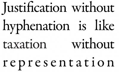
The layout? Not so great. Forced justification with apparently no hyphenation dictionary or hinting in the format. That's a huge failure. On a private list, I noted that, "Justification without hyphenation is like taxation without representation." That is, the poor letters and word groupings have no input into how they're displayed, which makes for a poor republic.
Adam Engst thought this would make a good T-shirt. And so I made one at Cafe Press [4].
[1]: http://db.tidbits.com/article/9327
[2]: http://blog.seattletimes.nwsource.com/techtracks/archives/2007/11/the_kindle_a_reviewers_first_impressions_1.html
[3]: http://www.tidbits.com/resources/2007-11/taxation_sm.jpg
[4]: http://www.cafepress.com/unpund