


SiteWriter
The SiteWriter manual
| Introduction to SiteWriter | ![[Top]](img/top.gif) |
SiteWriter is a complete web site authoring tool for RiscOS. Instead of assisting you to 'write' HTML, SiteWriter allows you to 'draw' your pages in a similar way to DTP programs. Place images, text, forms and tables anywhere on a page. Drag and drop of everything from links to colours. When you are finished, SiteWriter will prepare the entire site for you in HTML. And you can be sure that anyone using a web browser supporting tables can view your pages as you intended.
SiteWriter is designed to assist in the creation of complex graphical pages, and to allow easy modification of such pages. It appeals to designers of both small and medium sized sites.
SiteWriter is also a powerful RiscOS application, supported by Dansoft's own Interface engine. This is very similar to the normal RiscOS interface, with some enhancements.
| What you should know | |
This manual assumes that you posess a fair knowledge. It is assumed that you are reasonably familiar with the internet, and that you are familiar with RiscOS and computing in general.
In order to use Site Writer effectively, you will need a basic knowledge of the internet; in particular the World Wide Web . However you need not know anything about HTML.
For text editing, it is assumed you are familiar with word-processing; for example, we assume you know how to make text bold (i.e. you just select thet text and click B ).
Generally, if you have experience with browsing the web, then you probably know enough to get started. Even better, if you have written your own web pages, either by hand or through other software, you should progress rapidly.
For some topics, such as using forms , it is best that you are already aware of how these are implemented as the SiteWriter manual will only explain how to implement such forms. There is a vast quantity of existing information on the net on such topics.
A good place to learn about web design, is www.whatis.com.
| About this Manual | |
This manual is hypertext based. Any underlined text can be clicked on, to jump to the linked topic.
| Getting Help | |
While using SiteWriter, you may wonder what a particular icon does. If you move the pointer to that icon, and wait for a short period, it is likely that a tooltip will appear.
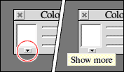
A tooltip is illustrated above: You may wonder what the small icon does (circled in red). A tooltip is shown after a short delay when the pointer is moved to that icon.
If you do not like tooltips, and would prefer to use the standard Acorn help (or similar help such as Bubble Help ) then you are welcome to do so. See the Preferences section.
| The User Interface | |
Before using SiteWriter, familiarise yourself with Colour Management .
Window Title Bars
Some windows have small title bars as shown (right). Often these are toolbar windows; they are designed to stay in front of the main window you are working on. There are extra buttons available on some toolbar windows.
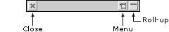
The Menu button opens a menu which is associated with the toolbar in some way.
The Roll-up button reduces the size of the toolbar so that only its title bar is showing. Clicking the Roll-up button again will open the toolbar back to its original size. The Roll-up feature is very useful, as you can have several toolbars open ready for use, and the screen is not cluttered by their contents. Double-clicking on a titlebar has the same effect.
Window Controls
Controls are the interactive components of a window, such as buttons, editable text fields, radio and option controls. SiteWriter uses several controls which you may not be familiar with, and these are explained below.
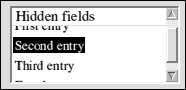
Shown above is a List Box control. This is simply a list of items; one of which may be selected. The list is scrollable if there are too many items to fit in the box.
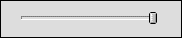
Shown above is a Slider control. This is used for selecting a single value from a range of values. Simply drag the little handle to a different position on the slider.
Shown above is a Dropmenu control. This is similar to a list box, but the different items are listed in a menu which appears when you click on the control. A dropmenu is shown above; its menu is shown on the right.
Shown above is a Tab control. Each of the tabs shows a different selection of options below it. To view the options associated with a tab, just click it.
| Common icons - what do they do? | |
SiteWriter provides some shortcut icons, which, when clicked, perform common actions, such as opening things for you. These are as follows:
 Open Web Directory
Opens the Web Directory (see the Assets section to learn about the Web Directory).
 Open Asset Manager
Opens the Asset Manager (see the Assets section to learn about Assets).
 Open Colour Manager
Opens the Colour Manager (see the Colour Management section to learn about this).
| Introduction to Site Management | |
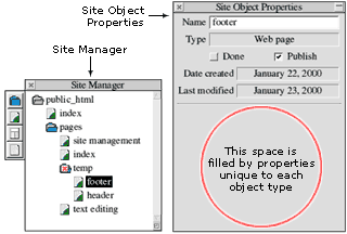
The Site Manager is basically a file manager. It organises those parts of your site which users will interact with directly (such as the individual web pages). Objects shown in the Site Manager are referred to as Site Objects .
As illustrated above, site management involves two windows. The Site Manager displays the objects of your site; this is accompanied by the Site Object Properties window, which allows you to edit the properties of the selected object.
Follow the links below for more information.
 See also:
Site Manager Details
Creating New Site Objects
Moving Site Objects
Linking to Site Objects
Site Object Properties
Site Object: Web Page
Site Object: HTML
Site Object: Frameset
Site Object: Folder
| Site Manager Details | |
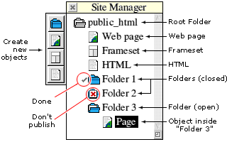
The Site Manager displays the objects of your site. The grey coloured folder at the top is the Root Folder ; it contains all site objects, which may be organised into sub-folders. The Root folder may not be deleted.
The objects within a folder are shown below it, with an indent. By double clicking on a folder it can be opened or closed, to reveal or hide its contents (if it contains no objects, it cannot be opened). Double clicking on a web page opens it in the Page Editor .
Objects with a tick beside them are Done ; indicating they are completed (this is merely informational, for your use). Objects with a red cross over then (Don't Publish) will not be published. These options can be set from the Site Object Properties window.
Site objects can be dragged away to form links, or they can be moved elsewhere in the Site Manager by dragging to a  Folder icon.
See also:
Introduction to Site Management
Creating New Site Objects
Moving Site Objects
Linking to Site Objects
Site Object Properties
Site Object: Web Page
Site Object: HTML
Site Object: Frameset
Site Object: Folder
Page Editing
| Site Object Properties | |
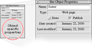
This window shows the properties for the currently selected site object. Every site object has the properties shown above, and some object types have additional properties; these fill the blank space (circled in red).
To alter an objects name, simply edit the Name field. Web pages, HTML objects, and Framesets are assumed to be published as html and will therefore be given the appropriate extension. For example, "index" is published as "index.html". To use an alternative extension, simply include it in the name, adding the extension after a period (for example "name.extension").
The Type field displays the site object type. There are four types:  Web Page ,
  HTML ,
  Frameset and Folder .
The Done checkbox allows you to set whether or not this object has been completed. When checked, a small tick will appear beside the icon of this object in the Site Manager . This is just information for your use.
The Publish checkbox allows you to set whether or not this object can be published. When un-checked, a small red cross will appear over the icon of this object in the Site Manager. This allows you to prevent an object from being published.
See also:
Introduction to Site Management
Site Object: Web Page
Site Object: HTML
Site Object: Frameset
Site Object: Folder
| Creating New Site Objects | |
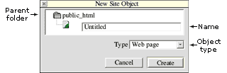
Site objects are created by clicking the appropriate icon on the Site Manager toolbar, or by selecting New from the Site Manager menu.
Shown above is the New Site Object window, which shows the parent folder in which this object will be created. Simply type a name, and select a object type, then click Create .
See also:
Introduction to Site Management
Site Manager Details
| Moving Site Objects | |
Site objects can be moved elsewhere in the Site Manager by dragging to a Folder icon. Only the Root Folder may not be moved.
See also:
Introduction to Site Management
Site Manager Details
Linking to Site Objects
| Linking to Site Objects | |
To link to a site object, simply drag that object to where you are linking from. For more specific details, read the information relating to where you are linking from.
If you begin dragging with the select mouse button (left), that object will be selected at the beginning of the drag. However if you start dragging with the adjust mouse button (right), the object will not be selected, but is still dragged. This is essential for linking to framesets.
See also:
Introduction to Site Management
Site Manager Details
Moving Site Objects
| Site Object: Web Page | |
Web Pages are probably the most common object of your site. They are the actual pages people will see when they visit your site. Web pages can be opened in the page editor, by double clicking on the a web page object in the Site Manager.
See also:
Introduction to Site Management
Site Manager Details
Site Object Properties
Site Object: HTML
Site Object: Frameset
Site Object: Folder
| Site Object: HTML | |
HTML objects are intended to contain HTML code you create yourself, although this is not a requirement (they need not contain HTML). They will be treated just like web pages, with the code already prepared by you.
To import your code, select an HTML site object in the Site Manager , type your code in a text editor, and save this to the blank icon in the Site Object Properties window.
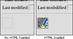
The Site Object Properties window is shown above. To the left is the blank icon; to the right it is shown after your code is loaded. Drag this icon back to a text editor to modify it, and save it back.
You could include any file here, not just HTML code. However, unless you give the object a name with an extension, SiteWriter will assume it is HTML and append the appropriate extension (for example, "test" would become "test.html" on your published site). The extension should take the form "name.ext". For example, if you were including a sound file in wav format, you could name it "sound.wav".
See also:
Introduction to Site Management
Site Manager Details
Site Object Properties
Site Object: Web Page
Site Object: Frameset
Site Object: Folder
| Site Object: Frameset | |
Framesets are used to show two seperate web pages of your published site, within a single browser window. For example, you may like to show a navigation bar down the left hand side, and use the rest of the browser window to display the actual content of your site.
Be cautious when using framesets. According to usability expert Jakob Nielsen, frames are one of the top 10 mistakes of web design. Refer to http://www.useit.com/alertbox/990502.html (1999).
Site Writer allows you to create framesets involving two frames. All the options are set from the Site Object Properties window:
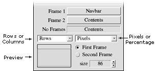
The first two fields Frame 1 and Frame 2 are the pages which form this frameset. Simply drag a site object to the field, ensuring that you drag with the adjust mouse button (right) so the frameset remains selected. In case a users browser does not support framesets, you can include a No Frames page which will be displayed instead.
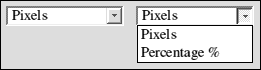
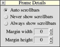
You can set whether the framset is organised horizontally ( rows ) or vertically ( columns ), and whether Pixels or Percentages are used for measurement purposes. In the case of Pixel measurements, you indicate whether you are specifying the size of the First or Second frame. A preview gives you an idea of the scale.
Click the Frame 1 and Frame 2 buttons to set options for each frame (shown above).
See also:
Introduction to Site Management
Site Manager Details
Site Object Properties
Site Object: Web Page
Site Object: HTML
Site Object: Folder
| Site Object: Folder | |
Folders perform the same role as directories; they are an organisational tool.
If you uncheck the Publish checkbox of a Folder in the Site Object Properties window, all sub-objects inside that folder will also not be published.
See also:
Introduction to Site Management
Site Manager Details
Site Object Properties
Site Object: Web Page
Site Object: HTML
Site Object: Frameset
| Introduction to Assets | |
Assets provide an interface between your site in SiteWriter, and the parts of your site outside SiteWriter.
Your site in SiteWriter consists of what you can see in the Site Manager: Folders, Pages, Framesets and HTML objects.
Your site outside SiteWriter includes images and files, and links to email addresses, websites, newsgroups etc. SiteWriter essentially knows of these external components, but has no direct control over them. For example, your site may use a particular image, but if you delete that image, SiteWriter will no longer be able to use it, although SiteWriter will remember it was there because it has an asset to represent that image.
Assets are basically a layer between SiteWriter and those external components. An Asset exists for each image, file, and external link used in your site. To view these assets, open the Asset Manager from the view menu.
An asset could be considered to be something tangible which SiteWriter can use to represent something which is essentially unknown.
See also:
The Asset Manager
Creating Assets
Editing Assets
The Web Directory
| The Asset Manager | |
The Asset Manager lists all assets of your site. You can add, edit and delete assets. The asset manager can be opened from the view sub-menu on the iconbar menu.
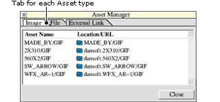
A tab exists for each asset type. To view the assets of each type, click on one of the tabs: Image , File or External link .
You create assets yourself. Or in the case of images, an asset will be created automatically when you place an image on a web page. Only a single asset exists for each image, therefore if you have several copies of an image on a page, only one asset will exist. SiteWriter also remembers if an image or file is in the Web Directory , and if so this icon  is shown beside the location.
The Asset Manager has the function of allowing you to view, create , edit and delete assets. When an asset is deleted, all links to it are removed. Deleting an asset can not be undone.
See also:
Introduction to Assets
Creating Assets
Editing Assets
The Web Directory
| Creating Assets | |
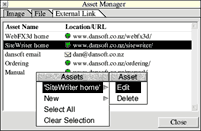
To create an asset, open the Asset Manager Menu by clicking menu over the Asset Manager, open the New sub-menu, and select the type of asset you wish to create. The asset will then be created, and opened for editing. Click here to find out about Editing Assets .
See also:
Introduction to Assets
The Asset Manager
Editing Assets
The Web Directory
| Editing Assets | |
Image and File assets are very similar, because they represent actual files on your hard disc. External link assets are completely different because they link to URLs on the internet. To edit any asset, double click on it in the Asset Manager, and a window will pop up (shown below).
Editing Image and File assets:
Double click the asset in the Asset Manager, and a window will open as shown below:
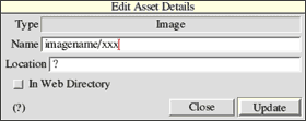
The asset Name is the name of the image or file as part of the published web site. Therefore, for image assets, an appropriate extension should be included (such as 'image/gif' instead of 'image'). The Location is a RiscOS pathname to where the image or file exists on your hard drive. This can be either a full pathname, such as ADFS::4.$.web.pic/gif, or a relative pathname for files inside the Web Directory. Therefore if your Web Directory was ADFS::4.$.webdir then a image inside that directory would have the relative name pic/gif and the In Web Directory checkbox would be ticked. For images, note that the width and height in pixels is shown at the bottom left or (?) if the dimensions could not be found.
The best procedure for creating image assets, is to let SiteWriter create them automatically whenever you use images in pages. Make sure your image files are named with an extension ("/gif" or "/jpg"). If you create the asset yourself, drop the actual file on the Location field, and when you click Update SiteWriter will decide if it is in the Web Directory.
Editing External Link assets:
Double click the asset in the Asset Manager, and a window will open as shown below:
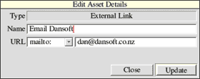
The asset Name is simply for you to identify this asset; use a descriptive name. You can link to any URL. Select the URL type from the list provided, and type the actual address in the space to the right. Only type the actual address, such as www.wherever instead of http://www.whatever.com, and dan@dansoft.co.nz instead of mailto:dan@dansoft.co.nz.
See also:
Introduction to Assets
The Asset Manager
Creating Assets
The Web Directory
| The Web Directory | |
Site Writer requires that any images and files you use in your site must exist on your hard drive at all times. To Assist with managing these files, you can place them in the Web Directory . This is simply a normal RiscOS directory, which is recognised as being special by Site Writer.
Normally, when an image asset (for example) is created, Site Writer remembers where on your hard drive the actual file is. The full pathname is remembered, so if the file Bkgrnd was in your root directory, its location is recorded as ADFS::IDEDisc4.$.Bkgrnd . If you then moved this file, Site Writer will not know where it has moved to, and will therefore be unable to access it until:
(i) it is moved back, or
(ii) the asset is modified to reflect the new location of the file.
To get around this problem, you should put all images, and files, in the Web Directory . When files in the Web Directory are used, only their location within the web directory is remembered, not the complete pathname as before. Thus you can move the web directory around, if you have to, and all you must do is tell SiteWriter where you moved it to and SiteWriter will know where to find the images. This is especially useful if your web site will be used on another computer, as you simply copy images and files from your web directory to the other web directory.
Because you will need to open your web directory often, there is a special button in Site Writer which will open it for you (a shortcut). It's a good idea to have a separate directory within the web directory for each site you create. Another directory could be created for common resources, such as background images etc. The actual directory structure you choose for the web directory is in no way related to the structure of the resulting web site.
See also:
Introduction to Assets
The Asset Manager
| Introduction to Page Editing | |
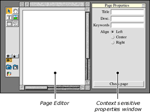
The Page Editor is opened by double-clicking on a web page in the Site Manager . The editor window has a toolbar, and a context-sensitive Properties window as shown below:
Topics:
Introduction to Page Editing
Page Editor Toolbar
Page Editor Properties Window
Page Scripting
Page Edtior Menu
Creating Elements
Moving Elements
Image Elements
Textbox Elements
Table Elements
Form Elements
Linking
Anchors
Element Scripting
Page Layout
Grid
Aligning elements
Preview
Text editing
Colour Management
| Page Editor Toolbar | |
The Page Editor Toolbar is shown below:

The Select tool allows you to select elements, by either clicking on them, or dragging a box over those you wish to select.
The Pan tool allows you to scroll the page by dragging it in the direction you wish to scroll (similar to using the window scroll bars).
The Textbox , Image , Table and Forms tools are for creating elements. The blank space below these may be filled with Context sensitive tools . To find out about these, see Creating Elements.
The buttons at the bottom of the toolbar are simply shortcuts. Note the Open Colours button opens the Colour Manager by clicking the select mouse button, but also opens the Colour Adjuster with an adjust mouse click.
| Page Editor Properties Window | |
The Page Editor Properties Window is context sensitive; its contents change according to what you have selected. If you have an element selected, follow one of the following links to learn about the options for that element type: Image , Text , Table , Form component .
When no elements are selected (or more than one element), general page properties can be set. The Page Editor Properties Window is shown below:
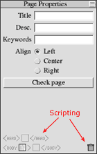
The first three fields are included with the final html web page, but are not actually shown in your web page.
The Title field is also shown in the titlebar of a web browser when your page is loaded. This is an important field which should be filled in with a brief description of the page contents.
The Desc. (description) field will be hidden inside the HTML of your page, and provides you with a way to describe your page to search engines or indexing software. Not every page needs a description, however it may be a good idea to describe a few key pages.
The Keywords field is similar to the Desc. field; it provides a mechanism for search engines to index your page.
With the Align you can tell a web browser where to align your page in the browser window.
Click Check page and SiteWriter will do a quick check to ensure your page is ready for publishing.
The icons at the bottom of the window are for Page Scripting; you may add your own HTML code to the page.
| Page Scripting | |
If you are familiar with HTML, you may add your own code for each page. If you are not familar with HTML, you may ignore this page without loss of continuity. When no elements are selected, the Properties window will show page scripting options:
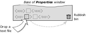
To the left are three square icons, each representing a snippet of HTML code (script). The first script will be inserted within the head section, the second script is inserted inside the body tag and the third script is inserted after the body tag.
When no script is present, the icon is  blank, when a script is loaded, the icon displays a
  text file.
Adding a script
Drag a file to the appropriate icon. The contents of that file will be copied, thus the actual file will no longer be required by SiteWriter. It is assumed that the script contains text only.
Editing a script
Drag the script icon to a text editor, edit the code, then save it back to the script icon by dragging. The process is basically to save the script from SiteWriter, then load the modified script back.
Removing a script
Drag the script to the Rubbish Bin .
| Page Editor Menu | |
The Page Editor Menu is opened by clicking the menu mouse button on a Page Editor window; it is shown below:

The menu entries are:
Page
 Layout Details: Set layout options for this page.
Anchors: Shows the anchors for this page.
Toolbar: Hides the toolbar.
Properties: Hides the properties window.
Element borders: shows or hides element borders.
Grid: Shows or hides the grid .
Select
Select all: Selects all elements on the page.
Clear: Un-selects selected elements.
Delete: Deletes selected elements.
Copy: Copies selected elements to the SiteWriter clipboard (not the global clipboard).
Paste: Pastes elements from the SiteWriter clipboard. Elements will be pasted to their original position, so you can copy elements from one page, and paste them to the same position on another page.
Table: Opens the Table Menu if a table element is selected.
Align
Opens the Align Window.
View
Opens the view sub-menu (allows you to get to the various components of your site, such as assets, styles, colours etc).
Publish
Preview: Opens the publish window, but only publishes a Preview of the page you are editing.
Publish: Opens the Publish Window .
| Creating Elements | |
Elements are created by selecting an appropriate tool from the toolbar, and dragging a box on the page. The element will be created to the size of the box, or in the case of forms, positioned at the top left corner of that box. The following element types can be created:
 Image
Image
GIF or JPEG images are supported. Additionally, hotspots can be created within an image, to allow linking from different parts of the image. The image creation tools are shown below:
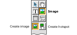
To create a hotspot , drag a box within an existing image element.
 Textbox
A box of text.
 Table
Table
A table with rows and columns, cells containing text and/or images.
 Forms
Forms
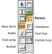
A form consists of a Form element and any number of additional Form Components . The form creation tools are shown below:
For more information, see:
Image Elements
Textbox Elements
Table Elements
Form Elements
| Moving Elements | |
Select the elements you wish to move. Then drag (by holding the select mouse button, and moving the pointer) to a new position.
Nudging
Alternatively, by pressing an arrow key, you can nudge the selected elements in a given direction. This is very useful for accurate positioning. To define the distance nudged (in pixels), see Preferences .
| Image Elements | |
To create an image, select the
Image tool, and drag a box on the page where you want an image to be. The top left corner of this box defines where the top left corner of the image will go. After dragging the box, a window will open as shown below:
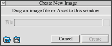
Drag an image file or asset to this window, then click Create and the image element will be created and selected. If you dropped an image file, an image asset will be created transparently.
When a single image element is selected, the Properties window will provide options relevant to this element type:
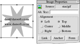
Shown above is a single image, and the associated Properties for this element type.
The Source field shows the name of the asset this element uses for its image. To use a different image, simply drop a different asset on this field. Or you can drop an image file and a new asset will be created transparently.
Alt. (alternative) text is a short description which may be displayed by a web browser in case the image can not be displayed for some reason. Do not use Alt. text for every image, use sparingly, only when a user would miss essential information should the image not be displayed.
Alignment: The border of your element can be bigger than the actual image. In this case, you may like to align the image to an edge of the border.
Link: Click this button, to link this image.
Anchor: Click this button to create an anchor at this image.
Form: Click this button to use this image as a Submit Button , as part of a form . The window below will be shown:

These options are the same as for a normal submit button (see the forms section for details). Check the Use checkbox to use this image element as a submit button, otherwise it will be treated as a normal image.

Hotspots allow you to link different parts of an image to different assets. For example, you could link the left half of an image to one asset, and the other half to a different asset. SiteWriter allows you to create rectangular hotspots.
To create a hotspot, select the Hotspot tool (see Creating Elements ), and drag a box within an existing image element. The hotspot will be created, and shown in the Properties window:
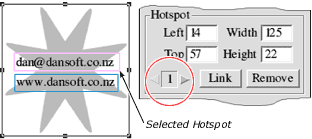
The illustration above shows an image element, containing two hotspots (indicated by coloured rectangles). Once created, the hotspots can only be re-positioned by typing different values in the Properties window. If hotspots exist for an image, one will always be selected, coloured pink; all other hotspots are coloured blue.
The index number of the selected hotspot is circled in red above. To select a different hotspot click the arrow 
 buttons.
The Left and Top values define the offset of the top left corner of the hotspot, from the top left corner of the image. For example, values of 0 and 0, would position the hotspot at the top left corner. Measurements in pixels.
Click Link to link the selected hotspot. Click Remove to remove the selected hotspot.
| Textbox elements | |
To create a textbox, select the
Textbox tool, and drag a box on the page where you require the textbox. After dragging the box, the textbox element will be created, and opened for editing . When a single textbox element is selected, the Properties window will provide options relevant to this element type:
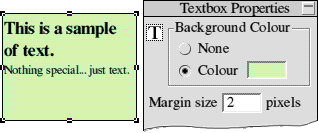
Shown above is an example textbox (left) and its properties.
Background Colour: Drop a colour to set the background of your textbox to that colour. Or select None for no colour (therefore the background colour/image will show through).
Margin size: A margin of a given size can exist between your text and the element border.
To edit the text, double-click the element. For more information, see Editing Text.
| Table Elements | |
To create a table, select the
Table tool , and drag a box on the page where you require the table. After dragging the box, a window will open:
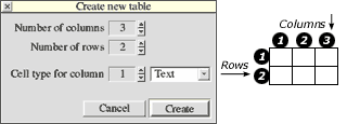
Set the number of Rows and Columns you require. Rows are horizontal, columns are vertical. You can also set the kind of cell each column will be filled with, to text or image . Click Create and the table will be created.
When a single table element is selected, the Properties window will provide options relevant to this element type:
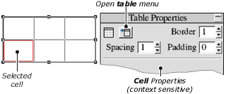
Shown above is an example table (left) and its properties. A cell is also selected, indicated by a red box. The top portion of the Properties window is shown; the lower portion is context sensitive (its contents depend on the kind of cell selected - image or text).
To select a different cell, click on it. The properties for that cell will be displayed in the lower portion of the Properties window.
Topics:
Table Properties
Table Menu
Table Cell: Image
Table Cell: Text
| Table Properties | |
The properties for a table are split into two parts. Firstly, the general properties for the table are shown at the top of the Properties window, shown below:
Secondly, each cell has its own properties, which are shown in the lower portion of the Properties window. There are two cell types: Image cells and Text cells.
The table properties are:
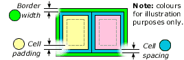
Border: a border around the table, in pixels.
Spacing: a border around each cell. Note that cells do not share a border, rather each cell has its own border. Therefore, with a spacing of 1, the border between two adjacent cells will be size 2.
Padding: a margin inside the cell. Essentially creates a gap between the cell contents, and its border.
| Table Menu | |
The Table Menu can be opened when a single table element is selected. It can be opened from the Select Menu as shown:
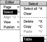
Alternatively, click on the  menu button in the Properties window:
The Table Menu is shown below:
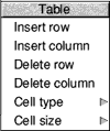
Insert Row: Create a new row after the row containing the selected cell.
Insert Column: Create a new column after the column containing the selected cell.
Delete Row: Delete the row containing the selected cell. The deleted cells are lost permenantly.
Delete Column: Delete the column containing the selected cell. The deleted cells are lost permenantly.
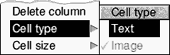
Cell type: Alter a cell type, to image or text. When a cell type is changed, its previous contents are lost permenantly.
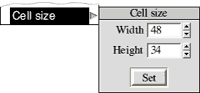
Cell size: Adjust the width and height of the selected cell (in pixels). It is the row height, and column width which will be altered, therefore all cells in the same row and column will have one of their dimensions altered also.
| Table Cell: Image | |
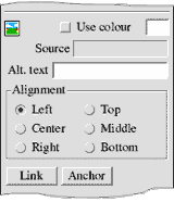
Shown above are the properties for an Image table cell.
Use colour defines a background colour for this cell. Drop a colour to this field to use it as a background. Or uncheck this option to allow the page background to show through.
The Source field shows the name of the asset this element uses for its image. To use a different image, simply drop a different asset on this field. Or you can drop an image file and a new asset will be created transparently.
Alt. (alternative) text is a short description which may be displayed by a web browser in case the image cannot be displayed for some reason. Do not use Alt. text for every image, use sparingly, only when a user would miss essential information should the image not be displayed.
Alignment: If the cell is bigger than the actual image. In this case, you may like to align the image to an edge of the cell.
Link: Click this button, to link this image.
Anchor: Click this button to create an anchor at this image.
| Table Cell: Text | |
To edit the text, double-click the cell. For more information, see Editing Text.
A Text table cell has the following properties:
Use colour defines a background colour for this cell. Drop a colour to this field to use it as a background. Or uncheck this option to allow the page background to show through.
| Form Elements | |
This guide does not explain web forms; this knowledge is assumed. On this page, we will briefly describe the process for creating forms using SiteWriter.
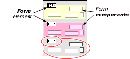
A form consists of a Form element and any number of additional Form Components:
The Form element represents a form tag in HTML, which defines what happens when the form is submitted . One of these Form elements must exist for each form on a page, they form part of the final page but are not visible as other elements are.
Multiple Forms. A page can contain any number of forms, however these must not exist beside each other (horizontally), and must have a Form element before any Form Components . Each component is associated with the first Form element above it, as illustrated below the circled elements are part of the same form:
Note that graphical submit buttons are supported, see Images .
To learn more about forms, see www.whatis.com , or view any good web design source.
| Linking | |
Many elements can be linked. When you click Link , the Link window will open as shown below:
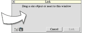
To create a link, drag whatever it is you wish to link to, to this window, then click the Link button. Links can be created to any object from the Site Manager, or to an Asset (for linking to an email address or URL).
If you are linking to a web page which contains Anchors , these will be listed as shown below:
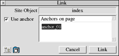
To link to a specific anchor, select it, then click Link . If you do not want to link to an anchor, make sure the Use anchor checkbox is un-checked.
| Anchors | |
An Anchor is something on a page which you can link to. It is hidden to anyone viewing your page. Anchors are only useful if you have a lengthy page which does not fit in a browser window. For example, if someone views a long page, it may be helpful to provide a link at the bottom of that page so they can jump back to the top. This is illustrated below:
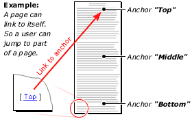
In this example, there are several anchors on a lengthy page. You can link to any one of them. At the bottom of the page, the text Top is linked to the top anchor on this page. So anyone viewing this page could click Top and jump to the top of the page.
You can assign an anchor to an Image element, to textbox elements and to table cells. To create the anchor, click the Anchor button, and the Anchors Window will open, showing anchors on the current page:
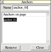
The anchor will be created, and given a name such as "Anchor_01". You should give the anchor a short and descriptive name. To remove an anchor, select it and click Remove .
If an anchor has already been assigned, by clicking Anchor , the Anchors window will open, and the existing anchor will be selected for you. Alternatively, you can open the Anchors window from the Page Editor Menu .
| Element Scripting | |
If you are familiar with HTML, you may add your own code for each element. If you are not familar with HTML, you may ignore this page without loss of continuity. When a single element is selected, the Properties window will show scripting options:
To the left are three square icons, each representing a snippet of HTML code (script). The first script will be inserted before the element tag, the second script is inserted inside the element tag and the third script is inserted after the element tag.
When no script is present, the icon is blank, when a script is loaded, the icon displays a text file.
Adding a script
Drag a file to the appropriate icon. The contents of that file will be copied, thus the actual file will no longer be required by SiteWriter. It is assumed that the script contains text only.
Editing a script
Drag the script icon to a text editor, edit the code, then save it back to the script icon by dragging. The process is basically to save the script from SiteWriter, then load the modified script back.
Removing a script
Drag the script to the Rubbish Bin .
| Layout details | |
The Layout Details window is opened from the Page Editor Menu and is shown below:
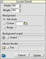
Width and Height:
The page dimensions in pixels.
Background:
There are three options relating to the background. Firstly, you can use the background defined by the Site Style, which will be either a colour or image.
Alternatively, you can define a colour or image for this page. Simply drop a colour onto the Colour field. Or drop an image file or asset on the Image field.
Background sound:
You may assign a sound, which will be played when your page is opened in a web browser. To use a background sound, you will need a sound file: create a File Asset and drag that to the Sound field.
Master Border:
To assign a Master Border , drag it to this field.
Click Update and your page will be updated with these settings. Click Cancel and these settings will be lost.
| Grid | |
The Grid Window is opened from the Page sub-menu, on the Page Editor Menu , and is shown below:

The Size of the grid may be set (in pixels). Check/un-check the View grid checkbox to show or hide the grid. Check/un-check the Grid lock checkbox to snap the mouse pointer to the grid. Click Set to use the new settings.
IMPORTANT
There is a complication to using the grid. The positioning of elements on a web page is unlike positioning objects in a drawing program. When two elements are positioned together, they may not share the same border . See the illustration below:
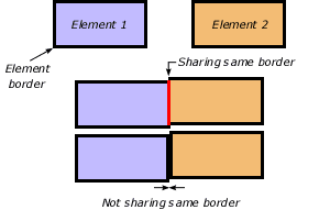
Shown above are two elements, with element borders showing. When next to eachother, there is a thicker line between them, showing that their borders are next to eachother, but not overlapping. However when overlapping, the border is much thinner.
With the grid lock turned on, its easy for elements to overlap, because two objects snap to the same grid point. If this is the case, turn the grid lock off, then reposition or resize the elements.
For your convenience, if the grid lock is on when an element is created, the width and height of that element will be reduced by one pixel automatically if possible. Therefore if you create several elements next to each other, they will not overlap in this way.
If you are unsure if elements are overlapping, click the Check Page button on the Properties window.
| Aligning Elements | |
Elements may be aligned horizontally and/or vertically. The Align Window is opened from the Page Editor Menu as shown below:
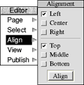
Check the alignment options you require, then click the Align button and all selected elements will be aligned as you require.
| Preview | |
See also: Publishing Preview. The Preview option is a special kind of Publishing .
Normally, when you publish, your entire site is prepared in HTML, including all images and directories. The Preview option allows you to publish only the page you are editing. No images or other pages are published.
The purpose of the Preview option, is simply to allow you to assess and modifications you have made to your page quickly, without having to re-publish the entire site! In addition, a web browser will automatically be called and the updated page loaded for you.
IMPORTANT
Please note that because only the single page is published, without anything else, it is assumed you have already published your site once, and that no additional images have been included. Therefore, if you make radical changes to a page, please Publish your entire site using the Publish option.
For additional information, see Publishing Preview.
| Text editing | |
When you double-click on a textbox, or text table cell, the Text Editor Toolbar will appear:
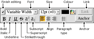
The text editor is similar to any word processor. You have a cursor which can be positioned before or after any character, by single clicking with the mouse. You can select several characters by clicking and dragging with the mouse over the text you wish to select.
Simply type text, select areas and click the buttons to turn on/off the various formating options. To begin a new paragraph, press  Return . To begin a new line, press
  shift-return . A space exists between paragraphs ; however no space exists when you create a new line .
 Paragraph alignment: Paragraphs can be aligned to the left, centre or right.
 Paragraph type: A paragraph can be bulleted. Subsequent bulleted paragraphs are placed immediately below with no space.
Link: Click to link the selected text.
Anchor: Click to create an anchor . Not to delete an anchor you may need to use the anchor window .
When you have finished, press the Escape key, or click this  button.
Note: Because your pages may be viewed on different systems, remember that differing fonts may be used for displaying your page. SiteWriter makes a good attempt to display your page as a browser would draw it. However you should always make your text area larger than the text within it, allowing for larger fonts.
| Colour Management | |
Colour handling is completely drag and drop. Simply drag a colour from one place to another.
There are three colour management tools:
The Colour Manager
The RGB Adjuster
The Colour Square
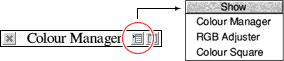
To view the Colour Manager , open the SiteWriter iconbar menu , open the view submenu, and click colours . To get to the other tools from the Colour Manager , click the menu icon on the window title bar (as shown above).
| Colour Manager | |
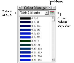
The Colour Manager allows you to store colours in named groups. For example, you could create a group named Orange and place shades of orange there. If your site uses a particular theme, you could create a group and store those colours there so you can quickly access them.
Click the menu mouse button for options to create, delete or rename a group, or delete the selected colour.
To add a colour, simply drag it to this window. To create new colours, use the colour adjuster . To delete a colour from a group, select it and press the delete key.
See also:
Colour Management
The RGB Adjuster
The Colour Square
| RGB Adjuster | |
The RGB Adjuster is for creating colours. See Colour Management to learn how to open the RGB Adjuster .
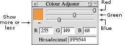
The basic window, consists of three sliders, and a colour. This can be extended by clicking on the small arrow below the colour (the illustration above shows the extended version).
Drag a colour to this window. Drag the sliders or type in values for the Red, Green and Blue components of this colour. Alternatively, type in the Hex value which is that used in HTML. When you are done, drag the colour away.
See also:
Colour Management
The Colour Manager
The Colour Square
| Colour Square | |
The Colour Square is for finding in between colours. See Colour Management to learn how to open the Colour Square .
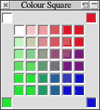
Simply drag a colour to one of the four corners, and the square will be adjusted to interpolate between the four corners. Drag any colour from this square.
See also:
Colour Management
The Colour Manager
The RGB Adjuster
| Introduction to Styles | |
Styles assist you to apply a uniform look to your site, by setting the default text colours and background colour/image. For example, you could create a style named 'white on blue' with a blue background and white text, then all pages on your site can be given this style. You could then alter the background from blue to green, and all your pages will be updated to reflect this.
Styles are managed by the Style Manager .
| The Style Manager | |
The Style Manager can be opened from the view sub-menu (on the iconbar menu), and is shown below:
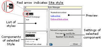
At the top left is a list of Styles , each identified by a name. These styles are not saved with your site, rather they are remembered by SiteWriter. Therefore you could use a single style on several sites. At the top of the Styles list is the Standard style which can not be modified.
The Site Style is indicated by the red arrow. This is the style which is applied to all pages of your site. When a site is first created, the Standard style will be applied. To use a different style on your site, select that style, open the menu and select Set site style .
At the bottom left is a list of Components of the selected style. To modify a component, select it and the various options associated with it will be shown to the right of the components list.
A preview is shown at the top right. The purpose of this is simply to give an idea of what the selected style looks like. Its function does not extend beyond this purpose.
See also:
Introduction to Styles
| Master Borders | |
Master Borders can be used to add a navigation bar to the side of each page, or for creating headers and footers. They work by attaching pages together. To understand this, consider the following illustration:
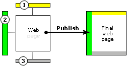
On the left are four individual web pages. The coloured pages (1,2 and 3) have been designed smaller than usual, and these form the Master Border . The white page is a ordinary web page containing your content. During publishing, the pages 1,2 and 3 will be attached to the white page, creating the final web page (shown right).
SiteWriter allows you to create several Master Borders . Each can have a web page attached to the left, right, top and bottom.
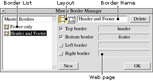
Shown above is the Master Border Manager (iconbar menu, view sub-menu). Down the left side is a list of master borders available. To edit the properties of a master border, select it by clicking on its name in the list.
There are two different ways the border can be combined (the layout icons in the picture above). If you utilise both side and top/bottom borders, this sets which pages are used for the corners. However if you are just using a header and footer, this has no effect.
To assign a page as part of a master border, simply drag it from the Site Manager to one of the four possible positions (top, bottom, left or right). The checkbox defines whether it will be used or not.
To create a new Master Border click New . To delete a Master Border, select it from the list, and click Delete. To assign a Master Border to a web page, simply drag its icon to the Layout Details window in the Page Editor. To see how your pages look with a master border, publish your site.
| Introduction to Publishing | |
Publishing is the process of creating your site in HTML, and preparing all the files required for your site to be viewed by a web browser.

Shown above is the structure of web sites created by SiteWriter. The root directory is simply a directory your site is published to, which can be anywhere with any name. This represents the public_html folder you see at the top of the Site Manager.
An assets sub-directory is created by SiteWriter. This is where all your images and files will be placed. These are based on your image and file assets.
All the other files and directories are your web-pages, framesets, HTML objects and folders from the Site Manager.
See also:
Publishing Your Site
Publishing Options
Publishing More Options
Publishing Preview
Publishing Tips
| Publishing your Site | |
To publish your site, open the Site Manager menu, select the Publish entry. The Publish Site window will open:
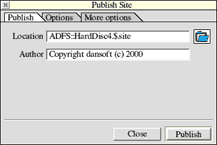
The Location field specifies a directory where your site will be published to; type a name in the field then drag the icon to a filer window. Alternatively you could type a complete path. The directory will be created if it does not exist.
The Author field is included in the HTML of all web pages (as a meta tag). If this field is empty, no author information will be included.
Click Publish and the site will be published to the set Location .
See also:
Introduction to Publishing
Publishing Options
Publishing More Options
Publishing Preview
Publishing Tips
| Publishing Options | |
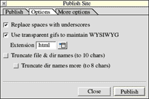
The publish Options tab is shown above. It contains the following fields:
Replace Spaces with Underscores. All file names which contain spaces will have the spaces replaced with the underscore character. This is to ensure your pages will work on all filing systems. For example, a page named "my page" would be renamed "my_page". (suggestion: tick this option)
Use transparent gifs to maintain WYSIWYG. Transparent images are placed on your page, which cannot be seen, but attempt to ensure your page looks the same on most web browsers. It helps to force the layout. (suggestion: tick this option)
Extension. What extension web page files will be given, .htm and .html are most acceptable.
Truncate file & dir names. All files and directory names are reduced in size. Handy for copying to a PC disc.
Truncate dir names more. All directory names are reduced in size even more. This may be an additional requirement for publishing to PC discs.
Note: If you are copying to a PC, it is a good idea not to truncate the file names, rather to publish to your hard disc with long names, then zip the files for copying to a PC. If you do not have long file name support, get the long filenames module.
See also:
Introduction to Publishing
Publishing Your Site
Publishing More Options
Publishing Preview
Publishing Tips
| Publishing More Options | |
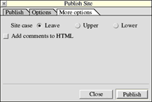
The publish More options tab is shown above. It contains the following fields:
Site case. You can choose to have all file names in uppercase, lowercase, or left as set in the Site and Asset Managers.
Add comments to HTML. When ticked, some comments are added to the HTML code. This is not important, and is an option which will be more useful for future versions of SiteWriter. (suggestion: untick this option)
See also:
Introduction to Publishing
Publishing Your Site
Publishing Options
Publishing Preview
Publishing Tips
| Publishing Preview | |
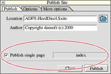
When editing a page, you have the option to Preview that page alone. If you do so, the Publish Site window will contain an additional field which is circled in red (above).
When ticked, only this page will be published, and it will subsequently be opened in a web browser for viewing. This allows you to quickly check any modification to a page, without updating the entire site.
Note, that only that page is published. Therefore, for the preview to work, you must have published your site at least once. If you add images to a page, you will need to publish again before the preview will work properly.
See also:
Introduction to Publishing
Publishing Your Site
Publishing Options
Publishing More Options
Publishing Tips
| Publishing Tips | |
If publishing Fails: If SiteWriter reports a message "unable to copy asset..." then simply try publishing a second time. Alternatively, you may have an asset, which refers to an image or file which does not exist. Therefore you must delete that asset, or tell it where the file is.
The RAM filing system does not appear to support the long filenames module. Therefore, when publishing to a RAM disc, filenames will be truncated.
We suggest you obtain the long filenames module if your computer does not support longer file names.
See also:
Introduction to Publishing
Publishing Your Site
Publishing Options
Publishing More Options
Publishing Preview
| Loading and Saving | |
Loading
Simply double click on a SiteWriter file in a filer window. SiteWriter will automatically be run and the site will be loaded. Alternatively, drop a SiteWriter file on the SiteWriter icon on the iconbar.
Saving
The save option can be found on the iconbar menu as shown below:
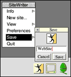
Type a filename, and drag the SiteWriter file icon to a filer window. Or, if you are editing an existing SiteWriter file, the full pathname will be showing, so click Save .
| Preferences | |
The Preferences window is opened from the iconbar menu, and is shown below:
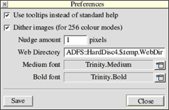
Use tooltips...
SiteWriter provides tooltips but you can choose to use Acorn standard help instead (such as the !help application or bubble help etc).
Dither images...
In 256 colour modes, gif images can be dithered (roughly) to give a fairer idea of colours. This takes a short while when images are loaded, so turning this off may speed up image loading if you are using SiteWriter in a 256 colour mode.
Nudge amount
In the Page Editor you can press the arrow keys to nudge selected items left/right/up/down. The number of pixels those items are moved can be set here.
Web Directory
This is the directory where you store your images and files. If you move your Web Directory , drag it to this field so that SiteWriter knows where you moved it to.
Medium and Bold font
The font used by SiteWriter in windows can be set here. Both bold and medium styles are required. Trinity works well.
Save
Click this button to save your preferences. If you do not save, these settings will not be remembered when SiteWriter is next run.
RISCWorld