


Rhapsody3
RISCWorld
Chapter 8
8.1 Stave heights and slot widths
The final appearance of your score on the printed page will be greatly improved by an appropriate choice of staves, stave heights, and slot widths. First staves. The default stave height is 12 units above and 12 units below the centre line. This is fine for most piano music but it is too far apart for vocal music (which rarely uses many leger lines). Use 10+10 instead. It is often a good idea to extend the upper half of the top stave (eg to accommodate tempo indications and to raise the height of 1st and 2nd time bar marks.) Similarly it is a good idea to extend the lower half of the bottom stave to lower the pedal lines.
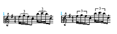
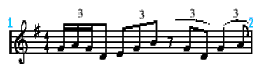
The vertical and horizontal extent of each slot is indicated by faint guide lines in the score. Whenever you insert or delete a symbol from a score, Rhapsody adjusts the slot width according to its own internal rules. For example, minims are generally given a wider slot than quavers etc. Sometimes these rules don't fit and you may wish to change either the space before the note or the space after it. This is most evident when writing triplets in one part against duplets in another. The following example shows such a case. The left section is as Rhapsody transcribes it whilst the right section has been altered. Look carefully and you will see that the first two slots on the altered section have been increased in width, while the third, fourth and fifth have been considerably reduced.
To alter the slot width between the note and the end of the slot use the W key to widen it and <Shift> W to reduce it. To alter the slot width between the note and the start of the slot use <Ctrl> W to widen and <Ctrl> <Shift> W narrow it.
8.2 Brackets and Braces
Bracket together ( [ ) staves which belong to the same family of instruments. Brace together ( Bracket together vocal parts but insert a blank stave between every part. This can be used for lyrics. This gives greater flexibility in positioning the text and also has the added benefit of preventing the bracketed staves from being joined together at every barline.
8.3 Packing and Tidying
Another reason for changing the usual slot widths is to pack more notes in to a bar - especially small notes used to indicate a fast run or glissando, or perhaps simply to make the whole score a bit shorter so that it will fit onto a more convenient number of pages. You can, of course, use a smaller scale when printing, or set compression on, (see page 86) but this doesn't have quite the same effect as reducing all the slot widths. To do this, first mark a block (see page 63), then choose the Pack option from the Block menu.
If you want to restore a block to its usual state, select Normal. Whenever a block is packed or unpacked, a number of other tidying operations are done at the same time. For example, rests are moved back to their default positions. This can sometimes be a nuisance but you can't please everybody all of the time!
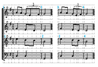
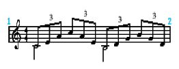
In the following example, the left bars are normal, the right bars are packed. (The guide lines have been included so that you can see the effect on the slot widths.)
Note that the process of packing and unpacking works out all the slot widths from scratch so any 'fine tuning' of triplets etc will be destroyed by either process.
The precise way in which Rhapsody calculates slot widths can be altered using !Config. Inside any slot, the space in front of the note is determined by the presence of things like accidentals and grace notes. The space after the note (called the 'backspace') is determined by the value of the note. Minims, for example, have larger backspaces than quavers. To alter the default backspaces used by the pack routine see page 110.
8.4 Headings
When you print out your score you will want to give it a title etc.. This is done by entering up to four headings in the Headings window:
When you print out your score, these four headings will appear in the following positions above your score:
The fonts used in the headings and elsewhere can be changed using the Print options window discussed below.
8.5 The Print options window
The printing of music is more of an art than a science and people have different preferences about the way certain things are done. Rhapsody is not designed to let you do everything just the way you want it, but it does provide a few alternatives for some of the more common differences in printing style. These are accessed through the Print options window off the main score menu. All five scores can have different print options and these, like the play options, are stored along with the score.
8.5a Time signatures
The first option is fairly obvious, allowing you to choose how 4/4 and 2/2 time signatures are printed.
8.5b Triplets (round/square)
Triplets can be printed in two different styles as follows:
8.5c Triplets (all/essential)
You can choose to suppress the printing of triplet slurs when notes are already beamed together in threes by selecting the essential option. The difference is shown below:
The first two triplets do not have slurs printed because, being beamed in threes, the slurs are unnecessary. The second two groups have slurs otherwise the meaning would be unclear. Note that the triplet 3 is printed in all cases.
Do not confuse this option with the Suppress triplets icon in the Main Panel window illustrated opposite (see page 41). This suppresses the printing of all triplet signs (including the 3 ) at any point in the score and is used when a score has so many triplets in it, it is pointless printing them all.
(Although the references above refer to triplets, all these options apply equally well to other groupings such as duplets, quintuplets etc.)
8.5d Shared notes
Normally, when writing in two parts on one stave, if both parts happen to be playing the same pitch (but not the same length), the two notes will be offset so that each part is distinct. If the notes are identical in both pitch and length, the note head is usually shared. Occasionally, it is useful for a crotchet or a minim to share a note head with a quaver. This happens most often with parts like the following:
There is no confusion here because the white note signifies a minim but the beamed tail clearly indicates a (triplet) quaver.
8.5e Pedal signs
Two alternatives are available. Take your choice.
8.5f Rehearsal marks
Using the symbol in the Main Panel window shown opposite, you can enter rehearsal marks. These can be printed either as numbers or as letters. If you opt for letters, all marks greater than 26 are printed as double letters - eg AA . Note however that the marks revert to numbers once mark 52 has been reached. The letter or number printed is calculated automatically so there is no problem about entering or deleting rehearsal marks.
8.6 Fonts
The last box in the window shows the fonts used.
Each score can have 5 associated fonts and point sizes. (A font is a particular type style and point size refers to the height of each character.) Because scores are almost invariably scaled in some way before they are printed, the point size shown in the box to the left of the font name is really an arbitrary figure and a value of 16 will suit most purposes. Clicking on this number with either Select or Adjust will alter the point size while clicking on the arrow to the right will bring up a menu of available fonts.
Four of the fonts have default uses. Font number 1 is used for the title (which is printed double this size), for the left and right subheadings and for rehearsal marks. Font number 2 is the normal text font but is also used for the stave names. Font number 3 is used for dynamics markings such as mp and ff and also the centred sub-title. Font number 4 is used for time signatures.
Font 5 is for your own use. It is suggested that you use a bold font such as font 4 (Trinity.Bold) for tempo changes such as rit. and allocate font 5 (Trinity.Medium.Italic) for other dynamics markings such as cresc. etc. Indications such as these are achieved by using the normal text entry icon. To use a font other than the default font prefix your text by a backslash and a number from 1-5. eg: \4rit. and \5cresc. will produce the desired effects by using Fonts 4 and 5 repectively. Titles and stave names can also be printed in different fonts using the same technique.
RISCWorld