


Using Text Areas in !Draw
Most RISC OS users will have used !Draw at one time or another, and there's little doubt that it's one of the most powerful tools available for the platform. The fact that it is given away with the OS means it is undervalued and under used and people tend to use something far more expensive and complex for tasks which can just as easily be done using !Draw.
Why use !Draw?
In the early days of the Archimedes computer, before there were any DTP programs for them, !Draw was far more widely used for this type of work, but now that almost everyone has a powerful DTP program like Impression or Ovation there is a natural tendency to use one of these for everything, and so employing !Draw for anything other than creating vector drawings has fallen out of favour. However, where you want a single page DTP-like document mixing text and graphics !Draw has some major advantages over any other RISC OS program.
- Every RISC OS computer, no matter what model, comes with a copy, so you know that everyone will be able to look at your document.
- The DrawFile format is very compact, much smaller than any DTP file.
- As long as you use standard fonts you know that everyone will see your document exactly as created.
These can be quite important if you want the document to be readable by other RISC OS users.
You might think that a better medium for this would be HTML. However, this has its own disadvantages. If you use graphics in an HTML document then the graphics files are external, which complicates things somewhat, and they will usually be bitmap graphics, which means they'll be a lot bigger. More importantly, with a DrawFile you know that everyone will see exactly the same layout as your original file, assuming that you've used universally available fonts. HTML is certainly not WYSIWYG. What you see with your browser and settings when creating the document may resemble only in general terms what the recipient sees.
Furthermore there's one use to which a DrawFile can be put that is almost unique. It can be used as a form when you want the recipient to be able to fill in some details and return it to you. You could use a plain text file for this, but it wouldn't look so nice. !Draw is ideal as it enables the recipient to fill in the required data and then either print the form and return it to you or transmit the file by electronic means. Whichever is used, you both know that the other will have an identical copy.
So, even in this age of HTML and complex DTP programs the humble DrawFile still has its uses, and with surprisingly little effort can be made to produce quite sophisticated single page documents mixing text and graphics.
Using text in !Draw
One aspect of !Draw which has always been under used is its ability to handle text. Almost everyone will have typed single lines of text into !Draw, but many don't realise that !Draw can deal with text in a much more sophisticated way, with many of the characteristics of a DTP program.
This is done using Text Areas. A text area is an 'object' similar in many respects to others in !Draw, it's just that instead of being a collection of lines or shapes or holding a graphic like a Spritefile or JPEG it contains text. It can be dragged about and have its size and shape altered just like other objects.
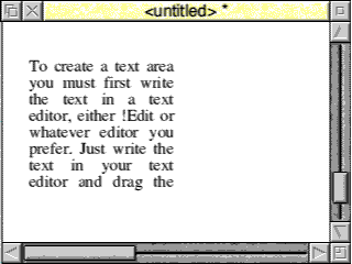
To create a text area you must first write the text in a text editor, either !Edit or whatever editor you prefer. Just write the text in your text editor and drag the textfile into a !Draw window, making sure that you press RETURN at the end so that the text ends with an end-of-line character, otherwise !Draw will give an error message and won't load the text.
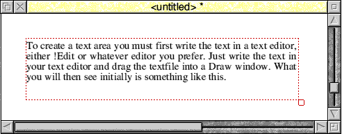
What you will then see initially is something like this.
This, as you can see, is the text of the preceding paragraph, but it appears truncated. This is because the initial default size of a text area is quite small, and the text is automatically formatted to fit. To see all of it click on it to select it and then drag the object's resize handle in the usual way. As you resize the object the text will automatically be reformatted to fit within it, like this.
You will notice that there is no Rotate handle on a text area object. This is one of the things you can't do with text areas. If you select the text area and then look at the Style sub menu you will see that the only items that can be selected are 'Text colour' and 'Background', and although the former works as expected the latter doesn't, but more about this later. You will also find that although text areas can be magnified, this merely alters the size of the frame the text appears in, it doesn't alter the width or height of the actual text. Unlike simple text objects you cannot alter the font or size of the text from the Style sub menu, these and many other features are all set and altered by commands embedded in the text. It is these embedded commands that are the most powerful feature of the text area.
The Header
All text that is to be placed in a text area should have a Header. This is a series of commands that define all the various styles that will be used, default line spacing, and various other parameters, including the number of columns. If, as in the example above, there is no header, then !Draw will add a default header of its own to set the style of the text. However, if you want to use many of the commands to alter text style etc. described later you must include a header.
The default 'style' for a text area is to use the font Trinity.Medium at 12 point with line spacing at 12 point, that is, single spaced, and fully justified, as you can see in both the examples above.
If you select the text area you will find that you can use 'Text area' from the Save sub-menu to save the text. If you load this text into your text editor you will see that !Draw has added a header to the text.
    \! 1
    \F 0 Trinity.Medium 12
    \F 1 Corpus.Medium 12
    \0\AD/\L12
Some versions of !Draw may split the final line into three separate commands, thus -
    \0
    \AD
    \L12
so don't worry if you see this, the meaning is exactly the same as you'll understand as we proceed.
I'll begin by describing what each of these commands mean as this will help you to understand the basic principles.
You will see that each line begins with a '\' (backslash) character. This character tells !Draw that what follows is a command, not just text. A command is terminated by either the end of a line or the '/' (forward slash) character. If you want to use an actual backslash character in your text then just type two together, '\\',
Commands don't have to be on a separate line from the text, though some will automatically cause a line break. However, with the header they obviously precede the text so are separate from it.
The first line is always the same. The first two characters, '\!', tell !Draw that this text is in a text area. The number which follows is the version number, and must be the figure '1'. This was presumably done so that if changes were ever made to the structure then later versions of !Draw would know whether to use the old or new format.
The next line defines a Font, hence the 'F', although it should more properly be called a style, and so that's how I shall refer to it. The 'F', which is the actually command, is followed by the number of the style being defined. This can be any number from 0 to 99. (Some versions of !Draw can support up to 256 styles, but it's probably best to stick with 0-99 which should be enough). The space between 'F' and the number is optional, but there must be a space after the number. After the style number is the precise name of the font to be used. For example, you can't just use Trinity, you would have to specify the full name of the font, eg. Trinity.Medium or Trinity.Bold. If you use a font that doesn't exist then !Draw will issue an error message and try to use the next available style it can match.
After the font name is another space and then the font size.
I'll describe the way styles are defined and used in more detail later.
You will see that in the default header a second style is defined using the monospaced font Corpus.Medium.
The final line contains three separate commands.
The first is a backslash followed by a zero. When the backslash is followed by just a number in this way it tells !Draw to display the text in that style number. In this case it's zero, which, as we know is Trinity.Medium 12 point. Therefore any text will be displayed in that style.
The next command consists of the letters 'AD'. The 'A' means Alignment and must be followed by one of four further letters, L, R, C or D.
- L means 'Left, and displays text left aligned with a ragged right margin
- R means 'Right' and displays text right aligned with a ragged left margin
- C means Centred, and displays each line centred in the frame
- D means Double alignment, and displays text 'stretched' to fit the frame, that is, fully justified.
The final command sets the line spacing. After the backslash the letter 'L' tells !Draw that this is a line spacing command and the 'L' is followed by the spacing in points. Normally this would be the same as the font size, but if you wanted widely spaced text you could use a higher number, or if you were trying to get the maximum amount of text into a small space you could make this 1 or even 2 less than the point size.
Before continuing you might like to try altering some of the values in the default header and seeing what the effects are. Try changing the point size, line spacing and even changing the font name used. You might also like to see what happens with the alternative alignment commands.
More on Fonts and Styles
You should understand that there's no mechanism for switching to Bold or Italic or altering the point size or proportions of text. Therefore for each change you may wish to make you must define a complete style. For example, if you had wanted to embolden some of the words in the text which was to be in style 0, that is, Trinity.Medium at 12 point, you would have to define a complete new style for that purpose, eg.
\F 1 Trinity.Bold 12
When you wanted a word or words in bold text you would then switch to this style, and then back to the non bold style afterwards.
Don't forget that if you change the font size you should normally also alter the line spacing. Line spacing changes take effect at the end of the line in which the command appears. It's important to remember this, as if, for example, you are going to change from a style which is 12 point to one which is 20 point you should put the 'L 20' command before the end of the last 12 point line or the 20 point line will be spaced at 12 point.
For example, if F0 is 12 point and F1 is 20 point -
  \0
  \L12
  This line is 12 point \L20
  \1 This line is 20 point. \L12
  \0 Back to 12 point again
When defining a style with the F command there is an additional parameter that can be used. If you follow the font point size with another number then the first number will define the font height and the second number the font width. This can be used to alter the width/height ratio of the font to give expanded or compressed text.
For example -
\F3 Homerton.Bold 16 24
would define a style where the characters were 12 points high but stretched horizontally to 24 points.
Underlining
I have explained how there is no direct equivalent to 'bold' and 'italic' effects in text areas, but you can underline text.
The \U command switches on underlining. There are two additional numerical parameters that must be supplied. In each case the number is 1/256th of the point size.
The first defines the position of the line. This number can be in the range -128 to 127. A position of '0' will place the line immediately below the letters. This means that descenders will be below the line, and it normally looks a bit messy. Even if you want your descenders to be below the line or if the text has no descenders, for example, if it's all capitals, a small gap always improves the appearance. A value of about -20 will give about the right minimum gap. If you want descenders to appear above the line then a value of about 70 should be OK. However, this might then be too close to the top of the following line of text, so you may have to increase the line spacing.
Giving the line position a positive value means it will be above the base of the letters, producing a 'strike through' effect. For normal mixed case text a value of about 70 should be OK, slightly more it the text is all upper case.
You can't use this to put a bar above letters because the highest value permitted is 127, which will be only around halfway up the text and about in line with the top of a lower case letter,.
The second parameter sets the width of the line. For a thin underline a value of about 20 should be OK, or around 30 for a thicker line. However, remember that the value is not absolute, but a fraction of the point size, which is normally fine in practice since the thickness of the underlining will be proportional to the size, and hence the thickness, of the letters.
There are two methods that can be used to turn underlining off. You can set the underline width to zero, that is
\U 0 0/
Or you can use
\U./
which is shorter. Note that is a full stop after the U.
Finally there must be a space between the two numeric parameters, but the space between the 'U' and the first number is optional.
Starting new lines
You will soon discover when you start putting text into text areas that your RETURNs at the end of lines are ignored and the text is just formatted to fit the frame.
For example, the following text -
  This is the first line
  This is the second
  This is the third
if dragged directly into !Draw might at first appear as -
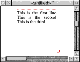
but this is only because the length of the lines just happens to fit the default box size. If you 'drag out' the box you will see something like this -

demonstrating that !Draw is actually ignoring the end of line characters.
In fact, !Draw treats a single RETURN as a space. So how do you start a new paragraph?
There are two ways of doing this.
- Use two RETURN characters.
- Use '\nl' or a '\' character immediately before the RETURN.
These two methods are not interchangeable. Using '\' will just force a line break and the new line will start immediately below the preceding line with the standard line spacing. Two RETURN characters are interpreted as 'start a new paragraph', and so a gap is inserted. By default this is 10 points, but it can be defined using the '\P' command.
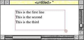
This was created using the text;
  \! 1
  \F 0 Trinity.Medium 12
  \AD
  \0
  \P 6
  This is the first line

  This is the second

  This is the third
Note the '\P 6' command to put a 6 point gap after every paragraph and the double-spaced lines to define the ends of the paragraphs.
Headings
As the line spacing is not altered when you change font size but must be done manually you may have realised from the previous section that if you want to use a bigger font, for example, as a heading, then you must alter the line spacing in the line before you change the font.
To do this you would use exactly the same techniques described in the previous section. Change to a larger line spacing before the end of the last line of the paragraph, making sure it's big enough to accommodate the larger font and leave a gap if required, then change back to a smaller line spacing to suit the text which will follow the heading.
Remember that if your text begins with a heading you must set the line spacing to at least the same as the point size used in the heading before the heading line otherwise the text will protrude above the bounding box of the text area. This isn't normally a problem but is best avoided.
Margins
It is possible to set the left and right margins for the text. As text will automatically flow to fill the bounding box the main reason for wanting to do this is where you want part of the text to be indented from one or both sides. The most common reason for this is where you have headings offset to the left of the body text. For example -
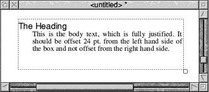
This was produced by the text;
  \! 1
  \F 0 Trinity.Medium 12
  \F 1 Homerton.Medium 14
  \0\AD/\L14
  \1/The Heading\
  \M 24 1
  \L12
  \0/This is the body text, which is fully justified. It should
  be offset 24 pt. from the left hand side of the box and not
  offset from the right hand side.
You can see that the heading (F1) is defined as Homerton.Medium in 14 pt. After the heading text the line spacing is reset to 12 pt. to match the body text and the margin is set to 24 pt. left and 1 pt. right, which causes the indentation of the body text. Before the next heading, after the end of the body text, you would need to reset the left margin again using;
\M 1 1/
Note that I've used an indent of 1 pt. and not 0 pt. This is because !Draw uses a 1pt. indent at both left and right sides by default to make sure that the text will always be slightly inside the bounding box, and so I've followed this. You could, of course, use 0 or any other figure if you prefer.
Multiple columns
Although these are called columns what this command actually does is to create a number of 'linked' text areas and text flows from one to the next. You can use it to produce multi-column pages, or you can use it to make text 'flow' around a picture, as shown below. Here there are three 'columns', but the three boxes are set so that the text appears to run around the picture.
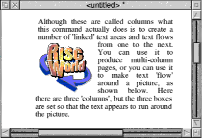
So how was this done?
The header for this text area consists of;
  \! 1
  \F 0 Trinity.Medium 12
  \0\AD/\L12
  \D3
This is followed by the text of the paragraph above.
The '\D' command creates the columns. The number following is the number of columns required. When you drag the text into !Draw it will appear as a single object with a single bounding box although the text will be split into three separate horizontal 'chunks'. This can be selected and dragged or resized as usual. To move or re-size each individual column just double-click on it and it will appear with its individual bounding box, which can be dragged and re-sized.
As you alter the size of an individual box the text will automatically 'flow' to or from the next box. Once you click outside an individual 'column' you can once again drag all three around together, and they remain grouped in this way.
As you might gather, in the example above the three 'columns' ware altered in this way so that the first section forms the wide part above the picture, the second is the narrow part beside the picture and the third is the wide part below the picture. If you subsequently make an alteration to the text you can drag it back to this text area and it will re-flow to fit the three boxes.
Colours
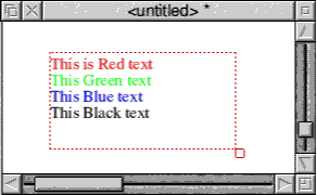
The two commands \C and \B are used to set the colour of the text and the background respectively. In each case the command takes three parameters which are the red, green and blue components and which can have a value of between 0 and 255.
For example -
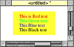
  \! 1
  \F 0 Trinity.Medium 12
  \AD
  \0
  \L12
  \C 255 0 0/This is Red text\
  \C 0 255 0/This Green text\
  \C 0 0 255/This Blue text\
  \C 0 0 0/This Black text\
would produce -
Adding the line -
\B 240 240 0/
before the first line of text should produce a yellow background, but instead all you would see is -
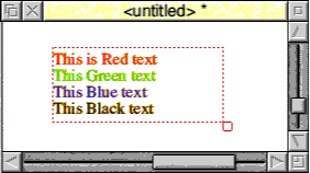
The difference between this and the previous example is that although there is no background colour the text has been anti-aliased so that it will display correctly against a yellow background. If you want an actual background you it is best to create a rectangle in !Draw filled with the correct colour, and place it behind the text area, like this.
Perhaps not terribly pretty but id does illustrate the principle.
Vertical movement
The 'V' command can be used to move the following text vertically up or down relative to the normal position of the line. It takes a single numeric parameter which is the amount of movement in points. To move upward use a positive value, to move downwards use a negative value.
The main reason for this is for superscripts or subscripts, but it could be used for other effects, for example -
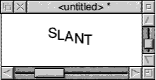
which was produced by -
  \! 1
  \F 0 Trinity.Medium 12
  \F 1 Homerton.Medium 16
  \AD/\L16
  \1
  S\V-2/L\V-2/A\V-2/N\V-2/T
Unfortunately there is no equivalent for horizontal movement and so no equivalent to TAB. The only way to force horizontal movement is either by the Margin command or by padding with spaces.
Hyphenation
Word processors can usually use hyphenation as a means of splitting long words at the end of a line when formatting text. !Draw can also do this, but you have to tell it which words it can split and where it can split them.
If you insert '\-' at a point in a long word where it can be split (that's the backslash character followed by a minus) then if necessary, !Draw will split the word at that point. If it is not split then the \- will not, of course, appear in the text.
Comments
If you want to put comments in the text then you can do this with the \; command, a backslash followed by a semi-colon. Anything after this and up to the next RETURN will then be treated as a comment and not displayed.
Finally
When the Archimedes computer first appeared people were amazed at how powerful !Draw was. You could not obtain anything on any other platform that was anywhere near as good without spending hundreds of pounds - and it came free with the computer!
We have now grown rather complacent and tend to use complex DTP program for the simplest things - probably because we now all have them. However, don't forget !Draw, and especially the little used text areas. It really is worth spending the time to learn to use them.
Command summary
This summarises the commands used in text areas, listed alphabetically.
- \A, set alignment followed by -
- L - left
- R - right
- C - centered
- D - double, fully justified
- L - left
- \B <red> <green> <blue> sets background colour
- \C <red> <green> <blue> sets text colour
- \D <num> number of columns
- \F <num> <font name> <font size> [font width] defines a font or 'style'
- \<num> switch to style number <num>
- \L <num> line spacing in points
- \M <left> <right> sets left and right margins in points
- \nl or just \ start a new line
- \P <num> sets paragraph spacing in points.
- \U <position> <thickness> underline. Parameters are in 1/256th of the point size of the text. <position> can be from +127 to -128. You can use \U.? to switch underlining off.
- positive number moves up, negative down.
- \; <text> used to insert a comment
- \\ literal backslash character
Don't forget that the text must begin with the line -
\! 1
Dave Holden