


DTP for beginners
Or How to Communicate a Simple Message on the Prevention of Alzheimer's with Nobilangelo Ceramalus
Once upon a time, long, long ago, the Apple world invented desktop publishing, saw its promulgation as part of the sacred Apple missionary drive, and stuck religiously to the term. But if you were a journalist hard-pressed for space, had no love for Apple, and possessed only two typing fingers to drive your beloved BBC B+, having to key 17 characters again and again in a longish article made you yearn for an abbreviation. You looked at the existing contraction of `word-processing' into WP, and `DTP' was born. Your Apple-fanatic colleagues wailed about the loss of part of their religion, but you ignored that and revelled in your small dash for freedom.
That was 1987, so long ago that it seems lost in Noah-like mists, but since I had never seen the abbreviation `DTP' anywhere in the computer media when I started using it in Computerworld NZ that year, I can lay some claim to being the first.
Which is one way of introducing an article on the basics of the desktop- publishing craft. Another would be to say that it does not matter a hoot whether your publishing effort is done with wooden type or a high-powered RISC OS computer, those on the receiving end are still people, with eyes and minds, so the basics are the same. Details differ, because you start with a power-plug, not a chisel and a lump of wood, but the aim is still to communicate. You must, therefore, be constantly aware of the reader. Fail in that and your DTP will fail.
If you are still reading, I have succeeded (so far) in communicating with you. The acid test is whether we both arrive at the last paragraph. The double-acid test is whether you will be glad you spent the time it took to get there, because you learnt something, and learnt it in a pleasing way.
DTP starts with one of the most worrying things in the world: a blank. A blank sheet of paper or a blank screen or a blank CD-ROM. A blank medium. The human mind reacts to it in much the same way it does to the cold stare of a poisonous snake--it goes blank.
All the wonderful ideas that you imagined would come, or that were dancing round your cot when you woke briefly at midnight, can freeze into immobile silence when that blank thing stares at you. Especially if you are unused to expressing yourself in writing, graphics and layout.
A simple way of getting past the blank is to take the simple approach. For example, imagine yourself having a conversation with someone about the subject of the task in front of you.
Say you wanted to design a simple A5 leaflet to tell people what they can do to avoid getting Alzheimer's Disease, using the latest in scientific findings (which are what will be used in this article). So imagine yourself telling someone about them, ticking them off on your fingers as you go. Then imagine yourself arranging your thoughts before you start, so that the digital ticking off starts with the most important and ends with the least important. Now you have started creating a basic structure.
You have also got yourself poised to enter the second level of the DTP task. The great American inventor, Thomas Alva Edison, said invention is, `One percent inspiration, ninety-nine percent perspiration', and that is true of all creative tasks. DTP, for instance.
You have done the first of the basics: chosen, and outlined, what you want to communicate. Now you have to decide /how/. That is where there must be a lot of perspiration coupled with your inspiration--a lot of trial-and-error, a lot experimentation and fiddling about with the detail of text and layout and graphical elements. You want to grab attention, and you want your work to look good, but in a way that works for the message and the reader: you want to get the message across. You want to speak in such a way that the hearer will want to listen, will listen, and will enjoy listening.
So you need a good headline and a good first paragraph. The first paragraph should tell, in summary, the entire story. The headline grows out of that paragraph, and leads into it, and the story spreads out from it. That is the writing bit, the textual bit, in a nutshell. The next bit, the visual, exists to make the textual more compelling. Both must work together, or one will weaken the other.
What can you say about Alzheimer's that will grab attention? All of us, somewhere in our innermost being, especially if we have had personal experience of the disease in someone close, fear it, wonder if we will go down with it, and wonder if there is anything we can do to help prevent it. So if we begin with that thought we will be saying something that everyone will want to hear and listen to.
If you are wondering why on earth I picked this dread subject as a vehicle for an article on DTP, ask yourself, `Do I want to keep reading to find out what I can to do to help avoid my becoming an Alzheimer's victim?' If the answer is `Yes, then I have chosen a subject likely to see both writer and reader arrive at the last paragraph. That proves a basic point: if there is something worth communicating, half the task is done. The other half lies in communicating it well. The rest of this article is about that other half.
Those of you with pernickety minds may, either here or earlier, have protested: `Your first paragraph breaks the rule you gave about first paragraphs. It has nothing to do with the story, so it cannot possibly sum it up.' True, but that sometimes works. And everyone likes a story that begins `Once upon a time...' That kind of beginning is what A A Milne called an `Ahhhhmmmm', a kind throat-clearing beginning that says, `Now here we all are.' It is how he began Winnie-the-Pooh, which you have to admit has had a modicum of success in the world.
I also cheated, because the sub-heading /does/ tell the story, it sums it up before the first paragraph could draw breath.
But a short A5 leaflet does not have the luxury of throat-clearing. It has to leap straight in. So leap. Shall it be the leap-negative, as in `ARE YOU AFRAID OF GETTING ALZHEIMER'S?', or some such? Or shall it be the leap-positive, along the lines of `HOW TO KEEP ALZHEIMER'S AWAY.'? Most people, reading those two, would prefer the second. We all prefer a happy ending.
But `HOW TO KEEP ALZHEIMER'S AWAY' is weak. It is too wordy, it does not have a sharp rhythm, and its brand of positive is uncomfortably like a close encounter of the officialese kind. We do not want to sound like a government department; we want something that carries a positive message, but is short and punchy.
Perhaps we should write the first paragraph first, since the headline must rise from it, and see what happens.
`Modern science does not yet know what causes Alzheimer's, or how to cure it, but it has learnt something about prevention--so now you can make it less likely that your brain turns slowly into a mess of sticky plaque and tangled fibres, first killing your personality, then killing you.'
That is short, accurate, and written in such an energetic way that no one sentient would fail to read to the end of it, or want to devour the rest of the piece. Did it get your attention, and make you want more? If so, it did its job. That is what a first paragraph should do.
Of course, it looks easy here. You did not see the polishing process that made the paragraph what it is now. But the first version was not too different. Polishing just gave it better balance and made it tighter and more compelling.
So we need a lead into that. Hmmm. The brain goes blank. Could this be Alzheimer's? No, just writer's block--the stare of the snake. Alzheimer's, as the leaflet will point out, is not about forgetting the keys to your door. It is about forgetting what keys are for. It is not about sitting wondering what on earth you are going to have as a headline; it is about wondering what the sheet of paper is for, who you are, what those, ummm, white, moving things outside the window are (seagulls).
This going off at a tangent is a trick, of course, to give the subconscious a chance to work on that headline without interference from the snake-frozen conscious. It is the short version of sleeping on it. If it fails, then sleep on it (and keep a pad and pencil by the bed just in case). Those indefatigable scientists have proved that that works. Going for a walk is another good way of killing the snake.
Yay! The brain has worked: `HELP YOURSELF BEAT ALZHEIMER'S', with the sub-heading, `Shift The Balance of Probabilities In Your Favour' or `Simple Things That Help Keep That Dread Disease Out Of Your Brain.'
Let' check what we have so far, by putting all that together and reading it over. Reading it is essential. Any writer who does not will fail as a writer. And by reading it, I mean aloud, because you miss things when you read your own words in your head.
HELP YOURSELF BEAT ALZHEIMER'S
Shift The Balance of Probabilities In Your Favour Modern science does not yet know what causes Alzheimer's, or how to cure it, but it has learnt something about prevention--so now you can make it less likely that your brain turns slowly into to a mess of sticky plaque and tangled fibres, first killing your personality then killing you. Even if you are, statistically, on the hit-list for this dread disease, making these simple changes to life will help ward it off.
The shorter, punchier sub-heading was used, partly because it was shorter and punchier, but also because the longer one contained ideas and words that were also in the heading and the first paragraph, and that reduced their power. But the reject did contain a powerful phrase that it would be a pity to lose, so we used it as the foundation of a second sentence. Later, perhaps, it will move and become the basis of the final paragraph.
Now let's start thinking about putting that in a graphical way. We need an eye-catching image on which to centre the leaflet. The obvious one is a brain. A grey, diseased brain. Perhaps a healthy brain too? Yes--we do not want all doom and gloom. This production is to be upbeat. It is also to be about the contrast between those who ignore the advice and those who take it. So we want a simple image that weighs the two sides in the balance and favours the wise. Someone holding a pair of scales is an obvious thought. That will also key into the `balance' in the sub-heading.
So how about a graphic that divides two columns, a graphic of someone holding scales that contain two brains, one a healthy colour, the other grey and diseased? The diseased one is on the lower side. The text will flow round the graphic. To make the graphic compelling, the person holding the scales will be staring straight at us with a challenging look.
(You will have to imagine all that--the budget does not allow the hiring of the star-studded lights-camera-action brigade, so we will make do here with a simple representation--unless an image can be found somewhere on the Internet that will do the job. The Net is always a good place to look for images that you can use for mockups, or as inspiration.)
Now we have a compelling headline, a positive sub-heading, a succinct, forward-driving first paragraph, and a dominant, powerful graphic. Just one dominant, powerful graphic. Avoid clutter. This is an A5, remember. But even if it were A0, the principle remains the same: KISS KID. Keep It Simple Stupid, Keep It Direct (Figure 1). Concentrate on presenting one thing with one idea. Strip away anything that distracts.
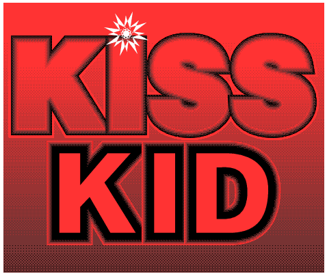
Keep It Simple Stupid, Keep It Direct--a dictum to be burned deep into your chromium, or scull, and never forgotten. You can also burn it into your cranium and skull, but that is less interesting.
There is always a temptation to treat every idea that floats through your mind as sacred, especially if you do very little writing, design, and layout. But be ruthless. Throw out the clutter. If you cannot bear to part with it, record it in a notes file somewhere. But do not let it near the task in hand.
If you are wondering why I bothered to make a figure of the words in Figure 1, when they are put forcefully enough in the text, ask yourself, both now and in a few days' time, which you remember most strongly: the textual or the graphical version. A big black-and-red 200-point declaration, with a few dramatic effects splashed about, gets far deeper into the grey stuff than a whispering string of 12-point text.
We have obviously got well past the stare of the snake, and have again proved what one of our great English writers once said (Thackeray? Trollope?): `A man does not know what is in him till he sits down to write.' In other words, to get going, get going. Begin. Only then you will find out what is in you. The same is true of every aspect of DTP: writing, design, layout.
To continue with the Alzheimer's leaflet...
We shall organise the rest of the text in easily-digestible bits, each picked out with a cross-heading. That will make it easy for readers to zero in on individual facts, it will break up what would otherwise be a big clump of grey stuff, and it will give us the opportunity to scatter some small, subsidiary graphics about (subsidiary to the main one, thus keeping the strengthening unity of the work). It will also make the whole thing look better. What you want to say is far more likely to be read if it looks inviting (it must also, of course, live up its visual promise, and /be/ inviting).
Science now knows that a brain-damage and strokes make Alzheimer's more likely, so it is good advice to say: `PROTECT YOUR HEAD--PROTECT YOUR BRAIN. Protect it from the outside: wear protective headgear when biking or working in hazardous places. Protect it from the inside: keep your blood-pressure down, get plenty of exercise, don't smoke.'
That takes care of the first chunk on the leaflet.
Science also knows that the well-used brain is less likely to disintegrate into A-mush, so we can use that as a cross-heading: `USE YOUR BRAIN. An exercised brain is less likely to turn to mush: use it or lose it. Schooling is known to postpone problems with memory and orientation, so don't leave school early, and keep learning all your life. Keep learning new skills and enlarging old ones. In particular, continually stretch and grow your linguistic skills. Take an interest in language, concentrate on how you use it, develop your writing and speaking skills, play Scrabble, do crossword puzzles. Mental gymnastics are good for your brain. Education is thought to help your brain build up the number of connections between neurons, thus forming a cushion against decline and failure.'
Chunk two done. Note that the text always says `/your/ brain', not `/the/ brain', to keep the text immediate and direct. That will make the message get through, it adheres to the KID of KISS KID, and it chimes in with the direct look of the graphic. It is also something that I did not notice till I was polishing, and realised that all the occurrences of `the brain' were too impersonal. We are talking to readers not machines.
You are what you eat, and it is now known that the right diet helps prevent Alzheimer's. Therefore: `EAT BRAINY. A strong link has been found between folic acid and the health of the brain. So eat plenty of folic- rich foods: breads, cereals, and leafy green vegetables. If necessary, add vitamin tablets that contain folic acid. At least 400mg a day is recommended. And good levels of antioxidants, such as vitamins C and E, although not found to be specifically helpful against Alzheimer's, are generally good for the body--they protect against cancer and other diseases--so make sure you are getting recommended levels in your diet.'
Chunk three done.
Keeping close social contacts also helps keep mental decline at bay. So: `KEEP IN TOUCH. Studies have shown that when old people keep close to others--family, friend, or community groups--they take longer to show the symptoms of Alzheimer's than those who spend their days alone.'
Chunk four. So now we can put it all together, and begin to work on the layout. But we have run out of space, so that will have to wait for the next article in this short series.
The key in what we have done so far is to keep the information informative, but brief, so that we can have a graphically strong layout that will not be overwhelmed by a lot of text.
At this point, I more often than not rough out the design out on a piece of paper, just to get some idea of the layout, the balance, the content. It is much quicker than making notes on a machine, even if only because you do not need to boot your brain, pencil, and paper before they are up and running. And they can be used anywhere--such as on the aforesaid walk.
In this case, I used the thirty-five minutes that it takes to travel to the New Zealand mainland by the big, fast catamaran-ferry from the island where I live. Figure 2 shows the result--or a scan of it, tidied up a bit so that you can see through the clutter to some semblance of order. As you can see, I also scribble a few notes to myself about details of the graphics--such as `gold' and `grey' for the opposing pans of the pair of scales.
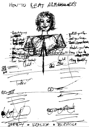
A scan of the sketch made on the ferry, with some crossings-out removed for clarity.
Between now and the next issue of RiscWorld you might like to work up your own idea, or your own version of the one planned here, and compare it with what will be shown in Part II.
Nobilangelo Ceramalus