


HTML Tricks and Tips
Richard Goodwin lets�you into some more of the deper secrets of the web designer.
Colour and layout
Some purists believe that any change in the colour of a website from the default grey background, black text, and blue/purple/red links (depending on whether it's been clicked on or not) is an unnecessary complication which makes it harder for visitors to a site to understand how to navigate around your site, and therefore the use of colour is some kind of design heresy. However, I'm sure you'll agree that this would not only make web browsing and site design a pretty dull experience, it'd also make for a very short article, so I'll plough on.
Colour
Colour brightens up a website, and careful use of colour can make it look more professional as well; but what constitutes 'careful use'? Well, the first thing is generally not to go overboard. The saying 'less is more' is especially relevant when you're trying to keep one eye on the download time, so it's a good job you can add colour quite cheaply - the attribute bgcolor can be dropped into either the <body> tag, or into the definition of a table cell (<td>), and a small two-colour GIF image of a few bytes can add colour and even a little texture. You can jazz up that boring old web page for the price of just a few bytes.
The second area to be careful of is the choice of what actual colours to use, and what they say about your site. If you're designing a site for a company, the job may have already been done for you - just get a hold of some headed notepaper, a business card or suchlike. Chances are they've already put time and money into deciding on their own colours and logo, and they'll want the website to fit in with all their other 'literature', thus saving you several minutes of important drinking time.

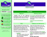
The IFEL website |
If the company doesn't have coloured logos however, don't despair, there are other easy ways of picking a colour scheme - pick colours to do with what the site is about. For instance, IFEL is well known in the RISC OS community for its hardware, and on its website (http://www.ifel.co.uk/) dark green with yellow and orange is used to reflect the green circuit boards and gold circuitry sometimes used in hardware manufacture. |
If you don't have such an easy-out, you'll just have to do a little thinking. You could just choose your favourite colour, but what goes with it? Generally you'll want to choose at least two, maybe three, colours that go well together so that when you start adding graphics you'll have something to contrast with the background to highlight the logo, links buttons and so on.
What colours say about your site
Each colour has a certain connotation attached to it, which might aid or hinder the message you're trying to get across.
The obvious starting place is red - a bold, exciting colour which is associated with danger (blood, stop signs etc.) and passionate romance (red roses). Possibly not one to over-use on a site about open heart surgery though. A darker red is slightly more old-fashioned, perhaps harking back to the times when books were bound in red leather; a little lighter and you get pink, which is again of course associated with love, perhaps a little too much for the boys.
![]()
Yellow is a happy, cheery, sunshine colour, although sometimes a little too bright to be used on its own - it's great as a highlight colour but won't show up well against white. If you tone it down a little you can go for a slightly brownish look - highlighted with yellow you can do all sorts of gold effects - or heat it up with a little red to make orange, which is a bouncy, fun colour.
![]()
![]()
Moving on through the spectrum we come to green, which is associated with nature - spring's new leaves, a grassy lawn and so on. Along with blue it's a very classy colour, and very calming, but this can mean you might find it a little dull - unless you add a little yellow and make it a zingy lime colour!
![]()
Blue is a cool, calming colour, telling of calm seas and the sky on a summer's day. It can also be cool in another way, mixed with a few white areas to make an icy theme. Again it can seem a little dull and conservative, but like a pair of blue jeans it never really goes out of style. Plus 35% of Americans say it's their favourite colour, and that many Americans can't be wrong, can they?
![]()
Purple is a hippy, trippy colour which I tend to avoid like the plague because it's used by so many people who want to be different but don't really have the taste to carry it off. This is perhaps a little unfair, as it is a little magical and occult (beloved of both bishops and Goths) and goes well with pink. Try it if you want to be nonconformist, but don't say I didn't warn you.
![]()
This just leaves the non-colours - black, white and greys. Black is the most powerful of "colours", and along with white gives the greatest contrast which aids visabilty and readability. It's also stylish - possibly why most consumer electronics has traditionally been black, although we finally seem to be moving away from this - and a little mysterious, with its association with dark nights and the occult. White on the other hand is bright and clean and pure and good. Greys can look a little washed out if not handled properly, but do have the advantage of going with just about every other colour.
![]()
You could just mix and match these colours to create a theme - for instance reds, oranges and yellows to make a fiery theme, or blues, turquoises and greens for an ocean-style theme, oranges and browns for a warm, earthy, Mediterranean theme and so on. Or you could apply a little colour science and save yourself the effort...
Colour wheels
A colour wheel is just a simple diagram showing colours arranged in a circular arrangement.
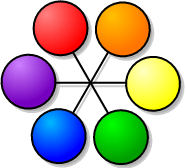
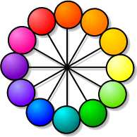
The six- and twelve-colour wheels.
Once you've picked a colour you want to use on your website, match it to the closest colour on one of the wheels above - the twelve colour wheel is just a slightly more complex version of the six colour one, so the rules work exactly the same on both. If you chose a colour which doesn't appear to fit - for instance, pink or brown - don't worry, just think of the colours shown as the most extreme examples, you can always add a little white or black into the mix, so for those examples you'd use red - just assume light red is pink, dark red is brown.
 | The simplest rule to remember is that of complimentary colours - those that are directly across from each other on the wheel. These colours are the exact opposite of each other, for instance, yellow and purple, green and red and so on, so you'll be a little familiar with them if you've seen photographic negatives. These show up well when placed side by side, but can be a little harsh. A neat trick is that if you mix them together in equal parts you get grey - remember how I said they went with almost anything? Well if you use complimentary colours and need a third colour for your site, you could always try grey which might calm things down a little. Or you could try a variation on the theme and go for three colours exactly one third around the wheel from each other. |
 | The more subtle rule however is that of adjacent or analogous colours - simply put, colours that are together on the wheel. In the section above I mentioned reds, oranges and yellows as a theme, as well as blues, turquoises and greens, both of which fit into an adjacent colour scheme. Of course, all colours are sort-of close together when you put them all in a wheel, but to make adjacent colours work it's best to keep the spread as close as possible - perhaps just the colours one step either side of your main colour, which works well on the six point wheel but even better on the twelve point wheel. |
Text areas
Consider most text-based websites - chances are they'll have a splash of colour down one side or across the top, and the main part of the page will be white with black text. Why? Well, first and foremost is that this is how it's been done for several hundred years with traditional publishing media such as books and magazines. People feel comfortable with this, which instantly makes it easier for them to understand what you're trying to get across. It's fairly easy on the eye; although staring at any colour on a monitor is going to give you a headache eventually, the high contrast of black on white at least gives the viewer a fighting chance. And it's also pretty easy on the printer ink if someone wants to print a page from your site.Of course, rules are there to be broken, and style can come from knowing exactly when to break the rules - for instance, most games-related websites usually have a black background with white text. This makes it closer to the style of most games, it's also a little easier on the eye (you get the same black/white contrast, but the predominance of black is more restful). You'd also want to do the same dark background, light foreground if your target audience is using a TV as their display device - although NCs didn't take off in quite the way people had hoped, as the Internet continues to gain popularity you'll find more and more consumer devices being web enabled; for instance, the Dreamcast games console. In this as in all things, it pays to know your target audience.
So, for large blocks of text high contrast is good, traditional colours are good, cyan backgrounds with black text are bad. It's also worth pointing out that textures for large text blocks run against most of the points raised above - you lower contrast, make printing harder (and much slower), and generally mess things up. However, a subtle watermark or very pale logo down one side of the page can look quite stylish.
Other rules and how to break them
|
You may have noticed by now that whenever someone tells me about "the rules", I always feel like rebelling and breaking them first chance I get. So, as well as trying to write about what you should do, I'll also try and think about how you can go against this advice to produce a stylish, unique site. For instance, consistency helps the reader feel more comfortable and helps them navigate about the site; if they come to something that looks quite different to where they've just been they'll get a little confused, and start wondering if they've wandered off the main site rather than read your carefully crafted prose, so you try to keep a similar layout and the same colour scheme throughout the site. They way to break this rule is, of course, to decide from the offset that multiple colours are part of your design; for instance, the current ArgoNet site (http://www.argonet.co.uk/) is similar in style across much of the official section, but the main pages are in shades of blue, the support area is made up of greens, and the links section is predominantly orange; the layout is very much the same, but the colours help show at a glance which part of a fairly large site you're currently in. |
Another rule is that the eye will start on the left and move right, and from top to bottom; the focal points are to the centre or upper left of the page. You should, therefore, put any navigation toolbars along the left or top edges of your page, with the text on the navigation buttons going left to right. However, this seems way too traditional and Western for me at times, so I'll sometimes switch the navigation to the right hand side; it's different, it's out of the way so people can concentrate on the text, and it's good if it's the sort of page someone might want to print - they're there for the content, not a printout of a load of one-word GIFs. You could also make the navigation buttons go down the page oriental-style instead of left-right if, for instance, the site is about some kind of martial art. I'd advise against right-left text for English words unless you're especially perverse though.
And finally, don't go overboard with trickery - keeping a page simple will mean it loads faster and is easier to navigate and read. Adding huge banner ads, loads of colour and massive images all over the place won't get you a repeat visit. Changes in colour in the main text can make the text harder to read. However, it does make it more fun! People like a bit of colour, it makes the text more interesting so long as you don't overdo it.

A site that changes colour depending on the time of day |
This month I finally added something to a site I've been meaning to do for ages - one that changes colour depending on the time of day. As the site is generated by a Perl program every time a page is requested I went overboard and got it to download the sunrise and sunset times every day, so although the site was originally in shades of blue I made it turn red and orange for the hour around sunset, black and blue throughout the night and purplish around sunrise until it returned again to blue for the rest of the day. It even changes to using a dark background with light text if it knows you're using an NC or Dreamcast!
While I'm not suggesting that you go quite so overboard, it might be fun to use a little simple JavaScript, SSI or PHP embedded into your page to switch colours based on the time of day, or the day of the week, or even turn green on St. Parick's day. Or you could remove all the references to colour to a separate file and use a very simple piece of SSI - the |

I hope that this has given you some food for thought, so get out there and start designing!
Richard Goodwin


