


Introduction
Phantasm is a unique colour control addition to ArtWorks. It enables the named colour system, a part of ArtWorks, to deliver to the artist a new level of control. Features like lightness adjustment, contrast and saturation were previously only available using professional non-Acorn vector and painting (bitmap) programs. However, it is the special features of shifting colours and converting colours to monochrome that provide a method of painlessly generating effects such as transparencies. In addition there is the ability to create new colours using various methods.
This manual assumes a working knowledge of both RISC OS and ArtWorks. We recommend you read the instructions for any add-on modules before installing them.
The operating principle
Phantasm can work externally to ArtWorks because it can import and export colour tables from any ArtWorks picture. It was created as a stand-alone application rather than following the conventional module add-on method so that it could provide a large number of options and features that would otherwise not fit within the standard ArtWorks tool bars. An additional advantage is that Phantasm can produce a sequence of colour manipulation operations much faster than any built-in module as ArtWorks does not have to render each stage, only the final result.
The way to export colour tables from ArtWorks is to bring up the main window menu, following File, through Export to Colour table. Drag the table file onto the Phantasm main window to commence editing.
System requirements
Whilst Phantasm will run on any RISC OS 3.1 or later machine we recommend that for any serious usage you have at least 4Mb of RAM and a hard disc.
Installing Phantasm
Phantasm is ready to use on any RISC OS 3.1 or higher machine. It can be copied onto your hard drive from the supplied disc. No further action is required.
Phantasm may be used on a floppy disc only system, just copy the program from the distribution disc onto another Acorn formatted disc. This disc must remain writable. Note that neither APDL nor ProAction guarantee the suitability of this program when used in this way, we recommend you use Phantasm with ArtWorks installed on a hard disc.
Phantasm�s Layout
After the Phantasm intro window clears the program icon will appear on the icon bar. From here click Select to open the main window.
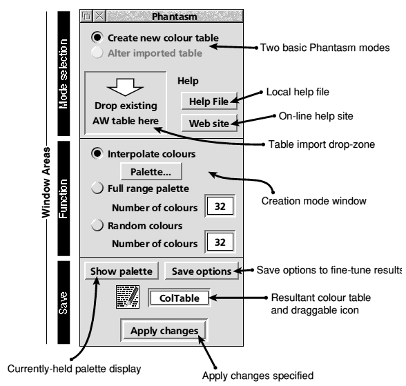
The main window is split up into three distinct segments; Mode selection, Function and Save. The Function segment is mode-sensitive and will change according to the required colour creation or alteration mode. Upon loading only the Create new colour table option is available as no existing colour table has been imported ready for modification.
Colour Creation Mode
The default setting lets you create new colour tables ready for exporting to any ArtWorks drawing window. The new colours may then be utilized within the drawing which can be edited and saved as normal. For Phantasm to let you create new colours, the Function window displays the three options;
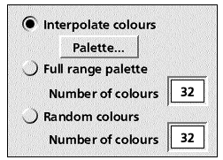
Interpolate colours
By choosing Interpolate colours (default upon loading) it is possible to generate various types of colour interpolations. The types can be chosen by clicking on the Palette... button which brings up the following window;.
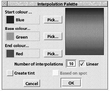
Phantasm lets you automatically create a table of interpolated colours between either two or three user-selectable colours. The start, middle or end colours may either be chosen from the standard ArtWorks palette, or by individually selecting new colours through the colour picker. The number of stages between these colours may also be stated so that you may determine the amount of change in colour between each step.
Interpolation between three colours
If any of the start, middle or end colours are present in the standard ArtWorks palette then it is possible to select these by clicking on any of the stated colours (by default, Blue, Green and Red) and their sample squares which will open an ArtWorks-like named colour menu. When this menu is displayed (note that the option none is only available with the Start colour) you can select the desired colour as with ArtWorks. This colour is then displayed in the main Interpolation window.
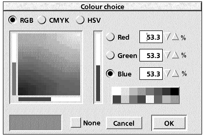
However, it is also possible to select non-standard colours using the Pick... button. This opens a colour picker window from which you can select any 24-bit colour using either RGB, CMYK or HSV. To help with the selection, the main display area will show an accurate view of your choices and how they would appear in sequence.
Once you have selected all three colours it is possible to alter the number of interpolations using the number input box. The number entered is the total number of resultant interpolated colours including the start, middle and end colours.
The final choice available for a three colour interpolation is whether you wish to have a linear or non-linear transition. Linear is the default and gives a constant percentage colour change between the colours. Non-linear interpolations provide cylinder-wall effect shading where the percentage change in colour increases towards the start and end colours away from the middle one.
When satisfied with the settings click on OK to fix them and close the interpolation window. Now click on Apply changes at the bottom of Phantasm"s main window.
To use these interpolated colours drag the colour table (the text icon above Apply changes) directly to Artworks. Alternatively they can be saved to disc for use later. When using ArtWorks with the new colour table dropped onto its drawing window it is possible to select any of the interpolated colours in the normal manner. Interpolation between two colours It is possible to use the interpolation facility in the same way described for three colours to generate a two colour variety. All features, such as being able to select the middle and end colours, entering the total number of interpolations and specifying whether the transition is linear or not remain. However, in order to use two colours, select none for the start colour (through either the named colour menu or the standard colour picker). This forces the start colour to be boxed out.
Generating interpolation tints
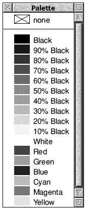
The best example of an interpolation tint is Black and its ten shades found in the standard ArtWorks colour table. As Black (Key) is one of the standard four colour separations, and therefore effectively a spot colour, its associated tints (x% Black) are all true shades of a spot colour. This is very important for printing purposes (see the literature accompanying ArtWorks for greater knowledge on the printing process), but is not restricted to just Black (Key).
When on a tight printing budget it may be best to opt for only one, two or three printing separations and not all four standard varieties (CMYK). It is also possible to specify a particular colour (for example, a corporate image) as one of the spot colours so that a true colour reproduction may be assured. However, it would then be possible to create a sequence of shades of that particular colour by using Phantasm"s interpolation tint option. Acorn"s green logo is such an example.
The one major restriction of ArtWorks is that it is not possible to create true separations using tints interpolated between two spot colours, even though the printing process would easily accommodate it. Therefore all tints of a colour, based on process or spot, have to graduate from the base colour (denoted as the end colour in Phantasm"s interpolation menu) to no colour � ie. white.
By selecting Create tint in the interpolation menu both the start and middle colour options are greyed out. Phantasm will automatically specify the middle colour as white and leave you to select the end colour. This is the colour all tints will remain proportional to, even when used within ArtWorks.
There are three further options left; the number of interpolations and linearity (both discussed earlier) and the new option of forcing the base (end) colour as being a spot colour. By selecting this you will be specifying a new separation in the printing process, so both a basic knowledge of the professional printing process as well as caution are required if you elect to print any artwork using a bureau or similar. (Note that such matters do not concern desktop printers.) By clicking OK in the interpolation window as well as Apply Changes in the main Phantasm save window, the tints are ready to be exported directly to ArtWorks, or saved to the filer. Note that Phantasm will save the interpolated colours in the table as true tints regardless of any Save settings, described later.
Creation of a �Full range palette�
In the colour table creation mode area found of Phantasm"s main function window is the option of creating a Full range palette. What this does is to create the greatest variation of hues when both saturation and value levels are at 100%. The result is a user-specified amount (the number of which is entered in the input box) of rainbow colours. Any shade may be generated from these colours by performing either a radial or linear fill from any of the generated colours to either black or white (effectively altering the saturation and value amounts).
By selecting this option and entering the required amount of colours, you may click on Apply changes to generate the table which is then ready for exporting or saving.
Generating random colours
For those indecisive moments...
When this option is selected and the number of colours entered, in an identical manner to creating a Full range palette, then the resultant colour table will contain a user-specified amount of random colours.
Colour Alteration Mode
Arguably the most useful aspect of Phantasm is its ability to alter existing colour tables used by ArtWorks drawings. The process used is to export the ArtWorks colour table to Phantasm as illustrated below;.
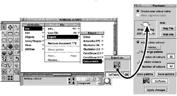
Once the ColTable file has been dragged from ArtWorks" Export Colour�table menu onto Phantasm"s target area (denoted by the white down-facing arrow), Phantasm will automatically alter its operation mode to Alter�imported�table. In doing so, the Function window will change as shown below The Function window is operation-sensitive, so by default the window will display the ability to Shift to colour. Note that the lower part of the Function window is always reserved for the Ignore facility regardless of operation. This is discussed later Six operation modes are available to suit the type of colour table modification required. These are;.
- Shift to colour
- Convert to monochrome
- Adjust lightness
- Adjust contrast
- Adjust saturation
- Miscellaneous
Each operation mode alters the Function window is some way to suit the user control. In order to enable each operation mode, you have to click on the pop-up menu button to the right of the text "Shift to colour" which will result in a menu stating all available operation modes. By clicking on your operation mode choice, you may begin to edit the imported colour table accordingly.
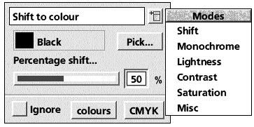
Shift to colour
The theory of Shift to colour is very simple but it can create some unique effects, such as transparencies.
If this function is applied to an existing colour table at 100% strength (selected either by sliding the blue bar, or entering the value in the input box), then all colours in the table become the same as the selected destination colour in the Function window (by default, Black). However, there are very few cases where a 100% shift is required, so a more moderate percentage is usually chosen which would result in all colours shifting x% from its original state to the chosen destination colour.
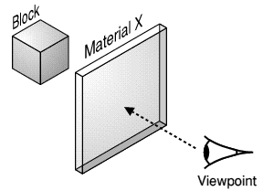
This is the principle of transparencies. The diagram to the right shows an object (Block) viewed through a sheet of Material X from Viewpoint. The link between the operation Shift to colour and Material X is that the percentage opacity of Material X is equivalent to the percentage in Phantasm"s window.
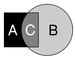
In the diagram above square A, which is of colour A, (the colour to be altered in the imported colour table) has a filter, B, partially obscuring it. The filter"s natural colour is B (the selected colour when using Shift to colour), which is defined by its colour when the filter loses all transparency. The intersection, C, is then of the colour A shifted to colour B by the level of opacity of the filter B, the percentage selected in the Function window Shift to colour.
To use Shift to colour, first select the colour you wish to shift the imported named colours to. For example, if you wish to create a glass-transparency effect, then you would either ensure that the colour name Glass is created using ArtWorks (try 35% Cyan, 5% Magenta, 0% Yellow and 10% Key) and therefore exported along with all other named colours so that it may be selected by select-clicking on the colour square and name, or by picking the colour by select-clicking in the Pick... button.
Once the colour is chosen, determine the percentage shift by using either the blue slider bar or the input box, then click on Apply�changes at the bottom of the main Phantasm window. The colour table is then ready to be exported or saved to filer.
To create transparency effects, please read the Techniques section.
Convert to monochrome
This is identical in layout to Shift to colour and very similar in principle to it. If 100% percentage shift were to be selected with this operation the result would be that all named colours would end up as percentage colours (like tints) of the selected monochrome colour. For example, if 10% Black were to be converted 100% towards Brown (to emulate old photographs), then the result would be that it would alter to 10% Brown. Likewise Black converted in the same way would become the colour Brown.
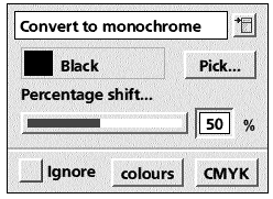
Uses for this are, for example, to create old-style photographs and to create true Black-and-White drawings which are more suitable for generating better results from monochrome printers.
Adjust lightness
When this is elected Function window alters as shown. The main differences from the previous modes are that there is no colour to select and that percentages can be either positive or negative.
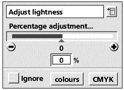
Adjust lightness is a very simple tool. By lightening the named colours by a positive amount the picture becomes brighter; a negative amount darkens it.
The two methods of determining the percentage adjustment are as before; either by dragging the slider or entering a value.
To reset the value to zero click on the centre triangle or the number zero below it. To increase or decrease the value by 5% steps click in the (+) and (-) buttons at the extremes of the blue slider.
Once the value has been set click on Apply changes at the bottom of Phantasm"s main window. Export or save as usual in order to use the modified colour table.
Adjust contrast
Adjust contrast is identical in appearance to Adjust lightness and just differs in the results it produces.
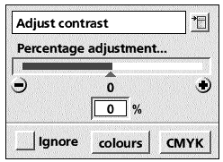
Note that certain colours and drawings are more susceptible to a positive function in this operation than others as certain colours can"t increase/decrease at all in terms of contrast (eg. Black).
Adjust saturation
The principle of this mode is that all named colours are internally converted to the HSV (Hue, Saturation and Value) colour model. Adjust saturation alters the percentage saturation within this colour model for each colour. The saturation is how "deep" the colour appears to be. The percentage adjustment is the multiplying percentage shift for each Hue value, not an addition to each value.
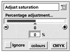
As with Adjust contrast, the effectiveness of this depends upon how much saturation each colour already possesses. If you were to adjust the standard ArtWorks palette colour Red (which converted to HSV values is 0� Hue, 100% Saturation and 100% Value), by +100%, there would be no effect as the colour already has 100% saturation. However, if the percentage adjustment were -100%, then the colour Red would become white. Experimentation with this operation mode is recommended.
Miscellaneous
The final operation mode presents two options without any levels or colours to be selected. The first, Invert image colours, is just an absolute operation that inverts all named colours by 100%. To make this effective to the imported colour table, ensure this option is selected, then Apply�changes.
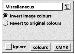
The second, Revert to original colours, is very useful as ArtWorks doesn"t recognise imported colour tables in its undo facility. Therefore it is strongly suggested that the ArtWorks file is saved before its colour table is exported, altered in Phantasm, then placed back in the drawing. However, this facility can be used as a last resort.
Ignore (mask) colours and separations
Each of the six colour table alteration modes have the ability to ignore certain named colours simultaneously with any combination of the four separations, Cyan Magenta, Yellow and Key. This adds great versatility to Phantasm.
By default Phantasm does not ignore any colours or separations as the Ignore box is unticked. However, as soon as a colour or separation is selected, the box becomes ticked and the ignore facility is operative.
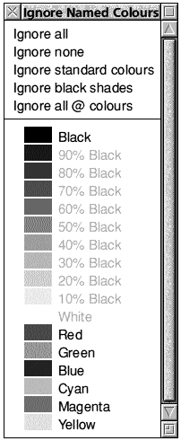
To select a named colour (or combination of named colours) to be ignored when the table is being altered, click on the colours button next to Ignore A menu will appear (the list of named colours depends on the colour table imported). At the top is a set of five quick-select options for selecting groups of named colours. 'Ignore none' is equivalent to deselecting all.
Below the dividing line is the list of imported named colours. Note that all tints are greyed out as they always remain relative to a specific colour. By selecting the colour on which tints are based, you will also be selecting all associated tints.
Click on a single colour or option to select it. The menu will disappear and this colour will then be ignored throughout any alterations.
To select a number of colours or quick-select options, use the Adjust mouse button to select or deselect individual colours. The menu will remain on screen and the ignored colours will be ticked.
The reason for the item Ignore all @ colours is that if you draw an ArtWorks picture with Phantasm in mind, you may wish to keep a number of colours free from any alteration. If this is the case, then name these colours (or re-name them) with an "@" symbol at the start. Then you may choose to ignore all these colours with a single mouse click.
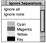
Ignoring separations is similar to ignoring colours, except the menu always displays the same four colours (CMYK) and there are only two quick-select options..
It is possible to eliminate certain separations (by ensuring they are not ignored, then shifting all colours to White by 100%) or single-out a particular separation. Ignoring separations may be used simultaneously with ignoring named colours.
Palette Display
It is possible to view effects, both when creating and altering, without having to export the colour table back to ArtWorks. Click on Show palette near the bottom of Phantasm"s main menu. A window similar to the one on the below will appear.
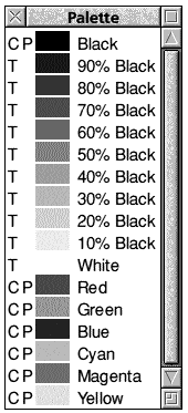
Not only will this display be constantly updated as you make any alterations but it also shows the specification. These are in the form of one or two letters before the colour square. The first of these may be either;
R � RGB colour model
C � CMYK colour model
H � HSV colour model
T � Tint
The second letter applies to all colour models other than Tints.
P � Process colour
S � Spot colour
Please refer to the ArtWorks documentation for full descriptions of each if in doubt.
Detailed colour information
It is possible to obtain more accurate and detailed information by clicking Menu over any of the named colours displayed in the palette window. The type of window that appears depends on the colour type (RGB, CMYK, HSV or Tint).
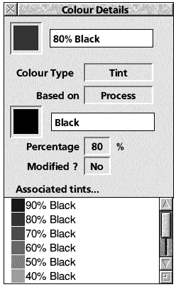
The two types of colour info windows are shown.
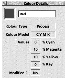
Information is shown such as colour composition, colour model, modification status and, if a tint, all associated tints.
Save Options
The Save options window is opened either by clicking on Save towards the bottom of the main Phantasm menu, or by clicking on the menu entry on the icon bar.
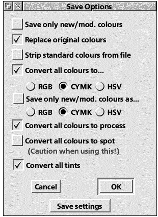
The options available in this window will probably determine the quality of the result from Phantasm and in some cases should be used with caution.
Whatever settings you choose they may be made effective just for the current session by just clicking on OK or made permanent, to be brought up in the next session, by clicking on Save�settings.
Save only new/modified colours will ensure that Phantasm saves/exports the colour table only with modified or newly created colours.
Replace original colours should normally be set as it tells Phantasm to append an exported colour table originated from ArtWorks. This in turn means that all colours will be updated with any alterations.
Strip standard colours from file is useful when collating ArtWorks palettes that may be useful for future pictures. It eliminates the standard ArtWorks palette of Black and its 10% interval tints, White, Red, Green, Blue, Cyan, Magenta and Yellow. This ensures that any palette dropped on an existing drawing will not interfere with the standard palette already in use.
Convert all colours to... (RGB, CMYK or HSV) will ensure that Phantasm saves/exports all colours in the chosen colour model. If this and Save only new/mod. colours as..., are unticked Phantasm will save any new or modified colours in the model that is most convenient for it internally, which may not be the best for the artist. Note that it is best to ensure that an ArtWorks picture is of one colour model to enable blends and other features to operate properly.
Phantasm operates a full Grey Component Replacement function to get the best results from four separation printing processes. Please refer to the ArtWorks Commercial Printing Guide for more information about this specialised area. However, this implies that if this option is set ticked and CMYK is selected (recommended), the output should be optimised for printing.
Save only new/modified colours as... (RGB, CMYK, HSV) will toggle Convert all colours to... off � if on prior to selection of this option. By ticking this, you are ensuring that Phantasm keeps all imported colours in their original colour model and only effects the created or modified colours.
Convert all colours to process ensures that all Spot colours are eliminated. This might be a good idea when checking a drawing for a commercial printing process. If it is not set and certain additional colours were set as Spot, then theoretically the printing cost could soar as you would be requesting more separations.
Convert all colours to spot should be used with extreme caution for the reasons outlined above. This option is only useful when dealing with a very small number of colours which were created specifically to be spot colours. Please read the ArtWorks literature for a greater understanding of Spot colours before use.
Convert all tints was added to Phantasm"s features to give further control to the user. In certain operations involving altering colour tables this is the only way to ensure correct function alteration. Phantasm will convert all tints to process colours (apart from the tints created in the interpolation window). However, this process is not easily reversed. The advantage of maintaining tints is that if spot colours are used, true tints remain as the drawing structure would have originally dictated. Also note that some alteration functions automatically convert tints, such as Invert.
Miscellaneous
Reset
It may be necessary at some stage through a single session with Phantasm to reset the application. This can be done by an entry on the icon bar menu and will result in the application returning to loaded state regarding the colour tables. It saves on having to quit and re-load Phantasm in order to start a-fresh.
Help features
There are three main help features with Phantasm, excluding this manual;
- Acorn"s !Help application (supplied with each RISC OS machine). Please refer to Acorn literature regarding this application.
- !Help file held within the Phantasm"s application directory. This may be accessed by either using the filer help facility or by clicking on Help�file found at the top of Phantasm"s main menu. It contains the latest additions/alterations to Phantasm.
Quit
Phantasm may be Quit by the normal manner from the icon bar menu.
Info
Phantasm"s version number is displayed by following Info on the icon bar menu.
Techniques
Phantasm is a very versatile application and may add much potential to your copy of ArtWorks. However, in order to harness this potential it is necessary to grow accustomed to some techniques used to create artwork effectively and efficiently.
Creating appropriate colours
Phantasm will operate perfectly with all existing ArtWorks files although it may be advisable to stick to a few guidelines to accelerate any colour adjustment work. The major consideration is to name colours meaningfully, not just using New colour x. The next step is to use the colours as their name dictates. So, for example, if you create a colour called Sea Blue and use it as the basis of creating a view of the sea, try not to use the same colour for the sky. In doing so you not only have to use Phantasm to adjust a scene"s colours, but also cut and paste objects/groups to the clipboard only to shuffle such items between ArtWorks sheets.
Always try to operate in one colour model, RGB, CMYK or HSV when using ArtWorks. You may find that HSV is the easiest system to select a colour and this is reflected in the title given to it of "The Artist"s Palette". The reason for this is not anything to do with Phantasm"s functionality, but with the way ArtWorks handles colour. This is shown in operations like blends where if a blend starts with an object filled with a colour of model A and finishes with an object filled with colour of model B, the results are not always good. Refer to ArtWorks literature for more information.
Make use of the "@" colour facility. You will often find it necessary to isolate a component of the drawing. This can easily be done for objects in ArtWorks where components may be grouped, but is not possible for named colours as they are not affected by groupings. If you know in advance that an intricate border should not be effected by Phantasm, name all colours involved as @ Border <colour>. Then if there are a number of colours used solely by the border, you are able to ignore them easily.
Example one
In this example the principle of naming colours appropriately will be demonstrated.

Load the ArtWorks file Example1a (above) into ArtWorks. This picture shows a strange ring tube with two spheres at the top and a skewed rectangular base constituting a frame around a cube with some text and a astro-belt effect disc.
The intention is to alter the centre cube, the text and astro-belt so they are converted to a red and white monochrome effect, whilst leaving the frame components intact.
When drawing this picture, the two major groups were given distinct colour names and were never interchanged, as below;
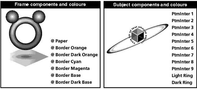
To obtain the colour alteration visible in the file Example1b, take the following steps; .
- Load Phantasm.
- Export the colour table of file Example1a directly onto Phantasm"s target import area.
- Alter the Function window operation mode to Convert�to�monochrome.
- Select the colour Red from the named colour menu.
- Specify a shift in percentage of 100% by sliding the blue bar all the way to the right.
- Click on the colours ignore button and select Ignore all @ colours. (Notice that the Ignore tick box is automatically ticked.)
- Click on the main menu Apply changes button.
- Drag the colour table directly to the ArtWorks window displaying Example1a from where the colour table originated.
The result should be identical to the file Example1b.
Example two
Demonstrating the principle in example one with a bit more realism, apply all the stages in example one to the file Example2, except instead of ignoring just the "@" colours, also choose to ignore all standard colours.
Please note that the classic ArtWorks Apple4 file (which was the basis of the file Example2) has had its colour names modified so that this process may be applied with greater ease. However it is possible to apply this effect to the standard file that was supplied with all copies of ArtWorks. Simply ungroup the drawing and select the apple body leaving the stalk, leaf and background behind. Group this selection and cut to clipboard. Paste this onto a new ArtWorks sheet and apply the Convert to monochrome (towards Red) process to the new drawing that just contains the apple body, ignoring the standard colours. Copy the result to the clipboard and paste and position the red apple back into the original file.
Cutting and pasting
The standard practice of cutting and pasting sections of drawings between sheets in ArtWorks is essential in order to colour manipulate images successfully. Basically, the principle was displayed with Example two, where in order to target a certain component of a drawing for isolated colour manipulation, it was copied to the clipboard and then pasted and modified on another sheet. By doing this you are also eliminating the need to carefully select colours to ignore, which is practical when dealing with drawings whose named colour use is not ideally suited to Phantasm"s Ignore facility.
By altering the colours on a separate sheet then copying and pasting back to the original drawing any modified colours are appended to the original drawing rather than replacing the existing ones. The two real problems with this are that; .
1If you carry out a number of such operation, each with several named colours, then the resultant file will have a large total number of colours which hinders selection (although there are no problems printing or editing).
2Positioning the artwork back in its correct position can be tricky. The best solution is to maintain the original object, then, when a modified replica is pasted back, use ArtWorks Alignment facility to exactly position the object.
Once an ArtWorks drawing has had a number of colour tables added to its list either by pasting a selection with a new set of colours or by importing a colour table it is very time-consuming to remove them individually. With a highly modified drawing it may be best to periodically copy and paste the whole drawing to a new sheet. This will remove all unused colours, but also eliminates any of layers unless each one is copied and pasted individually. Also, page sizes, colour etc. all have to be re-set.
The method of copying selections to the clipboard then pasting on another sheet is utilized in order to generate transparency effects.
Example three
Requires MW Software"s ArtWorks Intersect module for practical use.
Please contact APDL or view the MW Software website www.mwsoftware.com.
Creating transparency effects has eluded ArtWorks users since its launch. However, though Phantasm doesn"t allow ArtWorks to render these effects properly, it is able to give the appearance of being able to do so. The results remain in vector format yet look and print identically to true transparency-enabled software.
The theory of creating this effect was described earlier in Shift�to�colour but the following explains how to translate this into ArtWorks-specific use. By combining the features of the Intersect module and the ArtWorks clipboard it is possible to create effects as in the file Example3. To replicate this take the following steps; .
1Create the object to be seen through the lens, in this case a cone-shaded object constructed using radial fills and blends. In this example it was given a white start colour and a suitably named end colour. Group the objects.
2Draw the to-be-transparent shape and place over the original object. Note that the Intersect module limits this type of shape. Try to keep the number of bezier curves to a minimum. Colour the shape with a meaningfully-named colour, in this case Lense. This will be the absolute colour of the to-be-transparent object. This brings you to stage one in the file Example3. Save the drawing.
3Copy both items to clipboard and paste on to a new sheet. Select all and ensure that no objects have a line colour.
4Export this new drawing"s colour table to Phantasm and ensure that Shift�to colour mode is selected.
5Choose the colour used to fill the to-be-transparent object as the colour to shift to .
6In this example, the opaqueness of the lense is 25%, so this value is set using either the slider or the input box.
7Apply changes and export back to the ArtWorks window from where the colour table originated. For correct results, it is advised that the Convert all tints option found within the Save options window is set. This should bring you to stage two in the file Example3.
8Ensure that the single path object, in this example the circular lense, is in front of the object group. Using the Intersect module Intersect�with�top (found in the Lines/Shapes ArtWorks sub-menu). Group the objects. This should bring you to stage three in the file Example3.
9Copy this intersected group to clipboard and paste in the original ArtWorks drawing window and position precisely over the illustration.
10If the original transparent shape had a line colour, clone it and set the cloned shape to a fill colour None. This will bring you to the final stage in Example3.
The final result in this simple example is technically accurate as well as being a true ArtWorks drawing that is backwards-compatible and printable.
Known Limitations
There are a number of limitations of ArtWorks which affect its use with Phantasm.
Unnamed colours
ArtWorks operates on the principle that all colours are named and accounted for on any colour-selection menu. This remains constant until a blend between two named colours is made into shapes, a task done by either using the Make shapes command, or by using Intersect on a blend. At this point, the new inbetween shapes are coloured correctly, but their colours are not listed in any menu. Therefore they are not exported in the colour table which renders then untouchable to Phantasm.
The reason for this is that ArtWorks renders blends "on-the-fly". This has many advantages, such much less memory usage, but it also means that Computer Concepts considered that when converted to individual shapes, part of the theory should continue in the form of keeping colour listings to a minimum even though they have to be held within ArtWorks somewhere in order to render them.
The solution to this problem is to take the approach as shown in Example3, which is to first perform the colour alteration, then make shapes. However, under certain circumstances this may be impossible, for example, the Make shapes command may have been performed first and the undo facility does not go back that far, or it was pasted onto the drawing in that state. Therefore, the only option is to export the shapes to Draw, then to re-import them. By doing this all colours will be present, usually entitled New�colour�x, but there will be a loss of quality as any graduated fills will also be converted into single colour shapes. The result of this may be a very large named colour list as well as a very large file size.
Original ArtWorks files
Before ArtWorks was released it was known as TopDraw. Many drawings, such as the MG Midget, were created using this pre-release version of ArtWorks. Some of these files have non-standard colours as they do not have any name, which is theoretically impossible with later versions. For Phantasm to work on these files, they first have to be copied/pasted to a new sheet. This will force all colours to have a name.
Linking Phantasm to ArtWorks
Phantasm was created as a stand-alone application as this gives benefits such as greater control over colour manipulation and more features.
The original intention was to link Phantasm to a specified ArtWorks window so that, if required, any alteration to an imported colour table could be rendered instantly. However, after much research it has been found that ArtWorks does not comply with RISC OS convention and can therefore not be linked successfully. .
ArtWorks Undo
ArtWorks" Undo doesn"t recognise a colour table which has been imported into the drawing. Therefore, when clicking on undo past the point when such a table was imported, ArtWorks will not be aware of the change in colours.
Sprites within ArtWorks drawings
Phantasm is not a bitmap colour manipulator. Any sprite file(s) within an ArtWorks drawing will not be modified unless it is a 256 colour grey-scale image in which case the screen.top colour will be adjusted as it is listed and exported in the colour table. To adjust such graphics files, use an application such as ChangeFSI (supplied with every Acorn computer) before dropping onto the ArtWorks window. Further ArtWorks Information ArtWorks has been around for many years, yet there are only a handful of resources available. Various individuals have attempted to change this by writing articles for RISC OS magazines and placing information onto the Internet.
Artworks Made Easy
APDL does have in stock a limited number of the Dabs Press book ArtWorks Made Easy. Please call on 020 8778 2659 or visit the APDL stand at a show - postage costs almost as much as the book.
RISCWorld