
|
So, you want to make a Web Page! |

|
So, you want to make a Web Page! |
We've covered alot so far. Text & font manipulation, images, links. As far as the basics go, there's not a whole heck of alot more.
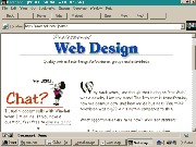
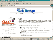
I think I'm going to take this time to tell you about screen resolution. The screen I work on is 640 pixels by 480 pixels. Many use 800x600 and a few use 1024x768. I'm sure that there are even a few others out there. What does this have to do with anything? It has alot to do with how your pages will look to them. Here are a couple screen shots of my current homepage at different resolutions.
 |
 |
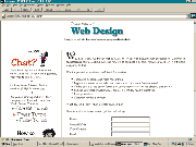 |
| 640×480 | 800×600 | 1024×768 |
It is a very good idea to check your page at other resolutions. Your carefully crafted layout might fall apart at other resolutions. There is a handy little MS Powertoy called Quickres that lets you easily switch screen resolutions.
Now we are going to look at a couple formatting tools availble to you. First one is <BLOCKQUOTE>. I've been using it throughout this whole tutorial. Basically it pulls your margins in from both sides. (I don't know if that's the proper terminology but if you understand what I mean I guess it's close enough).<BODY BGCOLOR="#FFFFFF">
<BLOCKQUOTE>
WE THE PEOPLE of the United States, in order to form a more perfect Union, establish Justice, insure domestic Tranquility, provide for the common defense, promote the general Welfare, and secure the Blessings of Liberty to ourselves and our Posterity, do ordain and establish this Constitution for the United States of America.
</BLOCKQUOTE>
</BODY>
 WE THE PEOPLE of the United States, in order to form a more perfect Union, establish Justice, insure domestic Tranquility, provide for the common defense, promote the general Welfare, and secure the Blessings of Liberty to ourselves and our Posterity, do ordain and establish this Constitution for the United States of America.
I'm sure when <BLOCKQUOTE> was first devised it had a loftier purpose, such as quoting profound bits of prose from authors I've never even heard of. But here in the trenches it serves a more mundane purpose... easy indenting. Another very useful little tool is a LIST. There are ORDERED lists and UNORDERED lists.
First, we will build an UNORDERED list. It's mind-numbingly simple- really.
This is an ordered list
- something big
- something small
- something short
- something tall
This is an unordered list
- something red
- something blue
- something old
- something new
Start with this...
<BODY BGCOLOR="#FFFFFF">
What I want for Christmas
</BODY>
What I want for Christmas
Note- technically we have not started to build the list yet. This is just a sort of heading.Add a pair of unordered list tags.
<BODY BGCOLOR="#FFFFFF">
What I want for Christmas
<UL>
</UL>
</BODY>
What I want for Christmas
Add a list item.
<BODY BGCOLOR="#FFFFFF">
What I want for Christmas
<UL>
<LI>a big red truck
</UL>
</BODY>
What I want for Christmas
- a big red truck
Add a few more...
<BODY BGCOLOR="#FFFFFF">
What I want for Christmas
<UL>
<LI>a big red truck
<LI>a real fast speedboat
<LI>a drum set
<LI>a BB gun
<LI>a Melanie Griffith
</UL>
</BODY>
What I want for Christmas
- a big red truck
- a real fast speedboat
- a drum set
- a BB gun
- a Melanie Griffith
Bingo! You made a list!How to make an ordered list? Easy! Change the <UL> tag to <OL>.
<BODY BGCOLOR="#FFFFFF">
What I want for Christmas
<OL>
<LI>a big red truck
<LI>a real fast speedboat
<LI>a drum set
<LI>a BB gun
<LI>a Melanie Griffith
</OL>
</BODY>
What I want for Christmas
- a big red truck
- a real fast speedboat
- a drum set
- a BB gun
- a Melanie Griffith
Another type of list is a definition list.
- aardvark
- A burrowing, ant-eating African mammal. And, as everyone knows, the first word in every self respecting dictionary. Did you know there's such a thing as an aardwolf?
Start with this...
<BODY BGCOLOR="#FFFFFF">
<DL>
</DL>
</BODY>
Then add a definition title...
<BODY BGCOLOR="#FFFFFF">
<DL>
<DT>10th Amendment
</DL>
</BODY>

- 10th Amendment
And a definition item.
<BODY BGCOLOR="#FFFFFF">
<DL>
<DT>10th Amendment
<DD>The powers not delegated to the United States by the Constitution, nor prohibited by it to the States, are reserved to the States respectively, or to the people.
</DL>
</BODY>

- 10th Amendment
- The powers not delegated to the United States by the Constitution, nor prohibited by it to the States, are reserved to the States respectively, or to the people.
As a finishing touch I like to make the definition title bold. It's not required, but I think it looks much better that way.
<BODY BGCOLOR="#FFFFFF">
<DL>
<DT><B>10th Amendment</B>
<DD>The powers not delegated to the United States by the Constitution, nor prohibited by it to the States, are reserved to the States respectively, or to the people.
</DL>
</BODY>

- 10th Amendment
- The powers not delegated to the United States by the Constitution, nor prohibited by it to the States, are reserved to the States respectively, or to the people.
Another little widget that you will find yourself using alot is the Horizontal Rule.
<BODY BGCOLOR="#FFFFFF">
<HR>
</BODY>

We have a few options available to us...
<BODY BGCOLOR="#FFFFFF">
<HR WIDTH=20%>
<HR WIDTH=50%>
<HR WIDTH=100%>
<HR WIDTH=20>
<HR WIDTH=50>
<HR WIDTH=100>
</BODY>

This one is pretty self explanatory.
<BODY BGCOLOR="#FFFFFF">
<HR WIDTH=60% ALIGN=LEFT>
<HR WIDTH=60% ALIGN=RIGHT>
<HR WIDTH=60% ALIGN=CENTER>
</BODY>

We can control the thickness...
<BODY BGCOLOR="#FFFFFF">
<HR WIDTH=60% SIZE=1>
<HR WIDTH=60% SIZE=3>
<HR WIDTH=60% SIZE=8>
<HR WIDTH=60% SIZE=15>
</BODY>

And we can make it a solid line.
<BODY BGCOLOR="#FFFFFF">
<HR WIDTH=60% SIZE=1 NOSHADE>
<HR WIDTH=60% SIZE=3 NOSHADE>
<HR WIDTH=60% SIZE=8 NOSHADE>
<HR WIDTH=60% SIZE=15 NOSHADE>
</BODY>

Remember when I said that the browser doesn't understand formatting, it just displays text in a steady stream? Kind of like this...
<BODY BGCOLOR="#FFFFFF">
                 \|/
                (@ @)
     +----oOO----(_)-----------+
     |      BARRY GOLDWATER    |
     |           for           |
     |        President        |
     +-----------------oOO-----+
               |__|__|
                || ||
               ooO Ooo
</BODY>
                 \|/
                (@ @)
     +----oOO----(_)-----------+
     |      BARRY GOLDWATER    |
     |           for           |
     |        President        |
     +-----------------oOO-----+
               |__|__|
                || ||
               ooO Ooo
Well, with the <PRE> (preformat) tag, we can put a stop to that and have things displayed the way we type them.
<BODY BGCOLOR="#FFFFFF">
<PRE>
\|/ (@ @) +----oOO----(_)-----------+ | BARRY GOLDWATER | | for | | President | +-----------------oOO-----+ |__|__| || || ooO Ooo</PRE>
</BODY>

\|/ (@ @) +----oOO----(_)-----------+ | BARRY GOLDWATER | | for | | President | +-----------------oOO-----+ |__|__| || || ooO Ooo
* Notice that a monospaced font is used.The last tag we're going to discuss is a comment.
<BODY BGCOLOR="#FFFFFF">
<!--This is a comment-->
This is not<P>>
A comment can be placed anywhere in the document and the browser will ignore everything inside the brackets. You can insert hidden messages, <!--Hi Mom!--> notes to yourself, <!--Pick up milk--> or write a helpful message to someone looking at the source of your page.<!--Copy anything off me and you're dead meat!-->
</BODY>
This is not
A comment can be placed anywhere in the document and the browser will ignore everything inside the brackets. You can insert hidden messages, notes to yourself, or write a helpful message to someone looking at the source of your page.
Just to be absolutely clear, the comment must start with <!-- and end with -->
You can even put other html tags in a comment and they will be ignored. The browser will just keep ignoring everything until it sees a -->
Well, that about does it! You now know all the basic tags you'll need to create a web page! Aren't there more tags? Oh yeah. Lots more. But rest assured you've got about 70% of the weaponry you'll need to make a web page. After you tinker with these main tags awhile, you may want to look at some of my other slightly more advanced tutorials: Table Tutor, Form Tutor and Frames Tutor. They will give you about another 27% of what you should know. What about that last 3% you ask?? Most of that is either tags you will probably never have occasion to use. Or, tags that for all intents and purposes duplicate other tags - that is, perform the same function. Or, tags that have a very limited and specialized use and you can add them to your bag of tricks later.I mentioned at the beginning of this tutorial some of my thoughts on HTML editors. In my opinion the best editors to use are not the big clunky wizard types. You know, the ones that say you don't need to know a lick of HTML to author a page. The only problem is, a large number of the pages I see that have been put together with these programs look as if the author didn't know a lick of HTML.
Most experienced authors use text-based editors. What these editors do is pop in a set of tags for you with a simple click. They make it so you don't have to manually type in color codes, LEFT, RIGHT, CENTER or whatever. You have absolute control over your page design. I once heard the phrase "text editor on steroids" to desribe one. That's about what they are. A couple good ones that come to mind are listed here. What they all have in common is that you must know some HTML. They will make your coding easier. They don't attempt to do it for you. What do I use? Lately I've been using Super NoteTab almost exclusively.
Once you have made your pages you will need to upload them to a server. The server is a computer that is running a server program that doles out documents to whoever requests them. If you are hooked up to the internet through your company or school computer, ask your system administrator how to go about getting space on your server for your pages. If you have your own Internet Service Provider ask them how to go about it. If you are using AOL or Compuserve, etc, they may have their own ways to go about posting your pages. The only definite piece of advice I can give, is that for transferring your files, the best program to use is Cute FTP. This gem of a program makes transferring files between computers as easy as moving them around on your own computer.
And before I go, I must say something about web page style and content. Better yet, I think I'll defer to Jeffrey Glover's Top 10 ways to tell if you have a sucky homepage and his Do's and Don'ts of web site design. Definately worth a looksee.
<--BACK NEXT-->
| Introduction | Lesson 1 | Lesson 2 | Lesson 3 | Lesson 4 | Lesson 5 | Lesson 6 | Index |
| PROFESSIONAL WEB DESIGN | |||||||